UX-UI Design for Finito iOS App - Student Project at Ironhack UX Design Bootcamp
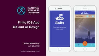
- 1. Finito iOS App UX and UI Design Adam Morenberg July 20, 2018 adammorenberg.com NATIONAL WELLNESS INSTITUTE
- 2. SOME OF MY RESEARCH CLIENTS
- 3. AGENDA UX DESIGN Client and Business Problem Initial User Research Hypothesis and Business Metrics Low & Mid-Fidelity Prototypes UI DESIGN Style Tile + Atomic Design System Desirability Test Results High-Fidelity Prototype + Microinteractions Usability Test Results Next Steps
- 4. THE PROBLEM Drop in memberships Want to find a way to add value to their offerings to Wellness Professionals Update NWI brand THE CLIENT Certification and Training for Wellness Professionals
- 5. USER-CENTERED DESIGN Ī░TEST EARLY AND KEEP TESTING EVERY STEP OF THE WAY.Ī▒ Jakob Nielsen
- 6. INITIAL USER RESEARCH 124 SURVEYS 5 USER INTERVIEWS SECONDARY RESEARCH
- 7. 38%OF MILLENIALS USE WELLNESS APPS (secondary research)
- 8. Ī░I ALWAYS GET BUSY AND FORGET TO WORK OUT.Ī▒ Qualitative Interview Participant
- 9. Ī░I MISS EXERCISE!Ī▒ Qualitative Interview Participant
- 11. SYNTHESIS
- 12. STRATEGY AND METRICS STRATEGY AND METRICS STRATEGY SUCCESS METRICS OFFER A WAY TO HELP USERS MANAGE BUSY LIVES BY HELPING THEM REMEMBER THEIR GOALS USERS WHO + ADD GOALS + TRACK PROGRESS + SEND DATA TO COACHES
- 16. RAPID PROTOTYPING + USER TEST RESULTS
- 17. Ī░IF A PICTURE IS WORTH A 1000 WORDS, A PROTOTYPE IS WORTH 1000 MEETINGS.Ī▒ Tom and David Kelley
- 18. LOW + MID-FIDELITY PROTOTYPE TEST RESULTS 5 TESTS EACH HOME SCREEN EDIT GOAL SCREEN Do I get a profile? ThereĪ»s no back button? What happens if I click it on accident? Low-Fi Mid-FiLow-FiMid-Fi I feel like I would click Delete by accident 40% didnĪ»t understand progress chart 20% looked for a profile page 40% looked for a back link 20% said Edit and Delete links too small
- 20. VISUAL ANALYSIS OF COMPETITORS TODAY PRODUCTIVEDONE
- 21. This is an example of the headline style This is an example of the style for body text in Open Sans regular, a highly legible font. Placeholder BRAND PERSONALITY Helpful Adventurous Creative Young STYLE TILE / INITIAL DESIGN SYSTEM
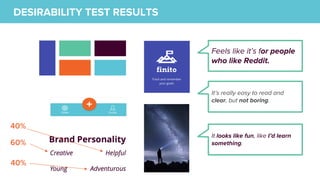
- 22. DESIRABILITY TEST RESULTS 5 TESTS 60% Feels like itĪ»s for people who like Reddit. ItĪ»s really easy to read and clear, but not boring. It looks like fun, like IĪ»d learn something. 40% 40%
- 23. HIGH FIDELITY PROTOTYPE DETAILED VIEW
- 24. PROTOTYPE LINK https://projects.invisionapp.com/s hare/DBN2LTX8SZ7#/screens MICROINTERACTIONS FLINTO ASSISTANCE David Fast Hugo Ramos Hector Gutierrez
- 25. NEXT STEPSAdd Goal Editing, Reminders, and Microinteractions to MVP Validate MVP Test clickable prototype Goal Editing, Reminders, Microinteractions Swipe navigation discoverability/learnability Research Sprint Understand information needs around Progress Data + Notifications NEXT STEPS


