Video game websites layout
ŌĆó
1 likeŌĆó1,655 views

The document discusses key terminology and conventions used in website design. It identifies common elements found on website homepages like headings, images, hyperlinks, navigation, and copy. Website homepages aim to provide important information and opportunities for users to interact with the page. Designers carefully consider the placement of elements on webpages to maximize usability according to research on viewing patterns, which shows users first look towards the top left corner before interacting with links.
Video game websites layout
- 1. LESSON OBJECTIVE: TO LEARN A RANGE OF MEDIA TERMINOLOGY RELEVANT TO THE ANALYSIS OF WEBSITE HOMEPAGES. TO IDENTIFY THE CONVENTIONS ON VARIOUS WEB PAGES. WEBSITES
- 2. THE PURPOSE OF WEBSITES Some websites provide information and others are for entertainment. Many websites blur this distinction by presenting information in an entertaining and engaging way.
- 3. HOMEPAGE A websites home page is usually the most important page, containing various elements that provide information in their own right or offer the audience the opportunity to interact with the page, navigating to other parts of the page or the website. Websites will contain a number of these factors:
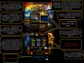
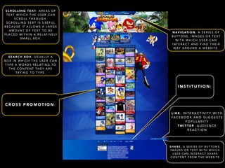
- 4. VIDEO: THANKS TO BROADBAND, MANY WEBSITES CAN SAFELY GO BEYOND FEATURING TEXT AND STAT I C IMAGES TO INCOPORATE VIDEO SOUND: USED ON MANY WEBSITES. YOU MAY HEAR A SOUND AS THE CURSOR ROLLS OVER SOME PART OF A WEBSITE. MUSIC IS OFTEN USED IN WEBSITES AS AN INTRODUCTION ON THE HOMEPAGE. THIS CANS SET UP CERTAIN EXPECTATIONS FOR THE VIEW TO ESTABLISH THE TONE OF THE REST OF THE WEBSITE HEADING: USED THROUGHOUT SOME WEBPAGES TO SPLIT THE CONTENT INTO MANAGABLE SECTIONS. THERE MAY BE SUB-HEADINGS, WHICH CAN FURTHER DIRECT THE USER TO A PARTICULAR PIECE OF INFORMATION. HYPERLINK: THESE CAN BE EITHER WORDS OR IMAGES THAT WHEN CLICKED UPON WILL TAKE YOU TO ANOTHER PAGE COPY: THE MAIN BODY OF THE TEXT IMAGES: USED IN ALMOST EVERY WEBSITE - SOMETIMES USED AS A LINK TO ANOTHER PART OF THE WEBSITE THUMBNAIL; IMAGES ARE SOMETIMES DISPLAYED IN REDUCED SIZE. HOWEVER A FULL SIZE CAN BE USUALLY ACCESSED BY CLICKING ON THE THUMBNAIL. NAVIGATION; A SERIES OF BUTTONS, IMAGES OR TEXT WITH WHICH USER CAN INTERACT AND FIND THEIR WAY AROUND A WEBSITE. FRAMES: THE CONTENT OF THE WEBSITE IS USUALLY BROKEN DOWN INTO FRAMES. THIS MAKES THE CONTENT MORE MANAGEABLE AND EASIER TO READ VIDEO GAME CLASSIFICATION INSTITUTION:
- 5. SCROLLING TEXT: AREAS OF TEXT WHICH THE USER CAN SCROLL THROUGH. SCROLLING TEXT IS USEFUL BECAUSE IT ALLOWS A LARGE AMOUNT OF TEXT TO BE PLACED WITHIN A RELATIVELY SMALL BOX. NAVIGATION; A SERIES OF BUTTONS, IMAGES OR TEXT WITH WHICH USER CAN INTERACT AND FIND THEIR WAY AROUND A WEBSITE. INSTITUTION: LIKE: INTERACTIVITY WITH FACEBOOK AND SUGGESTS POPULARITY TWITTER :AUDIENCE REACTION SHARE; A SERIES OF BUTTONS, IMAGES OR TEXT WITH WHICH USER CAN INTERACT SHARE CONTENT FROM THE WEBSITE SEARCH BOX: USUALLY A BOX IN WHICH THE USER CAN TYPE A WORDS RELATING TO THE CONTENT THEY ARE TRYING TO TYPE. CROSS PROMOTION:
- 6. LAYOUT AND DESIGN Consistency in design and layout in any website is important. In the case of music bands/ artistes it helps to build an awareness of them with the audience. The colours, text, logo and general design become familiar and easily recognisable to the audience.
- 7. HOW WE LOOK AT WEBPAGES Web pages are not just thrown together. The placing of each element is carefully considered by web designers to give maximum impact and to make a web page user friendly. Over the years a set of conventions has developed that underpins website design. This has, in part, been influenced by repetition of design, but also in part by research that suggested particular patterns in the way we view the website.
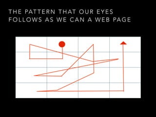
- 8. THE PATTERN THAT OUR EYES FOLLOWS AS WE CAN A WEB PAGE
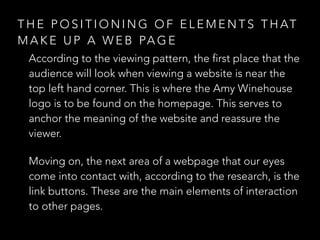
- 9. THE POSITIONING OF ELEMENTS THAT MAKE UP A WEB PAGE According to the viewing pattern, the first place that the audience will look when viewing a website is near the top left hand corner. This is where the Amy Winehouse logo is to be found on the homepage. This serves to anchor the meaning of the website and reassure the viewer. Moving on, the next area of a webpage that our eyes come into contact with, according to the research, is the link buttons. These are the main elements of interaction to other pages.