際際滷

際際滷Share a Scribd company logo
Visual composition slideshow-Kyle.S
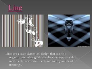
Lines are a basic element of design that can help
   organize, texturize, guide the observers eye, provide
   movement, make a statement, and convey universal
   meanings.
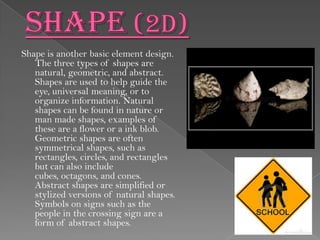
Shape is another basic element design.
   The three types of shapes are
   natural, geometric, and abstract.
   Shapes are used to help guide the
   eye, universal meaning, or to
   organize information. Natural
   shapes can be found in nature or
   man made shapes, examples of
   these are a flower or a ink blob.
   Geometric shapes are often
   symmetrical shapes, such as
   rectangles, circles, and rectangles
   but can also include
   cubes, octagons, and cones.
   Abstract shapes are simplified or
   stylized versions of natural shapes.
   Symbols on signs such as the
   people in the crossing sign are a
   form of abstract shapes.
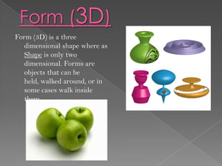
Form (3D) is a three
  dimensional shape where as
  Shape is only two
  dimensional. Forms are
  objects that can be
  held, walked around, or in
  some cases walk inside
  them.
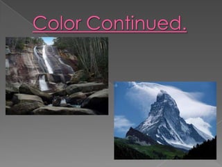
Color affects people differently on how they will respond to a visual composition.
   Color has 4 main vocabulary words, they are hue, value, intensity, and
   monochromatic color.

Hue: Is the primary colors, red, green, and blue.
Value: The amount of white or black added.
Intensity: The purity or saturation of the color.
Monochromatic Color: use of a single color in which only the value of the color
    changes.
Visual composition slideshow-Kyle.S
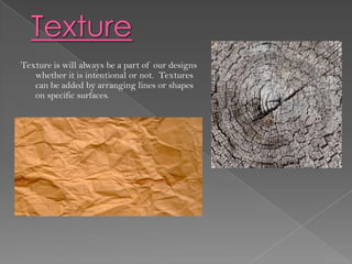
Texture is will always be a part of our designs
   whether it is intentional or not. Textures
   can be added by arranging lines or shapes
   on specific surfaces.
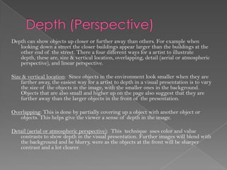
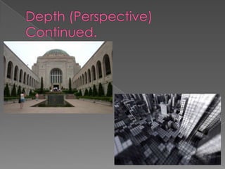
Depth can show objects up closer or further away than others. For example when
   looking down a street the closer buildings appear larger than the buildings at the
   other end of the street. There a four different ways for a artist to illustrate
   depth, these are, size & vertical location, overlapping, detail (aerial or atmospheric
   perspective), and linear perspective.

Size & vertical location: Since objects in the environment look smaller when they are
    farther away, the easiest way for a artist to depth in a visual presentation is to vary
    the size of the objects in the image, with the smaller ones in the background.
    Objects that are also small and higher up on the page also suggest that they are
    further away than the larger objects in the front of the presentation.

Overlapping: This is done by partially covering up a object with another object or
   objects. This helps give the viewer a sense of depth in the image.

Detail (aerial or atmospheric perspective): This technique uses color and value
   contrasts to show depth in the visual presentation. Further images will blend with
   the background and be blurry, were as the objects at the front will be sharper
   contrast and a lot clearer.
Visual composition slideshow-Kyle.S
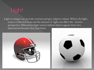
Light in images can provide contrast and give objects volume. Where the light
   source is directed from and the amount of light can affect the viewers
   perspective. Silhouettes (light source behind object) appear more two
   dimensional because they lack form.
We can not show motion in a image so we must rely on tricks to show motion to the viewer.
   There a six different tricks that a artist can use to show motion in his or hers presentation.
   These tricks include anticipated movement, fuzzy outlines, multiple images, optical
   movement, optical illusions, and rhythm and movement.

Anticipated movement: Figures portrayed in unstoppable body positions causes the feel of
    motion, such as a keeper (soccer goalie) diving for the ball.

Fuzzy outlines: When an object passes us at a high speed we perceive it as a bit blurry, such as a
   formula one car passing a spectator on the straight away. This experience helps the viewer
   interpret blurry objects in an image with conveying motion.

Multiple images: Similar objects overlapped helps give artist display a sense of motion in the
   image.

Optical Movement: This trick makes the viewers eyes move around the image in order to see all
    of the different elements. Optical movement can be enhanced by curved forms that keep
    our eyes moving in a circular motion.

Optical illusions: Certain optical illusions will cause the viewer to see motion by using a
    repetition of geometric shapes.
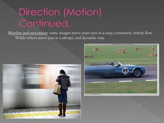
Rhythm and movement: some images move your eyes in a easy, connected, stately flow.
   While others move you in a abrupt, and dynamic way.
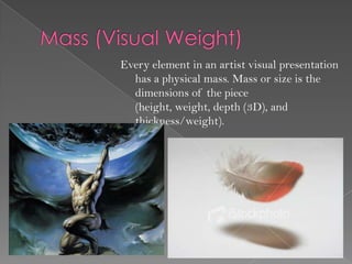
Every element in an artist visual presentation
  has a physical mass. Mass or size is the
  dimensions of the piece
  (height, weight, depth (3D), and
  thickness/weight).
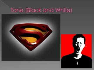
Tone can be regarded as value since both terms refer to the
  various degrees of darkness or lightness. Some important
  terms for tone include shade, tint, tone, and value.

Shade: Is a color with black added to it.

Tint: Is a color with white added to it.

Tone: Is a color with grey added to it.

Value: Is the amount of lightness or darkness in colors. Is much
   easier to see if colors are changed to greyscale.
Visual composition slideshow-Kyle.S
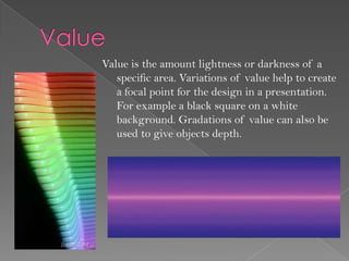
Value is the amount lightness or darkness of a
   specific area. Variations of value help to create
   a focal point for the design in a presentation.
   For example a black square on a white
   background. Gradations of value can also be
   used to give objects depth.
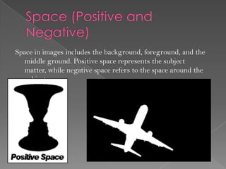
Space in images includes the background, foreground, and the
   middle ground. Positive space represents the subject
   matter, while negative space refers to the space around the
   subject.
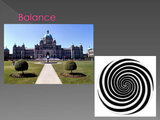
There are three different types of balance, they are symmetrical, asymmetrical, and
   radial.

Symmetrical: A symmetrical image is when the left side and the right side is almost a
   perfect mirror image of the other side. Objects with different masses on either
   side of the image can easily throw off the balance.

Asymmetrical: A asymmetrical image is usually an off centered symmetrical image.
   With an asymmetrical image you can use smaller objects to balance a large photo
   out that has a few bigger objects on either side or you can avoid adding the
   smaller images to make the image unbalanced.

Radial: on a standard page we generally place elements in orderly columns and rows.
   When using a radial technique we have the elements radiate from or swirl around
   in a spiral path. Some parts of the design still must be arranged so that image is
   balanced across the page, only if the artist does not want it to be balanced.
Visual composition slideshow-Kyle.S
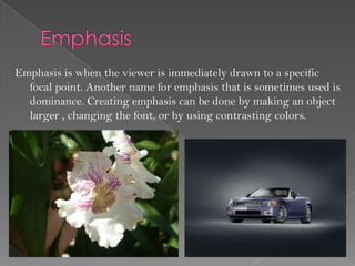
Emphasis is when the viewer is immediately drawn to a specific
  focal point. Another name for emphasis that is sometimes used is
  dominance. Creating emphasis can be done by making an object
  larger , changing the font, or by using contrasting colors.
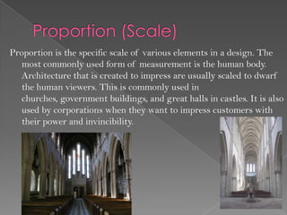
Proportion is the specific scale of various elements in a design. The
   most commonly used form of measurement is the human body.
   Architecture that is created to impress are usually scaled to dwarf
   the human viewers. This is commonly used in
   churches, government buildings, and great halls in castles. It is also
   used by corporations when they want to impress customers with
   their power and invincibility.
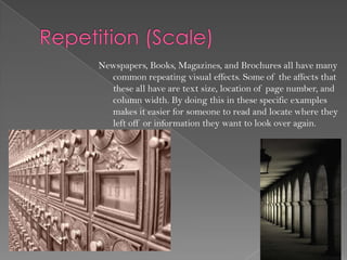
Newspapers, Books, Magazines, and Brochures all have many
  common repeating visual effects. Some of the affects that
  these all have are text size, location of page number, and
  column width. By doing this in these specific examples
  makes it easier for someone to read and locate where they
  left off or information they want to look over again.
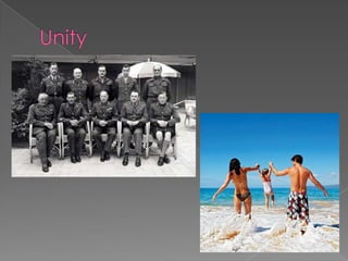
Is a way of making objects in a image look related to one another. The three
    techniques used to make unity are proximity, repetition, and
    continuation.

Proximity: This is of the simplest ways to create unity. All the artist has to
   do is closely place certain objects together to give the viewer a sense of
   unity between the objects.

Repetition: This form of unity is done by repeating color, shape, texture, or
   an object to tie the image together.

Continuation: A more subtle method of unifying work is done by a
   line, edge, or direction from one area to another. This method is
   commonly used in books and magazines to tie key elements on a page
   together.
Visual composition slideshow-Kyle.S
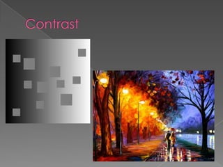
Contrast occurs when two elements are clearly different from one
  another. The greater the difference means the greater the contrast is.
  The biggest key to working with contrast is making sure that the
  differences are very obvious. The four common methods to creating
  contrast are by using different color, size, value, and type. Contrast
  gives interest to a page and also provides means of emphasizing what
  is important. An image that does not have contrast makes it harder for
  the viewer to know where to look first, where as an image with
  contrast automatically draws the viewer to what is the key element in
  the presentation. Contrast aids in making headlines and sub headlines
  stand out from the rest of the text and also helps by making the
  smaller or lighter elements recede on a page to allow other elements
  to stand out.
Visual composition slideshow-Kyle.S
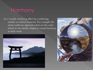
Is a visually satisfying affect by combining
    similar or related elements. For example the
    artist could use adjacent colors on the color
    wheel or use similar shapes to create harmony
    in their work.
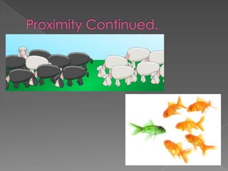
One easy way to create a visual composition that
  gives the viewer a organized feel is to space
  objects according to their relations to one
  another. Proximity simply means that items that
  are related should be closer together than those
  that arent. the spacing between the items is a
  visual clue for the viewer to know where what
  objects are related to one another.
Visual composition slideshow-Kyle.S
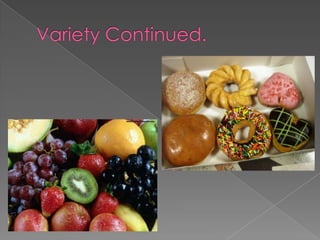
Variety means to change a elements character, to make a difference. Unity and variety are
    complementary to one another, without unity a image is chaotic, and without variety an
    image becomes bland. Five different ways to create variety is by
    line, shape, color, value, and texture.

Line: This can be done by changing the width of the line, value, color, angle, and/or its length.

Shape: To create variety with shape you can change its size, type, orientation and its texture.

Color: Variety in color can be done by changing its hue, value, or its saturation.

Value: Value can be done by changing the darkness or lightness, high or low key, or by changing
    its value contrast.

Texture: Texture can be done easily by making an item a smooth or rough surface.
Visual composition slideshow-Kyle.S

More Related Content

Visual composition slideshow-Kyle.S

  • 2. Lines are a basic element of design that can help organize, texturize, guide the observers eye, provide movement, make a statement, and convey universal meanings.
  • 3. Shape is another basic element design. The three types of shapes are natural, geometric, and abstract. Shapes are used to help guide the eye, universal meaning, or to organize information. Natural shapes can be found in nature or man made shapes, examples of these are a flower or a ink blob. Geometric shapes are often symmetrical shapes, such as rectangles, circles, and rectangles but can also include cubes, octagons, and cones. Abstract shapes are simplified or stylized versions of natural shapes. Symbols on signs such as the people in the crossing sign are a form of abstract shapes.
  • 4. Form (3D) is a three dimensional shape where as Shape is only two dimensional. Forms are objects that can be held, walked around, or in some cases walk inside them.
  • 5. Color affects people differently on how they will respond to a visual composition. Color has 4 main vocabulary words, they are hue, value, intensity, and monochromatic color. Hue: Is the primary colors, red, green, and blue. Value: The amount of white or black added. Intensity: The purity or saturation of the color. Monochromatic Color: use of a single color in which only the value of the color changes.
  • 7. Texture is will always be a part of our designs whether it is intentional or not. Textures can be added by arranging lines or shapes on specific surfaces.
  • 8. Depth can show objects up closer or further away than others. For example when looking down a street the closer buildings appear larger than the buildings at the other end of the street. There a four different ways for a artist to illustrate depth, these are, size & vertical location, overlapping, detail (aerial or atmospheric perspective), and linear perspective. Size & vertical location: Since objects in the environment look smaller when they are farther away, the easiest way for a artist to depth in a visual presentation is to vary the size of the objects in the image, with the smaller ones in the background. Objects that are also small and higher up on the page also suggest that they are further away than the larger objects in the front of the presentation. Overlapping: This is done by partially covering up a object with another object or objects. This helps give the viewer a sense of depth in the image. Detail (aerial or atmospheric perspective): This technique uses color and value contrasts to show depth in the visual presentation. Further images will blend with the background and be blurry, were as the objects at the front will be sharper contrast and a lot clearer.
  • 10. Light in images can provide contrast and give objects volume. Where the light source is directed from and the amount of light can affect the viewers perspective. Silhouettes (light source behind object) appear more two dimensional because they lack form.
  • 11. We can not show motion in a image so we must rely on tricks to show motion to the viewer. There a six different tricks that a artist can use to show motion in his or hers presentation. These tricks include anticipated movement, fuzzy outlines, multiple images, optical movement, optical illusions, and rhythm and movement. Anticipated movement: Figures portrayed in unstoppable body positions causes the feel of motion, such as a keeper (soccer goalie) diving for the ball. Fuzzy outlines: When an object passes us at a high speed we perceive it as a bit blurry, such as a formula one car passing a spectator on the straight away. This experience helps the viewer interpret blurry objects in an image with conveying motion. Multiple images: Similar objects overlapped helps give artist display a sense of motion in the image. Optical Movement: This trick makes the viewers eyes move around the image in order to see all of the different elements. Optical movement can be enhanced by curved forms that keep our eyes moving in a circular motion. Optical illusions: Certain optical illusions will cause the viewer to see motion by using a repetition of geometric shapes.
  • 12. Rhythm and movement: some images move your eyes in a easy, connected, stately flow. While others move you in a abrupt, and dynamic way.
  • 13. Every element in an artist visual presentation has a physical mass. Mass or size is the dimensions of the piece (height, weight, depth (3D), and thickness/weight).
  • 14. Tone can be regarded as value since both terms refer to the various degrees of darkness or lightness. Some important terms for tone include shade, tint, tone, and value. Shade: Is a color with black added to it. Tint: Is a color with white added to it. Tone: Is a color with grey added to it. Value: Is the amount of lightness or darkness in colors. Is much easier to see if colors are changed to greyscale.
  • 16. Value is the amount lightness or darkness of a specific area. Variations of value help to create a focal point for the design in a presentation. For example a black square on a white background. Gradations of value can also be used to give objects depth.
  • 17. Space in images includes the background, foreground, and the middle ground. Positive space represents the subject matter, while negative space refers to the space around the subject.
  • 18. There are three different types of balance, they are symmetrical, asymmetrical, and radial. Symmetrical: A symmetrical image is when the left side and the right side is almost a perfect mirror image of the other side. Objects with different masses on either side of the image can easily throw off the balance. Asymmetrical: A asymmetrical image is usually an off centered symmetrical image. With an asymmetrical image you can use smaller objects to balance a large photo out that has a few bigger objects on either side or you can avoid adding the smaller images to make the image unbalanced. Radial: on a standard page we generally place elements in orderly columns and rows. When using a radial technique we have the elements radiate from or swirl around in a spiral path. Some parts of the design still must be arranged so that image is balanced across the page, only if the artist does not want it to be balanced.
  • 20. Emphasis is when the viewer is immediately drawn to a specific focal point. Another name for emphasis that is sometimes used is dominance. Creating emphasis can be done by making an object larger , changing the font, or by using contrasting colors.
  • 21. Proportion is the specific scale of various elements in a design. The most commonly used form of measurement is the human body. Architecture that is created to impress are usually scaled to dwarf the human viewers. This is commonly used in churches, government buildings, and great halls in castles. It is also used by corporations when they want to impress customers with their power and invincibility.
  • 22. Newspapers, Books, Magazines, and Brochures all have many common repeating visual effects. Some of the affects that these all have are text size, location of page number, and column width. By doing this in these specific examples makes it easier for someone to read and locate where they left off or information they want to look over again.
  • 23. Is a way of making objects in a image look related to one another. The three techniques used to make unity are proximity, repetition, and continuation. Proximity: This is of the simplest ways to create unity. All the artist has to do is closely place certain objects together to give the viewer a sense of unity between the objects. Repetition: This form of unity is done by repeating color, shape, texture, or an object to tie the image together. Continuation: A more subtle method of unifying work is done by a line, edge, or direction from one area to another. This method is commonly used in books and magazines to tie key elements on a page together.
  • 25. Contrast occurs when two elements are clearly different from one another. The greater the difference means the greater the contrast is. The biggest key to working with contrast is making sure that the differences are very obvious. The four common methods to creating contrast are by using different color, size, value, and type. Contrast gives interest to a page and also provides means of emphasizing what is important. An image that does not have contrast makes it harder for the viewer to know where to look first, where as an image with contrast automatically draws the viewer to what is the key element in the presentation. Contrast aids in making headlines and sub headlines stand out from the rest of the text and also helps by making the smaller or lighter elements recede on a page to allow other elements to stand out.
  • 27. Is a visually satisfying affect by combining similar or related elements. For example the artist could use adjacent colors on the color wheel or use similar shapes to create harmony in their work.
  • 28. One easy way to create a visual composition that gives the viewer a organized feel is to space objects according to their relations to one another. Proximity simply means that items that are related should be closer together than those that arent. the spacing between the items is a visual clue for the viewer to know where what objects are related to one another.
  • 30. Variety means to change a elements character, to make a difference. Unity and variety are complementary to one another, without unity a image is chaotic, and without variety an image becomes bland. Five different ways to create variety is by line, shape, color, value, and texture. Line: This can be done by changing the width of the line, value, color, angle, and/or its length. Shape: To create variety with shape you can change its size, type, orientation and its texture. Color: Variety in color can be done by changing its hue, value, or its saturation. Value: Value can be done by changing the darkness or lightness, high or low key, or by changing its value contrast. Texture: Texture can be done easily by making an item a smooth or rough surface.