Want a Standing Ovation?
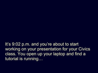
- 1. Itâs 9:02 p.m. and youâre about to start working on your presentation for your Civics class. You open up your laptop and find a tutorial is runningâĶ
- 2. H ere is everything you need to need to know to create your presentation for Civics class
- 3. The Audience is here to see you!
- 4. What âs in it for them?
- 5. PowerPoint/Keynote A tool to support YOU as the speaker
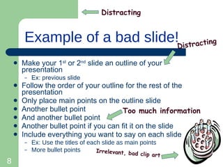
- 8. Example of a bad slide! Make your 1 st or 2 nd slide an outline of your presentation Ex: previous slide Follow the order of your outline for the rest of the presentation Only place main points on the outline slide Another bullet point And another bullet point Another bullet point if you can fit it on the slide Include everything you want to say on each slide Ex: Use the titles of each slide as main points More bullet points Distracting Distracting Irrelevant, bad clip art Too much information
- 9. AVOID Make your 1 st or 2 nd slide an outline of your presentation Ex: previous slide Follow the order of your outline for the rest of the presentation Only place main points on the outline slide Another bullet point And another bullet point Another bullet point if you can fit it on the slide Include everything you want to say on each slide Ex: Use the titles of each slide as main points More bullet points X
- 10. Start here
- 11. 1 idea per slide
- 12. Plan your presentation away from your computer šÝšÝßĢ 1 Why am I talking about this subject? šÝšÝßĢ 2 Ask the class a question šÝšÝßĢ 3 Outline the 1 st main point to cover
- 13. Remove backgrounds... all they do is distract the audience from your message
- 14. Black text on white is easy to read
- 15. Use High Quality Graphics Images is this presentation were purchased from a professional stock house
- 16. Or take your own imagesâĶ
- 17. Put details in a handout Give it out AFTER your presentation
- 18. Tell Stories TEDx Manhattan. August 2011. Flikr. Creative Commons License.
- 19. People remember stories TEDx Manhattan. August 2011. Flikr. Creative Commons License.
- 20. You don ât always need slides Demonstrations White Board Case Studies Game Shows Ask questions Group Brainstorm Skit Mind Maps Poll the Audience Create a video
- 21. ģŲīĮâĶ
- 22. Have Fun! Presentation Author: Natalie Currie
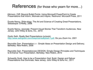
- 23. References (for those who yearn for moreâĶ) Atkinson, Cliff. Beyond Bullet Points: Using Microsoft PowerPoint to Create Presentations that Inform, Motivate and Inspire. Redmond: Microsoft Press, 2011 Durate Nancy. šÝšÝßĢ:ology: The Art and Science of Creating Great Presentations. Sebastopol: O âReilly, 2008 Duarte Nancy. resonate: Present Visual Stories That Transform Audiences. New Jersey: John Wiley & Sons, Inc., 2010 Godin Seth. Really Bad Presentations (e-book). http://www.sethgodin.com/freeprize/reallybad-1.pd f , Do you Zoom Inc. 2001 Reynolds Garr. Presentation zen: Simple Ideas on Presentation Design and Delivery. Berkeley: New Riders, 2008 Reynolds Garr. Presentationzen DESIGN: Simple Design Principles and Techniques to Enhance Your Presentation. Berkeley: New Riders, 2010 Schwertly Scott. How to be a Presentation God: Build, Design and Deliver Presentations that Dominate. New Jersey: John Wiley & Sons Inc., 2011
Editor's Notes
- #5: Involve them
- #6: Forget using them as a telepromptor
- #13: Use a story board or post-its to organize your thoughts and ideas before you create your PowerPoint presentationâĶwhatever works. Garr Reynolds, describes Storyboarding in his book Presentationzen. See Reference section for the complete reference. Garr also has a blog that talks about this form of presentation, http://www.presentationzen.blogs.com/


