Web typography
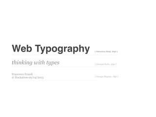
- 1. Web Typography ( Helvetica Bold, 64pt ) thinking with types ( Georgia Italic, 36pt ) Francesco Fraioli ( Georgia Regular, 18pt ) @ Hackatron 09/04/2013
- 2. Hi, Iâm Francesco Fraioli, Skills: I studied visual communication and multimedia at the Department of Art and Design at the Iuav University of Venice. I graduated in April 2008 with a thesis project which involved the design and implementation of a social network to enable music collaboration over the web. In June of that year, I presented my thesis in H-Farm: here begins the collaboration that gave birth to Thounds. Now I am a freelance interaction designer linkedin website Web Typography | Francesco Fraioli | @ Hcktrn 09 Aprile 2013
- 3. Web Design is 95% Typography by Oliver Reichenstein - informationarchitects.net â Correct leading, word and letter spacing, active white space, and dosed use of color help readability. Use Text as user interface â Web Typography | Francesco Fraioli | @ Hcktrn 09 Aprile 2013
- 4. Web Typography | Francesco Fraioli | @ Hcktrn 09 Aprile 2013
- 5. Web Typography | Francesco Fraioli | @ Hcktrn 09 Aprile 2013
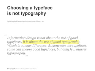
- 6. Choosing a typeface is not typography by Oliver Reichenstein - informationarchitects.net â Information design is not about the use of good typefaces, it is about the use of good typography. Which is a huge difference. Anyone can use typefaces, some can choose good typefaces, but only few master typography. â Web Typography | Francesco Fraioli | @ Hcktrn 09 Aprile 2013
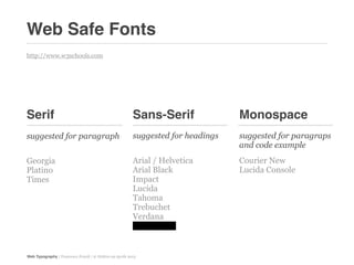
- 7. Web Safe Fonts http://www.w3schools.com Serif Sans-Serif Monospace suggested for paragraph suggested for headings suggested for paragraps and code example Georgia Arial / Helvetica Courier New Platino Arial Black Lucida Console Times Impact Lucida Tahoma Trebuchet Verdana Comic Sans Web Typography | Francesco Fraioli | @ Hcktrn 09 Aprile 2013
- 8. Georgia Palatino Times Georgia, serif "Palatino Linotype", "Book "Times New Romanâ, Times, serif Antiqua", Palatino, serif Web Typography | Francesco Fraioli | @ Hcktrn 09 Aprile 2013
- 9. Arial Arial Impact Arial, Helvetica, "Arial Black", Gadget, Impact, Charcoal, sans-serif sans-serif sans-serif Lucida Tahoma Trebuchet "Lucida Sans Unicode", Tahoma, Geneva, sans-serif "Trebuchet MS", Helvetica, "Lucida Grande", sans-serif sans-serif Verdana Comic "Lucida Sans Unicode", "Comic Sans MS", cursive, "Lucida Grande", sans-serif sans-serif Web Typography | Francesco Fraioli | @ Hcktrn 09 Aprile 2013
- 10. Courier New Monaco "Courier New", "Lucida Console", Courier, Monaco, monospace monospace Web Typography | Francesco Fraioli | @ Hcktrn 09 Aprile 2013
- 11. 1. Font Size The body of a web page has 16 px text by default. 1 em is a distance equal to the type size. In 6 point type, an em is 6 points. Thus a one em space is proportionately the same in any size. body { font-size:100%; } h1 { font-size:2.25em; /* 16x2.25=36 */ } h2 { font-size:1.5em; /* 16x1.5=24 */ } h3 { font-size:1.125em; /* 16x1.125=18 */ } h4 { font-size:0.875em; /* 16x0.875=14 */ } p { font-size:0.75em; /* 16x0.75=12 */ } Sizing text using the em unit is the next most appropriate approach. The em is a true typographic unit and was recommended by the w3c from the outset of css. Ems are a relative unit and act as multipliers based on the text elementâs parent element. Web Typography | Francesco Fraioli | @ Hcktrn 09 Aprile 2013
- 12. 2. Kern Adjust the spacing between (letters or characters) in a piece of text to be printed Donât use letterspace without a reason! Letterspacing lower case on the Web is particularly risky as only some faces actually benefit from it .kern { letter-spacing: -0.1em; } ... <h1><span class=âkernâ>T</span>rust</h1> http://kerningjs.com/ http://type.method.ac/ Web Typography | Francesco Fraioli | @ Hcktrn 09 Aprile 2013
- 13. 3. Line-Height â Vertical space is metered in a different way [to horizontal space]. You must choose not only the overall measure â the depth of the column or page â but also a basic rhythmical unit. This unit is the leading, which is the distance from one baseline to the next. â Donât using absolute units such as points or pixels to set up line-height. p { font-size:1em; line-height: 1.25 } Web Typography | Francesco Fraioli | @ Hcktrn 09 Aprile 2013
- 14. 4. Break Questo ÃĻ Questo sbagliato ÃĻ corretto Most important rule in typography is never leave a single word such as a conjunction as last word in a text line. In web design is quiet difficult to do it for a long paragraph but I suggest to do it for headlines. <h1>Questo<br/>ÃĻ corretto</h1> Web Typography | Francesco Fraioli | @ Hcktrn 09 Aprile 2013
- 15. References A practical guide Information to web typography Architects http://webtypography.net/ http://informationarchitects.net/ Robert Bringhurstâs book iA plans, designs, and builds The Elements of Typographic Style digital products. for web design Cool links Books http://typographica.org/ Thinking with types http://www.markboulton.co.uk/ by Ellen Lupton http://ilovetypography.com/ The Elements of Typographic Style http://www.typetester.org/ for web design by Robert Bringhurst Web Typography | Francesco Fraioli | @ Hcktrn 09 Aprile 2013
- 16. Thanks ( Helvetica Bold, 64pt ) and donât use Comic Sans ( Georgia Italic, 36pt ) Francesco Fraioli ( Georgia Regular, 18pt ) @ Hackatron 09/04/2013


![3. Line-Height
â Vertical space is metered in a different way [to horizontal space]. You must
choose not only the overall measure â the depth of the column or page â but also
a basic rhythmical unit. This unit is the leading, which is the distance from one
baseline to the next.
â
Donât using absolute units such as points or pixels to set up line-height.
p { font-size:1em; line-height: 1.25 }
Web Typography | Francesco Fraioli | @ Hcktrn 09 Aprile 2013](https://image.slidesharecdn.com/web-typography-130416092331-phpapp01/85/Web-typography-13-320.jpg)


