Working with SASS/Compass and Zurb Foundation
- 1. Responsive Web Design Working with SASS/Compass and Zurb Foundation
- 2. What is SASS? SASS is an extension of CSS3, adding nested rules, variables, mixins, selector inheritance, and more.
- 3. What is Compass? Compass is a stylesheet authoring framework that makes your stylesheets and markup easier to build and maintain. With compass, you write your stylesheets in SASS instead of plain CSS.
- 4. What is Foundation? The most advanced responsive front-end framework in the world.
- 5. Getting started gem install sass gem install compass gem install zurb-foundation
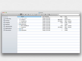
- 6. Getting started Navigate to your chosen directory in terminal compass create <project-name> -r zurb-foundation --using foundation
- 9. What makes working with SASS and Foundation great?
- 10. Lots of things The grid Nesting Handling of media queries Built-in functions(mixins)
- 11. The grid <div class=ŌĆØrowŌĆØ> <div class=ŌĆØlarge-8 columnsŌĆØ> 8 column content </div> <div class=ŌĆØlarge-4 columnsŌĆØ> 4 column content </div> </div>
- 12. The grid <div class=ŌĆØrowŌĆØ> <div class=ŌĆØlarge-8 small-6 columnsŌĆØ> 8 column content LARGE 6 column content SMALL </div> <div class=ŌĆØlarge-4 small-6 columnsŌĆØ> 4 column content LARGE 6 column content SMALL </div> </div>
- 13. Nesting li { font: { family: serif; weight: bold; size: 1.2em; } }
- 14. Nesting li { font-family: serif; font-weight: bold; font-size: 1.2em; }
- 15. Nesting a { color: #ce4dd6; &:hover { color: #ffb3ff; } &:visited { color: #c458cb; } }
- 16. Nesting a { color: #ce4dd6; } a:hover { color: #ffb3ff; } a:visited { color: #c458cb; }
- 17. Media Queries @media (max-width: 600px) { insert hundreds of CSS selectors/rules }
- 18. Media Queries h1{ font-size: 2em; @media (max-width: 600px) { font-size: 1.6em; } }
- 19. Media Queries $small-screen: emCalc(768); $medium-screen: emCalc(1280); $large-screen: emCalc(1440);
- 20. Media Queries $screen: "only screen"; $small: "only screen and (min-width:"#{$small- screen}")"; $medium: "only screen and (min-width:"#{$medium- screen}")"; $large: "only screen and (min-width:"#{$large- screen}")"; $landscape: "only screen and (orientation: landscape)"; $portrait: "only screen and (orientation: portrait)";
- 21. Media Queries h1{ font-size: 1em; @media #{$small}{ font-size: 1.4em; } @media #{$medium}{ font-size: 1.6em; } @media #{$large}{ font-size: 2em; }
- 22. Functions(mixins) $pink: #ce4dd6; a { color: $pink; &:hover { color: darken($pink, 10%); } &:visited { color: darken($pink, 20%); } }
- 23. Functions(mixins) a { color: #ce4dd6; } a:hover { color: #ba2dc3; } a:visited { color: #93239a; }
- 25. Questions???
- 26. Thank You! Clint Robinson - Advancement and Community Engagement clint.robinson@usask.ca


