


Writing Studio
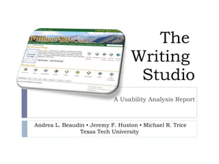
- 1. The Writing Studio A Usability Analysis Report Andrea L. Beaudin ? Jeremy F. Huston ? Michael R. Trice Texas Tech University
- 2. Report Overview Study Purpose and Goals Methodology Results and Analysis Recommendations
- 3. Study Purpose and Goals
- 4. Client Purpose and Goals Client Purpose Determine usability of profile page navigation of the Writing Studio Identify areas where usability could be improved Client Goals Increase effectiveness of site navigational elements for users Increase comprehension of individual navigational elements on website Make the interface familiar and usable for users of popular social media
- 5. Study Purpose and Goals Study Purpose Determine what areas of the profile page are the most/least memorable, error-prone, efficient, and learnable Study Goals Determine whether the navigation on the profile page is intuitive Investigate what navigational components may be leading to and increasing the frequency of errors, and determining recoverability of those errors Determine the learnability of specific functions (creating blogs and e-portfolios) performed from the profile page Evaluate comparative cognitive load across tasks
- 6. User Profiles Multiple Users Students 17-21 year-old first-year students (first-time users) 22+ year-old first-year students (first-time users) High school students (first-time users) Intermediate users (1 year experience) Expert users (2+ years experience) Instructors Novice/Beginner Intermediate Expert Writers not affiliated with classes
- 7. Methodology MEELS ? Procedures ? Participants ? Tasks
- 8. MEELS M emorability If a user has used the system before, can he or she remember enough to use it effectively the next time or does the user have to start over again learning everything? E fficiency Once an experienced user has learned to use the system, how fast can he or she accomplish tasks? E rrors How often do users make errors while using the system, how serious are these errors, and how do users recover from these errors? L earnability How fast can a user who has never seen the user interface before learn it sufficiently well to accomplish basic tasks? S atisfaction How much does the user like using the system?
- 9. Procedures Testing Environment: TTU Usability Lab Morae Mouse tracking Click measurement Task time Screen capture Video Survey administration Eye tracking Retrospective Recall System Software: Windows XP Firefox Research Roles: Facilitator Observer Note Taker Measures for Optimal Use Mouse clicks Task time
- 10. Participants Solicited via email and class invitation 5 first-year full-time FYC students at Texas Tech 4 males, 1 female 17-21 years old No experience with Writing Studio All Blackboard CMS users On a scale of 5 (highly confident) to 1 (not confident at all) rated CMS confidence between 4 (40%) and 3 (60%) self-reported comfort level with CMS Online Writing Frequency Weekly (60%) Daily (40%) Online Writing Spaces All used Facebook and Email One indicated blogs; another listed Comment Fields
- 11. Tasks Task Purpose 1 Create user account Establish user in system Determine usability of account creation process 2 Create profile with image Introduce user to My Page interface Measure navigation and functionality 3 Create blog Navigation Evaluate comparative cognitive load 4 Create blog entry Navigation Measure memorability and learnability Evaluate comparative cognitive load 5 Check/Change Password (repetitive task) Navigation Measure memorability and learnability Evaluate comparative cognitive load 6 Create ePortfolio (repetitive task) Navigation Measure memorability and learnability
- 12. Results and Analysis Navigation ? Functionality ? Design
- 13. Navigation 60% of users resulted to using the back button to return to the main page during at least one task. 40% of users closed the profile setting options before creating a profile. On average, changing a password took 3 extra steps and a full minute longer than expected. Eye-tracking data and quotes suggest users were confused by lack of conventional navigation structure along left sidebar and horizontal headings.
- 14. Eye tracking suggests that although users initially followed the standard ˇ°Fˇ± pattern for scanning the page (Task 1 and the beginning of Task 2), by the end of the test, there was no discernible focus area. Users were looking everywhere on the screen to complete tasks. Users performed best at creating blogs and ePortfolios. Task times were within 30 seconds and 20 seconds of optimal range for each, respectively. No users made use of the search box 60% of users rated profile creation either ˇ°difficultˇ± or ˇ°very difficultˇ± User Quote: Functionality ˇŞ User 6 ˇ° The hardest part was finding where to go to create the profile.ˇ± ˇŞ User 3
- 15. Design 4 links 10 drop down menus 5 graphic icons 9 graphic icons 8 tabs 2 links 2 buttons search box icon link 2 breadcrumbs
- 16. Design: Clicks per Task
- 17. Design ˇŞ User 3
- 18. Recommendations Navigation ? Functionality ? Design
- 19. Navigation Simplify navigation with context sensitive menus Or conceptually group navigational elements Cluster navigational elements on left of page Offer direct navigation to profile page and class page from blogs
- 20. Functionality Option to hide elements: Add a reset button Or ˇ°return to defaultˇ± Make link styles more uniform Correct upload issues with user photos (fixed?) Add webcam option for photo upload Rename ˇ°Passwordˇ± to ˇ°New Passwordˇ±; move ˇ°Current Passwordˇ± field above ˇ°New Passwordˇ±
- 21. Design 5 graphic icons 9 graphic icons 8 tabs 2 links 2 buttons icon Users looking for a more ˇ°Facebookˇ± type navigation
- 22. Design
- 23. Conclusion Navigation ? Functionality ? Design
- 24. Conclusions Writing Studio offers a full suite of options to writers and provides a ˇ°bottom upˇ± model for writing instruction. The platform provides a great deal of control for users / students Based on user testing, minor design/ navigation tweaks could increase the usability of the site
- 26. Following Up After the initial presentation, Mike Palmquist instituted major changes to site, including security updates, feature redesigns, and a server upgrade. Most notable, however, was the site redesign, particularly of the Personal Page.
- 27. Following Up ˇ° Some of the most visible changes to the site include a major upgrade to the Personal Pages as well as to the management pages for our classes, wikis, and writing tools. We've dropped the tabbed interface on our pages and replaced it with a simpler and (we hope) easier to use set of links. We've also worked to eliminate the drop-down menus that we used so extensively in the past.ˇ± ˇŞ Mike Palmquist, ˇ°Writing Studio News and Updatesˇ±
- 28. Following Up: Redesigned Page New page is considerably streamlined Personal Page menu options have been moved to right Content (dependent upon menu choice) appears below profile
- 29. Thank You Usability testing can identify situations and potential problems; the key is what to do with the information once the testing is done. Mike Palmquist worked with our recommendations to implement a redesign that was not altogether radical (so that more experienced users would not be disoriented), but is clearly more streamlined and user-friendly. The changes are subtle, yet effective. We wish to thank Mike Palmquist and all those involved with the Writing Studio for their support and receptiveness.
Editor's Notes
- #10: Live Video Track Performance Task?Surveys Record User Reflection Eye-tracking Trace Focus Input Tracking Calculate Steps Taken Error Tracking Calculate Task Difficulty User Comments Track Impromptu Thoughts Retrospective Recall Gather Overall Reflections
- #11: Participants were 4 male 1 female first-year comp students at Tech between 17-21. No experience with WS, but experience with Blackboard. They self-reported their comfort with Blackboard between 3 and 4 on a scale of 1 (not confident) to 5 (highly confident). They write online at least weekly; all use facebook and email.
- #16: 46 navigation elements on page Graphic icons, tabs, drop down menus, buttons, text links, search box, breadcrumbs
- #20: Blog navigation usability and accessibility issue
- #23: Increase white space!