Film Magazine front cover Evaluation
Download as PPTX, PDF0 likes272 views
The document provides an analysis of the conventions used in designing the front cover of a magazine. It discusses several design elements and how they follow typical conventions: 1) The masthead is located at the top in a large, chunky font for readability. The magazine title links to thriller films through its reference to paranoia. 2) Typography and color contrasts are used to make text stand out, such as a rough font paired with white text on a dark background. 3) Key elements like the skyline and coverlines are placed in prominent positions to attract readers' attention according to conventions.
1 of 5
Download to read offline


Recommended
Magazine Final A2
Magazine Final A2chenai96
Ìý
The document summarizes the design choices for a film magazine cover called "Monstrosity". Key points include:
- The masthead is in white against a black background at the top to stand out.
- The main image was edited to look gloomy to fit the horror genre.
- A skyline at the top displays actor names to attract fans looking for free posters.
- Cover lines and a price of £2 were used based on the target audience's preferences.
- A flash button informs viewers of a special on the 100 goriest films of 2015 to appeal to the horror-focused audience.Entertainment Weekly Magazine Cover Analysis
Entertainment Weekly Magazine Cover Analysiszoelingua
Ìý
This magazine cover is promoting the film The Hunger Games. It features Jennifer Lawrence as her character Katniss Everdeen from the film. The large central image of Lawrence draws readers in and her recognizable character helps audiences relate to the film genre. Bold cover lines further entice readers by promising an "exclusive inside scoop" on the film. The masthead, magazine title, is prominently displayed and the matching orange color used ties the cover elements together around the theme of the film.A2 Media - Empire 1
A2 Media - Empire 1zoelingua
Ìý
The document summarizes and analyzes the design elements of the front cover of Empire magazine. The main image features a protagonist to interest readers in the featured film. Cover lines promote film news in minimal words to entice readers. The masthead establishes the brand identity in red. Placement of images and text strategically draw attention while providing necessary information like the date and price.double page spread analysis 
double page spread analysis LoisPorter
Ìý
Spider-Man appears to be engaging the reader in an action-packed scene that creates excitement. The background is blurred to emphasize Spider-Man as the main subject. The article uses magazine conventions like a large bold initial letter, mixture of red, black and white text matching Spider-Man's colors, and images bleeding over the page divide to make the layout attractive. These design choices aim to draw the reader into learning the new information presented about Spider-Man.Production log1
Production log1thomasm2612
Ìý
This document outlines the design choices for the front cover of a hip-hop magazine. Key elements include a red masthead spelling "PAR" which is "RAP" backwards, with a black stroke. Supporting text is in white with a black stroke. The main image shows a teenage rapper recording, with a supporting image of three people. Minor changes from the initial plan included adding a subtle grey background and moving the barcode. The design aims to attract a youthful audience through bold visuals and relatable artist imagery.Production process 3 fc
Production process 3 fcso05056454
Ìý
1) The document describes the process of designing a magazine cover in Photoshop, including adjusting images, adding text layers, and applying effects like outer glow.
2) Colors like red were used for text to match the Halloween theme and make elements stand out from the dark background.
3) Cover lines and other text were positioned around the main image to create visual interest and balance across the cover. Effects, sizing, and layering were applied to draw attention to important details.Adverts and DPS
Adverts and DPSEMILYCORBET
Ìý
This advertisement is for a Netflix documentary series called Making A Murderer. The photograph takes up most of the background and shows an extreme close-up of eyes. The image is split in half to create an eerie effect. Minimal text is used, with the title and information that it is a documentary and can be viewed on Netflix. The target audience seems to be those interested in crime documentaries, as the title references murder.Magazine Mind Map - Unit G324
Magazine Mind Map - Unit G324tj_salango
Ìý
This document provides a mind map and research for a TV magazine front cover as part of an A2 media studies coursework. It summarizes the inspiration, history, circulation figures, typical audience, and various design elements for the front cover such as masthead ideas, main headline ideas, needed images, language/price, puff promotions, and synergy with social media. The student concludes they will purchase an example soap opera magazine, organize a photo shoot with group members, and design the front cover in Adobe Photoshop using the researched conventions.Contents analysis kerrang
Contents analysis kerrangLaurenCooney97
Ìý
The document analyzes the design of a magazine contents page. It discusses four key aspects:
1) Imagery - The large main image uses dark lighting and costumes to represent the rock genre, while secondary images use brighter lighting to seem less intimidating.
2) Design Principle - The main image is in the primary optical area to get attention, while the masthead and articles are in other areas readers are likely to view.
3) House Style - The color scheme, fonts, and three column layout continue the magazine's style and make the contents easy to read and recognize.
4) Design Balance - The page is evenly balanced with images and text, though there is no clear divide between theKerrang!
Kerrang!KirbySztanko
Ìý
The double page spread uses bold typography in different colors and sizes to catch the reader's attention. A large image of rock star Davey Havok dominates the first page, drawing in his fans. The text is laid out in three columns for clarity and uses techniques like drop caps and question boxes to guide the reader. Bright lights and stars around the spread imply Davey is on stage and convey positivity, contrasting the usual stereotypes of the rock genre. An eye-catching red "NEWS" box and website promotion help promote the magazine. A mix of typical rock colors like black and grey along with the unusual pink is used to appeal to both male and female youth readers.Empire front cover analysis
Empire front cover analysisJessicaLouiseJ8
Ìý
This analysis summarizes the key elements of the Empire magazine cover featuring Spiderman. It discusses the masthead which stands out in bold red font conveying the magazine's name. The main image of Spiderman in his signature pose attracts fans while his different colored suit references the story's new look. However, the splash is less noticeable and subsidiary images clutter the cover somewhat. Additional information uses clear plus signs to entice readers without extra words.Layouts and analysis
Layouts and analysisAubert Cavallo
Ìý
The document discusses several posters and digital press summaries (DPS) used to promote television programs and newspapers. It analyzes the conventions used in each including logos, titles, images and other visual elements. The posters and DPS are evaluated based on how effectively they convey information to audiences and engage their interest through simplicity, color contrasts, variety of elements, and use of imagery to provide context and intrigue viewers.Front cover progress
Front cover progressEmily852
Ìý
This document contains notes from Emily Kennedy experimenting with designs for the front cover of a magazine. It discusses tweaks made to the placement of text elements, changing the masthead texture and size, adjusting the contrast and visibility of elements, and rearranging components to improve visibility and aesthetics while maintaining the intended style. The overall goal was to create a simple yet eye-catching and appropriately styled cover design.Inception Magazine Cover Analysis
Inception Magazine Cover AnalysisA2MediaStudies
Ìý
This magazine cover features Leonardo DiCaprio to promote the film Inception. DiCaprio's image takes up most of the cover and uses lighting and angle to make him seem dominant. Smaller text promotes additional articles inside the magazine. The cover uses a color scheme and layout that matches the film's themes and draws readers in to learn more. The headline compares the film to The Matrix and James Bond, hinting it will combine and enhance elements from those franchises.College contents analysis 2
College contents analysis 2HollyHayne
Ìý
The document analyzes the front cover of a college magazine. It discusses the use of bright colors, bold text, and a central image of a student to grab readers' attention. Specific techniques like subheadings and "buzz words" are used to entice readers and direct them to relevant articles. The target audience of college students is evident through the choice of a student image and content themes.Ancillary text research
Ancillary text researchSashawallen
Ìý
This document summarizes the author's research analyzing movie magazine covers and posters to understand conventions and effective design elements. The author examined 6 products over 3 weeks, gaining knowledge about what works well. Key findings included centering prominent images; using anchorage or captions to add meaning; employing graphic features like lighting bolts to engage viewers; and incorporating buzzwords, questions, and calls to action. Understanding these conventions will help the author effectively design their own ancillary materials promoting a movie trailer.Jai maw research blog - #2 
Jai maw research blog - #2 bir
Ìý
This magazine cover analysis discusses the key design elements of the cover. The masthead is clearly visible in bold red font against a dark background. The main image is of Wolverine to promote the new X-Men film. While most conventions are followed, such as a prominent central image and masthead at the top, the dark and dull colors break conventions by not being bright and attractive. The hierarchy of text begins with a tagline about Wolverine, followed by the masthead and slogan, with various sized body text showing importance.Producing My School Magazine Cover
Producing My School Magazine Coveryasmincoutinho
Ìý
This document summarizes lessons on Photoshop skills, analyzing magazine covers, sketching an initial school magazine cover design, taking photo shoot images, and creating a first draft of the school magazine cover. It discusses techniques for editing images in Photoshop, attributes of good magazine covers, an initial sketch concept, unsuitable photo shoot images due to lack of space and lighting, and changes made for the first draft cover based on feedback.Flat plan ideas 
Flat plan ideas olibrandon
Ìý
The document discusses 5 flat plan ideas for posters to promote a charity called SASH. Each plan is mostly imagery with some accompanying text including the SASH logo and contact details. Plan 1 has text only on one side. Plan 2 is wide for billboards. Plan 3 is portrait for walls or bus stops. Plan 4 includes a small paragraph. Plan 5 centers the image with text in corners, allowing space for additional information. The document also lists some font and slogan ideas.The girl with the dragon tattoo magazine cover analysis
The girl with the dragon tattoo magazine cover analysisGussssssy1
Ìý
This document analyzes the fonts, colors, images, and layout used on the magazine cover of "The Girl with the Dragon Tattoo". It finds that many design elements effectively promote the psychological thriller genre. The large sans-serif font stands out and identifies the magazine title. Bold fonts and colors are used for the film title that suggest the thriller genre. While some colors are unconventional, they advertise other articles. The dark image creates an intimidating feel and focuses attention on the film. The overall layout draws the eye to key information in a conventional order.Magazine analysis
Magazine analysisLaurenCooke95
Ìý
The document analyzes magazine covers promoting the film "Twilight" from Empire, Entertainment Weekly, and Odeon Magazine. It describes the design elements of each cover including the masthead, background, images, colors, headlines and text. Key details that stand out are intended to attract readers' attention and link to themes in the film around mystery, relationships and hidden secrets.Radio times article
Radio times articleasmediae15
Ìý
The document summarizes the layout and design conventions of an article from Radio Times magazine. Key aspects include the use of drop caps to indicate the start of the article, a large main image spanning one page to convey the topic, and an enlarged heading on the left with a subheading below. The style represents the in-house magazine format with a navy and white color scheme. The target audience appears to be middle-aged women based on the subject of the main image and language used. Strengths include professionally spaced text and clear, relevant images while weaknesses are a lack of visual interest and limited color palette that may not appeal to younger readers.Media Studies- Film magazine research
Media Studies- Film magazine researchajefferies
Ìý
The document discusses magazine cover design for a film. It provides examples of effective magazine covers that prominently feature large mastheads, eye-catching text in contrasting colors, and dominant central images. The document examines covers with multiple figures, text on background images, and graphic elements related to the film's genre. It considers using a train image, text on a wall, and other design techniques for the cover being designed to advertise a short film trailer.Evaluaton Question 1
Evaluaton Question 1TomPeacock
Ìý
This document analyzes how the magazine uses and develops conventions of existing music magazines in its design. It discusses elements like the masthead, coverlines, images, and pull quotes on the front cover, contents page, and a double page spread. While some elements like placement of the masthead and coverlines follow conventions, other aspects are developed or challenge conventions, such as splitting the coverline from the "In this issue" box, using two pull quotes instead of one, and choosing a "bad-boy" main image to expand the target audience. The document examines both conventional and unconventional design choices to analyze how the magazine forms and challenges existing conventions.Woman in Black Magazine Textual Analysis
Woman in Black Magazine Textual Analysischarlottepage94
Ìý
The magazine cover is for Cineworld's film magazine promoting the movie "Woman in Black". The main image features the back of a character with a ghostly figure in the background to create intrigue. Bold text and quotes challenge the reader to see the "chilling ghost story". The magazine aims to increase awareness of new films to boost cinema profits through exclusive information for its subscribers.Textual analysis 1
Textual analysis 1Rosie5Mae
Ìý
The document summarizes the textual analysis of various elements of a magazine's layout, including the front cover, contents page, and a double-page spread. Key points include:
- The front cover uses a low-key main image against a bright color palette to attract female readers. The masthead is in a sans serif font to appeal to stereotypical female audiences.
- The contents page has a neutral layout with stereotypical colors for its target demographic. Images relate to interior content and are positioned staggered between text.
- The double-page spread follows conventions with a large cover image and column of text between two images to separate content and engage readers visually.Double Page Spread Planning
Double Page Spread PlanningCharlotteLaurenMEDIA
Ìý
The document discusses planning for a double-page magazine spread. It includes topics like locations, makeup, hair, clothing, lighting and styling for photos. Several students share their ideas - one suggests using a plain background for the main photo to make it stand out, while another favors taking photos in a garden to tell a story. They also discuss styling the female model with dark eye makeup and flowing hair, and dressing models in bright, contrasting colors that fit R&B music genres.Recovered file 1
Recovered file 1lizzymcdonald1
Ìý
The document provides an in-depth analysis of the design elements of a film magazine cover. It examines the main image featuring the lead actor, use of color schemes, placement of text elements like mastheads and cover lines, and how these stylistic choices work to engage the target audience and communicate the genre of the featured film. Specific techniques discussed include using direct eye contact in images, high contrast colors to draw the eye, bold fonts for important text, and coordinating stylistic elements like fonts and hues across the cover layout. The level of detail in the analysis suggests it was intended to educate on best practices for crafting effective magazine cover designs.Evaluation-Conventions
Evaluation-Conventionsemily_rhian18
Ìý
This document discusses how the media product uses and challenges conventions of real magazines.
The author followed several conventions in their front cover, contents page, and double page spread. They used consistent colors, fonts, and featured the same model on each to connect the pieces. Placement of elements like the masthead, date, and barcodes also followed conventions.
Some conventions were challenged, like adding a second image on the cover and using album art on the contents page. Unconventional elements were chosen for readability or to portray the genre, like outlining text.
Overall, the author strived to balance following reader expectations through conventions with original elements to make the magazine stand out, resulting in a product that looksMagazine cover analysis
Magazine cover analysismrcaptainpanda
Ìý
The student created a magazine cover design for a film featuring a model with direct eye contact looking serious. Elements were added like headings in red and black, banners listing films, and a bottom banner. Techniques like drop shadows, selective black and white background, and glow were used. Feedback was provided on improvements made between drafts, like removing stray hairs and repositioning the masthead for better impact. The student feels the final design will draw in the target audience and looks professional following magazine conventions.More Related Content
What's hot (20)
Contents analysis kerrang
Contents analysis kerrangLaurenCooney97
Ìý
The document analyzes the design of a magazine contents page. It discusses four key aspects:
1) Imagery - The large main image uses dark lighting and costumes to represent the rock genre, while secondary images use brighter lighting to seem less intimidating.
2) Design Principle - The main image is in the primary optical area to get attention, while the masthead and articles are in other areas readers are likely to view.
3) House Style - The color scheme, fonts, and three column layout continue the magazine's style and make the contents easy to read and recognize.
4) Design Balance - The page is evenly balanced with images and text, though there is no clear divide between theKerrang!
Kerrang!KirbySztanko
Ìý
The double page spread uses bold typography in different colors and sizes to catch the reader's attention. A large image of rock star Davey Havok dominates the first page, drawing in his fans. The text is laid out in three columns for clarity and uses techniques like drop caps and question boxes to guide the reader. Bright lights and stars around the spread imply Davey is on stage and convey positivity, contrasting the usual stereotypes of the rock genre. An eye-catching red "NEWS" box and website promotion help promote the magazine. A mix of typical rock colors like black and grey along with the unusual pink is used to appeal to both male and female youth readers.Empire front cover analysis
Empire front cover analysisJessicaLouiseJ8
Ìý
This analysis summarizes the key elements of the Empire magazine cover featuring Spiderman. It discusses the masthead which stands out in bold red font conveying the magazine's name. The main image of Spiderman in his signature pose attracts fans while his different colored suit references the story's new look. However, the splash is less noticeable and subsidiary images clutter the cover somewhat. Additional information uses clear plus signs to entice readers without extra words.Layouts and analysis
Layouts and analysisAubert Cavallo
Ìý
The document discusses several posters and digital press summaries (DPS) used to promote television programs and newspapers. It analyzes the conventions used in each including logos, titles, images and other visual elements. The posters and DPS are evaluated based on how effectively they convey information to audiences and engage their interest through simplicity, color contrasts, variety of elements, and use of imagery to provide context and intrigue viewers.Front cover progress
Front cover progressEmily852
Ìý
This document contains notes from Emily Kennedy experimenting with designs for the front cover of a magazine. It discusses tweaks made to the placement of text elements, changing the masthead texture and size, adjusting the contrast and visibility of elements, and rearranging components to improve visibility and aesthetics while maintaining the intended style. The overall goal was to create a simple yet eye-catching and appropriately styled cover design.Inception Magazine Cover Analysis
Inception Magazine Cover AnalysisA2MediaStudies
Ìý
This magazine cover features Leonardo DiCaprio to promote the film Inception. DiCaprio's image takes up most of the cover and uses lighting and angle to make him seem dominant. Smaller text promotes additional articles inside the magazine. The cover uses a color scheme and layout that matches the film's themes and draws readers in to learn more. The headline compares the film to The Matrix and James Bond, hinting it will combine and enhance elements from those franchises.College contents analysis 2
College contents analysis 2HollyHayne
Ìý
The document analyzes the front cover of a college magazine. It discusses the use of bright colors, bold text, and a central image of a student to grab readers' attention. Specific techniques like subheadings and "buzz words" are used to entice readers and direct them to relevant articles. The target audience of college students is evident through the choice of a student image and content themes.Ancillary text research
Ancillary text researchSashawallen
Ìý
This document summarizes the author's research analyzing movie magazine covers and posters to understand conventions and effective design elements. The author examined 6 products over 3 weeks, gaining knowledge about what works well. Key findings included centering prominent images; using anchorage or captions to add meaning; employing graphic features like lighting bolts to engage viewers; and incorporating buzzwords, questions, and calls to action. Understanding these conventions will help the author effectively design their own ancillary materials promoting a movie trailer.Jai maw research blog - #2
Jai maw research blog - #2 bir
Ìý
This magazine cover analysis discusses the key design elements of the cover. The masthead is clearly visible in bold red font against a dark background. The main image is of Wolverine to promote the new X-Men film. While most conventions are followed, such as a prominent central image and masthead at the top, the dark and dull colors break conventions by not being bright and attractive. The hierarchy of text begins with a tagline about Wolverine, followed by the masthead and slogan, with various sized body text showing importance.Producing My School Magazine Cover
Producing My School Magazine Coveryasmincoutinho
Ìý
This document summarizes lessons on Photoshop skills, analyzing magazine covers, sketching an initial school magazine cover design, taking photo shoot images, and creating a first draft of the school magazine cover. It discusses techniques for editing images in Photoshop, attributes of good magazine covers, an initial sketch concept, unsuitable photo shoot images due to lack of space and lighting, and changes made for the first draft cover based on feedback.Flat plan ideas
Flat plan ideas olibrandon
Ìý
The document discusses 5 flat plan ideas for posters to promote a charity called SASH. Each plan is mostly imagery with some accompanying text including the SASH logo and contact details. Plan 1 has text only on one side. Plan 2 is wide for billboards. Plan 3 is portrait for walls or bus stops. Plan 4 includes a small paragraph. Plan 5 centers the image with text in corners, allowing space for additional information. The document also lists some font and slogan ideas.The girl with the dragon tattoo magazine cover analysis
The girl with the dragon tattoo magazine cover analysisGussssssy1
Ìý
This document analyzes the fonts, colors, images, and layout used on the magazine cover of "The Girl with the Dragon Tattoo". It finds that many design elements effectively promote the psychological thriller genre. The large sans-serif font stands out and identifies the magazine title. Bold fonts and colors are used for the film title that suggest the thriller genre. While some colors are unconventional, they advertise other articles. The dark image creates an intimidating feel and focuses attention on the film. The overall layout draws the eye to key information in a conventional order.Magazine analysis
Magazine analysisLaurenCooke95
Ìý
The document analyzes magazine covers promoting the film "Twilight" from Empire, Entertainment Weekly, and Odeon Magazine. It describes the design elements of each cover including the masthead, background, images, colors, headlines and text. Key details that stand out are intended to attract readers' attention and link to themes in the film around mystery, relationships and hidden secrets.Radio times article
Radio times articleasmediae15
Ìý
The document summarizes the layout and design conventions of an article from Radio Times magazine. Key aspects include the use of drop caps to indicate the start of the article, a large main image spanning one page to convey the topic, and an enlarged heading on the left with a subheading below. The style represents the in-house magazine format with a navy and white color scheme. The target audience appears to be middle-aged women based on the subject of the main image and language used. Strengths include professionally spaced text and clear, relevant images while weaknesses are a lack of visual interest and limited color palette that may not appeal to younger readers.Media Studies- Film magazine research
Media Studies- Film magazine researchajefferies
Ìý
The document discusses magazine cover design for a film. It provides examples of effective magazine covers that prominently feature large mastheads, eye-catching text in contrasting colors, and dominant central images. The document examines covers with multiple figures, text on background images, and graphic elements related to the film's genre. It considers using a train image, text on a wall, and other design techniques for the cover being designed to advertise a short film trailer.Evaluaton Question 1
Evaluaton Question 1TomPeacock
Ìý
This document analyzes how the magazine uses and develops conventions of existing music magazines in its design. It discusses elements like the masthead, coverlines, images, and pull quotes on the front cover, contents page, and a double page spread. While some elements like placement of the masthead and coverlines follow conventions, other aspects are developed or challenge conventions, such as splitting the coverline from the "In this issue" box, using two pull quotes instead of one, and choosing a "bad-boy" main image to expand the target audience. The document examines both conventional and unconventional design choices to analyze how the magazine forms and challenges existing conventions.Woman in Black Magazine Textual Analysis
Woman in Black Magazine Textual Analysischarlottepage94
Ìý
The magazine cover is for Cineworld's film magazine promoting the movie "Woman in Black". The main image features the back of a character with a ghostly figure in the background to create intrigue. Bold text and quotes challenge the reader to see the "chilling ghost story". The magazine aims to increase awareness of new films to boost cinema profits through exclusive information for its subscribers.Textual analysis 1
Textual analysis 1Rosie5Mae
Ìý
The document summarizes the textual analysis of various elements of a magazine's layout, including the front cover, contents page, and a double-page spread. Key points include:
- The front cover uses a low-key main image against a bright color palette to attract female readers. The masthead is in a sans serif font to appeal to stereotypical female audiences.
- The contents page has a neutral layout with stereotypical colors for its target demographic. Images relate to interior content and are positioned staggered between text.
- The double-page spread follows conventions with a large cover image and column of text between two images to separate content and engage readers visually.Double Page Spread Planning
Double Page Spread PlanningCharlotteLaurenMEDIA
Ìý
The document discusses planning for a double-page magazine spread. It includes topics like locations, makeup, hair, clothing, lighting and styling for photos. Several students share their ideas - one suggests using a plain background for the main photo to make it stand out, while another favors taking photos in a garden to tell a story. They also discuss styling the female model with dark eye makeup and flowing hair, and dressing models in bright, contrasting colors that fit R&B music genres.Recovered file 1
Recovered file 1lizzymcdonald1
Ìý
The document provides an in-depth analysis of the design elements of a film magazine cover. It examines the main image featuring the lead actor, use of color schemes, placement of text elements like mastheads and cover lines, and how these stylistic choices work to engage the target audience and communicate the genre of the featured film. Specific techniques discussed include using direct eye contact in images, high contrast colors to draw the eye, bold fonts for important text, and coordinating stylistic elements like fonts and hues across the cover layout. The level of detail in the analysis suggests it was intended to educate on best practices for crafting effective magazine cover designs.Similar to Film Magazine front cover Evaluation (20)
Evaluation-Conventions
Evaluation-Conventionsemily_rhian18
Ìý
This document discusses how the media product uses and challenges conventions of real magazines.
The author followed several conventions in their front cover, contents page, and double page spread. They used consistent colors, fonts, and featured the same model on each to connect the pieces. Placement of elements like the masthead, date, and barcodes also followed conventions.
Some conventions were challenged, like adding a second image on the cover and using album art on the contents page. Unconventional elements were chosen for readability or to portray the genre, like outlining text.
Overall, the author strived to balance following reader expectations through conventions with original elements to make the magazine stand out, resulting in a product that looksMagazine cover analysis
Magazine cover analysismrcaptainpanda
Ìý
The student created a magazine cover design for a film featuring a model with direct eye contact looking serious. Elements were added like headings in red and black, banners listing films, and a bottom banner. Techniques like drop shadows, selective black and white background, and glow were used. Feedback was provided on improvements made between drafts, like removing stray hairs and repositioning the masthead for better impact. The student feels the final design will draw in the target audience and looks professional following magazine conventions.Question 1
Question 1PotterM2
Ìý
This media product develops and challenges conventions of real music magazines in the following ways:
1. Common magazine design elements like headers, mastheads, cover lines, and fonts are used to look professional and establish continuity.
2. Photographs of the artist are featured prominently on the cover and inside pages following conventions, while customized elements like colors and layouts make it distinct from other magazines.
3. The contents page includes section headings, images, page numbers and a sidebar - all conforming to typical magazine style - to help readers navigate easily.Presentation slides
Presentation slidesRayrayy
Ìý
The document provides feedback questions for a student magazine project asking about target audience, design choices, lessons learned using Adobe Photoshop and InDesign, and areas for improvement. It also includes examples of the student's magazine cover, contents page, and double page spread and asks how they link together and achieve the goals of drawing in the reader.Ancillary products magazine
Ancillary products magazinelewisjupp
Ìý
This document analyzes the design elements used on the front cover of two magazines. For the first magazine covering the Joker, it summarizes that a sans-serif font, large text sizes, and a bold masthead are used to appeal to a young audience. The creepy image of the Joker in distinctive clothing and makeup entices readers. Dark colors create an unsettling atmosphere. For the second magazine covering Leonardo DiCaprio, it notes the use of a wide shot that shows his suit, creating intrigue, while mist in the image adds mystery. Pale colors emphasize the mist and red headlines stand out. Both covers follow conventions like using the route of the eye to guide reading.Eval 1 presentation
Eval 1 presentationsteviemccann
Ìý
The document summarizes how the author's media product uses and develops conventions of real magazines. It compares elements of the author's magazine like the cover, contents page, articles, and photographs to existing magazines. Key similarities noted include layouts, styles, and genres. Differences include quality of images and specific design elements. The author aims to emulate conventions of magazines like Kerrang, NME, Q, Rolling Stone, and Vogue while developing a unique style.AS Media - Evaluation - Question 1
AS Media - Evaluation - Question 1Nino2323
Ìý
This document discusses how the student's media product uses and develops conventions of real music magazines. It analyzes the layout, images, text, and audience profile of the magazine "Classic Rock" as a point of reference. Key elements that conform to conventions include the masthead design, cover lines, model photography, and two-column text layout. Some conventions are challenged, like an original contents page design and added QR code. Overall, the goal is to create a recognizable brand while drawing from typical magazine structures.Evaluation q1
Evaluation q1Kiraan123
Ìý
The document discusses how the media product challenges conventions of real music magazines.
The front cover challenges conventions by having an unusual Christmas-themed masthead in green and red instead of the typical bold colors. The main headline is also in red on a background with many colors, challenging readability conventions but making it stand out.
The contents page challenges conventions by including a "Top Picks" section where magazine staff recommend articles, which magazines don't usually have. This section may not appeal to all readers who just want the standard contents listing.
The double page spread layout follows conventions but challenges them by including cut-out images without backgrounds, which could make the page look cluttered but allows the images to standEvaluation question 1 
Evaluation question 1 Kieran Hadfield
Ìý
The document discusses the design choices made for the magazine's front cover. It follows conventions like having the main image fill the front cover and including a barcode. However, it also challenges conventions by having additional text under the cover lines and using one font color instead of multiple colors. The main image uses a medium long shot to show the subject in their environment but could be interpreted as showing them as isolated. Overall, the cover aims to look professional while also making the magazine stand out.In what ways does your media product use, develop or challenge forms and conv...
In what ways does your media product use, develop or challenge forms and conv...RyanDenner
Ìý
The document discusses how the media product follows conventions of real music magazines in some areas such as layout, fonts, and images, but also challenges some conventions to make it unique. It follows conventions with the masthead, color scheme, and location of elements like the barcode and masthead. However, it challenges conventions with an edgy font for the masthead and titles. While the layout, tones, and styles of articles generally follow conventions, the double page spread layout is more unique. Images also both follow and challenge conventions to attract the target audience. Overall, the goal is to balance following and challenging conventions.Evaluation
Evaluationchris mcguinness
Ìý
This document discusses how the media product created by the author uses and challenges conventions of real magazines.
The author uses several common magazine conventions in their product, such as a bold title font, barcode, advertising the main article, brand recognition, date and issue number, subheadings, captions, and text overlaying images.
Some conventions are challenged, such as using a black and white front cover image and female model, not including small pictures on the front cover, and having only one main picture per page rather than multiple small images.
The author also discusses representing their target audience of teenage girls, an appropriate distributing institution, attracting their audience through color scheme and tone of voice, and the technologies and skills learnedEvaluation media
Evaluation mediachirstohper
Ìý
The document discusses the ways in which the author's magazine designs use and develop conventions of real magazines.
For the magazine cover, the author uses typical conventions like a masthead at the top and a medium shot for the main image. However, the placement of the strapline at the bottom challenges conventions.
For the double-page spread, the use of different colored text in a Q&A format follows conventions, while just using the subject's name for the title develops conventions.
The contents page keeps many elements conventional, like a background image and listing content, but overlaps images in a way atypical of real magazines.
The author aims to represent social group E, ages 18-25, throughQUESTION 1
QUESTION 1kelsiecolee
Ìý
In what ways does your media product use, develop or challenge forms and conventions of real media products?Evaluation Question 1
Evaluation Question 1katherinecarr95
Ìý
The document discusses how the writer's magazine cover and layout utilizes common magazine conventions and design techniques. For the cover, they use a red, yellow, and black color scheme to attract readers, as well as a bold title treatment and single model photo. In the layout, they include pull quotes to entice reading, highlight text for emphasis, and incorporate a variety of images with writing. The contents page also applies typical conventions like large page numbers, subtitles, article previews, and consistent colors to effectively guide the reader through the magazine.Written Evaluation First Draft
Written Evaluation First DraftRyanDenner
Ìý
The document describes a media product (a magazine) and how it uses and challenges conventions of real magazines. It discusses the magazine's masthead, images, color scheme, text, and layouts. The magazine aims to represent a young, urban audience that listens to pop music. It follows conventions like masthead placement and font but challenges some with edgier fonts. The target audience would be teens to late 20s, primarily male students and music fans. Feedback from a focus group was positive overall.Magazine production evaluation - Question 1
Magazine production evaluation - Question 1ConnorDelaney
Ìý
The document discusses how the magazine production uses conventions of real magazines. It summarizes how each element - the front cover, contents page, and double page spread - follows typical magazine conventions like using rules of thirds for layout, varying font sizes and styles, and including mastheads, dates, and page numbers. It also discusses some ways the magazine challenges conventions, like using "This Week" instead of "Contents" and including a subscription promotion on the contents page. Overall, the document shows an understanding of common magazine conventions and how the student's magazine production applies and develops those conventions across multiple pages.Question 1
Question 1Chloe-mai Tassinari
Ìý
This document discusses the conventions and forms used in real media products that the author's media product uses, develops, or challenges. It examines the conventions used for magazine covers, contents pages, and articles. For the cover, it follows conventions like using the largest font for the main headline and centering it. For contents pages, it uses conventions like numbers, images, headings, and ads. For articles, it uses conventions like the main image, celebrity name, title, page numbers, and differing text styles. The author discusses how their product develops conventions by making elements louder and bolder to fit the rock genre.Magazine Evaluation - Question 1
Magazine Evaluation - Question 1ConnorDelaney
Ìý
This document discusses the conventions used in magazine design and how the student's media product follows or challenges these conventions.
The student uses common magazine design conventions like rules of thirds for layout, varying font sizes and styles for emphasis, and consistent branding across the front cover, contents page, and articles. However, the student challenges some conventions by using "This Week" instead of "Contents" and including a subscription promotion on the contents page. Overall, the student aims to create a professional magazine that follows real industry standards while putting their own spin on some elements.Evaluation
Evaluationchris mcguinness
Ìý
The document discusses how the author's media product uses and develops conventions of real magazines.
It begins by explaining design choices for the title, cover image, barcode, and other typical magazine elements. These follow conventions like placing the title prominently and the barcode in the bottom right corner.
The document then analyzes how the contents pages, articles, and other internal elements use conventions like subheadings, captions, and consistent formatting. However, it also challenges some conventions by using a black and white cover image and limiting additional images on the front page.As research planning_updated_2010-11
As research planning_updated_2010-11abdulyusuff
Ìý
The student created a music magazine for their target audience of other students. They learned that Photoshop is better for photo editing while InDesign is suited for layouts. Based on feedback, they aim to make the cover more eye-catching using better images and design. The contents page was designed to link to the cover through color scheme and images while highlighting the best stories.Recently uploaded (20)
Digital Tools with AI for e-Content Development.pptx
Digital Tools with AI for e-Content Development.pptxDr. Sarita Anand
Ìý
This ppt is useful for not only for B.Ed., M.Ed., M.A. (Education) or any other PG level students or Ph.D. scholars but also for the school, college and university teachers who are interested to prepare an e-content with AI for their students and others.How to use Init Hooks in Odoo 18 - Odoo ºÝºÝߣs
How to use Init Hooks in Odoo 18 - Odoo ºÝºÝߣsCeline George
Ìý
In this slide, we’ll discuss on how to use Init Hooks in Odoo 18. In Odoo, Init Hooks are essential functions specified as strings in the __init__ file of a module.Principle and Practices of Animal Breeding || Boby Basnet
Principle and Practices of Animal Breeding || Boby BasnetBoby Basnet
Ìý
Principle and Practices of Animal Breeding Full Note
|| Assistant Professor Boby Basnet ||IAAS || AFU || PU || FUDatabase population in Odoo 18 - Odoo slides
Database population in Odoo 18 - Odoo slidesCeline George
Ìý
In this slide, we’ll discuss the database population in Odoo 18. In Odoo, performance analysis of the source code is more important. Database population is one of the methods used to analyze the performance of our code. APM People Interest Network Conference - Tim Lyons - The neurological levels ...
APM People Interest Network Conference - Tim Lyons - The neurological levels ...Association for Project Management
Ìý
APM People Interest Network Conference 2025
-Autonomy, Teams and Tension: Projects under stress
-Tim Lyons
-The neurological levels of
team-working: Harmony and tensions
With a background in projects spanning more than 40 years, Tim Lyons specialised in the delivery of large, complex, multi-disciplinary programmes for clients including Crossrail, Network Rail, ExxonMobil, Siemens and in patent development. His first career was in broadcasting, where he designed and built commercial radio station studios in Manchester, Cardiff and Bristol, also working as a presenter and programme producer. Tim now writes and presents extensively on matters relating to the human and neurological aspects of projects, including communication, ethics and coaching. He holds a Master’s degree in NLP, is an NLP Master Practitioner and International Coach. He is the Deputy Lead for APM’s People Interest Network.
Session | The Neurological Levels of Team-working: Harmony and Tensions
Understanding how teams really work at conscious and unconscious levels is critical to a harmonious workplace. This session uncovers what those levels are, how to use them to detect and avoid tensions and how to smooth the management of change by checking you have considered all of them.Rass MELAI : an Internet MELA Quiz Prelims - El Dorado 2025
Rass MELAI : an Internet MELA Quiz Prelims - El Dorado 2025Conquiztadors- the Quiz Society of Sri Venkateswara College
Ìý
Prelims of Rass MELAI : a Music, Entertainment, Literature, Arts and Internet Culture Quiz organized by Conquiztadors, the Quiz society of Sri Venkateswara College under their annual quizzing fest El Dorado 2025. 

Computer Application in Business (commerce)
Computer Application in Business (commerce)Sudar Sudar
Ìý
The main objectives
1. To introduce the concept of computer and its various parts. 2. To explain the concept of data base management system and Management information system.
3. To provide insight about networking and basics of internet
Recall various terms of computer and its part
Understand the meaning of software, operating system, programming language and its features
Comparing Data Vs Information and its management system Understanding about various concepts of management information system
Explain about networking and elements based on internet
1. Recall the various concepts relating to computer and its various parts
2 Understand the meaning of software’s, operating system etc
3 Understanding the meaning and utility of database management system
4 Evaluate the various aspects of management information system
5 Generating more ideas regarding the use of internet for business purpose How to Modify Existing Web Pages in Odoo 18
How to Modify Existing Web Pages in Odoo 18Celine George
Ìý
In this slide, we’ll discuss on how to modify existing web pages in Odoo 18. Web pages in Odoo 18 can also gather user data through user-friendly forms, encourage interaction through engaging features. Eng7-Q4-Lesson 1 Part 1 Understanding Discipline-Specific Words, Voice, and T...
Eng7-Q4-Lesson 1 Part 1 Understanding Discipline-Specific Words, Voice, and T...sandynavergas1
Ìý
Understanding Discipline-Specific Words, Voice, and Technical TermsThe Constitution, Government and Law making bodies .
The Constitution, Government and Law making bodies .saanidhyapatel09
Ìý
This PowerPoint presentation provides an insightful overview of the Constitution, covering its key principles, features, and significance. It explains the fundamental rights, duties, structure of government, and the importance of constitutional law in governance. Ideal for students, educators, and anyone interested in understanding the foundation of a nation’s legal framework.


South Hornsey: The Lost Local Authority that Merged with Stoke Newington by T...
South Hornsey: The Lost Local Authority that Merged with Stoke Newington by T...History of Stoke Newington
Ìý
Presented at the 24th Stoke Newington History Talks event on 27th Feb 2025
https://stokenewingtonhistory.com/stoke-newington-history-talks/Kaun TALHA quiz Prelims - El Dorado 2025
Kaun TALHA quiz Prelims - El Dorado 2025Conquiztadors- the Quiz Society of Sri Venkateswara College
Ìý
Prelims of Kaun TALHA : a Travel, Architecture, Lifestyle, Heritage and Activism quiz, organized by Conquiztadors, the Quiz society of Sri Venkateswara College under their annual quizzing fest El Dorado 2025. 
Rass MELAI : an Internet MELA Quiz Finals - El Dorado 2025
Rass MELAI : an Internet MELA Quiz Finals - El Dorado 2025Conquiztadors- the Quiz Society of Sri Venkateswara College
Ìý
Finals of Rass MELAI : a Music, Entertainment, Literature, Arts and Internet Culture Quiz organized by Conquiztadors, the Quiz society of Sri Venkateswara College under their annual quizzing fest El Dorado 2025. How to attach file using upload button Odoo 18
How to attach file using upload button Odoo 18Celine George
Ìý
In this slide, we’ll discuss on how to attach file using upload button Odoo 18. Odoo features a dedicated model, 'ir.attachments,' designed for storing attachments submitted by end users. We can see the process of utilizing the 'ir.attachments' model to enable file uploads through web forms in this slide.Research & Research Methods: Basic Concepts and Types.pptx
Research & Research Methods: Basic Concepts and Types.pptxDr. Sarita Anand
Ìý
This ppt has been made for the students pursuing PG in social science and humanities like M.Ed., M.A. (Education), Ph.D. Scholars. It will be also beneficial for the teachers and other faculty members interested in research and teaching research concepts.APM People Interest Network Conference - Tim Lyons - The neurological levels ...
APM People Interest Network Conference - Tim Lyons - The neurological levels ...Association for Project Management
Ìý
Rass MELAI : an Internet MELA Quiz Prelims - El Dorado 2025
Rass MELAI : an Internet MELA Quiz Prelims - El Dorado 2025Conquiztadors- the Quiz Society of Sri Venkateswara College
Ìý
South Hornsey: The Lost Local Authority that Merged with Stoke Newington by T...
South Hornsey: The Lost Local Authority that Merged with Stoke Newington by T...History of Stoke Newington
Ìý
Kaun TALHA quiz Prelims - El Dorado 2025
Kaun TALHA quiz Prelims - El Dorado 2025Conquiztadors- the Quiz Society of Sri Venkateswara College
Ìý
Rass MELAI : an Internet MELA Quiz Finals - El Dorado 2025
Rass MELAI : an Internet MELA Quiz Finals - El Dorado 2025Conquiztadors- the Quiz Society of Sri Venkateswara College
Ìý
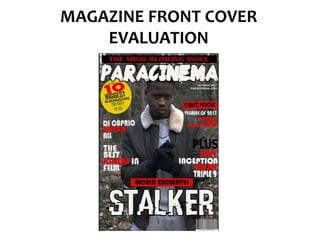
Film Magazine front cover Evaluation
- 2. The masthead I have used is conventional as it is at the top of the page in a very large and chunky font, making it in a logical order for the audience to read. The name I’ve chosen links to thriller films as ‘para’ is short for paranoia which is a common theme in thriller films. The typography is a rough, edgy font which links well with the overall mood of the front cover. The colour white is used because the background is quite dark, so the contrast makes it clearer to see and stand out. I have followed conventions by using a skyline and placing it at the top of the page, this is because it has a statement that will instantly attract readers attention therefore it should be placed in a position where it can be read easily and clearly, which is why I’ve placed it above the masthead.
- 3. I have followed conventions by using coverlines that are consice and relevant. Conventionally, coverlines are there to attract readers to continue reading the magazine, through my use of language I have done this and made the coverlines effective by using star appeal (mentioning names of big celebrities and using superlatives such as ‘best’ and ‘biggest’. Use of news values are conventional on front covers as they need to attract readers, therefore I’ve used Gultung and Ruges’s news value of exclusivity – this is effective as it means readers will want to buy my magazine as they can only see interviews in this magazine and nowhere else.
- 4. Puff’s usually contain important information and need to stand out, I’ve followed this convention by making the puff into a circle shape and using the bright colour yellow – this assuredly makes it stand out. Also the black and red text on a yellow background makes it stand out. My main coverline is in the form of anchorage text, it is white text on a dark background and a large font. This makes it stand out and be read easily. This follows conventions as since it is the focus of the magazine, it needs to stand out. I’ve included the issue month of the magazine, which allows readers to know which issue this particular magazine is. I’ve added a website link as this is a common convention due to the increased use of internet in the media.
- 5. The main image is conventional because it is lens centre and the focus of the page. Also, the image is of the main character of the film that is most prominent in the magazine. The NVC of the model is serious – which links to the dark thriller genre. Also mise-en-scene has been precisely chosen – the dress code is that of a regular teenager – which attracts the target audience. Whilst the setting is a forest, which is a conventional setting for the thriller genre as it heavily involves mystery. Barcode in a conventional position in the bottom right hand corner. Adds professionalism and makes the front cover look more realistic Sophisticated colour code – limited use of colours for professionalism. Colours red and black link well to the thriller genre as red connotes danger whilst black connotes mystery. White is a professional colour which makes certain pieces of text stand out.