Responsive Web design _2013
Download as PPTX, PDF0 likes551 views

The document discusses responsive web design, including its history beginning in 2010, the basic principles of using flexible grid layouts, images, and videos along with media queries to adapt designs based on screen size. Responsive design allows a single website to be accessed from any device by using fluid, proportional layouts and flexible media. The basic techniques are supported by most modern browsers and tools exist to help designers implement responsive designs.


More Related Content
Viewers also liked (11)


Similar to Responsive Web design _2013 (20)


![[SF HTML5] Responsive Cross-Device Development with Web Standards (2013)](https://cdn.slidesharecdn.com/ss_thumbnails/rwd-web-standards-sfhtml5-170412200009-thumbnail.jpg?width=560&fit=bounds)
Recently uploaded (20)


![[Webinar] Scaling Made Simple: Getting Started with No-Code Web Apps](https://cdn.slidesharecdn.com/ss_thumbnails/webinarscalingmadesimplegettingstartedwithno-codewebapps-mar52025-250305183437-f03c78a3-thumbnail.jpg?width=560&fit=bounds)


Responsive Web design _2013
- 2. Out Line ŌĆó INTRODUCTION ŌĆó HISTROY ŌĆó DEFINITION ŌĆó NEED OF RWD ŌĆó BASIC PRINCIPLES ŌĆó GRIDLAYOUTS ŌĆó FELXIBLE IMAGES ŌĆó FLEXIBLE VIDEO ŌĆó MEDIA QURIES ŌĆó BROWSER SUPPORT ŌĆó TOOLS ŌĆó NEED MORE INFORMATIONŌĆ”.?
- 3. History
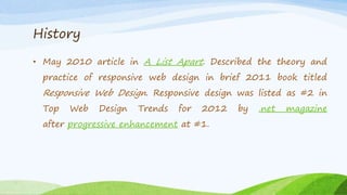
- 4. History ŌĆó May 2010 article in A List Apart. Described the theory and practice of responsive web design in brief 2011 book titled Responsive Web Design. Responsive design was listed as #2 in Top Web Design Trends for 2012 by .net magazine after progressive enhancement at #1.
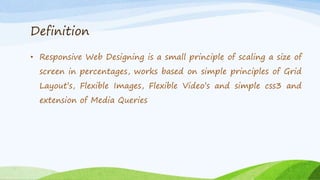
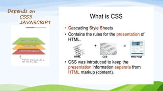
- 5. Definition ŌĆó Responsive Web Designing is a small principle of scaling a size of screen in percentages, works based on simple principles of Grid LayoutŌĆÖs, Flexible Images, Flexible VideoŌĆÖs and simple css3 and extension of Media Queries
- 6. Why We Need Ėķ░┬Č┘ŌĆ”.?
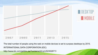
- 7. The total number of people using the web on mobile devices is set to surpass desktops by 2015. INTERNATIONAL DATA CORPORATION (IDC) http://www.idc.com/getdoc.jsp?containerId=prUS23028711
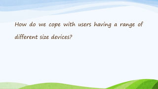
- 8. How do we cope with users having a range of different size devices?
- 11. ->methods are not completely reliable unless used in conjunction with a device capabilities database ->HTML and CSS features are supported User Agent Detection
- 13. Ethan Marcotte
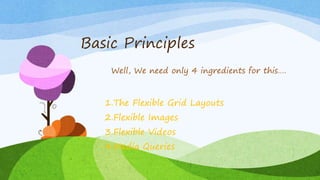
- 16. Basic Principles 1.The Flexible Grid Layouts 2.Flexible Images 3.Flexible Videos 4.Media Queries Well, We need only 4 ingredients for thisŌĆ”.
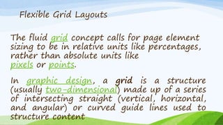
- 17. The fluid grid concept calls for page element sizing to be in relative units like percentages, rather than absolute units like pixels or points. Flexible Grid Layouts In graphic design, a grid is a structure (usually two-dimensional) made up of a series of intersecting straight (vertical, horizontal, and angular) or curved guide lines used to structure content
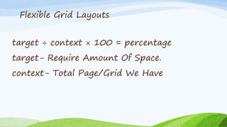
- 18. target ├Ę context ├Ś 100 = percentage target- Require Amount Of Space. context- Total Page/Grid We Have Flexible Grid Layouts
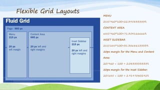
- 19. Flexible Grid Layouts MENU 215/960*100=22.395833333% CONTENT AREA 685/960*100=71.354166666% INSET SLIDEBAR 215/685*100=31.3868613333% 20px margin for the Menu and Content Area: 20/960 ├Ś 100 = 2.0833333333% 20px margin for the Inset Sidebar: 20/685 ├Ś 100 = 2.9197080292%
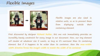
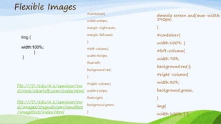
- 21. Flexible images are also sized in relative units, so as to prevent them from displaying outside their containing element First discovered by designer Richard Rutter, this one rule immediately provides an incredibly handy constraint for every image in our document. Now, our img element will render at whatever size it wants, as long as itŌĆÖs narrower than its containing element. But if it happens to be wider than its container, then the max-width: 100% directive forces the imageŌĆÖs width to match the width of its container Flexible Images
- 22. Flexible Images file:///D:/edu/4.1/seminor/rw d/images/clagnut.com/sandbox /imagetest/index.html file:///D:/edu/4.1/seminor/rw d/rwd/clearleft.com/index.html Img { width:100%; } } #container{ width:600px; margin-right:auto; margin-left:auto; } #left-column{ width:420px; float:left; background:red; } #right-column{ width:180px; float:right; background:green; } @media screen and(max-width: 590px) { #container{ width:100%; } #left-column{ width:70%; background:red;} #right-column{ width:30%; background:green; } img{ width:100%; } }
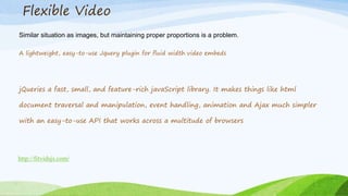
- 23. Flexible Video Similar situation as images, but maintaining proper proportions is a problem. A lightweight, easy-to-use Jquery plugin for fluid width video embeds http://fitvidsjs.com/ jQueries a fast, small, and feature-rich javaScript library. It makes things like html document traversal and manipulation, event handling, animation and Ajax much simpler with an easy-to-use API that works across a multitude of browsers
- 24. Flexible Video img, embed, object, video { width: 100%; } .video iframe, .video object, .video embed { position: absolute; top: 0; left: 0; width: 100%; height: 100%; }
- 25. Media Queries Media queries allow the page to use different CSS style rules based on characteristics of the device the site is being displayed on, most commonly the width of the browser. Media Queries is a CSS3 module allowing content rendering to adapt to conditions such as screen resolution (e.g. smartphone vs. high definition screen). When a media query is true, the corresponding style sheet or style rules are applied, following the normal cascading rules. Here is a simple example: @media screen and (min-width:500px) { ... }
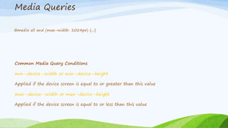
- 26. Media Queries @media all and (max-width: 1024px) {...} Common Media Query Conditions min-ŌĆÉdevice-ŌĆÉwidth or min-ŌĆÉdevice-ŌĆÉheight Applied if the device screen is equal to or greater than this value max-ŌĆÉdevice-ŌĆÉwidth or max-ŌĆÉdevice-ŌĆÉheight Applied if the device screen is equal to or less than this value
- 27. What web browsers support CSS3 media queries?
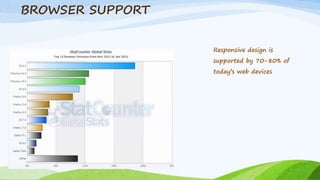
- 29. BROWSER SUPPORT Responsive design is supported by 70-80% of todayŌĆÖs web devices
- 30. How many mobile browsers support CSS3 media queries?
- 31. Many websites are using responsive design to target mobile devices
- 32. Semantic Grid System Golden Grid System Inuit.Css TOOLS