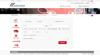
10 form design
- 1. www.dadda.it roberto@dadda.it Excellence in usability 1nd semester 2020-2021 1 ERGONOMICS APPLIED TO THE DESIGN OF USABLE WEB PAGES AND APPS Roberto DADDA and Paolo NEGRI
- 2. 1st semester 2021-2022 www.dadda.it roberto@dadda.it Form design 2
- 3. 1st semester 2021-2022 www.dadda.it roberto@dadda.it Letâs begin with a question 3 The most accessed Internet page isâĶ
- 4. 1st semester 2021-2022 www.dadda.it roberto@dadda.it 4
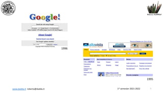
- 5. 1st semester 2021-2022 www.dadda.it roberto@dadda.it 5 1995 1996
- 6. 1st semester 2021-2022 www.dadda.it roberto@dadda.it Google search 6 4.5 billion search a day 53.000 a second
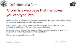
- 7. 1st semester 2021-2022 www.dadda.it roberto@dadda.it Definition of a form The relationship of a form is the relationship between the organization that is asking the questions and the person who is answering The conversation of a form comes from the questions that it asks, any other instructions, and the way the form is arranged into topics. The appearance of a form is the way that it looks: the arrangement of text, input areas such as fields and graphics, and the use of color. YES they are in order of importance! A form is a web page that has boxes you can type into. 7
- 8. 1st semester 2021-2022 www.dadda.it roberto@dadda.it 8
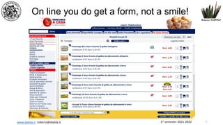
- 9. 1st semester 2021-2022 www.dadda.it roberto@dadda.it On line you do get a form, not a smile! 9
- 10. 1st semester 2021-2022 www.dadda.it roberto@dadda.it 10
- 11. 1st semester 2021-2022 www.dadda.it roberto@dadda.it 11
- 12. 1st semester 2021-2022 www.dadda.it roberto@dadda.it 12
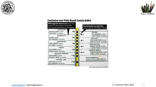
- 13. 1st semester 2021-2022 www.dadda.it roberto@dadda.it Al Gore George W. Bush 2000 13
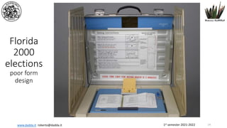
- 14. 1st semester 2021-2022 www.dadda.it roberto@dadda.it Florida 2000 elections poor form design 14
- 15. 1st semester 2021-2022 www.dadda.it roberto@dadda.it 15
- 16. 1st semester 2021-2022 www.dadda.it roberto@dadda.it 16
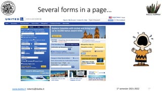
- 17. 1st semester 2021-2022 www.dadda.it roberto@dadda.it Several forms in a pageâĶ 17
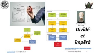
- 18. 1st semester 2021-2022 www.dadda.it roberto@dadda.it Forms that Work: Designing Web Forms for Usability (Interactive Technologies) by Caroline Jarrett, Gerry Gaffney DÄŦvÄdÄ et ÄŦmpÄrÄ Philip II of Macedon 382 â 336 BC 18
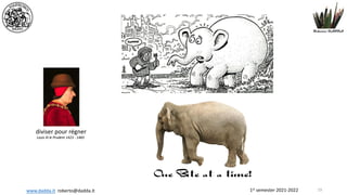
- 19. 1st semester 2021-2022 www.dadda.it roberto@dadda.it 19 diviser pour rÃĐgner Louis XI le Prudent 1423 - 1483
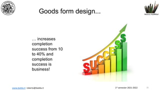
- 20. 1st semester 2021-2022 www.dadda.it roberto@dadda.it Goods form design... âĶ increases completion success from 10 to 40% and completion success is business! 20
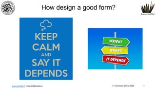
- 21. 1st semester 2021-2022 www.dadda.it roberto@dadda.it How design a good form? 21
- 22. 1st semester 2021-2022 www.dadda.it roberto@dadda.it Design outside-in âĶ not, as done usually, inside out! 22
- 23. 1st semester 2021-2022 www.dadda.it roberto@dadda.it Our mantra 23 The official ISO 9241-11 definition of usability is: âthe extent to which a product can be used by specified users to achieve specified goals with effectiveness, efficiency and satisfaction in a specified context of use.â A mantra is usually any repeated word or phrase, but it can also refer more specifically to a word repeated in meditation. Mantra comes from a Sanskrit word meaning a âsacred message or text, charm, spell, counsel.â
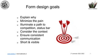
- 24. 1st semester 2021-2022 www.dadda.it roberto@dadda.it Form design goals q Explain why q Minimize the pain q Illuminate a path to competition, status bar q Consider the context q Ensure consistent communication q Short & visible 24
- 25. 1st semester 2021-2022 www.dadda.it roberto@dadda.it Have a conversation rather then an interrogation! 25
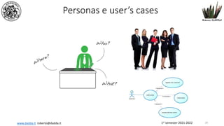
- 26. 1st semester 2021-2022 www.dadda.it roberto@dadda.it Personas e userâs cases 26
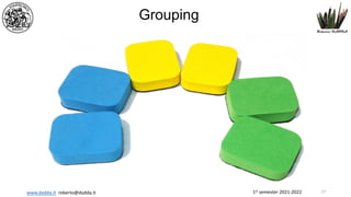
- 27. 1st semester 2021-2022 www.dadda.it roberto@dadda.it Grouping 27
- 28. 1st semester 2021-2022 www.dadda.it roberto@dadda.it Dispose of garbage content! 28
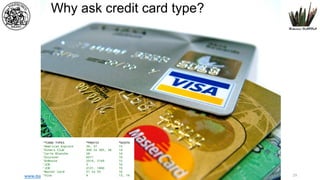
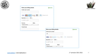
- 29. 1st semester 2021-2022 www.dadda.it roberto@dadda.it Why ask credit card type? 29
- 30. 1st semester 2021-2022 www.dadda.it roberto@dadda.it 30
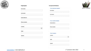
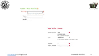
- 31. 1st semester 2021-2022 www.dadda.it roberto@dadda.it Input elements should be organized in logical groups so that brain can process the form layout in chunks of related fields. Not needed variations are harmful Use variations if there are defined and easily understandable reasons Use meaningful groups http://www.lukew.com/ff/entry.asp?1502 Grouping basic... 31
- 32. 1st semester 2021-2022 www.dadda.it roberto@dadda.it A fundamental question: What user needs to see for better usage of a form? If needed repeat data Eg Balance of bank account in the page of payments 32
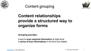
- 33. 1st semester 2021-2022 www.dadda.it roberto@dadda.it Content grouping Content relationships provide a structured way to organize forms Grouping provides: A way to scan required information at hight level A sense of how informations in the form are related 33
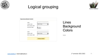
- 34. 1st semester 2021-2022 www.dadda.it roberto@dadda.it Logical grouping Lines Background Colors ... 34
- 35. 1st semester 2021-2022 www.dadda.it roberto@dadda.it 35
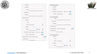
- 36. 1st semester 2021-2022 www.dadda.it roberto@dadda.it 36
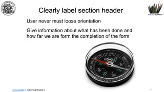
- 37. 1st semester 2021-2022 www.dadda.it roberto@dadda.it Clearly label section header User never must loose orientation Give information about what has been done and how far we are form the completion of the form 37
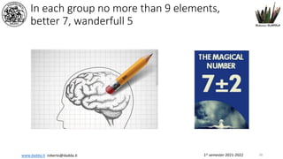
- 38. 1st semester 2021-2022 www.dadda.it roberto@dadda.it In each group no more than 9 elements, better 7, wanderfull 5 38
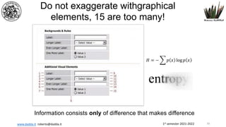
- 39. 1st semester 2021-2022 www.dadda.it roberto@dadda.it Do not exaggerate withgraphical elements, 15 are too many! Information consists only of difference that makes difference 39
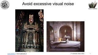
- 40. 1st semester 2021-2022 www.dadda.it roberto@dadda.it Grouping golden rules Use relevant content to organize forms Use MINIMUM amount of visual elements necessary to communicate useful relationship 40
- 41. 1st semester 2021-2022 www.dadda.it roberto@dadda.it Avoid excessive visual noise 41
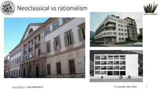
- 42. 1st semester 2021-2022 www.dadda.it roberto@dadda.it Neoclassical vs rationalism 42
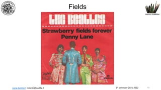
- 43. 1st semester 2021-2022 www.dadda.it roberto@dadda.it Fields 43
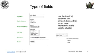
- 44. 1st semester 2021-2022 www.dadda.it roberto@dadda.it Type of fields Use the type that better fits: the simplest, the one that shows more informations in the specific situation 44
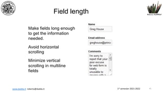
- 45. 1st semester 2021-2022 www.dadda.it roberto@dadda.it Field length Make fields long enough to get the information needed. Avoid horizontal scrolling Minimize vertical scrolling in multiline fields 45
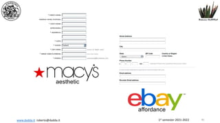
- 46. 1st semester 2021-2022 www.dadda.it roberto@dadda.it aesthetic affordance 46
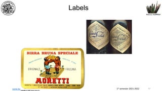
- 47. 1st semester 2021-2022 www.dadda.it roberto@dadda.it Labels 47
- 48. 1st semester 2021-2022 www.dadda.it roberto@dadda.it Choose conversational labels If instead of using: âIssuing bankâ you use âWhat bank issued you this credit card?â You will have a quicker answer, always! âWho gave you this credit card?â May be is too much! But do not exagerate! 48
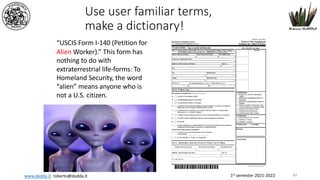
- 49. 1st semester 2021-2022 www.dadda.it roberto@dadda.it Use user familiar terms, make a dictionary! âUSCIS Form I-140 (Petition for Alien Worker).â This form has nothing to do with extraterrestrial life-forms: To Homeland Security, the word âalienâ means anyone who is not a U.S. citizen. 49
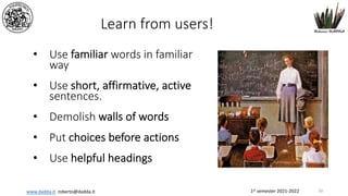
- 50. 1st semester 2021-2022 www.dadda.it roberto@dadda.it Learn from users! âĒ Use familiar words in familiar way âĒ Use short, affirmative, active sentences. âĒ Demolish walls of words âĒ Put choices before actions âĒ Use helpful headings 50
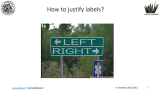
- 51. 1st semester 2021-2022 www.dadda.it roberto@dadda.it How to justify labels? 51
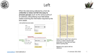
- 52. 1st semester 2021-2022 www.dadda.it roberto@dadda.it When the data being collected by a form is unfamiliar or does not fall into easy to process groups (such as the various parts of an address), left-justifying input field labels makes scanning the information required by the form easier. Users have to âjumpâ from column to column in order to find the right association of input field and label before inputting data. Westerns are used to left line reference Left 52
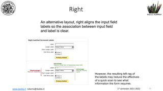
- 53. 1st semester 2021-2022 www.dadda.it roberto@dadda.it An alternative layout, right aligns the input field labels so the association between input field and label is clear. However, the resulting left rag of the labels may reduce the effectives of a quick scan to see what information the form requires. Right 53
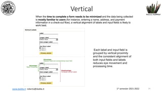
- 54. 1st semester 2021-2022 www.dadda.it roberto@dadda.it When the time to complete a form needs to be minimized and the data being collected is mostly familiar to users (for instance, entering a name, address, and payment information in a check-out flow), a vertical alignment of labels and input fields is likely to work best. Each label and input field is grouped by vertical proximity and the consistent alignment of both input fields and labels reduces eye movement and processing time. Vertical 54
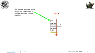
- 55. 1st semester 2021-2022 www.dadda.it roberto@dadda.it BOLD labels increase visual weight and makes easy to compete with field for user attention PATH 55
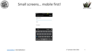
- 56. 1st semester 2021-2022 www.dadda.it roberto@dadda.it Small screensâĶ mobile first! 56
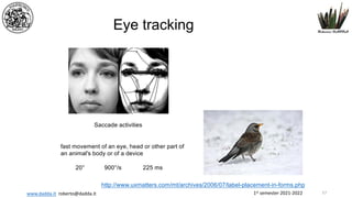
- 57. 1st semester 2021-2022 www.dadda.it roberto@dadda.it Eye tracking Saccade activities fast movement of an eye, head or other part of an animal's body or of a device 20° 900°/s 225 ms http://www.uxmatters.com/mt/archives/2006/07/label-placement-in-forms.php 57
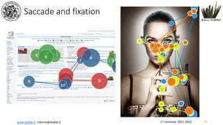
- 58. 1st semester 2021-2022 www.dadda.it roberto@dadda.it Saccade and fixation 58
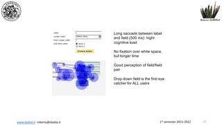
- 59. 1st semester 2021-2022 www.dadda.it roberto@dadda.it Long saccade between label and field (500 ms): hight cognitive load No fixation over white space, but longer time Good perception of field/field pair Drop down field is the first eye catcher for ALL users 59
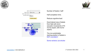
- 60. 1st semester 2021-2022 www.dadda.it roberto@dadda.it Number of fixation: half! Half completion time. Reduce cognitive load. Good lateral view of labels from field with short saccadic movements (170 ms for expert, 240 ms for expert) The non-predictable starting position of labels is NOT a problem! Some recheck, but shorter 60
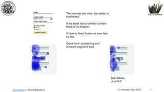
- 61. 1st semester 2021-2022 www.dadda.it roberto@dadda.it The nearest the label, the better is confirmed! If the label has a familiar content there is no fixation. If label is fixed fixation is very fast: 50 ms. Quick form completing and reduced cognitive load. Bold labels, doubtful! 61
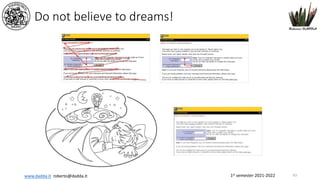
- 62. 1st semester 2021-2022 www.dadda.it roberto@dadda.it Do not believe to dreams! 63
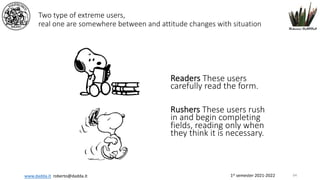
- 63. 1st semester 2021-2022 www.dadda.it roberto@dadda.it Two type of extreme users, real one are somewhere between and attitude changes with situation Readers These users carefully read the form. Rushers These users rush in and begin completing fields, reading only when they think it is necessary. 64
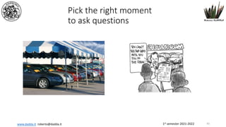
- 64. 1st semester 2021-2022 www.dadda.it roberto@dadda.it Pick the right moment to ask questions 65
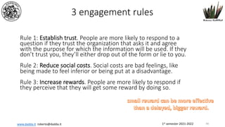
- 65. 1st semester 2021-2022 www.dadda.it roberto@dadda.it 3 engagement rules Rule 1: Establish trust. People are more likely to respond to a question if they trust the organization that asks it and agree with the purpose for which the information will be used. If they donât trust you, theyâll either drop out of the form or lie to you. Rule 2: Reduce social costs. Social costs are bad feelings, like being made to feel inferior or being put at a disadvantage. Rule 3: Increase rewards. People are more likely to respond if they perceive that they will get some reward by doing so. 66
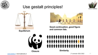
- 66. 1st semester 2021-2022 www.dadda.it roberto@dadda.it Use gestalt principles! Equilibrium Good continuation, good figure and common fate. Closure Similarity 67
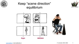
- 67. 1st semester 2021-2022 www.dadda.it roberto@dadda.it Keep âscene directionâ equilibrium WRONG! Right 68
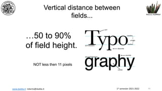
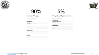
- 68. 1st semester 2021-2022 www.dadda.it roberto@dadda.it Vertical distance between fields... âĶ50 to 90% of field height. NOT less then 11 pixels 69
- 69. 1st semester 2021-2022 www.dadda.it roberto@dadda.it 90% 5% 70
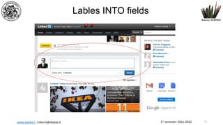
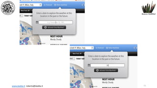
- 70. 1st semester 2021-2022 www.dadda.it roberto@dadda.it Lables INTO fields 71
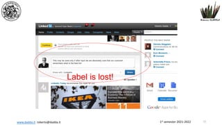
- 71. 1st semester 2021-2022 www.dadda.it roberto@dadda.it Label is lost! 72
- 72. 1st semester 2021-2022 www.dadda.it roberto@dadda.it 73
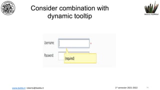
- 73. 1st semester 2021-2022 www.dadda.it roberto@dadda.it Consider combination with dynamic tooltip 74
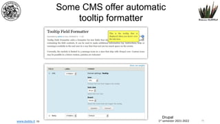
- 74. 1st semester 2021-2022 www.dadda.it roberto@dadda.it Some CMS offer automatic tooltip formatter Drupal 75
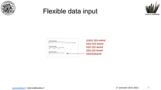
- 75. 1st semester 2021-2022 www.dadda.it roberto@dadda.it Flexible data input 76
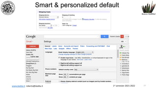
- 76. 1st semester 2021-2022 www.dadda.it roberto@dadda.it Smart & personalized default 77
- 77. 1st semester 2021-2022 www.dadda.it roberto@dadda.it Actions 78
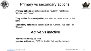
- 78. 1st semester 2021-2022 www.dadda.it roberto@dadda.it Primary vs secondary actions Primary actions are actions such as âSubmitâ, âContinueâ, âFinishâ, and âSaveâ. They enable form completion, the most important action on the form. Secondary actions are actions such as âCancelâ, âGo backâ, or âResetâ. Active vs inactive Active acions may be fired Inactive actions may NOT be fired in that specific moment 79
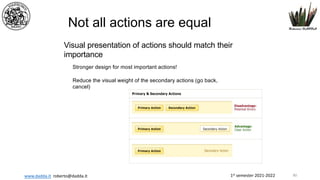
- 79. 1st semester 2021-2022 www.dadda.it roberto@dadda.it Stronger design for most important actions! Reduce the visual weight of the secondary actions (go back, cancel) Not all actions are equal Visual presentation of actions should match their importance 80
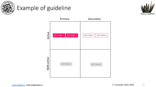
- 80. 1st semester 2021-2022 www.dadda.it roberto@dadda.it Example of guideline 81 Primary Secundary Active NON active
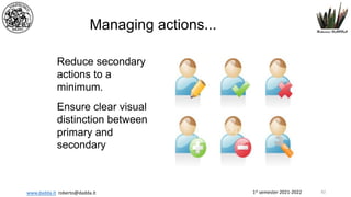
- 81. 1st semester 2021-2022 www.dadda.it roberto@dadda.it Managing actions... Reduce secondary actions to a minimum. Ensure clear visual distinction between primary and secondary 82
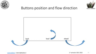
- 82. 1st semester 2021-2022 www.dadda.it roberto@dadda.it Buttons position and flow direction 83 ahead back local
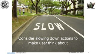
- 83. 1st semester 2021-2022 www.dadda.it roberto@dadda.it Consider slowing down actions to make user think about 84
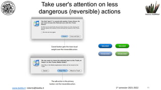
- 84. 1st semester 2021-2022 www.dadda.it roberto@dadda.it Take user's attention on less dangerous (reversible) actions 85
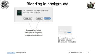
- 85. 1st semester 2021-2022 www.dadda.it roberto@dadda.it Blending in background Be careful not to make confusion between blended and not enabled 86
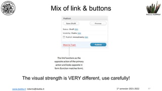
- 86. 1st semester 2021-2022 www.dadda.it roberto@dadda.it Mix of link & buttons The visual strength is VERY different, use carefully! 87
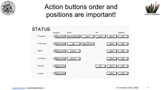
- 87. 1st semester 2021-2022 www.dadda.it roberto@dadda.it Action buttons order and positions are important! 88
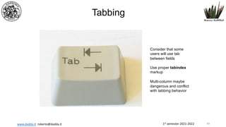
- 88. 1st semester 2021-2022 www.dadda.it roberto@dadda.it Tabbing Consider that some users will use tab between fields Use proper tabindex markup Multi-column maybe dangerous and conflict with tabbing behavior 89
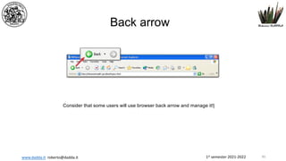
- 89. 1st semester 2021-2022 www.dadda.it roberto@dadda.it Back arrow Consider that some users will use browser back arrow and manage it!| 90
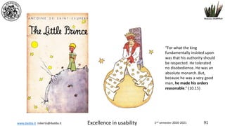
- 90. www.dadda.it roberto@dadda.it Excellence in usability 1nd semester 2020-2021 91 âFor what the king fundamentally insisted upon was that his authority should be respected. He tolerated no disobedience. He was an absolute monarch. But, because he was a very good man, he made his orders reasonable.â (10.15)
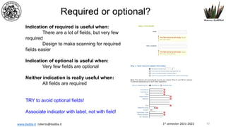
- 91. 1st semester 2021-2022 www.dadda.it roberto@dadda.it Required or optional? Indication of required is useful when: There are a lot of fields, but very few required Design to make scanning for required fields easier Indication of optional is useful when: Very few fields are optional Neither indication is really useful when: All fields are required TRY to avoid optional fields! Associate indicator with label, not with field! 92
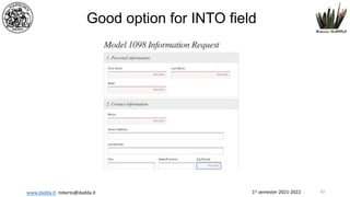
- 92. 1st semester 2021-2022 www.dadda.it roberto@dadda.it Good option for INTO field 93
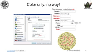
- 93. 1st semester 2021-2022 www.dadda.it roberto@dadda.it Color only: no way! 94
- 94. 1st semester 2021-2022 www.dadda.it roberto@dadda.it Help 95
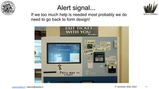
- 95. 1st semester 2021-2022 www.dadda.it roberto@dadda.it Alert signal... If we too much help is needed most probably we do need to go back to form design! 96
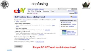
- 96. 1st semester 2021-2022 www.dadda.it roberto@dadda.it confusing People DO NOT read much instructions! 97
- 97. 1st semester 2021-2022 www.dadda.it roberto@dadda.it Helps & Tips Useful when: âĒ Asking unfamiliar data âĒ Tell why ask for data âĒ User may have doubts about data âĒ There are different possible interpretations âĒ When user maybe concerned about security and privacy âĒ When there is a specific way of inputting, eg comma delimited. âĒ Optional/required Too many may easily destroy form usability 98
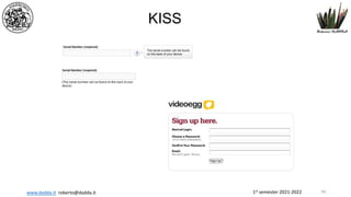
- 98. 1st semester 2021-2022 www.dadda.it roberto@dadda.it KISS 99
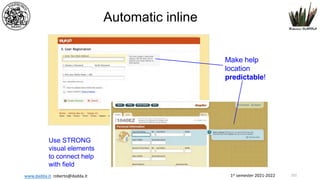
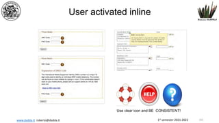
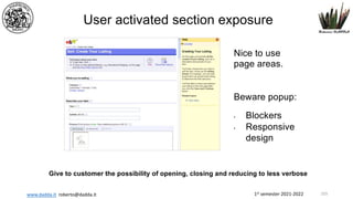
- 99. 1st semester 2021-2022 www.dadda.it roberto@dadda.it If really we need a lot of help let us consider dynamic solutions âĒ Automatic inline exposure âĒ User activated inline exposures âĒ User activated section exposure 100
- 100. 1st semester 2021-2022 www.dadda.it roberto@dadda.it Automatic inline Make help location predictable! Use STRONG visual elements to connect help with field 101
- 101. 1st semester 2021-2022 www.dadda.it roberto@dadda.it User activated inline Use clear icon and BE CONSISTENT! 102
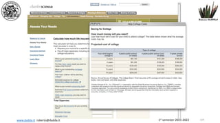
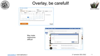
- 102. 1st semester 2021-2022 www.dadda.it roberto@dadda.it User activated section exposure Nice to use page areas. Beware popup: âĒ Blockers âĒ Responsive design Give to customer the possibility of opening, closing and reducing to less verbose 103
- 103. 1st semester 2021-2022 www.dadda.it roberto@dadda.it 104
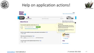
- 104. 1st semester 2021-2022 www.dadda.it roberto@dadda.it Help on application actions! 105
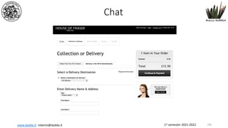
- 105. 1st semester 2021-2022 www.dadda.it roberto@dadda.it Chat 106
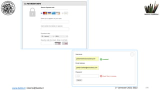
- 106. 1st semester 2021-2022 www.dadda.it roberto@dadda.it Explain security, always! With a link to an explanation/certification page! 107
- 107. 1st semester 2021-2022 www.dadda.it roberto@dadda.it 108
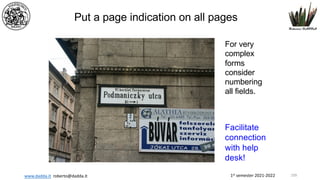
- 108. 1st semester 2021-2022 www.dadda.it roberto@dadda.it Put a page indication on all pages For very complex forms consider numbering all fields. Facilitate connection with help desk! 109
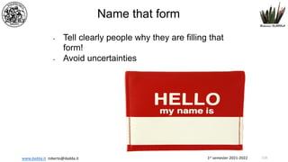
- 109. 1st semester 2021-2022 www.dadda.it roberto@dadda.it Name that form âĒ Tell clearly people why they are filling that form! âĒ Avoid uncertainties 110
- 110. 1st semester 2021-2022 www.dadda.it roberto@dadda.it People may be scared... âĶ when they see a complex form without help. If this is the situation GIVE A MESSAGE telling that you will help them 111
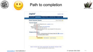
- 111. 1st semester 2021-2022 www.dadda.it roberto@dadda.it Path to completion 112
- 112. 1st semester 2021-2022 www.dadda.it roberto@dadda.it Path to completion âĒ Completion: primary goal of form!!! âĒ Consider EVERY input carefully âĒ Remove all unnecessary âĒ Enable flexible data input when needed âĒ Provide a CLEAR path âĒ Enable smart default âĒ Show progress and save âĒ Enable partial save whenever possible 113
- 113. 1st semester 2021-2022 www.dadda.it roberto@dadda.it How long will be? So the form needs to be long enough to ask the relevant questions, to be short enough to minimize the userâs effort, and to ask questions that are appropriate within the context of the overall relationship 114
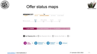
- 114. 1st semester 2021-2022 www.dadda.it roberto@dadda.it Offer status maps 115
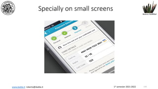
- 115. 1st semester 2021-2022 www.dadda.it roberto@dadda.it Specially on small screens 116
- 116. 1st semester 2021-2022 www.dadda.it roberto@dadda.it Celebrate successes! 117
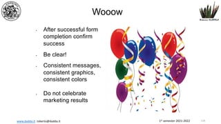
- 117. 1st semester 2021-2022 www.dadda.it roberto@dadda.it Wooow âĒ After successful form completion confirm success âĒ Be clear! âĒ Consistent messages, consistent graphics, consistent colors âĒ Do not celebrate marketing results 118
- 118. 1st semester 2021-2022 www.dadda.it roberto@dadda.it 119
- 119. 1st semester 2021-2022 www.dadda.it roberto@dadda.it Avoid dead end sensation... 120
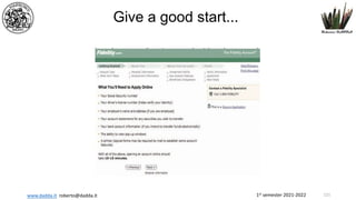
- 120. 1st semester 2021-2022 www.dadda.it roberto@dadda.it Give a good start... 121
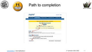
- 121. 1st semester 2021-2022 www.dadda.it roberto@dadda.it Path to completion 122
- 122. 1st semester 2021-2022 www.dadda.it roberto@dadda.it Path to completion 123
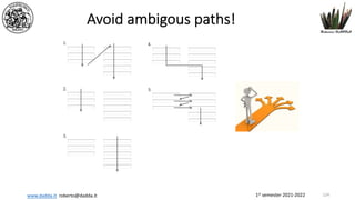
- 123. 1st semester 2021-2022 www.dadda.it roberto@dadda.it Avoid ambigous paths! 124
- 124. 1st semester 2021-2022 www.dadda.it roberto@dadda.it Progressive disclosure âĒ Not all users require all options in different situations âĒ Prioritize user's needs âĒ If possible user initiated âĒ Progressive disclosure provides an option âĒ Advanced options âĒ Gradual engagement âĒ Strongly depending on user/situation/action âĒ BE consistent 125
- 125. 1st semester 2021-2022 www.dadda.it roberto@dadda.it 126
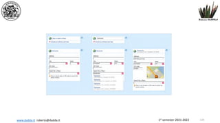
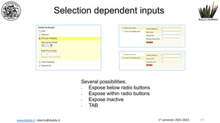
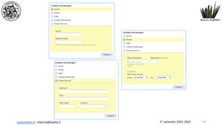
- 126. 1st semester 2021-2022 www.dadda.it roberto@dadda.it Selection dependent inputs Several possibilities: âĒ Expose below radio buttons âĒ Expose within radio buttons âĒ Expose inactive âĒ TAB 127
- 127. 1st semester 2021-2022 www.dadda.it roberto@dadda.it 128
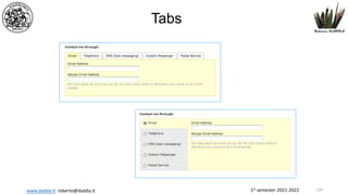
- 128. 1st semester 2021-2022 www.dadda.it roberto@dadda.it Tabs 129
- 129. 1st semester 2021-2022 www.dadda.it roberto@dadda.it Selection dependent inputs âĒ Show clear relation between options âĒ Clearly associate trigger with triggered fields âĒ Manage data loss if trigger is changed after some data input âĒ Avoid big (out of visible page) uncontrolled jumps 130
- 130. 1st semester 2021-2022 www.dadda.it roberto@dadda.it Overlay, be carefull! Kayak May make responsive difficult 131
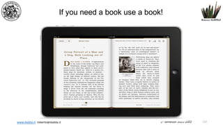
- 131. 1st semester 2021-2022 www.dadda.it roberto@dadda.it If you need a book use a book! 132
- 132. 1st semester 2021-2022 www.dadda.it roberto@dadda.it feedback 133
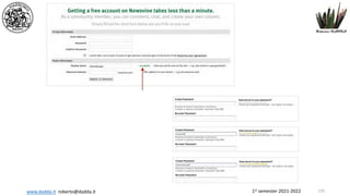
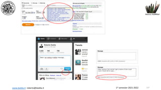
- 133. 1st semester 2021-2022 www.dadda.it roberto@dadda.it Inline validation assistance q Provide DIRECT and CONTESTUAL feedback as data are entered q Validate input and correlations between inputs q Suggest valid input q Suggest corrections q Help users stay in limits and possible data sets q Use where errors are more probable q Disambiguate! q Communicate limits if any 134
- 134. 1st semester 2021-2022 www.dadda.it roberto@dadda.it 135
- 135. 1st semester 2021-2022 www.dadda.it roberto@dadda.it 136
- 136. 1st semester 2021-2022 www.dadda.it roberto@dadda.it 137
- 137. 1st semester 2021-2022 www.dadda.it roberto@dadda.it Errors 139
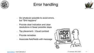
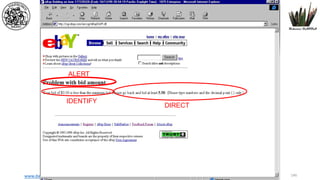
- 138. 1st semester 2021-2022 www.dadda.it roberto@dadda.it Error handling âĒ Do whatever possible to avoid errors, but "Shit happensâ âĒ Provide clear indication and clear resolutions in fewer possible steps âĒ Top placement - Visual contrast âĒ Provide remedies âĒ Associate field/fields with message 140
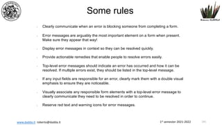
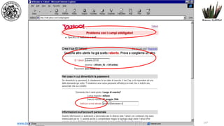
- 139. 1st semester 2021-2022 www.dadda.it roberto@dadda.it âĒ Clearly communicate when an error is blocking someone from completing a form. âĒ Error messages are arguably the most important element on a form when present. Make sure they appear that way! âĒ Display error messages in context so they can be resolved quickly. âĒ Provide actionable remedies that enable people to resolve errors easily. âĒ Top-level error messages should indicate an error has occurred and how it can be resolved. If multiple errors exist, they should be listed in the top-level message. âĒ If any input fields are responsible for an error, clearly mark them with a double visual emphasis to ensure they are noticeable. âĒ Visually associate any responsible form elements with a top-level error message to clearly communicate they need to be resolved in order to continue. âĒ Reserve red text and warning icons for error messages. Some rules 141
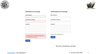
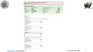
- 140. 1st semester 2021-2022 www.dadda.it roberto@dadda.it But here something is wrong! 142
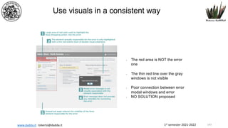
- 141. 1st semester 2021-2022 www.dadda.it roberto@dadda.it âĒ The red area is NOT the error one âĒ The thin red line over the gray windows is not visible âĒ Poor connection between error modal windows and error âĒ NO SOLUTION proposed Use visuals in a consistent way 143
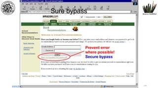
- 142. 1st semester 2021-2022 www.dadda.it roberto@dadda.it Sure bypass Prevent error where possible! Secure bypass 144
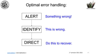
- 143. 1st semester 2021-2022 www.dadda.it roberto@dadda.it Optimal error handling: ALERT IDENTIFY DIRECT Something wrong! This is wrong. Do this to recover. 145
- 144. 1st semester 2021-2022 www.dadda.it roberto@dadda.it ALERT IDENTIFY DIRECT 146
- 145. 1st semester 2021-2022 www.dadda.it roberto@dadda.it 147
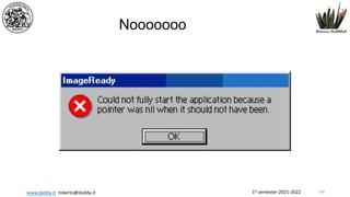
- 146. 1st semester 2021-2022 www.dadda.it roberto@dadda.it Nooooooo 148
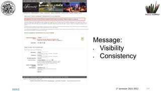
- 147. 1st semester 2021-2022 www.dadda.it roberto@dadda.it Message: âĒ Visibility âĒ Consistency 149
- 148. 1st semester 2021-2022 www.dadda.it roberto@dadda.it 150
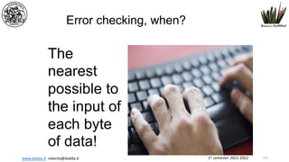
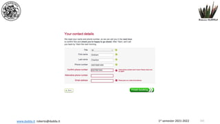
- 149. 1st semester 2021-2022 www.dadda.it roberto@dadda.it Error checking, when? The nearest possible to the input of each byte of data! 151
- 150. 1st semester 2021-2022 www.dadda.it roberto@dadda.it 152
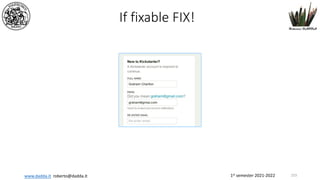
- 151. 1st semester 2021-2022 www.dadda.it roberto@dadda.it If fixable FIX! 153
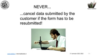
- 152. 1st semester 2021-2022 www.dadda.it roberto@dadda.it NEVER... ...cancel data submitted by the customer if the form has to be resubmitted! 154
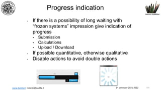
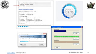
- 153. 1st semester 2021-2022 www.dadda.it roberto@dadda.it Progress indication âĒ If there is a possibility of long waiting with âfrozen systemsâ impression give indication of progress âĒ Submission âĒ Calculations âĒ Upload / Download âĒ If possible quantitative, otherwise qualitative âĒ Disable actions to avoid double actions 155
- 154. 1st semester 2021-2022 www.dadda.it roberto@dadda.it 156
- 155. 1st semester 2021-2022 www.dadda.it roberto@dadda.it And is only the beginning 157
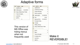
- 156. 1st semester 2021-2022 www.dadda.it roberto@dadda.it Adaptive forms This version of MS Office was hiding menus when not frequently used Make it REVERSIBLE! 158
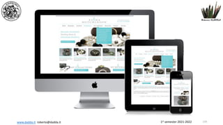
- 157. 1st semester 2021-2022 www.dadda.it roberto@dadda.it 159
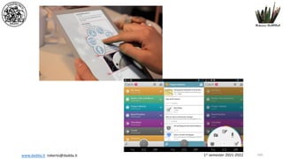
- 158. 1st semester 2021-2022 www.dadda.it roberto@dadda.it 160
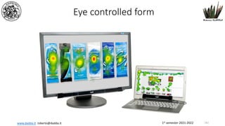
- 159. 1st semester 2021-2022 www.dadda.it roberto@dadda.it Eye controlled form 161

