際際滷

際際滷Share a Scribd company logo
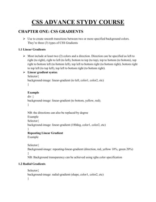
CSS ADVANCE STYDY COURSE
CHAPTER ONE: CSS GRADIENTS
 Use to create smooth transitions between two or more specified background colors.
Theyre three (3) types of CSS Gradients
1.1 Linear Gradients
 Most include at least two (2) colors and a direction. Direction can be specified as left to
right (to right), right to left (to left), bottom to top (to top), top to bottom (to bottom), top
right to bottom left (to bottom left), top left to bottom right (to bottom right), bottom right
to top left (to top left), top left to bottom right (to bottom right).
 Linear gradient syntax
Selector{
background-image: linear-gradient (to left, color1, color2, etc)
}
Example
div {
background-image: linear-gradient (to bottom, yellow, red);
}
NB: the directions can also be replaced by degree
Example
Selector{
background-image: linear-gradient (180deg, color1, color2, etc)
}
Repeating Linear Gradient
Example
Selector{
Background-image: repeating-linear-gradient (direction, red, yellow 10%, green 20%)
}
NB: Background transparency can be achieved using rgba color specification
1.2 Radial Gradients
Selector{
background-image: radial-gradient (shape, color1, color2, etc)
}
Repeating Radial Gradient
Selector{
Background-image: repeating-radial-gradient (shape, red, yellow 10%, green 20%);
}
1.3 Conic Gradients
A conic gradient is a gradient with color transitions rotated around a center point. To create a
conic gradient you must define at least two colors. By default, angle is 0deg and position is
center.
Syntax
Selector{
background-image: conic-gradient([from angle] [at position,] color [degree], color [degree]);
}
Example
Selector{
background-image: conic-gradient(from 60deg at left, blue, pink, black, indigo, cyan, orange,
white, darkblue, purple);
}
or
#grad1 {
background-color: red; /* For browsers that do not support gradients */
background-image: conic-gradient(from 0deg at center bottom, blue 10deg, red 100deg, yellow
10deg);
border-radius: 50%;
}
Or
Selector{
background-image: conic-gradient(red, yellow, green);
}
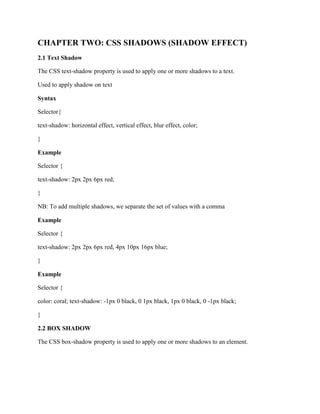
CHAPTER TWO: CSS SHADOWS (SHADOW EFFECT)
2.1 Text Shadow
The CSS text-shadow property is used to apply one or more shadows to a text.
Used to apply shadow on text
Syntax
Selector{
text-shadow: horizontal effect, vertical effect, blur effect, color;
}
Example
Selector {
text-shadow: 2px 2px 6px red;
}
NB: To add multiple shadows, we separate the set of values with a comma
Example
Selector {
text-shadow: 2px 2px 6px red, 4px 10px 16px blue;
}
Example
Selector {
color: coral; text-shadow: -1px 0 black, 0 1px black, 1px 0 black, 0 -1px black;
}
2.2 BOX SHADOW
The CSS box-shadow property is used to apply one or more shadows to an element.
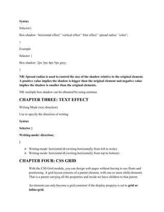
Syntax
Selector{
Box-shadow: horizontal effect vertical effect blur effect spread radius color;
}
Example
Selector {
Box-shadow: 2px 3px 4px 5px grey;
}
NB: Spread radius is used to control the size of the shadow relative to the original element.
A positive value implies the shadow is bigger than the original element and negative value
implies the shadow is smaller than the original elements.
NB: multiple box-shadow can be obtained by using commas
CHAPTER THREE: TEXT EFFECT
Writing Mode (text direction)
Use to specify the direction of writing
Syntax
Selector {
Writing-mode: direction;
}
 Writing-mode: horizontal-tb (writing horizontally from left to write)
 Writing-mode: horizontal-tb (writing horizontally from top to bottom)
CHAPTER FOUR: CSS GRID
With the CSS Grid module, you can design web pages without having to use floats and
positioning. A grid layout consists of a parent element, with one or more child elements.
That is a parent carrying all the properties and inside we have children to that parent.
An element can only become a grid container if the display property is set to grid or
inline-grid.
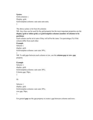
Syntax
Grid-container {
Display: grid;
Grid-template-columns: auto auto auto auto;
}
The above syntax is for four (4) columns
NB: Any class can be used for the grid property but the most important properties are the
display (grid or inline-grid) and grid-template-columns (number of columns to be
partition)
Each column can be set to auto if they will all be the same. Use percentage (%) if the
column differ from each other
Example
Selector {
display: grid;
Grid-template-columns: auto auto 30%;
}
NB: To add gaps between each column or row, use the column-gap or row- gap
property
Example
Selector {
display: grid;
Grid-template-columns: auto auto 30%;
Column-gap: 50px;
}
Or
Selector {
display: grid;
Grid-template-columns: auto auto 30%;
row-gap: 50px;
}
For general gap use the gap property to create a gap between columns and rows.
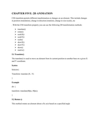
CHAPTER FIVE: 2D ANIMATION
CSS transform permits different transformation or changes on an element. This include changes
in position (translation), change in direction (rotation), change in size (scale), etc
. With the CSS transform property you can use the following 2D transformation methods:
 translate()
 rotate()
 scaleX()
 scaleY()
 scale()
 skewX()
 skewY()
 skew()
 matrix()
5.1 Translate()
The translate() is used to move an element from its current position to another base on a given X
and Y coordinate.
Syntax
Selector{
Transform: translate (X , Y)
}
Example
div {
transform: translate(40px, 80px);
}
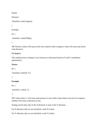
5.2 Rotate ()
This method rotates an element about a fix axis based on a specified angle
Syntax
Selector{
Transform: rotate (degree)
}
Example
div {
transform: rotate(20deg);
}
NB: Positive values will cause clock-wise rotation while a negative value will cause anti-clock-
wish direction.
5.3 Scale ()
This method cause a change in size (increase or decrease) based on X and Y coordinates
(parameters).
Syntax
div {
transform: rotate(X, Y);
}
Example
div {
transform: scale(2, 3);
}
NB: Values above 1 will cause and increase in sizes while values below one (not 0 or negative
number) will cause a decrease in size.
Scaling can be done only in the X direction or only in the Y direction.
For X direction only we use transform: scale X (value).
For Y direction only we use transform: scale Y (value).
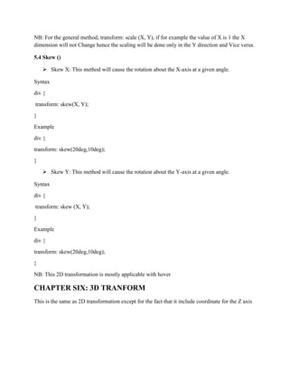
NB: For the general method, transform: scale (X, Y), if for example the value of X is 1 the X
dimension will not Change hence the scaling will be done only in the Y direction and Vice versa.
5.4 Skew ()
 Skew X: This method will cause the rotation about the X-axis at a given angle.
Syntax
div {
transform: skew(X, Y);
}
Example
div {
transform: skew(20deg,10deg);
}
 Skew Y: This method will cause the rotation about the Y-axis at a given angle.
Syntax
div {
transform: skew (X, Y);
}
Example
div {
transform: skew(20deg,10deg);
}
NB: This 2D transformation is mostly applicable with hover
CHAPTER SIX: 3D TRANFORM
This is the same as 2D transformation except for the fact that it include coordinate for the Z axis
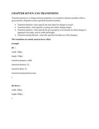
CHAPTER SEVEN: CSS TRANSITIONS
Transition permits us to change elements properties or to transform element smoothly within a
given duration. Properties used to specified transition includes;
 Transition-duration: value (specify the time taken for changes to occur)
 Transition-delay: value (specify a waiting time before changes begin)
 Transition property: value (specify the given property of an element on which changes is
supposed to be made, such as width and height).
 Transition-timing-function: value (this specifies the behavior of the changes).
NB: transitions are mostly used on hover effect.
Example
div {
width: 100px;
height: 100px;
transition-property: width;
transition-duration: 2s;
transition-delay: 5s;
transition-timing-function:ease;
}
div:hover {
width: 300px;
height: 600px;
}
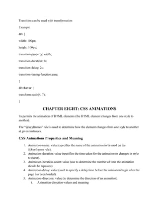
Transition can be used with transformation
Example
div {
width: 100px;
height: 100px;
transition-property: width;
transition-duration: 2s;
transition-delay: 2s;
transition-timing-function:ease;
}
div:hover {
transform:scale(4, 7);
}
CHAPTER EIGHT: CSS ANIMATIONS
Its permits the animation of HTML elements (the HTML element changes from one style to
another).
The @keyframes rule is used to determine how the element changes from one style to another
at given instances.
CSS Animations Properties and Meaning
1. Animation-name: value (specifies the name of the animation to be used on the
@keyframes rule).
2. Animation-duration: value (specifies the time taken for the animation or changes in style
to occur).
3. Animation-iteration-count: value (use to determine the number of time the animation
should be repeated).
4. Animation-delay: value (used to specify a delay time before the animation begin after the
page has been loaded).
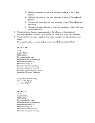
5. Animation-direction: value (to determine the direction of an animation)
i. Animation-direction-values and meaning
 Animation-direction: normal; (the animation is played in the forward
direction)
 Animation-direction: reverse; (the animation is played in the backward
direction)
 Animation-direction: alternate; (the animation is played forward first, then
backward)
 Animation-direction: alternate-reverse; (the animation is played backward
first then forward)
6. Animation-timing-function: value (determines the behavior of the animations)
This property can take different values include (is, linear, is-in, is-out, and is-in-out)
7. Animation-fill-mode: value (specify a style for the element when the animation is not
playing)
This property can take values including (none, forwards, backwards, and both)
EXAMPLES 1
Div {
Height: 200px;
Width: 200px;
Background-color: red;
Animation-name: myanimation;
Animation-duration: 3s;
Animation-delay: 2s;
Animation-iteration-count: 5;
Animation-direction: normal;
Animation-timing-function: linear;
Animation-fill-mode: forwards;
}
@keyframes myanimation{
from {width: 50px;}
to {width: 200px;}
}
EXAMPLE 2
Div {
Height: 200px;
Width: 200px;
Background-color: red;
Animation-name: myanimation;
Animation-duration: 3s;
Animation-delay: 2s;
Animation-iteration-count: 5;
Animation-direction: normal;
Animation-timing-function: linear;
Animation-fill-mode: forwards;
}
@keyframes myanimation{
0% {background-color: orange ;}
25% {background-color: pink ;}
50% {background-color: indigo ;}
75% {background-color: purple ;}
100% {background-color: black ;}
}
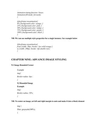
NB: We can use multiple style properties for a single instance. See example below
@keyframes myanimation{
from {width: 50px; border: 1px solid orange;}
to {width: 200px; border: 4px double red;}
}
CHAPTER NINE: ADVANCE IMAGE STYLING
9.1 Image Rounded Corner
Example
img{
Border-radius: 8px;
}
9.2 Rounded Image
Example
img{
Border-radius: 50%;
}
NB: To center an image, set left and right margin to auto and make it into a block element
img {
filter: grayscale(100%);
}
9.2 Image Responsive
 Image should automatically readjust and fit for different screen sizes. To do this,
specify image width using percentage and image height as auto
 To centralize an image set the margin-left and margin-right to auto and set image
display to block
9.3 Image opacity (transparency)
img {
opacity: 0.5;
}
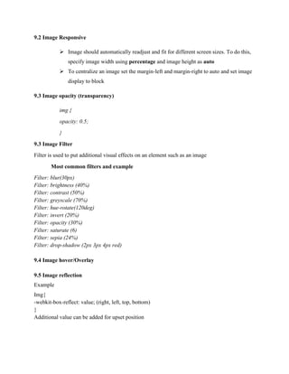
9.3 Image Filter
Filter is used to put additional visual effects on an element such as an image
Most common filters and example
Filter: blur(30px)
Filter: brightness (40%)
Filter: contrast (50%)
Filter: greyscale (70%)
Filter: hue-rotate(120deg)
Filter: invert (20%)
Filter: opacity (30%)
Filter: saturate (6)
Filter: sepia (24%)
Filter: drop-shadow (2px 3px 4px red)
9.4 Image hover/Overlay
9.5 Image reflection
Example
Img{
-webkit-box-reflect: value; (right, left, top, bottom)
}
Additional value can be added for upset position
Example
Img{
-webkit-box-reflect: right 10px;
}
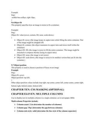
9.6 Object fit
This property specifies how an image is resize to fit a container.
Example:
Img{
Object-fit: value (cover, contain, fill, none, scale-down,)
}
 Object-fit: cover; (the image keeps its aspect ratio while filling the entire container. Part
of the image might be chopped off)
 Object-fit: contain; (the object maintains its aspect ratio and resize itself within the
container)
 Object-fill: fill; (the image is resize to fill the entire container. The image might be
stretched or compress thereby losing its aspect ratio)
 Object-fill: none; (the image is not resize)
 Object-fill: scale-down; (the image is resize to its smallest version that can fit into the
container.)
9.7 Object position
This property is used to choose a position of focus on an image
Example
Img{
Object-fit: cover;
Object-position: top left;
}
Other object position values include (top right, top center, center left, center center, center right,
bottom right, bottom center, bottom left)
CHAPTER TEN: CSS MASKING (OPTIONAL)
CHAPTER ELEVEN: MULTIPLE COLUMNS
Use to display text in multiple columns in a single container, as in newspaper, Bible
Multi-column Properties include;
 Column-count: 2 (to determine the number of columns)
 Column-gap: 35px (determine the gap between columns)
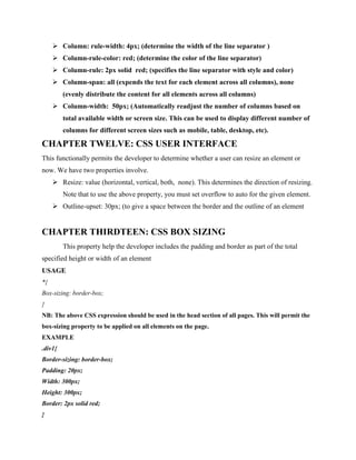
 Column-rule-style: solid (determine the line style of the column separator)
 Column: rule-width: 4px; (determine the width of the line separator )
 Column-rule-color: red; (determine the color of the line separator)
 Column-rule: 2px solid red; (specifies the line separator with style and color)
 Column-span: all (expends the text for each element across all columns), none
(evenly distribute the content for all elements across all columns)
 Column-width: 50px; (Automatically readjust the number of columns based on
total available width or screen size. This can be used to display different number of
columns for different screen sizes such as mobile, table, desktop, etc).
CHAPTER TWELVE: CSS USER INTERFACE
This functionally permits the developer to determine whether a user can resize an element or
now. We have two properties involve.
 Resize: value (horizontal, vertical, both, none). This determines the direction of resizing.
Note that to use the above property, you must set overflow to auto for the given element.
 Outline-upset: 30px; (to give a space between the border and the outline of an element
CHAPTER THIRDTEEN: CSS BOX SIZING
This property help the developer includes the padding and border as part of the total
specified height or width of an element
USAGE
*{
Box-sizing: border-box;
}
NB: The above CSS expression should be used in the head section of all pages. This will permit the
box-sizing property to be applied on all elements on the page.
EXAMPLE
.div1{
Border-sizing: border-box;
Padding: 20px;
Width: 300px;
Height: 300px;
Border: 2px solid red;
}
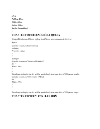
.div2{
Padding: 20px;
Width: 300px;
Height: 300px;
Border: 2px solid red;
}
CHAPTER FOURTEEN: MEDIA QUERY
It is used to display different styling for different screen sizes or device type
Syntax
@media screen and(expression){
.selector{
Property: value;
}
}
Example
@media screen and (max-width:600px){
div {
Width: 30%;
}
}
The above styling for the div will be applied only to screen sizes of 600px and smaller.
@media screen and (min-width: 600px){
div {
Width: 30%;
}
}
The above styling for the div will be applied only to screen sizes of 600px and larger.
CHAPTER FIFTEEN: CSS FLEX BOX
More Related Content

Similar to ADVANCE CSS STYDY COURSE TO BECOME A PROFESSIONAL.docx (20)

PDF
Workshop 18: CSS Animations & cool effects
Visual Engineering
PPTX
CSS3 TTA (Transform Transition Animation)
谿曙
PPT
CSS - Basics
Shubham_Saurabh
PDF
CSS-3 Course 際際滷
BoneyGawande
PDF
Css notes for professionals
Zafer Galip Ozberk
PPTX
Lecture 5 & 6 Advance CSS.pptx for web
ZahraWaheed9
PPTX
css3.pptx
ThiyaguPappu
PDF
Designing Your Next Generation Web Pages with CSS3
Gil Fink
PDF
CascadingStyleSheets in ONESHOT By DeathCodeYT .pdf
balbirnainnain496
PPTX
Cordova training - Day 2 Introduction to CSS 3
Binu Paul
PDF
Css3
Inbal Geffen
KEY
CSS3: stay tuned for style
Chris Mills
KEY
CSS and CSS3
Robyn Overstreet
PDF
The amazing power of CSS
Pedro Duarte
PPTX
CSS 3 Overview
Danilo Sousa
PDF
Class 4 handout w css3 using j fiddle
Erin M. Kidwell
PPTX
Css3 Complete Reference
EPAM Systems
PPT
CSS3
Doncho Minkov
PDF
Post-Modern CSS: Start learning CSS Grid, Flexbox and other new properties
Bryan Robinson
PPTX
Chapter 18: Transitions, Transforms, and Animation
Steve Guinan
Workshop 18: CSS Animations & cool effects
Visual Engineering
CSS3 TTA (Transform Transition Animation)
谿曙
CSS - Basics
Shubham_Saurabh
CSS-3 Course 際際滷
BoneyGawande
Css notes for professionals
Zafer Galip Ozberk
Lecture 5 & 6 Advance CSS.pptx for web
ZahraWaheed9
css3.pptx
ThiyaguPappu
Designing Your Next Generation Web Pages with CSS3
Gil Fink
CascadingStyleSheets in ONESHOT By DeathCodeYT .pdf
balbirnainnain496
Cordova training - Day 2 Introduction to CSS 3
Binu Paul
CSS3: stay tuned for style
Chris Mills
CSS and CSS3
Robyn Overstreet
The amazing power of CSS
Pedro Duarte
CSS 3 Overview
Danilo Sousa
Class 4 handout w css3 using j fiddle
Erin M. Kidwell
Css3 Complete Reference
EPAM Systems
Post-Modern CSS: Start learning CSS Grid, Flexbox and other new properties
Bryan Robinson
Chapter 18: Transitions, Transforms, and Animation
Steve Guinan

Recently uploaded (20)

PPTX
arctitecture application system design os dsa
za241967
PDF
Mastering VPC Architecture Build for Scale from Day 1.pdf
Devseccops.ai
PDF
CodeCleaner: Mitigating Data Contamination for LLM Benchmarking
arabelatso
PPTX
For my supp to finally picking supp that work
necas19388
PDF
The Next-Gen HMIS Software AI, Blockchain & Cloud for Housing.pdf
Prudence B2B
PPTX
ERP Systems in the UAE: Driving Business Transformation with Smart Solutions
dheeodoo
PDF
Building scalbale cloud native apps with .NET 8
GillesMathieu10
DOCX
Best AI-Powered Wearable Tech for Remote Health Monitoring in 2025
SEOLIFT - SEO Company London
PDF
Which Hiring Management Tools Offer the Best ROI?
HireME
PDF
Automated Test Case Repair Using Language Models
Lionel Briand
PDF
What Is an Internal Quality Audit and Why It Matters for Your QMS
BizPortals365
PDF
Telemedicine App Development_ Key Factors to Consider for Your Healthcare Ven...
Mobilityinfotech
PDF
Automated Testing and Safety Analysis of Deep Neural Networks
Lionel Briand
PPTX
Introduction to web development | MERN Stack
JosephLiyon
PDF
TEASMA: A Practical Methodology for Test Adequacy Assessment of Deep Neural N...
Lionel Briand
PDF
CodeCleaner: Mitigating Data Contamination for LLM Benchmarking
arabelatso
PPTX
Wondershare Filmora Crack 14.5.18 + Key Full Download [Latest 2025]
HyperPc soft
PDF
capitulando la keynote de GrafanaCON 2025 - Madrid
Imma Valls Bernaus
PPTX
Android Notifications-A Guide to User-Facing Alerts in Android .pptx
Nabin Dhakal
PDF
Rewards and Recognition (2).pdf
ethan Talor
arctitecture application system design os dsa
za241967
Mastering VPC Architecture Build for Scale from Day 1.pdf
Devseccops.ai
CodeCleaner: Mitigating Data Contamination for LLM Benchmarking
arabelatso
For my supp to finally picking supp that work
necas19388
The Next-Gen HMIS Software AI, Blockchain & Cloud for Housing.pdf
Prudence B2B
ERP Systems in the UAE: Driving Business Transformation with Smart Solutions
dheeodoo
Building scalbale cloud native apps with .NET 8
GillesMathieu10
Best AI-Powered Wearable Tech for Remote Health Monitoring in 2025
SEOLIFT - SEO Company London
Which Hiring Management Tools Offer the Best ROI?
HireME
Automated Test Case Repair Using Language Models
Lionel Briand
What Is an Internal Quality Audit and Why It Matters for Your QMS
BizPortals365
Telemedicine App Development_ Key Factors to Consider for Your Healthcare Ven...
Mobilityinfotech
Automated Testing and Safety Analysis of Deep Neural Networks
Lionel Briand
Introduction to web development | MERN Stack
JosephLiyon
TEASMA: A Practical Methodology for Test Adequacy Assessment of Deep Neural N...
Lionel Briand
CodeCleaner: Mitigating Data Contamination for LLM Benchmarking
arabelatso
Wondershare Filmora Crack 14.5.18 + Key Full Download [Latest 2025]
HyperPc soft
capitulando la keynote de GrafanaCON 2025 - Madrid
Imma Valls Bernaus
Android Notifications-A Guide to User-Facing Alerts in Android .pptx
Nabin Dhakal
Rewards and Recognition (2).pdf
ethan Talor
Ad

ADVANCE CSS STYDY COURSE TO BECOME A PROFESSIONAL.docx

  • 1. CSS ADVANCE STYDY COURSE CHAPTER ONE: CSS GRADIENTS Use to create smooth transitions between two or more specified background colors. Theyre three (3) types of CSS Gradients 1.1 Linear Gradients Most include at least two (2) colors and a direction. Direction can be specified as left to right (to right), right to left (to left), bottom to top (to top), top to bottom (to bottom), top right to bottom left (to bottom left), top left to bottom right (to bottom right), bottom right to top left (to top left), top left to bottom right (to bottom right). Linear gradient syntax Selector{ background-image: linear-gradient (to left, color1, color2, etc) } Example div { background-image: linear-gradient (to bottom, yellow, red); } NB: the directions can also be replaced by degree Example Selector{ background-image: linear-gradient (180deg, color1, color2, etc) } Repeating Linear Gradient Example Selector{ Background-image: repeating-linear-gradient (direction, red, yellow 10%, green 20%) } NB: Background transparency can be achieved using rgba color specification 1.2 Radial Gradients Selector{ background-image: radial-gradient (shape, color1, color2, etc) }
  • 2. Repeating Radial Gradient Selector{ Background-image: repeating-radial-gradient (shape, red, yellow 10%, green 20%); } 1.3 Conic Gradients A conic gradient is a gradient with color transitions rotated around a center point. To create a conic gradient you must define at least two colors. By default, angle is 0deg and position is center. Syntax Selector{ background-image: conic-gradient([from angle] [at position,] color [degree], color [degree]); } Example Selector{ background-image: conic-gradient(from 60deg at left, blue, pink, black, indigo, cyan, orange, white, darkblue, purple); } or #grad1 { background-color: red; /* For browsers that do not support gradients */ background-image: conic-gradient(from 0deg at center bottom, blue 10deg, red 100deg, yellow 10deg); border-radius: 50%; } Or Selector{ background-image: conic-gradient(red, yellow, green); }
  • 3. CHAPTER TWO: CSS SHADOWS (SHADOW EFFECT) 2.1 Text Shadow The CSS text-shadow property is used to apply one or more shadows to a text. Used to apply shadow on text Syntax Selector{ text-shadow: horizontal effect, vertical effect, blur effect, color; } Example Selector { text-shadow: 2px 2px 6px red; } NB: To add multiple shadows, we separate the set of values with a comma Example Selector { text-shadow: 2px 2px 6px red, 4px 10px 16px blue; } Example Selector { color: coral; text-shadow: -1px 0 black, 0 1px black, 1px 0 black, 0 -1px black; } 2.2 BOX SHADOW The CSS box-shadow property is used to apply one or more shadows to an element.
  • 4. Syntax Selector{ Box-shadow: horizontal effect vertical effect blur effect spread radius color; } Example Selector { Box-shadow: 2px 3px 4px 5px grey; } NB: Spread radius is used to control the size of the shadow relative to the original element. A positive value implies the shadow is bigger than the original element and negative value implies the shadow is smaller than the original elements. NB: multiple box-shadow can be obtained by using commas CHAPTER THREE: TEXT EFFECT Writing Mode (text direction) Use to specify the direction of writing Syntax Selector { Writing-mode: direction; } Writing-mode: horizontal-tb (writing horizontally from left to write) Writing-mode: horizontal-tb (writing horizontally from top to bottom) CHAPTER FOUR: CSS GRID With the CSS Grid module, you can design web pages without having to use floats and positioning. A grid layout consists of a parent element, with one or more child elements. That is a parent carrying all the properties and inside we have children to that parent. An element can only become a grid container if the display property is set to grid or inline-grid.
  • 5. Syntax Grid-container { Display: grid; Grid-template-columns: auto auto auto auto; } The above syntax is for four (4) columns NB: Any class can be used for the grid property but the most important properties are the display (grid or inline-grid) and grid-template-columns (number of columns to be partition) Each column can be set to auto if they will all be the same. Use percentage (%) if the column differ from each other Example Selector { display: grid; Grid-template-columns: auto auto 30%; } NB: To add gaps between each column or row, use the column-gap or row- gap property Example Selector { display: grid; Grid-template-columns: auto auto 30%; Column-gap: 50px; } Or Selector { display: grid; Grid-template-columns: auto auto 30%; row-gap: 50px; } For general gap use the gap property to create a gap between columns and rows.
  • 6. CHAPTER FIVE: 2D ANIMATION CSS transform permits different transformation or changes on an element. This include changes in position (translation), change in direction (rotation), change in size (scale), etc . With the CSS transform property you can use the following 2D transformation methods: translate() rotate() scaleX() scaleY() scale() skewX() skewY() skew() matrix() 5.1 Translate() The translate() is used to move an element from its current position to another base on a given X and Y coordinate. Syntax Selector{ Transform: translate (X , Y) } Example div { transform: translate(40px, 80px); } 5.2 Rotate () This method rotates an element about a fix axis based on a specified angle
  • 7. Syntax Selector{ Transform: rotate (degree) } Example div { transform: rotate(20deg); } NB: Positive values will cause clock-wise rotation while a negative value will cause anti-clock- wish direction. 5.3 Scale () This method cause a change in size (increase or decrease) based on X and Y coordinates (parameters). Syntax div { transform: rotate(X, Y); } Example div { transform: scale(2, 3); } NB: Values above 1 will cause and increase in sizes while values below one (not 0 or negative number) will cause a decrease in size. Scaling can be done only in the X direction or only in the Y direction. For X direction only we use transform: scale X (value). For Y direction only we use transform: scale Y (value).
  • 8. NB: For the general method, transform: scale (X, Y), if for example the value of X is 1 the X dimension will not Change hence the scaling will be done only in the Y direction and Vice versa. 5.4 Skew () Skew X: This method will cause the rotation about the X-axis at a given angle. Syntax div { transform: skew(X, Y); } Example div { transform: skew(20deg,10deg); } Skew Y: This method will cause the rotation about the Y-axis at a given angle. Syntax div { transform: skew (X, Y); } Example div { transform: skew(20deg,10deg); } NB: This 2D transformation is mostly applicable with hover CHAPTER SIX: 3D TRANFORM This is the same as 2D transformation except for the fact that it include coordinate for the Z axis
  • 9. CHAPTER SEVEN: CSS TRANSITIONS Transition permits us to change elements properties or to transform element smoothly within a given duration. Properties used to specified transition includes; Transition-duration: value (specify the time taken for changes to occur) Transition-delay: value (specify a waiting time before changes begin) Transition property: value (specify the given property of an element on which changes is supposed to be made, such as width and height). Transition-timing-function: value (this specifies the behavior of the changes). NB: transitions are mostly used on hover effect. Example div { width: 100px; height: 100px; transition-property: width; transition-duration: 2s; transition-delay: 5s; transition-timing-function:ease; } div:hover { width: 300px; height: 600px; }
  • 10. Transition can be used with transformation Example div { width: 100px; height: 100px; transition-property: width; transition-duration: 2s; transition-delay: 2s; transition-timing-function:ease; } div:hover { transform:scale(4, 7); } CHAPTER EIGHT: CSS ANIMATIONS Its permits the animation of HTML elements (the HTML element changes from one style to another). The @keyframes rule is used to determine how the element changes from one style to another at given instances. CSS Animations Properties and Meaning 1. Animation-name: value (specifies the name of the animation to be used on the @keyframes rule). 2. Animation-duration: value (specifies the time taken for the animation or changes in style to occur). 3. Animation-iteration-count: value (use to determine the number of time the animation should be repeated). 4. Animation-delay: value (used to specify a delay time before the animation begin after the page has been loaded). 5. Animation-direction: value (to determine the direction of an animation) i. Animation-direction-values and meaning
  • 11. Animation-direction: normal; (the animation is played in the forward direction) Animation-direction: reverse; (the animation is played in the backward direction) Animation-direction: alternate; (the animation is played forward first, then backward) Animation-direction: alternate-reverse; (the animation is played backward first then forward) 6. Animation-timing-function: value (determines the behavior of the animations) This property can take different values include (is, linear, is-in, is-out, and is-in-out) 7. Animation-fill-mode: value (specify a style for the element when the animation is not playing) This property can take values including (none, forwards, backwards, and both) EXAMPLES 1 Div { Height: 200px; Width: 200px; Background-color: red; Animation-name: myanimation; Animation-duration: 3s; Animation-delay: 2s; Animation-iteration-count: 5; Animation-direction: normal; Animation-timing-function: linear; Animation-fill-mode: forwards; } @keyframes myanimation{ from {width: 50px;} to {width: 200px;} } EXAMPLE 2 Div { Height: 200px; Width: 200px; Background-color: red; Animation-name: myanimation; Animation-duration: 3s; Animation-delay: 2s; Animation-iteration-count: 5; Animation-direction: normal;
  • 12. Animation-timing-function: linear; Animation-fill-mode: forwards; } @keyframes myanimation{ 0% {background-color: orange ;} 25% {background-color: pink ;} 50% {background-color: indigo ;} 75% {background-color: purple ;} 100% {background-color: black ;} } NB: We can use multiple style properties for a single instance. See example below @keyframes myanimation{ from {width: 50px; border: 1px solid orange;} to {width: 200px; border: 4px double red;} } CHAPTER NINE: ADVANCE IMAGE STYLING 9.1 Image Rounded Corner Example img{ Border-radius: 8px; } 9.2 Rounded Image Example img{ Border-radius: 50%; } NB: To center an image, set left and right margin to auto and make it into a block element img { filter: grayscale(100%); }
  • 13. 9.2 Image Responsive Image should automatically readjust and fit for different screen sizes. To do this, specify image width using percentage and image height as auto To centralize an image set the margin-left and margin-right to auto and set image display to block 9.3 Image opacity (transparency) img { opacity: 0.5; } 9.3 Image Filter Filter is used to put additional visual effects on an element such as an image Most common filters and example Filter: blur(30px) Filter: brightness (40%) Filter: contrast (50%) Filter: greyscale (70%) Filter: hue-rotate(120deg) Filter: invert (20%) Filter: opacity (30%) Filter: saturate (6) Filter: sepia (24%) Filter: drop-shadow (2px 3px 4px red) 9.4 Image hover/Overlay 9.5 Image reflection Example Img{ -webkit-box-reflect: value; (right, left, top, bottom) } Additional value can be added for upset position
  • 14. Example Img{ -webkit-box-reflect: right 10px; } 9.6 Object fit This property specifies how an image is resize to fit a container. Example: Img{ Object-fit: value (cover, contain, fill, none, scale-down,) } Object-fit: cover; (the image keeps its aspect ratio while filling the entire container. Part of the image might be chopped off) Object-fit: contain; (the object maintains its aspect ratio and resize itself within the container) Object-fill: fill; (the image is resize to fill the entire container. The image might be stretched or compress thereby losing its aspect ratio) Object-fill: none; (the image is not resize) Object-fill: scale-down; (the image is resize to its smallest version that can fit into the container.) 9.7 Object position This property is used to choose a position of focus on an image Example Img{ Object-fit: cover; Object-position: top left; } Other object position values include (top right, top center, center left, center center, center right, bottom right, bottom center, bottom left) CHAPTER TEN: CSS MASKING (OPTIONAL) CHAPTER ELEVEN: MULTIPLE COLUMNS Use to display text in multiple columns in a single container, as in newspaper, Bible Multi-column Properties include; Column-count: 2 (to determine the number of columns) Column-gap: 35px (determine the gap between columns) Column-rule-style: solid (determine the line style of the column separator)
  • 15. Column: rule-width: 4px; (determine the width of the line separator ) Column-rule-color: red; (determine the color of the line separator) Column-rule: 2px solid red; (specifies the line separator with style and color) Column-span: all (expends the text for each element across all columns), none (evenly distribute the content for all elements across all columns) Column-width: 50px; (Automatically readjust the number of columns based on total available width or screen size. This can be used to display different number of columns for different screen sizes such as mobile, table, desktop, etc). CHAPTER TWELVE: CSS USER INTERFACE This functionally permits the developer to determine whether a user can resize an element or now. We have two properties involve. Resize: value (horizontal, vertical, both, none). This determines the direction of resizing. Note that to use the above property, you must set overflow to auto for the given element. Outline-upset: 30px; (to give a space between the border and the outline of an element CHAPTER THIRDTEEN: CSS BOX SIZING This property help the developer includes the padding and border as part of the total specified height or width of an element USAGE *{ Box-sizing: border-box; } NB: The above CSS expression should be used in the head section of all pages. This will permit the box-sizing property to be applied on all elements on the page. EXAMPLE .div1{ Border-sizing: border-box; Padding: 20px; Width: 300px; Height: 300px; Border: 2px solid red; }
  • 16. .div2{ Padding: 20px; Width: 300px; Height: 300px; Border: 2px solid red; } CHAPTER FOURTEEN: MEDIA QUERY It is used to display different styling for different screen sizes or device type Syntax @media screen and(expression){ .selector{ Property: value; } } Example @media screen and (max-width:600px){ div { Width: 30%; } } The above styling for the div will be applied only to screen sizes of 600px and smaller. @media screen and (min-width: 600px){ div { Width: 30%; } } The above styling for the div will be applied only to screen sizes of 600px and larger. CHAPTER FIFTEEN: CSS FLEX BOX