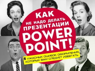
Как не надо делать презентацию (anti power point)
6 likes2,229 views

Как не надо делать презентацию (anti power point)


![SMOKE - The Convenient Truth [1st place Worlds Best Presentation Contest] by ...](https://cdn.slidesharecdn.com/ss_thumbnails/smoke-theconvenienttruth-ep-101028211434-phpapp01-thumbnail.jpg?width=560&fit=bounds)


More Related Content
Viewers also liked (20)
More from Vasiliy Bro (7)


Как не надо делать презентацию (anti power point)
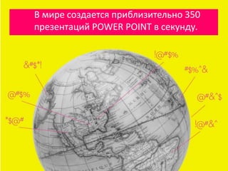
- 2. В мире создается приблизительно 350 презентаций POWER POINT в секунду.
- 3. И приблизительно 99% из них – ОТСТОЙ! Но это не POWER POINT ужасен…
- 4. это Спикеры (Вы), которым следует овладеть основными законами презентации
- 5. К СОЖАЛЕНИЮ, если презентация POWER POINT никакая, то и ваше выступление насмарку.
- 6. Давайте научимся делать презентации в POWER POINT на чужих ошибках…
- 9. НЕ ВПИХИВАЙТЕ ВСЮ ИНФОРМАЦИЮ В СЛАЙДЫ!
- 10. Если вы собрались показывать каждое слово, которое произнесете, тогда просто сядьте и листайте слайды, пусть читают!
- 11. Это вам не доклад и не отчет! ЭТО ПРЕЗЕНТАЦИЯ!
- 12. Не превращайте выступление в бессмысленный поток данных НЕ БОЛЕЕ 8 СТРОК НА 1 СЛАЙД!
- 13. Потрудитесь показать своей аудитории ТОЛЬКО САМОЕ ВАЖНОЕ!
- 15. Разные типы восприятия: Одни любят АУДИО другие ВИДЕО, ФОТО а кто-то что-то и еще …
- 16. НЕ БОЙСЯ, БЕЙ НАВЕРНЯКА! Используй все. Сделайте свой выход запоминающимся.
- 19. Используй ФОТО высокого качества и размера.
- 20. 1 Хочется его купить. Классный дизайн стоит денег. Инвестируйте в профессиональные фото и шрифты. Небольшой $$$ вклад даст вам значительные преимущества.
- 21. 2 Хочется его скопировать. Вы можете заказать практически любой хороший дизайн. Выберите любимые варианты презентаций, инфографики, сайтов, схем, разложите на части, смиксуйте, и сделайте что-то новое. Кстати, идею этой презентации я нашел в инете
- 22. ЭТИ ШРИФТЫ УЖЕ ДОВОЛЬНО СКУЧНЫЕ
- 23. В google найдется масса бесплатных и, ммм, превосходных шрифтов.
- 24. НО НЕ БОЛЕЕ 2 ШРИФТОВ во всей презентации!
- 26. Будьте внимательны к расположению и выравниванию!
- 27. Соблюдайте границы и оси. Все должно быть ровно и чисто.
- 28. Не забудьте сконвертировать презентацию в PDF. Иначе вас ожидают сюрпризы типа…
- 29. Используйте фото одного типа/серии.
- 30. И всегда придерживайтесь одной цветовой гаммы, в которой НЕ БОЛЕЕ 3х ЦВЕТОВ и максимальный контраст!
- 31. И, наконец, самая ужасная ошибка…
- 33. Большинство презентаций ужасны лишь потому, что не хватает времени их готовить.
- 34. ВЫДАЮЩАЯСЯПРЕЗЕНТАЦИЯ НА1ЧАС СТОИТПРИМЕРНО 30 ЧАСОВ ПОДГОТОВКИ. Это шокирует, я знаю!
- 35. И еще, всего 25% люди запомнят из вашего 2х-ЧАСОВОГО выступления.
- 37. ДИЗАЙН – ШТУКА ЯРКАЯ. А публика любит зрелища. Если вы не подготовились, не вините POWER POINT.
- 38. Избегайте 5 ОШИБОК: 1 ТАК МНОГО ИНФО 2 НЕХВАТКА ВИЗУАЛА 3 УЖАСНОЕ КАЧЕСТВО 4 ПЕРЕНАСЫЩЕНИЕ 5 НЕТ ПОДГОТОВКИ