Changes
Download as PPTX, PDF0 likes166 views
The document discusses and compares two magazine layouts. The first layout uses too many fonts, dull colors, unedited photos, and plain text. It lacks thought and planning. The second layout has clearer communication, edited content, thoughtfully selected colors and images, and an overall more appealing design that makes better use of layout, fonts, and background elements.
1 of 2
Download to read offline

Recommended
Contents page analysis
Contents page analysislaurenamyharriman
Ìı
This contents page uses a minimalist design with contrasting images, text, fonts, and colors to separate different sections. A central natural photo of a woman with blood on her head is intended to intrigue readers, while humorously contrasting images of men in bear onesies also draw attention. Key information like page numbers and titles are displayed in bold red text boxes to stand out from the black text organized under headings. The design emphasizes the most important visual elements to guide readers through the magazine in an accessible yet eye-catching layout.Contents construction
Contents constructionTaylerRebecca
Ìı
The document summarizes the process of designing a contents page for a magazine. It describes choosing a gray background color to avoid blank space and make the page more visually interesting. An image of a musician was selected from a photo shoot and adjusted to blend into the background without being distracting. Text elements like the title and section information were positioned according to the design plan. The title logo was modified to stand out better against the background images and colors.Contents page layout
Contents page layoutzoya167
Ìı
This document describes revisions made to a magazine contents page layout. It discusses changing the layout from a "block like and boring" format to one with rotated images and varied spacing. Images were chosen that relate to the magazine topic of a school publication. Fonts, colors, and graphics were adjusted to match the magazine cover design. Feedback was incorporated that removed unneeded text and enlarged the word "CONTENTS" for clarity. The finished layout is assessed as having better visual appeal and spacing than the original flat plan.Contents page evaluation
Contents page evaluationcansu12
Ìı
The document discusses ways to improve the design of a magazine contents page. It suggests making the page layout more unique by placing page titles and numbers in different locations. Using a mix of the author's own photos and internet images could add more variety. While bright colors grab attention, neutral tones may make the page seem more formal. Mixing italic and regular text satisfies readers with different preferences. Adding a question and answer section would increase reader interest.Contents page development
Contents page developmentrobnmbec15
Ìı
This document summarizes the development process of a contents page layout for a magazine. It describes how the designer iteratively refined the layout by [1] adding section labels and writing, [2] resizing and repositioning the cover image to make more space, and [3] filling out the article listings and fixing formatting details. The final version connects the cover image visually to its corresponding article and labels the lead interview piece prominently.Contents page analysis
Contents page analysislaurenamyharriman
Ìı
This contents page uses a minimalist design with red, black and white colors. It features a striking central image of a woman with blood on her head to draw attention. Text is kept brief and separated from images. Page numbers and some text are highlighted in red boxes to stand out. Various fonts, images, and layout techniques are used to separate different sections clearly without overcomplicating the overall simple design.Making my magazine
Making my magazineChloe Mills
Ìı
The document discusses changes made to a magazine cover design, including adding a stroke and drop shadow to the masthead to make it bolder, changing the coverline color to black with a white stroke to make it stand out, and changing colors of the masthead and text to pink to target a female audience. The main image and layout were also adjusted to have a plain background and easier to see coverlines.Contents page presentation
Contents page presentationsteviemccann
Ìı
This document summarizes the process of creating a contents page for a magazine. It describes editing a photograph to use on the page, using consistent fonts and styles to match the cover, and framing the photo with a black rectangle. It also discusses using different font sizes, colors and styles to make the contents appear busy and packed with information, as well as including a subscription box to generate profits and loyal readers. Finally, it presents an alternate simpler contents page with better edited photography.Presentation1
Presentation1TaylerRebecca
Ìı
The document discusses changes made to the layout and design of a magazine page. Key changes include stretching the title to make more of an impact, rearranging images in a horizontal line for easier viewing, adding more page numbers and increasing font size for contents, and changing the layout of contents information to a cubed design in the center of the page to fill space. An editor's note was kept at the bottom with a friendly, chatty style. A Facebook logo and extra puff were included to interact with audiences and fill blank space. The company address was added to the bottom to provide contact information and a professional touch.Contents progress
Contents progressryanrococo
Ìı
The document describes the process taken to design the contents page for a rock/pop music magazine. Key steps included:
1. Editing the background of the base photograph to feature a nebula image and overlaying blue to fit the magazine's color scheme.
2. Adding a "Contents" title in blue and white following magazine conventions.
3. Including a "Main Features" subtitle and listing main articles with photographs to emphasize them.
4. Adding the artist's name, a page number, and details about the issue's focus on upcoming female artists.
5. Creating a list of contents in blue and white to make sections accessible, matching typical magazine features and page counts.Frontcovers
FrontcoversImran_R
Ìı
The document discusses magazine cover design elements. It notes the use of bold fonts, color contrasts, positioning of images and text, font sizes and styles to draw attention and emphasize important information. Different techniques are discussed for various genres including the use of barcodes, color schemes, shots, layouts and more to make the covers eye-catching and appeal to target audiences.Construction of the double page spread
Construction of the double page spreadpriasandhu
Ìı
The document summarizes the steps taken to construct a double page magazine spread. The key points are:
The interview, title, and stand first were imported from Word. The interview was changed to a 3-column format following the rule of thirds. The title size was increased to be the focal point.
The main image was imported and tilted slightly for a "young, pop vibe." Conventions like a drop cap, bylines, and page numbers were added.
Additional elements like a pink flasher, logo, artist name, and shapes were placed to draw the eye and fill white space as informed by a reader questionnaire favoring bright colors. The final steps refined the image tilt and addedConstruction of the front cover
Construction of the front coverpriasandhu
Ìı
The document summarizes the steps taken to design the front cover of a magazine. The designer started with a main image and resized and positioned it. A masthead was added in a black font inside an outlined box on top of the image. Based on survey results indicating a preference for bright colors, a blue box was added around the masthead and the font was changed. Coverlines were added in blue and other colors to maintain consistency. Backgrounds were added to coverlines to brighten the page using orange and yellow fitting with the summer edition. A blue footer was added for pricing. More images and shapes were placed at the bottom to make it less bare as surveys indicated a preference for more images. The barcode was resized and pricingMagazine Inner Pages Research 1
Magazine Inner Pages Research 1libbydulhanty
Ìı
The masthead features the artist's name "Lady Gaga" in uppercase and lowercase letters to draw attention. The main image shows Lady Gaga in a black and white mid-shot posing seductively to engage the reader. The page has an informal design balance as the text is on one side and a large image fills the other side, balanced by a large "L" behind the text. The font is small and simple contrasting with the large bold "L" bringing focus to the artist.Nme contents
Nme contentsHolly182
Ìı
The document analyzes the design of a magazine contents page. It describes the layout as clearly organized with sections featuring quotes from stars and article descriptions. Images give direct address to create a personal feel. Larger, bold numbers make articles easy to find. While following some Gutenberg design principles with a central image and quote, it also places enticing minor images in the weak fallow area, diverging from strict use of the principles. Overall the design aims to attract readers through an informal, relatable style using realistic polaroid-like images.3rd Submission of Final Product
3rd Submission of Final ProductEliza09ec
Ìı
This document summarizes changes made to a final product submission, including making the front cover simpler with less text in a more professional layout, lightening the background of the contents page to make elements stand out more while adding subtle gradients, and lightening the background of the double page spread to make text easier to read while reducing clutter by removing some text and adding new visual elements like a larger mask shot and quote.Contents Page
Contents PageRobjjackson
Ìı
The document provides a critique of the masthead, typography, layout, and photographs used across three magazine pages. For the first page, the masthead could use a background image and the text color could be adjusted for better readability. The second page has a readable text color scheme but images that are too dark. The third page has large titles that distract from the text below and an underexposed main image, with photographs that do not complement the overall page.Final dps changes
Final dps changeslaurenmorgan
Ìı
Lauren Morgan made several changes to the design and layout of a double page spread (DPS) for a magazine based on feedback from a focus group. This included deleting some graphic features and secondary articles to reduce clutter, adding consistent page numbers and logos at the bottom of each page, and using the same font styles across pages to create a uniform brand identity and style. Images were arranged evenly on the pages and the font was changed to improve readability and complement the design changes.Drafts and analysis for magazine
Drafts and analysis for magazineasmediae12
Ìı
The double page spread features an interview with the artist Grace who is featured throughout the magazine. A large main image of Grace looks more casual to give a relaxed feel to the article. Additional smaller images related to the article have captions. The title, logo, and page number create consistency with other pages. The text is separated into columns with questions in bold to distinguish them from answers.Front Cover
Front Coverbeckythurman1995
Ìı
This document outlines the steps taken to design the front cover of a magazine. The main image was added first to position other elements around it. A shadow was added behind the image to make it stand out from the white background. Barcodes and mastheads were then included to make the cover look more professional. Issue details, headers, footers, and flashers were progressively incorporated using contrasting colors to highlight important information for readers. Cover lines and quotes were arranged around the main image and in decreasing levels of prominence to guide the eye across the finished front cover design.Question 1
Question 1Katiebannermedia
Ìı
Katie Banner's cover page uses conventions of music magazines by including a banner and skyline with information. The mid-shot image on the cover page develops codes by incorporating more background while the lack of direct eye contact from one band member challenges conventions. The contents page uses a banner but could improve spacing while developing columns and font sizes to include more images. The DPS uses related images and develops the title convention though could have benefitted from including the magazine name and website.Pod handler (12)
Pod handler (12)HarryAllinson2
Ìı
This document provides a reflection on the process of creating magazine covers and spreads for a football magazine. It describes applying background images and adjusting colors and lighting. Cutting out images and adding shadows is discussed. Various design elements like titles, headers, and lines are added. For the spreads, images are precisely placed and colors are used symbolically. Text on different topics is added to provide information and entertainment about football. Grids help organize the layout. Overall the reflection outlines the iterative process of composing visual designs and integrating images and text.Nme contents
Nme contentsasmediae15
Ìı
The document analyzes the design and layout of the contents page of a magazine issue featuring Dizzee Rascal. Key design elements discussed include the use of red, white, and black fonts and backgrounds to make headings and subheadings stand out. Photo images are also used prominently, including a central image of a blonde woman pointing to a bus related to an article about a tour. Additional design features covered are the date placement, informal writing style, and inclusion of social media promotion. The purpose of the contents page is to clearly direct readers to specific articles and sections through this intentional use of design elements that guide the eye to important information.Final Design Portfolio
Final Design Portfoliodeawou
Ìı
The document provides examples of good and bad design principles, including use of alignment, proximity, repetition, contrast, color, and embellishment/enhancement. In the bad examples, principles are not properly applied, making the designs cluttered and difficult to understand. The good examples demonstrate how properly applying design principles can make visual content more organized, readable and achieve its purpose.Photoshop progress
Photoshop progressHeather_XxooxX_
Ìı
The document discusses various edits and design changes made to improve a magazine cover and layout. Changes included making text bolder and larger, adjusting colors to stand out more, adding graphics and effects like drop shadows and white boxes to make elements bolders, changing layouts to add more content and organization, and modifying images to emphasize features like eyes and lips. The overall goal of the edits was to make various elements more noticeable, appealing and stand out to the target audience.Evaluaton question one
Evaluaton question oneLterry95
Ìı
The document discusses how the media product uses and develops conventions of real music magazines. It uses conventional magazine elements like mastheads, banners, and page numbers. However, it challenges conventions by using multiple images per page instead of just one main image, and arranging pictures of an artist over one page in a panel design not commonly seen. Overall it incorporates traditional magazine styles but also adds some unconventional and creative elements.Tv commercials
Tv commercialsescudero12345
Ìı
Commercial TV and radio is funded by private companies purchasing advertising time. Stations like ITV rely on advertising revenue to operate since they are not publicly funded. There are a range of commercial TV channels in the UK like ITV, Channel 4, Channel 5 and their digital counterparts that are each owned by different parent companies who control the advertising sold on the channels. National and local commercial stations also contain advertisements from various industries to generate revenue.Secondary Research FMP 2
Secondary Research FMP 2Deightonater
Ìı
This document summarizes the art styles of various 2D games. It discusses the pixel art style of Street Fighter II, the top-down view and varied environments of The Binding of Isaac: Rebirth and Legend of Zelda: Link to the Past. It also examines the detailed character art in King of Fighters XIII and Expendabros, as well as the use of color in character art in MegaMan 2. Finally, it analyzes the gritty, varied environments in Metal Gear and Braid and the unique locations portrayed in Marvel vs Capcom 2.
Fête du Jeu - Reims - 2013Chef de service éducatif
Ìı
J'ai organisé la première fête du jeu à Reims.
Claudia tema 2 de mateClaudiaayuso
Ìı
Este documento presenta los conceptos básicos de las operaciones con números naturales. Explica las propiedades de la suma, la resta y la multiplicación. También cubre expresiones con operaciones combinadas y la prioridad de las operaciones. Por último, proporciona enlaces a juegos y videos para practicar las operaciones con números naturales.More Related Content
What's hot (18)
Presentation1
Presentation1TaylerRebecca
Ìı
The document discusses changes made to the layout and design of a magazine page. Key changes include stretching the title to make more of an impact, rearranging images in a horizontal line for easier viewing, adding more page numbers and increasing font size for contents, and changing the layout of contents information to a cubed design in the center of the page to fill space. An editor's note was kept at the bottom with a friendly, chatty style. A Facebook logo and extra puff were included to interact with audiences and fill blank space. The company address was added to the bottom to provide contact information and a professional touch.Contents progress
Contents progressryanrococo
Ìı
The document describes the process taken to design the contents page for a rock/pop music magazine. Key steps included:
1. Editing the background of the base photograph to feature a nebula image and overlaying blue to fit the magazine's color scheme.
2. Adding a "Contents" title in blue and white following magazine conventions.
3. Including a "Main Features" subtitle and listing main articles with photographs to emphasize them.
4. Adding the artist's name, a page number, and details about the issue's focus on upcoming female artists.
5. Creating a list of contents in blue and white to make sections accessible, matching typical magazine features and page counts.Frontcovers
FrontcoversImran_R
Ìı
The document discusses magazine cover design elements. It notes the use of bold fonts, color contrasts, positioning of images and text, font sizes and styles to draw attention and emphasize important information. Different techniques are discussed for various genres including the use of barcodes, color schemes, shots, layouts and more to make the covers eye-catching and appeal to target audiences.Construction of the double page spread
Construction of the double page spreadpriasandhu
Ìı
The document summarizes the steps taken to construct a double page magazine spread. The key points are:
The interview, title, and stand first were imported from Word. The interview was changed to a 3-column format following the rule of thirds. The title size was increased to be the focal point.
The main image was imported and tilted slightly for a "young, pop vibe." Conventions like a drop cap, bylines, and page numbers were added.
Additional elements like a pink flasher, logo, artist name, and shapes were placed to draw the eye and fill white space as informed by a reader questionnaire favoring bright colors. The final steps refined the image tilt and addedConstruction of the front cover
Construction of the front coverpriasandhu
Ìı
The document summarizes the steps taken to design the front cover of a magazine. The designer started with a main image and resized and positioned it. A masthead was added in a black font inside an outlined box on top of the image. Based on survey results indicating a preference for bright colors, a blue box was added around the masthead and the font was changed. Coverlines were added in blue and other colors to maintain consistency. Backgrounds were added to coverlines to brighten the page using orange and yellow fitting with the summer edition. A blue footer was added for pricing. More images and shapes were placed at the bottom to make it less bare as surveys indicated a preference for more images. The barcode was resized and pricingMagazine Inner Pages Research 1
Magazine Inner Pages Research 1libbydulhanty
Ìı
The masthead features the artist's name "Lady Gaga" in uppercase and lowercase letters to draw attention. The main image shows Lady Gaga in a black and white mid-shot posing seductively to engage the reader. The page has an informal design balance as the text is on one side and a large image fills the other side, balanced by a large "L" behind the text. The font is small and simple contrasting with the large bold "L" bringing focus to the artist.Nme contents
Nme contentsHolly182
Ìı
The document analyzes the design of a magazine contents page. It describes the layout as clearly organized with sections featuring quotes from stars and article descriptions. Images give direct address to create a personal feel. Larger, bold numbers make articles easy to find. While following some Gutenberg design principles with a central image and quote, it also places enticing minor images in the weak fallow area, diverging from strict use of the principles. Overall the design aims to attract readers through an informal, relatable style using realistic polaroid-like images.3rd Submission of Final Product
3rd Submission of Final ProductEliza09ec
Ìı
This document summarizes changes made to a final product submission, including making the front cover simpler with less text in a more professional layout, lightening the background of the contents page to make elements stand out more while adding subtle gradients, and lightening the background of the double page spread to make text easier to read while reducing clutter by removing some text and adding new visual elements like a larger mask shot and quote.Contents Page
Contents PageRobjjackson
Ìı
The document provides a critique of the masthead, typography, layout, and photographs used across three magazine pages. For the first page, the masthead could use a background image and the text color could be adjusted for better readability. The second page has a readable text color scheme but images that are too dark. The third page has large titles that distract from the text below and an underexposed main image, with photographs that do not complement the overall page.Final dps changes
Final dps changeslaurenmorgan
Ìı
Lauren Morgan made several changes to the design and layout of a double page spread (DPS) for a magazine based on feedback from a focus group. This included deleting some graphic features and secondary articles to reduce clutter, adding consistent page numbers and logos at the bottom of each page, and using the same font styles across pages to create a uniform brand identity and style. Images were arranged evenly on the pages and the font was changed to improve readability and complement the design changes.Drafts and analysis for magazine
Drafts and analysis for magazineasmediae12
Ìı
The double page spread features an interview with the artist Grace who is featured throughout the magazine. A large main image of Grace looks more casual to give a relaxed feel to the article. Additional smaller images related to the article have captions. The title, logo, and page number create consistency with other pages. The text is separated into columns with questions in bold to distinguish them from answers.Front Cover
Front Coverbeckythurman1995
Ìı
This document outlines the steps taken to design the front cover of a magazine. The main image was added first to position other elements around it. A shadow was added behind the image to make it stand out from the white background. Barcodes and mastheads were then included to make the cover look more professional. Issue details, headers, footers, and flashers were progressively incorporated using contrasting colors to highlight important information for readers. Cover lines and quotes were arranged around the main image and in decreasing levels of prominence to guide the eye across the finished front cover design.Question 1
Question 1Katiebannermedia
Ìı
Katie Banner's cover page uses conventions of music magazines by including a banner and skyline with information. The mid-shot image on the cover page develops codes by incorporating more background while the lack of direct eye contact from one band member challenges conventions. The contents page uses a banner but could improve spacing while developing columns and font sizes to include more images. The DPS uses related images and develops the title convention though could have benefitted from including the magazine name and website.Pod handler (12)
Pod handler (12)HarryAllinson2
Ìı
This document provides a reflection on the process of creating magazine covers and spreads for a football magazine. It describes applying background images and adjusting colors and lighting. Cutting out images and adding shadows is discussed. Various design elements like titles, headers, and lines are added. For the spreads, images are precisely placed and colors are used symbolically. Text on different topics is added to provide information and entertainment about football. Grids help organize the layout. Overall the reflection outlines the iterative process of composing visual designs and integrating images and text.Nme contents
Nme contentsasmediae15
Ìı
The document analyzes the design and layout of the contents page of a magazine issue featuring Dizzee Rascal. Key design elements discussed include the use of red, white, and black fonts and backgrounds to make headings and subheadings stand out. Photo images are also used prominently, including a central image of a blonde woman pointing to a bus related to an article about a tour. Additional design features covered are the date placement, informal writing style, and inclusion of social media promotion. The purpose of the contents page is to clearly direct readers to specific articles and sections through this intentional use of design elements that guide the eye to important information.Final Design Portfolio
Final Design Portfoliodeawou
Ìı
The document provides examples of good and bad design principles, including use of alignment, proximity, repetition, contrast, color, and embellishment/enhancement. In the bad examples, principles are not properly applied, making the designs cluttered and difficult to understand. The good examples demonstrate how properly applying design principles can make visual content more organized, readable and achieve its purpose.Photoshop progress
Photoshop progressHeather_XxooxX_
Ìı
The document discusses various edits and design changes made to improve a magazine cover and layout. Changes included making text bolder and larger, adjusting colors to stand out more, adding graphics and effects like drop shadows and white boxes to make elements bolders, changing layouts to add more content and organization, and modifying images to emphasize features like eyes and lips. The overall goal of the edits was to make various elements more noticeable, appealing and stand out to the target audience.Evaluaton question one
Evaluaton question oneLterry95
Ìı
The document discusses how the media product uses and develops conventions of real music magazines. It uses conventional magazine elements like mastheads, banners, and page numbers. However, it challenges conventions by using multiple images per page instead of just one main image, and arranging pictures of an artist over one page in a panel design not commonly seen. Overall it incorporates traditional magazine styles but also adds some unconventional and creative elements.Viewers also liked (20)
Tv commercials
Tv commercialsescudero12345
Ìı
Commercial TV and radio is funded by private companies purchasing advertising time. Stations like ITV rely on advertising revenue to operate since they are not publicly funded. There are a range of commercial TV channels in the UK like ITV, Channel 4, Channel 5 and their digital counterparts that are each owned by different parent companies who control the advertising sold on the channels. National and local commercial stations also contain advertisements from various industries to generate revenue.Secondary Research FMP 2
Secondary Research FMP 2Deightonater
Ìı
This document summarizes the art styles of various 2D games. It discusses the pixel art style of Street Fighter II, the top-down view and varied environments of The Binding of Isaac: Rebirth and Legend of Zelda: Link to the Past. It also examines the detailed character art in King of Fighters XIII and Expendabros, as well as the use of color in character art in MegaMan 2. Finally, it analyzes the gritty, varied environments in Metal Gear and Braid and the unique locations portrayed in Marvel vs Capcom 2.Fête du Jeu - Reims - 2013Chef de service éducatif
Ìı
J'ai organisé la première fête du jeu à Reims.Claudia tema 2 de mateClaudiaayuso
Ìı
Este documento presenta los conceptos básicos de las operaciones con números naturales. Explica las propiedades de la suma, la resta y la multiplicación. También cubre expresiones con operaciones combinadas y la prioridad de las operaciones. Por último, proporciona enlaces a juegos y videos para practicar las operaciones con números naturales.

Ova matematicasGlopypir
Ìı
Un número decimal es aquel que se puede expresar mediante una fracción decimal y consta de dos partes: una entera y otra decimal. El documento explica cómo sumar, restar, multiplicar y dividir números decimales a través de varios ejemplos.
Los eclipsesRamiro Murillo
Ìı
Este documento describe los diferentes tipos de eclipses solares y lunares. Explica que los eclipses solares ocurren cerca de los nodos de la órbita lunar y que un eclipse total del sol ocurre en el mismo punto de la Tierra una vez cada 200-300 años. Describe las etapas de los eclipses solares y lunares como parciales, totales, anulares y penumbrales.Zana Zburatoare, Zana Balerina, Zana Fluturas - doar la Nicoro Toys!
Zana Zburatoare, Zana Balerina, Zana Fluturas - doar la Nicoro Toys!Nicoro Toys
Ìı
De Pasti, Zanele Magice te asteapta la Nicoro Toys.
Breve historia de las matemáticasbeltran10rbn
Ìı
El documento describe brevemente la historia y desarrollo de las matemáticas a través de diferentes culturas y épocas, incluyendo a los babilonios, egipcios, griegos, romanos, árabes y mayas. También discute el papel de las matemáticas en la sociedad moderna y su importancia para comprender el mundo.2010 Brochure Tnt Web
2010 Brochure Tnt WebTadBeckelman
Ìı
Generate microwave network designs in a flash. Powerful online software for saves months of design work.George Coffin, EMEA Head of Facilities at Plantronics Ltd - Retrofit of Build...
George Coffin, EMEA Head of Facilities at Plantronics Ltd - Retrofit of Build...Global Business Events
Ìı
The document outlines a 5 step plan for retrofitting existing buildings presented by George Coffin. It discusses determining the current baseline of a building, identifying why retrofitting is important for brand value, building value, sustainability and productivity. The document then covers the 3 classes of retrofit upgrades and making a retrofit project happen through securing budget and managing the retrofit process.
Entrevista de Beatriz RuizRevista Digital El Recreo. Facultad de Educación Toledo
Ìı
Nuevas experiencias en la vida escolar.
De Beatriz Ruiz Guerrero, estudiante de 1ºA Educación Infantil.2 apple pay_g_livieratos_i_square
2 apple pay_g_livieratos_i_squareAlexandra Bakalexi
Ìı
Gerasimos Livieratos is the Business Development Manager at iSquare S.A., a company that has developed a mobile wallet app. The document summarizes that while mobile wallets have long been anticipated, most previous attempts have disappointed or not been widely adopted. iSquare's mobile wallet app aims to be truly private and secure by not revealing any personal customer information to merchants, unlike traditional mobile payment methods. It uses NFC, Touch ID, and a secure element for contactless payments directly from an iPhone without disclosing names, credit card numbers, or security codes during transactions.Newspapers
Newspapersescudero12345
Ìı
The document discusses several British newspapers including The Daily Mail, The Sun, The Daily Telegraph, Daily Express, The Guardian, Daily Star, The Times, and The Independent. It provides details on their ownership, founding dates, and publication formats. It also discusses Rupert Murdoch, who owns many mass media companies around the world including expanding The Sun newspaper in the UK. Some local newspapers mentioned are the Camden New Journal and Hampstead and Highgate Express. International newspapers like The New York Times and The Guardian are also referenced.Victorian
Victorianmayaw3
Ìı
Victorian tea time consisted of expensive drinks like tea and coffee reserved for the rich. Meals had up to nine courses and included foods like cheese straws, crumpets often eaten with jam, and special dishes created for Queen Victoria like cherries jubilee. Other foods mentioned include ginger lemonade, vinegar cookies made for the poor to add flavor cheaply, and hickory nut drop cookies made from hickory nuts.
Presentación fisica Josue Espinoza
Ìı
Las rocas se clasifican en Ãgneas, metamórficas y sedimentarias. Las Ãgneas se forman a partir de magma y son intrusivas o extrusivas. Las metamórficas han sufrido cambios debido a cambios de temperatura, presión y fluidos. Las sedimentarias se forman por acumulación y sedimentación de materiales transportados. El ciclo de las rocas comienza con la generación de magma en el interior de la Tierra.
61759138 catalogo-de-productos-maxamNeyda Flores Vasquez
Ìı
Este documento presenta el catálogo de productos de una compañÃa peruana llamada CIPENSA S.A.C. que fabrica y comercializa explosivos y accesorios para minerÃa, canteras e industrias relacionadas. Incluye información sobre la variedad de explosivos, detonadores y equipos de ignición que ofrece la compañÃa, asà como detalles sobre sus oficinas, planta industrial y almacenes en Perú.
Estadisticajonathanthan12
Ìı
El director general de una empresa de café desea determinar si es conveniente abrir un nuevo negocio en una ubicación. Los datos muestran el número de tazas de café vendidas en una tienda durante 10 perÃodos de 30 dÃas cada uno. Se calculan las medidas de tendencia central (media, mediana y moda) y dispersión de los datos para analizar el potencial de ventas en la ubicación.
Edital 10 curso de nr10 - campina grandecapacitacaoufcg
Ìı
Este edital anuncia a abertura de inscrições para um curso de capacitação em NR-10 para eletricistas e
ajudantes de eletricistas da UFCG, com 30 vagas, carga horária de 80 horas e aulas quintas-feiras à tarde entre
abril e agosto. O curso tem como objetivo capacitar os servidores nos requisitos de segurança em instalações
elétricas.
Tema10esquema 140308064828-phpapp01 Valentin Valentinov Ristanov
Ìı
Este documento proporciona una lista de temas relacionados con el estudio de la lengua, incluyendo la mitologÃa china, la reseña de libros, la expresión escrita y oral, el resumen y ampliación de información, juegos de lenguaje, gramática, vocabulario y ortografÃa. El documento también menciona repasar una unidad anterior a través de un esquema.George Coffin, EMEA Head of Facilities at Plantronics Ltd - Retrofit of Build...
George Coffin, EMEA Head of Facilities at Plantronics Ltd - Retrofit of Build...Global Business Events
Ìı
More from bossmanb (8)
Double Page Layout Ideas
Double Page Layout Ideasbossmanb
Ìı
This presentation shows double page layout ideas for a publication. Several design concepts are presented that use both the left and right pages to display articles, images, and other content in an aesthetically pleasing manner. The goal is to find an effective double page spread format that optimally conveys information to readers.Masthead Progression
Masthead Progressionbossmanb
Ìı
To remove color from the font outline, I resized the layer and used the magic wand tool to select the outline area before deleting the color. I then filled the blank area with the preferred color using the paint bucket tool. This process removed the original color from the font outline and replaced it with a new color.Possible Fonts
Possible Fontsbossmanb
Ìı
We considered font designs for our newspaper masthead and gathered ideas that fit conventions. We voted on the best serif and sans-serif fonts and decided on final selections for the masthead.Front Page Possible Layouts
Front Page Possible Layoutsbossmanb
Ìı
This document discusses planning three layouts for the front page of a local newspaper. The author analyzed three existing newspapers to understand conventions for content and design. They will now use that research to produce three potential layouts for the front page of the newspaper they will be creating.Tools used presentation
Tools used presentationbossmanb
Ìı
The document summarizes the tools used to edit and design a magazine cover and contents page. It describes selecting and pasting parts of an image, using brightness/contrast tools to even out a face, adding a drop shadow to copy, airbrushing a face using selection and brush tools, changing eye color using color balance, making skin more tanned also using color balance, creating abstract lines on a contents page using a box tool, resizing fonts and using text boxes, changing font colors according to backgrounds, adding shadows, gradients and embossing to double page spreads, and using blogging and slideshare websites to post and embed project content.Audience Research Results
Audience Research Resultsbossmanb
Ìı
After distributing a questionnaire and collecting the results in Microsoft Excel, the document summarizes the findings. The most popular magazine name choice was "New Wave", surprisingly. Font 4 was shown to be the most appealing magazine masthead font, being sans serif, tall and bold. The document concludes that using the questionnaire results will help guide the creation of the magazine by indicating the preferred typefaces, title, and content to include.Audience research questionnaire
Audience research questionnairebossmanb
Ìı
The document discusses aspects of magazine branding, design, content, and distribution from the perspective of a reader. It asks the reader questions about their preferences regarding magazine titles, photography, fonts, content like celebrity photos and product advertisements. It also asks about desired frequency of magazine issues and distribution methods like email, apps, subscriptions. The goal seems to be understanding reader preferences to design an engaging magazine.Product Research
Product Researchbossmanb
Ìı
This document provides a detailed summary and analysis of the conventions and design elements used across the covers and contents pages of several music magazines. Key points include:
- Magazine covers typically feature close-up portraits of artists to capture their emotions and engage readers in their stories. Covers use symbolic imagery, color schemes, fonts and layouts to convey information about the featured artist and contents.
- Contents pages are designed for easy navigation, with page numbers, sections and artist photos organized clearly. They provide overviews of magazine contents and advertise additional online content.
- Analyses suggest target audiences based on representations of gender and styles of music featured. Magazines are aimed at both male and female readers and portray artists in non-sexualChanges
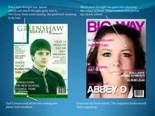
- 1. Not a very thought out layoutclearly not much thought gone into it.Too many fonts used causing the preferred meaningto be lost.Much more thought has gone into planningthe colour scheme. Tidier content and photosare clearly edited.Dull Colours and photo tint making thephoto look unedited.Even text has been edited. The magazine looks overall more appealing.
- 2. Clearer communication using descriptionsand a preview of what’s to come using images.Not much thought has gone into themaking of this page. Looks very plain and not like a contents page at all.No website or page numbers inserted,Same font used making the magazine page very dull.Background inserted making the pagemuch more appealing and also a very though out layout.