Presentation1
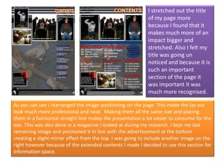
- 1. I stretched out the title of my page more because I found that it makes much more of an impact bigger and stretched. Also I felt my title was going un noticed and because it is such an important section of the page it was important it was much more recognised. As you can see I rearranged the image positioning on the page. This made the lay out look much more professional and neat. Making them all the same size and placing them in a horizontal straight line makes the presentation a lot easier to consume for the eye. This was also done in a magazine I looked at during my research. I kept my last remaining image and positioned it in line with the advertisement at the bottom creating a slight mirror effect from the top. I was going to include another image on the right however because of the extended contents I made I decided to use this section for information space.
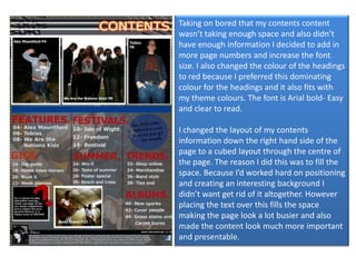
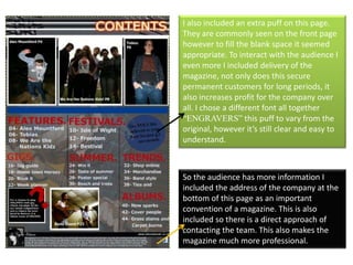
- 2. Taking on bored that my contents content wasn’t taking enough space and also didn’t have enough information I decided to add in more page numbers and increase the font size. I also changed the colour of the headings to red because I preferred this dominating colour for the headings and it also fits with my theme colours. The font is Arial bold- Easy and clear to read. I changed the layout of my contents information down the right hand side of the page to a cubed layout through the centre of the page. The reason I did this was to fill the space. Because I’d worked hard on positioning and creating an interesting background I didn’t want get rid of it altogether. However placing the text over this fills the space making the page look a lot busier and also made the content look much more important and presentable.
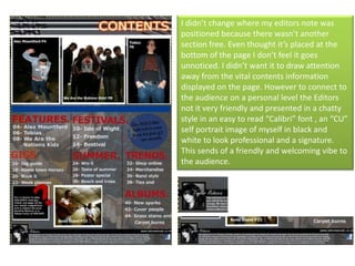
- 3. I didn’t change where my editors note was positioned because there wasn’t another section free. Even thought it’s placed at the bottom of the page I don’t feel it goes unnoticed. I didn’t want it to draw attention away from the vital contents information displayed on the page. However to connect to the audience on a personal level the Editors not it very friendly and presented in a chatty style in an easy to read “Calibri” font , an “CU” self portrait image of myself in black and white to look professional and a signature. This sends of a friendly and welcoming vibe to the audience.
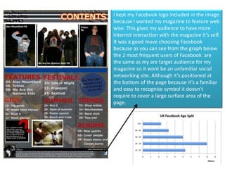
- 4. I kept my Facebook logo included in the image because I wanted my magazine to feature web wise. This gives my audience to have more intermit interaction with the magazine it’s self. It was a good move choosing Facebook because as you can see from the graph below the 2 most frequent users of Facebook are the same as my are target audience for my magazine so it wont be an unfamiliar social networking site. Although it’s positioned at the bottom of the page because it’s a familiar and easy to recognise symbol it doesn't require to cover a large surface area of the page.
- 5. I also included an extra puff on this page. They are commonly seen on the front page however to fill the blank space it seemed appropriate. To interact with the audience I even more I included delivery of the magazine, not only does this secure permanent customers for long periods, it also increases profit for the company over all. I chose a different font all together “ENGRAVERS” this puff to vary from the original, however it’s still clear and easy to understand. So the audience has more information I included the address of the company at the bottom of this page as an important convention of a magazine. This is also included so there is a direct approach of contacting the team. This also makes the magazine much more professional.