Contents flat plans
Download as PPTX, PDF1 like1,097 views
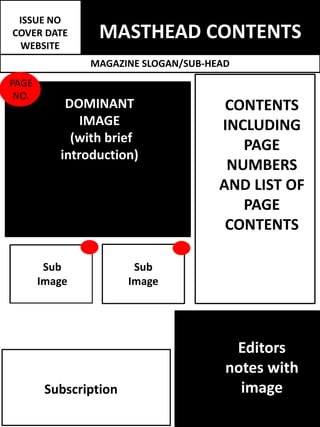
This magazine issue contains various articles and images across multiple pages. The cover features a dominant image with a brief introduction. The table of contents lists the page numbers and summaries of the articles and images contained within.
1 of 1
Download to read offline
Recommended
dps
dpszoetoase
╠²
This document appears to be a layout for a publication but contains no actual text, only placeholder labels for typical publication elements like headlines, articles in multiple columns, images, captions and more. The document provides a template for organizing content but does not include any summarizable information itself.Front cover flat pln
Front cover flat plnzoetoase
╠²
This document provides a visual layout for a banner or masthead including key elements such as a dominant image, main sell line, puff text with essential information, barcode, sub-headlines, additional sell lines paired with supporting images. The layout organizes these elements in a structured format to effectively communicate information and offers to potential customers.Colour scheme shades
Colour scheme shadeszoetoase
╠²
The document discusses the color choices for a magazine, selecting a dark yellow to stand out against black, a darker red similar to NME but against white, a bright solid white for contrast, and solid black to add mystery. The colors were added to a Photoshop color library to maintain consistency throughout the magazine.Sub genre research
Sub genre researchzoetoase
╠²
The document discusses sub-genres that could be included in a culture/lifestyle magazine for northeast England. It summarizes the sub-genres used in four existing magazines - The Crack, Luxe, Sunderland Vibe, and Cozymag. Based on the research, the key sub-genres identified are events, music, art, and fashion. The document concludes that the new magazine will include these four sub-genres, along with film. It will also have a personalized section like "Clique Life" and either a "What's North" or "Events" section. A new sub-genre like tech will also be included to make the magazine unique.Magazine genre research
Magazine genre researchzoetoase
╠²
The document discusses magazine genres and choosing a genre for a regional magazine in the North East of England. It analyzes several existing regional magazines, including music, sports, and fashion magazines. The document determines that a culture and lifestyle magazine would be the best genre since it can incorporate a wide variety of sub-genres like music, art, film and more to appeal to a broad audience. It concludes that this genre is the best fit and there appears to be a gap for a modern culture magazine aimed at younger adults in the region.Film poster drafts
Film poster draftszoetoase
╠²
The document provides instructions for creating film posters using Photoshop. It details steps taken to edit multiple images, such as cropping out backgrounds, flipping an image horizontally, and experimenting with different channel color options to achieve various color effects. The images were then aligned, centered, grouped and overlapped on a grid. Text was added and sized, choosing a font that is easy to read in all capital letters. The overall process involved preparing and combining multiple photos while editing colors and positioning the elements to create a poster.Double page spread drafts
Double page spread draftszoetoase
╠²
The document provides instructions for creating a double exposure image in Photoshop. It involves:
1. Duplicating the background layer and selecting just the background to lock it and prevent changes.
2. Smoothing the selection edges and adding a layer mask to isolate the selection as its own layer.
3. Embedding another image and using the layer mask selection to apply it to the portrait silhouette.
4. Adjusting the blending mode and opacity of the duplicate layer to blend the two images together..
.zoetoase
╠²
The document analyzes potential magazine names - "The Eye", "The Clique", and "NE Culture". For each name, strengths and weaknesses are considered from literal, visual, and audience appeal perspectives. "The Clique" is determined to be the best option, having tested positively in a social media poll of the target audience, fitting well visually on mock magazine covers, and relating well to the intended community focus of the publication. While "NE Culture" was the second choice, "The Clique" is selected as the finalized magazine name.my own institution
my own institutionzoetoase
╠²
Zoe Toase outlines conventions for naming and designing an institution logo to promote her magazine. She considers names that are short, memorable, regionally associated and reflective of her magazine's interests. After polling an audience, she decides on the name "NERP Media" which stands for "North East Regional Productions." Her logo incorporates the letters NERP in a colorful, geometric design within a rectangle and triangles to represent the institution's purpose of guiding regional media products like her magazine.Web C&C
Web C&Czoetoase
╠²
The document discusses various conventions for website design and layout. It identifies key elements such as navigation bars, grid systems, and centering main content. It also notes the importance of images, interactive elements, and ensuring content and design match the target genre and audience. Technical considerations include things like downloadable audio/video depending on the site topic. Overall the conventions aim to create an easy to use, visually appealing site tailored to its purpose..
.zoetoase
╠²
The document discusses research into the colors associated with the major cities in the North East region of England - Sunderland, Newcastle, and Durham. Sunderland is typically linked to the colors red, white, and black due to its football team. Newcastle is also associated with black and white due to its football club. Durham has links to blue due to its football team's colors and natural scenery featuring rivers, forests, and trees. After reviewing the most common colors for each city, the author considers using a blue, white, grey, and black color scheme or a red, white, grey, and black scheme for their regional magazine. They ultimately decide on a blue color scheme as it has stronger representation of the entire region and avoids using theReader research
Reader researchzoetoase
╠²
The document discusses readers profile research conducted by Zoe Toase. It defines a readers profile as a demographic analysis of a company's users developed for advertisers, or a profile created by content producers to tailor content for their audience. Zoe examines readers profiles from magazines NME, Q, and KERRANG to learn about their structure and the information provided. Based on this research, Zoe decides her own readers profile will include features like a collage of audience images, magazine price/release frequency, lifestyle facts and statistics about her target readership gathered from surveys. The profile will follow her company's color scheme and keep the design simple and straight to the point.Survey 2 results
Survey 2 resultszoetoase
╠²
The survey results showed that the target audience prefers fast food restaurants like McDonalds and Subway due to their student and low-income status. They also enjoy national restaurants like Nando's but had little interest in independent restaurants. For clothing, their favorite shops were online retailers like ASOS and Primark as well as H&M, suggesting they like variety and expression through fashion. Their top movie genres included comedy, thriller, and horror. Popular music styles included indie, rock, and rap. Favorite TV shows covered mature themes around sex, drugs, and violence.Surv 1 bill
Surv 1 billzoetoase
╠²
The survey results showed that the respondent's preferred billboards that were landscape oriented with a unique style and predominantly featured images rather than text. Specifically, over 80% preferred a landscape format. Half felt unique style was important for memorability and a third noted images were important. Based on this, the document recommends including contact details like a website or social media on the billboard, using a landscape orientation, incorporating a unique style through images and graphics, and focusing on images while including some accompanying text.surv 1 res
surv 1 reszoetoase
╠²
The survey results showed that the target audience for the magazine is fairly evenly split between males and females. Most respondents were between 18-25 years old. Based on this, the magazine will focus on topics relevant to students and young adults. Black and blue were the most popular colors chosen. The magazine will be released monthly and be free to readers based on other magazines in the region and audience preferences. The top subgenres chosen were film, technology, music, events, art, and fashion. These will be the main focus of the magazine. Images, unique designs, and detailed articles were what appealed most to readers. Events and detailed articles were the preferred article types. The magazine will highlight the local music scene, landmarks, bars,
Photoshoot image evaluation
Photoshoot image evaluationzoetoase
╠²
Zoe Toase took many photos from different angles and distances during a photoshoot since opportunities to use the studio were rare. She filtered the images, separating suitable ones from unsuitable ones. Suitable images had a variety of professional yet inviting poses from different camera angles and were all in focus. Unsuitable images were blurry, showed the model talking or moving, included studio equipment affecting lighting, or had poses that did not match the magazine's genre.Female costume ideas
Female costume ideaszoetoase
╠²
The document provides initial costume ideas for a female model, including wearing a logo t-shirt with a catchphrase to portray being young at heart, along with funky leggings or brightly colored trousers. Shoe options mentioned are Dr. Martens, Converse, or Timberlands. While layers aren't necessary, the costume shouldn't hide the model's natural body shape to fit the contemporary and quirky magazine style.Colour scheme ideas
Colour scheme ideaszoetoase
╠²
Zoe Toase discusses color scheme ideas for a website. She chooses a basic black, white, and grey scheme to keep the style contemporary and make text and models stand out. This basic scheme will be balanced by one dominant bright color. She creates a palette using black, white, red, and grey that references local teams and links to her region. Each sub-genre section will also have its own representative color palette.Model organisation
Model organisationzoetoase
╠²
The document discusses choosing models for a magazine. The author believes it is important to have multiple models to represent different audiences and add variety. They chose three models - a male friend named Adam, a female friend named Coral, and themselves. Both Adam and Coral confirmed they would participate after being sent brief messages. The author created model consent forms to provide more information and ensure the models agreed to be photographed for use in the magazine and other promotional materials.Location scout
Location scoutzoetoase
╠²
The document discusses potential locations for a photoshoot for a magazine. It considers locations like a university photo studio, churches, beaches, and art galleries.
The document settles on using the university photo studio to take pictures of models. It notes the studio will make the images look more professional. Outdoor locations could draw attention away from the models. Permission must be obtained from the studio manager.
A second location of the photographer's home is selected to photograph props and cultural items against a white wall or in flat lays. While not as advanced as the studio, the photographer aims to achieve a similar look. This location is very convenient with no travel or guests to coordinate.Regional magazine deconstruction 2
Regional magazine deconstruction 2zoetoase
╠²
The document analyzes and summarizes the cover design of the regional magazine Spark Sunderland. Key elements discussed include the masthead logo, dominant color run image, color scheme using vibrant reds and blues, main sell line of "The city in full color", and inclusion of the magazine's website as a tagline. Graphics and paint effects are used throughout the cover to tie elements together and give a creative feel relevant to the local audience. The summary highlights how the cover successfully promotes the featured event while maintaining the magazine's branding through consistent colors and styles.Mag
Magzoetoase
╠²
- The masthead uses a simple, bold font that dominates the top third of the page and easily identifies the magazine's brand.
- The dominant image features a quirky, extravagant look of model Mykki Blanco, who focuses on journalizing homosexual culture. This aligns with the magazine's "Queer" genre and shows it appeals to a wide audience.
- Sell lines are kept subtle and simplistic, listing names and bands in the bottom right corner in the smallest text, intriguing readers to learn more inside.Question 6
Question 6zoetoase
╠²
Throughout constructing products for a course, the student learned new software, hardware, and online tools. This allowed them to create a media-rich blog and ensure professional presentation. Specifically, the student used Blogger to organize and present research and final products, learning how to structure pages and embed media. They also gained experience with Photoshop, learning tools to design magazine pages and add effects like levels and blending. A variety of other online tools helped with tasks like creating presentations and surveys, adding audio/visual elements, and sharing work. Overall, the student enhanced prior skills and became more versatile with technologies through this project.Question 2
Question 2zoetoase
╠²
This document discusses how a media product represents a particular social group of 16-24 year old rock and indie music fans. It examines the representation of this group in terms of the modeling choices, clothing, hairstyles, makeup, body language, and photography techniques. Specifically, it aims to portray the stereotypes associated with this group, such as dark clothing, tattoos, piercings, and messy hair, while also challenging some stereotypes by having the model take his music seriously and not smile. The document analyzes the similarities and differences between this media product and how other magazines like Kerrang represent this target audience.Question 1 front cover
Question 1 front coverzoetoase
╠²
The document discusses how the media product uses, develops and challenges conventions of existing rock magazines. It analyzes the front cover design of KERRANG magazine and describes how various elements were used, adapted or challenged in the creation of the front cover for the student's own magazine called DEFUSED. Key elements that are discussed include the masthead, dominant image, sell lines, essential information, secondary images/posters, and a competition puff. The student aimed to both utilize proven magazine conventions while also making subtle changes to make their magazine stand out from competitors like KERRANG.
Camera shots
Camera shotszoetoase
╠²
Close up shots are commonly used in magazines like KERRANG, NME, and Rock Sound to fill small spaces, while low angle shots that make models look powerful are also frequently employed. The most typical front cover shot is a medium shot of one artist, though images of multiple artists span from medium-long shots to long shots.Mate, a short story by Kate Grenvile.pptx
Mate, a short story by Kate Grenvile.pptxLiny Jenifer
╠²
A powerpoint presentation on the short story Mate by Kate Greenville. This presentation provides information on Kate Greenville, a character list, plot summary and critical analysis of the short story.A PPT Presentation on The Princess and the God: A tale of ancient India by A...
A PPT Presentation on The Princess and the God: A tale of ancient India by A...Beena E S
╠²
A PPT Presentation on The Princess and the God: A tale of ancient India by Aaron ShepardMore Related Content
More from zoetoase (20)
my own institution
my own institutionzoetoase
╠²
Zoe Toase outlines conventions for naming and designing an institution logo to promote her magazine. She considers names that are short, memorable, regionally associated and reflective of her magazine's interests. After polling an audience, she decides on the name "NERP Media" which stands for "North East Regional Productions." Her logo incorporates the letters NERP in a colorful, geometric design within a rectangle and triangles to represent the institution's purpose of guiding regional media products like her magazine.Web C&C
Web C&Czoetoase
╠²
The document discusses various conventions for website design and layout. It identifies key elements such as navigation bars, grid systems, and centering main content. It also notes the importance of images, interactive elements, and ensuring content and design match the target genre and audience. Technical considerations include things like downloadable audio/video depending on the site topic. Overall the conventions aim to create an easy to use, visually appealing site tailored to its purpose..
.zoetoase
╠²
The document discusses research into the colors associated with the major cities in the North East region of England - Sunderland, Newcastle, and Durham. Sunderland is typically linked to the colors red, white, and black due to its football team. Newcastle is also associated with black and white due to its football club. Durham has links to blue due to its football team's colors and natural scenery featuring rivers, forests, and trees. After reviewing the most common colors for each city, the author considers using a blue, white, grey, and black color scheme or a red, white, grey, and black scheme for their regional magazine. They ultimately decide on a blue color scheme as it has stronger representation of the entire region and avoids using theReader research
Reader researchzoetoase
╠²
The document discusses readers profile research conducted by Zoe Toase. It defines a readers profile as a demographic analysis of a company's users developed for advertisers, or a profile created by content producers to tailor content for their audience. Zoe examines readers profiles from magazines NME, Q, and KERRANG to learn about their structure and the information provided. Based on this research, Zoe decides her own readers profile will include features like a collage of audience images, magazine price/release frequency, lifestyle facts and statistics about her target readership gathered from surveys. The profile will follow her company's color scheme and keep the design simple and straight to the point.Survey 2 results
Survey 2 resultszoetoase
╠²
The survey results showed that the target audience prefers fast food restaurants like McDonalds and Subway due to their student and low-income status. They also enjoy national restaurants like Nando's but had little interest in independent restaurants. For clothing, their favorite shops were online retailers like ASOS and Primark as well as H&M, suggesting they like variety and expression through fashion. Their top movie genres included comedy, thriller, and horror. Popular music styles included indie, rock, and rap. Favorite TV shows covered mature themes around sex, drugs, and violence.Surv 1 bill
Surv 1 billzoetoase
╠²
The survey results showed that the respondent's preferred billboards that were landscape oriented with a unique style and predominantly featured images rather than text. Specifically, over 80% preferred a landscape format. Half felt unique style was important for memorability and a third noted images were important. Based on this, the document recommends including contact details like a website or social media on the billboard, using a landscape orientation, incorporating a unique style through images and graphics, and focusing on images while including some accompanying text.surv 1 res
surv 1 reszoetoase
╠²
The survey results showed that the target audience for the magazine is fairly evenly split between males and females. Most respondents were between 18-25 years old. Based on this, the magazine will focus on topics relevant to students and young adults. Black and blue were the most popular colors chosen. The magazine will be released monthly and be free to readers based on other magazines in the region and audience preferences. The top subgenres chosen were film, technology, music, events, art, and fashion. These will be the main focus of the magazine. Images, unique designs, and detailed articles were what appealed most to readers. Events and detailed articles were the preferred article types. The magazine will highlight the local music scene, landmarks, bars,Photoshoot image evaluation
Photoshoot image evaluationzoetoase
╠²
Zoe Toase took many photos from different angles and distances during a photoshoot since opportunities to use the studio were rare. She filtered the images, separating suitable ones from unsuitable ones. Suitable images had a variety of professional yet inviting poses from different camera angles and were all in focus. Unsuitable images were blurry, showed the model talking or moving, included studio equipment affecting lighting, or had poses that did not match the magazine's genre.Female costume ideas
Female costume ideaszoetoase
╠²
The document provides initial costume ideas for a female model, including wearing a logo t-shirt with a catchphrase to portray being young at heart, along with funky leggings or brightly colored trousers. Shoe options mentioned are Dr. Martens, Converse, or Timberlands. While layers aren't necessary, the costume shouldn't hide the model's natural body shape to fit the contemporary and quirky magazine style.Colour scheme ideas
Colour scheme ideaszoetoase
╠²
Zoe Toase discusses color scheme ideas for a website. She chooses a basic black, white, and grey scheme to keep the style contemporary and make text and models stand out. This basic scheme will be balanced by one dominant bright color. She creates a palette using black, white, red, and grey that references local teams and links to her region. Each sub-genre section will also have its own representative color palette.Model organisation
Model organisationzoetoase
╠²
The document discusses choosing models for a magazine. The author believes it is important to have multiple models to represent different audiences and add variety. They chose three models - a male friend named Adam, a female friend named Coral, and themselves. Both Adam and Coral confirmed they would participate after being sent brief messages. The author created model consent forms to provide more information and ensure the models agreed to be photographed for use in the magazine and other promotional materials.Location scout
Location scoutzoetoase
╠²
The document discusses potential locations for a photoshoot for a magazine. It considers locations like a university photo studio, churches, beaches, and art galleries.
The document settles on using the university photo studio to take pictures of models. It notes the studio will make the images look more professional. Outdoor locations could draw attention away from the models. Permission must be obtained from the studio manager.
A second location of the photographer's home is selected to photograph props and cultural items against a white wall or in flat lays. While not as advanced as the studio, the photographer aims to achieve a similar look. This location is very convenient with no travel or guests to coordinate.Regional magazine deconstruction 2
Regional magazine deconstruction 2zoetoase
╠²
The document analyzes and summarizes the cover design of the regional magazine Spark Sunderland. Key elements discussed include the masthead logo, dominant color run image, color scheme using vibrant reds and blues, main sell line of "The city in full color", and inclusion of the magazine's website as a tagline. Graphics and paint effects are used throughout the cover to tie elements together and give a creative feel relevant to the local audience. The summary highlights how the cover successfully promotes the featured event while maintaining the magazine's branding through consistent colors and styles.Mag
Magzoetoase
╠²
- The masthead uses a simple, bold font that dominates the top third of the page and easily identifies the magazine's brand.
- The dominant image features a quirky, extravagant look of model Mykki Blanco, who focuses on journalizing homosexual culture. This aligns with the magazine's "Queer" genre and shows it appeals to a wide audience.
- Sell lines are kept subtle and simplistic, listing names and bands in the bottom right corner in the smallest text, intriguing readers to learn more inside.Question 6
Question 6zoetoase
╠²
Throughout constructing products for a course, the student learned new software, hardware, and online tools. This allowed them to create a media-rich blog and ensure professional presentation. Specifically, the student used Blogger to organize and present research and final products, learning how to structure pages and embed media. They also gained experience with Photoshop, learning tools to design magazine pages and add effects like levels and blending. A variety of other online tools helped with tasks like creating presentations and surveys, adding audio/visual elements, and sharing work. Overall, the student enhanced prior skills and became more versatile with technologies through this project.Question 2
Question 2zoetoase
╠²
This document discusses how a media product represents a particular social group of 16-24 year old rock and indie music fans. It examines the representation of this group in terms of the modeling choices, clothing, hairstyles, makeup, body language, and photography techniques. Specifically, it aims to portray the stereotypes associated with this group, such as dark clothing, tattoos, piercings, and messy hair, while also challenging some stereotypes by having the model take his music seriously and not smile. The document analyzes the similarities and differences between this media product and how other magazines like Kerrang represent this target audience.Question 1 front cover
Question 1 front coverzoetoase
╠²
The document discusses how the media product uses, develops and challenges conventions of existing rock magazines. It analyzes the front cover design of KERRANG magazine and describes how various elements were used, adapted or challenged in the creation of the front cover for the student's own magazine called DEFUSED. Key elements that are discussed include the masthead, dominant image, sell lines, essential information, secondary images/posters, and a competition puff. The student aimed to both utilize proven magazine conventions while also making subtle changes to make their magazine stand out from competitors like KERRANG.Camera shots
Camera shotszoetoase
╠²
Close up shots are commonly used in magazines like KERRANG, NME, and Rock Sound to fill small spaces, while low angle shots that make models look powerful are also frequently employed. The most typical front cover shot is a medium shot of one artist, though images of multiple artists span from medium-long shots to long shots.Recently uploaded (20)
Mate, a short story by Kate Grenvile.pptx
Mate, a short story by Kate Grenvile.pptxLiny Jenifer
╠²
A powerpoint presentation on the short story Mate by Kate Greenville. This presentation provides information on Kate Greenville, a character list, plot summary and critical analysis of the short story.A PPT Presentation on The Princess and the God: A tale of ancient India by A...
A PPT Presentation on The Princess and the God: A tale of ancient India by A...Beena E S
╠²
A PPT Presentation on The Princess and the God: A tale of ancient India by Aaron ShepardHow to Configure Restaurants in Odoo 17 Point of Sale
How to Configure Restaurants in Odoo 17 Point of SaleCeline George
╠²
Odoo, a versatile and integrated business management software, excels with its robust Point of Sale (POS) module. This guide delves into the intricacies of configuring restaurants in Odoo 17 POS, unlocking numerous possibilities for streamlined operations and enhanced customer experiences.How to attach file using upload button Odoo 18
How to attach file using upload button Odoo 18Celine George
╠²
In this slide, weŌĆÖll discuss on how to attach file using upload button Odoo 18. Odoo features a dedicated model, 'ir.attachments,' designed for storing attachments submitted by end users. We can see the process of utilizing the 'ir.attachments' model to enable file uploads through web forms in this slide.Rass MELAI : an Internet MELA Quiz Prelims - El Dorado 2025
Rass MELAI : an Internet MELA Quiz Prelims - El Dorado 2025Conquiztadors- the Quiz Society of Sri Venkateswara College
╠²
Prelims of Rass MELAI : a Music, Entertainment, Literature, Arts and Internet Culture Quiz organized by Conquiztadors, the Quiz society of Sri Venkateswara College under their annual quizzing fest El Dorado 2025. How to Configure Flexible Working Schedule in Odoo 18 Employee
How to Configure Flexible Working Schedule in Odoo 18 EmployeeCeline George
╠²
In this slide, weŌĆÖll discuss on how to configure flexible working schedule in Odoo 18 Employee module. In Odoo 18, the Employee module offers powerful tools to configure and manage flexible working schedules tailored to your organization's needs.How to use Init Hooks in Odoo 18 - Odoo ║▌║▌▀Żs
How to use Init Hooks in Odoo 18 - Odoo ║▌║▌▀ŻsCeline George
╠²
In this slide, weŌĆÖll discuss on how to use Init Hooks in Odoo 18. In Odoo, Init Hooks are essential functions specified as strings in the __init__ file of a module.Digital Tools with AI for e-Content Development.pptx
Digital Tools with AI for e-Content Development.pptxDr. Sarita Anand
╠²
This ppt is useful for not only for B.Ed., M.Ed., M.A. (Education) or any other PG level students or Ph.D. scholars but also for the school, college and university teachers who are interested to prepare an e-content with AI for their students and others.How to Modify Existing Web Pages in Odoo 18
How to Modify Existing Web Pages in Odoo 18Celine George
╠²
In this slide, weŌĆÖll discuss on how to modify existing web pages in Odoo 18. Web pages in Odoo 18 can also gather user data through user-friendly forms, encourage interaction through engaging features. Kaun TALHA quiz Finals -- El Dorado 2025
Kaun TALHA quiz Finals -- El Dorado 2025Conquiztadors- the Quiz Society of Sri Venkateswara College
╠²
Finals of Kaun TALHA : a Travel, Architecture, Lifestyle, Heritage and Activism quiz, organized by Conquiztadors, the Quiz society of Sri Venkateswara College under their annual quizzing fest El Dorado 2025. Adventure Activities Final By H R Gohil Sir
Adventure Activities Final By H R Gohil SirGUJARATCOMMERCECOLLE
╠²
Adventure Activities Final By H R Gohil SirRass MELAI : an Internet MELA Quiz Finals - El Dorado 2025
Rass MELAI : an Internet MELA Quiz Finals - El Dorado 2025Conquiztadors- the Quiz Society of Sri Venkateswara College
╠²
Finals of Rass MELAI : a Music, Entertainment, Literature, Arts and Internet Culture Quiz organized by Conquiztadors, the Quiz society of Sri Venkateswara College under their annual quizzing fest El Dorado 2025. POWERPOINT-PRESENTATION_DM-NO.017-S.2025.pptx
POWERPOINT-PRESENTATION_DM-NO.017-S.2025.pptxMarilenQuintoSimbula
╠²
Rubric level Summary for Teacher 1 to 3, Proficient Teacher. Guide in assessing MOV presented.Database population in Odoo 18 - Odoo slides
Database population in Odoo 18 - Odoo slidesCeline George
╠²
In this slide, weŌĆÖll discuss the database population in Odoo 18. In Odoo, performance analysis of the source code is more important. Database population is one of the methods used to analyze the performance of our code. APM People Interest Network Conference - Oliver Randall & David Bovis - Own Y...
APM People Interest Network Conference - Oliver Randall & David Bovis - Own Y...Association for Project Management
╠²
APM People Interest Network Conference 2025
- Autonomy, Teams and Tension
- Oliver Randall & David Bovis
- Own Your Autonomy
Oliver Randall
Consultant, Tribe365
Oliver is a career project professional since 2011 and started volunteering with APM in 2016 and has since chaired the People Interest Network and the North East Regional Network. Oliver has been consulting in culture, leadership and behaviours since 2019 and co-developed HPTM┬«ŌĆ»an off the shelf high performance framework for teams and organisations and is currently working with SAS (Stellenbosch Academy for Sport) developing the culture, leadership and behaviours framework for future elite sportspeople whilst also holding down work as a project manager in the NHS at North Tees and Hartlepool Foundation Trust.
David Bovis
Consultant, Duxinaroe
A Leadership and Culture Change expert, David is the originator of BTFAŌäó and The Dux Model.
With a Masters in Applied Neuroscience from the Institute of Organisational Neuroscience, he is widely regarded as the ŌĆśGo-ToŌĆÖ expert in the field, recognised as an inspiring keynote speaker and change strategist.
He has an industrial engineering background, majoring in TPS / Lean. David worked his way up from his apprenticeship to earn his seat at the C-suite table. His career spans several industries, including Automotive, Aerospace, Defence, Space, Heavy Industries and Elec-Mech / polymer contract manufacture.
Published in LondonŌĆÖs Evening Standard quarterly business supplement, James CaanŌĆÖs ŌĆśYour businessŌĆÖ Magazine, ŌĆśQuality WorldŌĆÖ, the Lean Management Journal and Cambridge Universities ŌĆśPMAŌĆÖ, he works as comfortably with leaders from FTSE and Fortune 100 companies as he does owner-managers in SMEŌĆÖs. He is passionate about helping leaders understand the neurological root cause of a high-performance culture and sustainable change, in business.
Session | Own Your Autonomy ŌĆō The Importance of Autonomy in Project Management
#OwnYourAutonomy is aiming to be a global APM initiative to position everyone to take a more conscious role in their decision making process leading to increased outcomes for everyone and contribute to ŌĆ£a world in which all projects succeedŌĆØ.
We want everyone to join the journey.
#OwnYourAutonomy is the culmination of 3 years of collaborative exploration within the Leadership Focus Group which is part of the APM People Interest Network. The work has been pulled together using the 5 HPTM® Systems and the BTFA neuroscience leadership programme.
https://www.linkedin.com/showcase/apm-people-network/about/SOCIAL CHANGE(a change in the institutional and normative structure of societ...
SOCIAL CHANGE(a change in the institutional and normative structure of societ...DrNidhiAgarwal
╠²
This PPT is showing the effect of social changes in human life and it is very understandable to the students with easy language.in this contents are Itroduction, definition,Factors affecting social changes ,Main technological factors, Social change and stress , what is eustress and how social changes give impact of the human's life.Eng7-Q4-Lesson 1 Part 1 Understanding Discipline-Specific Words, Voice, and T...
Eng7-Q4-Lesson 1 Part 1 Understanding Discipline-Specific Words, Voice, and T...sandynavergas1
╠²
Understanding Discipline-Specific Words, Voice, and Technical TermsEssentials of a Good PMO, presented by Aalok Sonawala
Essentials of a Good PMO, presented by Aalok SonawalaAssociation for Project Management
╠²
APM event hosted by the South Wales and West of England Network (SWWE Network)
Speaker: Aalok Sonawala
The SWWE Regional Network were very pleased to welcome Aalok Sonawala, Head of PMO, National Programmes, Rider Levett Bucknall on 26 February, to BAWA for our first face to face event of 2025. Aalok is a member of APMŌĆÖs Thames Valley Regional Network and also speaks to members of APMŌĆÖs PMO Interest Network, which aims to facilitate collaboration and learning, offer unbiased advice and guidance.
Tonight, Aalok planned to discuss the importance of a PMO within project-based organisations, the different types of PMO and their key elements, PMO governance and centres of excellence.
PMOŌĆÖs within an organisation can be centralised, hub and spoke with a central PMO with satellite PMOs globally, or embedded within projects. The appropriate structure will be determined by the specific business needs of the organisation. The PMO sits above PM delivery and the supply chain delivery teams.
For further information about the event please click here.

Rass MELAI : an Internet MELA Quiz Prelims - El Dorado 2025
Rass MELAI : an Internet MELA Quiz Prelims - El Dorado 2025Conquiztadors- the Quiz Society of Sri Venkateswara College
╠²
Kaun TALHA quiz Finals -- El Dorado 2025
Kaun TALHA quiz Finals -- El Dorado 2025Conquiztadors- the Quiz Society of Sri Venkateswara College
╠²
Rass MELAI : an Internet MELA Quiz Finals - El Dorado 2025
Rass MELAI : an Internet MELA Quiz Finals - El Dorado 2025Conquiztadors- the Quiz Society of Sri Venkateswara College
╠²
APM People Interest Network Conference - Oliver Randall & David Bovis - Own Y...
APM People Interest Network Conference - Oliver Randall & David Bovis - Own Y...Association for Project Management
╠²
Contents flat plans
- 1. MASTHEAD CONTENTS ISSUE NO COVER DATE WEBSITE MAGAZINE SLOGAN/SUB-HEAD CONTENTS INCLUDING PAGE NUMBERS AND LIST OF PAGE CONTENTS DOMINANT IMAGE (with brief introduction) PAGE NO. Sub Image Sub Image Subscription Editors notes with image