Font styles
Download as DOCX, PDF0 likes746 views

This document discusses font styles that could be used for a magazine targeted towards girls. It lists initial font options like Melody-Blackadder ITC and Melody-Edwardian Script ITC. The author notes they will only use certain fonts in certain sections. Additional fonts are suggested like "Candy girls â black kids" that are more appealing while keeping readability in mind. The author's favorite is "black kids" as it is girly yet edgy. They decide not to use "Clementine sketch" as it is hard to read. "Juice" is selected for the front cover as it is edgy in an appealing way.
1 of 2
Download to read offline
Recommended
As level coursework
As level courseworkdannyrobinson1998
Ėý
The document summarizes how the author's indie magazine challenges conventions of real magazines. It uses conventions like mastheads, cover lines, and model poses but challenges conventions with things like longer mastheads, additional images, and no side features bar. The author took influences from magazines like VMAN and Q but adapted designs and layouts to better suit an indie magazine genre and younger audience.Media Blog Presentation
Media Blog PresentationJack Parsons
Ėý
My magazine uses standard magazine layout conventions such as a large masthead at the top of the page, consistent colors throughout, and a strict column-based layout. However, it also challenges some conventions by not covering the masthead with a model and having the front cover model look away instead of directly at the reader. The magazine aims to match a "rough, 'against the rules' theme" through fonts, photography, and occasional breaks from the guidelines.Quastion 1
Quastion 1georginamanton
Ėý
My magazine uses conventions from other magazines in its genre, such as sans-serif fonts and different fonts around the cover to seem contemporary. It keeps the cover layout simple and eye-catching like Q magazine. However, it differs from magazines in other genres which use soft colors and serif fonts for mature audiences and more writing on the cover for sophisticated readers. The double page spread imitates NME's layout of a full page picture with different fonts to make it more interesting.Media question 1 
Media question 1 iramd
Ėý
The document discusses how the media product, a magazine, uses and develops conventions of real magazines. It summarizes how different elements of the magazine, such as the title font and style, images, and written content, follow conventions of R&B/Hip-Hop magazines like VIBE and XXL. Some aspects challenge conventions, such as not including a background on the masthead and featuring only women throughout instead of a mix of men and women. Overall, the magazine aims to look sophisticated while still representing the R&B and Hip-Hop genre through conventions used in real magazines.Critical reflection
Critical reflectionNeha Saleem
Ėý
Neha Saleem created a fashion magazine called "Uptown" that both follows and challenges conventions of the genre. She followed conventions like featuring a model on the cover wearing a designer's clothing and including the magazine's name, issue date, and barcode. However, she broke conventions by using a textured background on the cover instead of the outdoor location and a black and white background on the double spread page. The magazine targets teenagers to middle aged people across Asia with English content and affordable pricing for print and eventual online distribution. Through this project, Neha developed skills in magazine design, photography, and use of software like Photoshop and presentation tools.Manga To Me
Manga To Memojankarimi124
Ėý
The document discusses the author's interest in manga and their personal collection. It notes that there are manga for different tastes, from girly to more daring genres, and that collections can start small but grow quite large over time. While the author did not generally enjoy reading, they found manga very entertaining and developed favorite authors. The document encourages readers not to be pessimistic about manga based on age ratings and recommends giving it a try before judging.Media question 1
Media question 1gchristie10
Ėý
The magazine title "SCRIPTED" was chosen to be catchy and memorable while also relating to music. The page layout is simple, clear, and easy to read with the title in the same place on each page. Photographs feature a model wearing indie-style clothing in a relaxed pose. Pictures are taken with a mid-shot straight-on angle to show both clothing and face. A simple, clear font is used to look good while remaining easy to read.Categories of fonts
Categories of fontsSally Garza
Ėý
The document categorizes and defines six main font styles: Oldstyle, Modern, Slab Serif, Sans Serif, Script, and Decorative. It provides examples for each category and defines their key characteristics, such as Oldstyle fonts having slanted serifs and medium thick-thin transitions, making them good for body text. Modern fonts have thin, flat serifs and dramatic thick-thin transitions, making them suitable for headlines. The document instructs students to find examples of five fonts for each of the six categories.Font Analysis
Font AnalysisStephanieAlabi
Ėý
The document discusses four fonts - Trench, Castellar, All Ages, and CF Cracked - that could be used for the masthead of an indie rock magazine. The author chooses the All Ages font because it reflects the dark indie rock genre and will attract their target audience. They reject Trench for being too basic, Castellar for being too sophisticated, and CF Cracked for not looking like a typical magazine masthead font.Font and Colour
Font and ColourEmmaBuckleyASMedia
Ėý
Choices within my magazine regarding masthead, font and colour, and why I have chosen them, including self-assessment and audience feedback.From Castellar
From CastellarECT
Ėý
This document provides an overview of Castellar del VallÃĻs, a village in Catalonia, Spain. It describes the location and climate of Catalonia. It then discusses some key facts about Castellar del VallÃĻs, including that it has a population of 20,600, is near the city of Sabadell, and has a history dating back to 7000 BC. It also briefly introduces the local primary school, CEIP Emili Carles-Tolrà , noting that it has 264 students and 16 teachers.Type
TypeMelanie Lavoie
Ėý
This document provides an overview of typography and font design. It discusses different font categories including serif, sans serif, script, decorative, and modern. It describes font elements such as typeface, glyph, and kerning. It provides tips for choosing fonts for different purposes and platforms. The document also discusses logo design principles such as simplicity, scalability, and readability in different color modes.Font type research
Font type researchSamantha Elliott
Ėý
The document discusses font type research for a music magazine focused on the rock/metal genre. It explores various font options and their connotations, including "Broken glass 74" which is chosen for its bold, loud, and shattered style that highlights the reckless nature of the genre. Experimentations with different fonts are described as aiming to create memorable magazine designs through vibrant colors and distinctive typography that capture the feel of the music.Typography
Typographymjones27
Ėý
This document provides a history of typography from print to digital formats. It discusses the origins of typography in print, with Johannes Gutenberg creating the first metal movable type in the 15th century. Modernist typographers in the early 20th century experimented with size, spacing and design to encourage new values. Digital typography later borrowed from print typefaces but also allowed new possibilities with layout and multimedia. The development shows typography must relate to its functional purpose and reading environment in each era.Masthead designs
Masthead designsnicolanightingale
Ėý
Nicola Nightingale is choosing a font and masthead for her magazine targeted at young girls. She considers 9 different font options, commenting on whether each font would appeal to her target audience and be bold enough for a magazine cover. Her favorite option is the "Blenda Script" font because it is bold and joins up the lettering in a way that would appeal to young girls.Q5.How did you attract/address your audience?
Q5.How did you attract/address your audience?lavanaraza
Ėý
The document discusses font, color, picture, and language choices for a magazine focused on indie music. For fonts, a bold script style was used to fit the genre. The main colors are black, white, and red to match other magazines in the genre. Pictures of two models in a natural setting were used for the double page spread to attract both male and female readers. The language is informal but not slang to appeal to the target 16-25 age range.Colour pallets and fonts x10
Colour pallets and fonts x10Phoebe Williams
Ėý
The document discusses color palettes and fonts for a new magazine. It focuses on a feminine, relaxing feel aimed at teenage girls. The author's favorite color palettes are 2 and 3, as they complement the magazine's style and can be combined in photos. These colors also match what female country artists wear. The author has researched natural colors from flowers and coasts to create a calm atmosphere. Regarding fonts, the author selects Angelface as the favorite as it looks feminine and matches the target market. The Impact Label font also fits the retro, modern vintage style. Hoedown will be used within articles to incorporate the country music genre. Some other fonts are deemed difficult to read or not feminine enough for the magazine.Mastheads and analysis
Mastheads and analysisCardinal Newman Catholic School
Ėý
This document discusses different font options for the masthead of a music magazine focused on the indie genre. Five initial masthead options are presented along with peer feedback. Masthead 4 receives the most positive feedback for fitting the indie style and looking simplistic. While Masthead 5 is also liked, it is deemed too simplistic. In the end, a simple masthead with a large capital 'N' is selected to represent the magazine's name and look professional while aligning with the indie genre.Potential models media
Potential models medialeahdouglas98
Ėý
The document considers potential models for a magazine focused on indie rock music. It evaluates Bethan, Felan, Emma, Chandler, and Jess. Bethan is described as versatile, willing to take directions, and confident in front of the camera. Felan has a scruffy look and style that fits the genre. Emma resembles a member of the band Haim but is quite shy. Chandler is confident and could help explore the genre's presentation through her long hair. Jess resembles the cover of NME and has a pale complexion and dark eyebrows like many indie rock artists.Stylesheets
StylesheetsTonishaMedia
Ėý
The document discusses planning the stylesheets for a new magazine, including:
1) Choosing a gender-neutral color scheme of red, white, and black to appeal to a wide audience.
2) Selecting the font "Demo" for the masthead as it closely relates to the magazine's goal of discussing new music.
3) Experimenting with different masthead colors and choosing red as it stands out and has passionate connotations fitting the magazine's theme.Font ideas for masthead
Font ideas for mastheadmollieafh
Ėý
The document considers different font options for a magazine masthead and shares audience feedback on each option. The top choices were Castellar, which was praised for its boldness and balance, and Magneto, which most audience members felt was the most eye-catching. The least favored was Trajan Pro, deemed too formal. Overall, Magneto was identified as the best choice to catch readers' attention on the magazine's front cover.Q5 evaluation
Q5 evaluationelle_gray
Ėý
The document discusses how the author addressed and attracted their target audience for their pop music magazine. They used bright colors and simple layouts to make the magazine appealing. Photographs were brightly lit and unobscured to bring a clear, refreshing image. Content about popular music and celebrities would interest readers who love music. Language was written colloquially to be easy to read and relate to for teenage girls. A mixture of fonts gave the magazine a modern look. The model was the same age as readers to inspire them.Stylesheets
StylesheetsTonishaMedia
Ėý
The document discusses planning the stylesheets for a magazine, including:
1) Choosing a gender-neutral color scheme of red, white, and black to appeal to a wide audience.
2) Brainstorming masthead ideas and selecting "Demo" as it closely relates to discussing new music releases.
3) Choosing a bold yet youthful, readable font for the masthead that reflects the simple design.
4) Experimenting with different masthead colors and deciding on red as it stands out and has passionate connotations.
5) Testing body text fonts to be simple but interesting for younger readers.
6) Choosing fonts for cover lines, subheadings and ensuring theyMasthead Evaluation
Masthead EvaluationKatyMarwood
Ėý
The author has chosen the title "Encounter" for their indie rock magazine because it suggests unexpected musical discoveries. They selected fonts like "Edo SZ" and "Whisky Lickers" that reflect the genre. After evaluating different styles, "Edo SZ" stood out as clear, readable, and fitting for the magazine's masthead. The author will design the final masthead using "Edo SZ" in Photoshop to represent their new indie publication.Magazine design
Magazine designVicki_Media
Ėý
The document discusses plans for an indie pop magazine called "IndiePop!". It will target teenagers aged 14-18 and cost ÂĢ1.60 per weekly issue. The style will use dark colors and photos from concerts. Fonts from dafont.com will be used, including a sans serif font for the masthead to make it stand out. Example articles will be in the style of magazines like NME, Q and Spin. Photos of concerts, photo shoots and casual images from social media will also be featured. Popular indie and pop artists like Imagine Dragons, Coldplay, Katy Perry and Taylor Swift will be covered.Ideas for camera
Ideas for cameraCharliee Green
Ėý
The document provides details on camera techniques, sound design, lighting, props, costumes, hair, and makeup for a horror film project. It discusses using close-up shots to show emotion and tension, as well as long shots to establish characters and locations. Non-diegetic sounds like nursery rhymes with stabs are suggested to create fear. Low-key lighting, back lighting, and under lighting are lighting techniques that will be used to generate shadows and silhouettes. Common props for possession films include children's toys and antique objects. Costumes start clean and get dirty as possession takes hold. Hair should look sweaty and tangled to indicate distress. Makeup will age the mother and make the children look pale andFilm magazine poster over view pics
Film magazine poster over view picsCharliee Green
Ėý
This document analyzes the conventions used on the front covers of six film magazines. All six magazines feature a large main image of the film's main character to attract viewers' attention. Three magazines include a "puff" or highlighted text area to promote prizes or content. The magazine titles are prominently displayed at the top to identify the brand. Four magazines contain "sell lines" to tease the content without revealing too much. Banners are used on four covers to feature additional images or information in an uncluttered way. Features vary between magazines but work together to create an appealing brand identity and attract readers.Presentation1
Presentation1Charliee Green
Ėý
The document discusses conventions used in horror film posters, magazines, and trailers. Horror film posters typically feature the main villain or possessed character prominently and place institutional information like the film title at the bottom. Horror magazines commonly use multiple dramatic images on the cover and include little information about the magazine's contents. Horror trailers employ techniques like establishing equilibrium with a happy scene before inserting fear, using fast-paced montages set to heightening music, and ending with a frightening sting to effectively scare audiences.Ideas for film name
Ideas for film nameCharliee Green
Ėý
This document discusses ideas for a film name, tagline, and film magazine name that were generated and tested with target audiences. For the film name, the favorite among Facebook users was "The Chosen One." For the tagline, the initial favorite from a questionnaire was "She told me too" but it was later changed to "Ribbon Ribbon brightest blue.. Is it too late for your family too." For the film magazine name, the options were narrowed to "Cinemix," "cinematic," and "blockbusters." Focus group testing indicated "Cinemix" was the preferred choice.Trailer, poster and film magazine ideas
Trailer, poster and film magazine ideasCharliee Green
Ėý
The document provides ideas for the layout of a film magazine cover and poster. For the magazine cover, it suggests using conventional magazine elements like a puff and sell lines, with an overlapping film image that grabs attention. The bulk of the text would cover the image. For the poster, it proposes centering the main character actresses and placing key information like the film name, tagline, date and institutional details at the top or bottom to focus on the image without revealing too much of the story.More Related Content
Viewers also liked (6)
Font Analysis
Font AnalysisStephanieAlabi
Ėý
The document discusses four fonts - Trench, Castellar, All Ages, and CF Cracked - that could be used for the masthead of an indie rock magazine. The author chooses the All Ages font because it reflects the dark indie rock genre and will attract their target audience. They reject Trench for being too basic, Castellar for being too sophisticated, and CF Cracked for not looking like a typical magazine masthead font.Font and Colour
Font and ColourEmmaBuckleyASMedia
Ėý
Choices within my magazine regarding masthead, font and colour, and why I have chosen them, including self-assessment and audience feedback.From Castellar
From CastellarECT
Ėý
This document provides an overview of Castellar del VallÃĻs, a village in Catalonia, Spain. It describes the location and climate of Catalonia. It then discusses some key facts about Castellar del VallÃĻs, including that it has a population of 20,600, is near the city of Sabadell, and has a history dating back to 7000 BC. It also briefly introduces the local primary school, CEIP Emili Carles-Tolrà , noting that it has 264 students and 16 teachers.Type
TypeMelanie Lavoie
Ėý
This document provides an overview of typography and font design. It discusses different font categories including serif, sans serif, script, decorative, and modern. It describes font elements such as typeface, glyph, and kerning. It provides tips for choosing fonts for different purposes and platforms. The document also discusses logo design principles such as simplicity, scalability, and readability in different color modes.Font type research
Font type researchSamantha Elliott
Ėý
The document discusses font type research for a music magazine focused on the rock/metal genre. It explores various font options and their connotations, including "Broken glass 74" which is chosen for its bold, loud, and shattered style that highlights the reckless nature of the genre. Experimentations with different fonts are described as aiming to create memorable magazine designs through vibrant colors and distinctive typography that capture the feel of the music.Typography
Typographymjones27
Ėý
This document provides a history of typography from print to digital formats. It discusses the origins of typography in print, with Johannes Gutenberg creating the first metal movable type in the 15th century. Modernist typographers in the early 20th century experimented with size, spacing and design to encourage new values. Digital typography later borrowed from print typefaces but also allowed new possibilities with layout and multimedia. The development shows typography must relate to its functional purpose and reading environment in each era.Similar to Font styles (11)
Masthead designs
Masthead designsnicolanightingale
Ėý
Nicola Nightingale is choosing a font and masthead for her magazine targeted at young girls. She considers 9 different font options, commenting on whether each font would appeal to her target audience and be bold enough for a magazine cover. Her favorite option is the "Blenda Script" font because it is bold and joins up the lettering in a way that would appeal to young girls.Q5.How did you attract/address your audience?
Q5.How did you attract/address your audience?lavanaraza
Ėý
The document discusses font, color, picture, and language choices for a magazine focused on indie music. For fonts, a bold script style was used to fit the genre. The main colors are black, white, and red to match other magazines in the genre. Pictures of two models in a natural setting were used for the double page spread to attract both male and female readers. The language is informal but not slang to appeal to the target 16-25 age range.Colour pallets and fonts x10
Colour pallets and fonts x10Phoebe Williams
Ėý
The document discusses color palettes and fonts for a new magazine. It focuses on a feminine, relaxing feel aimed at teenage girls. The author's favorite color palettes are 2 and 3, as they complement the magazine's style and can be combined in photos. These colors also match what female country artists wear. The author has researched natural colors from flowers and coasts to create a calm atmosphere. Regarding fonts, the author selects Angelface as the favorite as it looks feminine and matches the target market. The Impact Label font also fits the retro, modern vintage style. Hoedown will be used within articles to incorporate the country music genre. Some other fonts are deemed difficult to read or not feminine enough for the magazine.Mastheads and analysis
Mastheads and analysisCardinal Newman Catholic School
Ėý
This document discusses different font options for the masthead of a music magazine focused on the indie genre. Five initial masthead options are presented along with peer feedback. Masthead 4 receives the most positive feedback for fitting the indie style and looking simplistic. While Masthead 5 is also liked, it is deemed too simplistic. In the end, a simple masthead with a large capital 'N' is selected to represent the magazine's name and look professional while aligning with the indie genre.Potential models media
Potential models medialeahdouglas98
Ėý
The document considers potential models for a magazine focused on indie rock music. It evaluates Bethan, Felan, Emma, Chandler, and Jess. Bethan is described as versatile, willing to take directions, and confident in front of the camera. Felan has a scruffy look and style that fits the genre. Emma resembles a member of the band Haim but is quite shy. Chandler is confident and could help explore the genre's presentation through her long hair. Jess resembles the cover of NME and has a pale complexion and dark eyebrows like many indie rock artists.Stylesheets
StylesheetsTonishaMedia
Ėý
The document discusses planning the stylesheets for a new magazine, including:
1) Choosing a gender-neutral color scheme of red, white, and black to appeal to a wide audience.
2) Selecting the font "Demo" for the masthead as it closely relates to the magazine's goal of discussing new music.
3) Experimenting with different masthead colors and choosing red as it stands out and has passionate connotations fitting the magazine's theme.Font ideas for masthead
Font ideas for mastheadmollieafh
Ėý
The document considers different font options for a magazine masthead and shares audience feedback on each option. The top choices were Castellar, which was praised for its boldness and balance, and Magneto, which most audience members felt was the most eye-catching. The least favored was Trajan Pro, deemed too formal. Overall, Magneto was identified as the best choice to catch readers' attention on the magazine's front cover.Q5 evaluation
Q5 evaluationelle_gray
Ėý
The document discusses how the author addressed and attracted their target audience for their pop music magazine. They used bright colors and simple layouts to make the magazine appealing. Photographs were brightly lit and unobscured to bring a clear, refreshing image. Content about popular music and celebrities would interest readers who love music. Language was written colloquially to be easy to read and relate to for teenage girls. A mixture of fonts gave the magazine a modern look. The model was the same age as readers to inspire them.Stylesheets
StylesheetsTonishaMedia
Ėý
The document discusses planning the stylesheets for a magazine, including:
1) Choosing a gender-neutral color scheme of red, white, and black to appeal to a wide audience.
2) Brainstorming masthead ideas and selecting "Demo" as it closely relates to discussing new music releases.
3) Choosing a bold yet youthful, readable font for the masthead that reflects the simple design.
4) Experimenting with different masthead colors and deciding on red as it stands out and has passionate connotations.
5) Testing body text fonts to be simple but interesting for younger readers.
6) Choosing fonts for cover lines, subheadings and ensuring theyMasthead Evaluation
Masthead EvaluationKatyMarwood
Ėý
The author has chosen the title "Encounter" for their indie rock magazine because it suggests unexpected musical discoveries. They selected fonts like "Edo SZ" and "Whisky Lickers" that reflect the genre. After evaluating different styles, "Edo SZ" stood out as clear, readable, and fitting for the magazine's masthead. The author will design the final masthead using "Edo SZ" in Photoshop to represent their new indie publication.Magazine design
Magazine designVicki_Media
Ėý
The document discusses plans for an indie pop magazine called "IndiePop!". It will target teenagers aged 14-18 and cost ÂĢ1.60 per weekly issue. The style will use dark colors and photos from concerts. Fonts from dafont.com will be used, including a sans serif font for the masthead to make it stand out. Example articles will be in the style of magazines like NME, Q and Spin. Photos of concerts, photo shoots and casual images from social media will also be featured. Popular indie and pop artists like Imagine Dragons, Coldplay, Katy Perry and Taylor Swift will be covered.More from Charliee Green (20)
Ideas for camera
Ideas for cameraCharliee Green
Ėý
The document provides details on camera techniques, sound design, lighting, props, costumes, hair, and makeup for a horror film project. It discusses using close-up shots to show emotion and tension, as well as long shots to establish characters and locations. Non-diegetic sounds like nursery rhymes with stabs are suggested to create fear. Low-key lighting, back lighting, and under lighting are lighting techniques that will be used to generate shadows and silhouettes. Common props for possession films include children's toys and antique objects. Costumes start clean and get dirty as possession takes hold. Hair should look sweaty and tangled to indicate distress. Makeup will age the mother and make the children look pale andFilm magazine poster over view pics
Film magazine poster over view picsCharliee Green
Ėý
This document analyzes the conventions used on the front covers of six film magazines. All six magazines feature a large main image of the film's main character to attract viewers' attention. Three magazines include a "puff" or highlighted text area to promote prizes or content. The magazine titles are prominently displayed at the top to identify the brand. Four magazines contain "sell lines" to tease the content without revealing too much. Banners are used on four covers to feature additional images or information in an uncluttered way. Features vary between magazines but work together to create an appealing brand identity and attract readers.Presentation1
Presentation1Charliee Green
Ėý
The document discusses conventions used in horror film posters, magazines, and trailers. Horror film posters typically feature the main villain or possessed character prominently and place institutional information like the film title at the bottom. Horror magazines commonly use multiple dramatic images on the cover and include little information about the magazine's contents. Horror trailers employ techniques like establishing equilibrium with a happy scene before inserting fear, using fast-paced montages set to heightening music, and ending with a frightening sting to effectively scare audiences.Ideas for film name
Ideas for film nameCharliee Green
Ėý
This document discusses ideas for a film name, tagline, and film magazine name that were generated and tested with target audiences. For the film name, the favorite among Facebook users was "The Chosen One." For the tagline, the initial favorite from a questionnaire was "She told me too" but it was later changed to "Ribbon Ribbon brightest blue.. Is it too late for your family too." For the film magazine name, the options were narrowed to "Cinemix," "cinematic," and "blockbusters." Focus group testing indicated "Cinemix" was the preferred choice.Trailer, poster and film magazine ideas
Trailer, poster and film magazine ideasCharliee Green
Ėý
The document provides ideas for the layout of a film magazine cover and poster. For the magazine cover, it suggests using conventional magazine elements like a puff and sell lines, with an overlapping film image that grabs attention. The bulk of the text would cover the image. For the poster, it proposes centering the main character actresses and placing key information like the film name, tagline, date and institutional details at the top or bottom to focus on the image without revealing too much of the story.Overview of film posters pictures
Overview of film posters picturesCharliee Green
Ėý
The document provides an overview and analysis of seven horror film posters. Some key similarities across the posters include:
1) The main image takes up most of the frame and focuses on the main horrific character or victim to grab attention.
2) The film title is typically placed at the bottom to be one of the last things seen.
3) Institutional information like actors and producers is placed underneath the title.
4) Dark, dull colors like black, red and white are predominantly used to signal the horror genre.Location and reconnaissance
Location and reconnaissanceCharliee Green
Ėý
The document describes the location that will be featured prominently in a horror trailer. The location is a deserted and isolated road with only 10 houses, emphasizing feelings of isolation but also security since it is enclosed. The targeted house is at the end of the street so any abnormal events there would not be noticed as quickly. The exterior of the house looks pleasant but the equilibrium will be disturbed. Interior shots of the kitchen, living area, children's bedroom and office/playroom will contrast the bright, positive spaces with the evil nature of the adopted child character. Exterior images show the isolation of the house, backed by woods, and family items like swings but also a sign of danger. The family car and an adoption officeLocation and reconnaissance
Location and reconnaissanceCharliee Green
Ėý
The document discusses location scouting for a horror film trailer. It describes a deserted isolated road with only 10 houses as the chosen location. This portrays themes of isolation but also security within the close-knit neighborhood. The targeted house is at the end of the street, so any abnormal events there would go unnoticed longer than other homes. Internally, the home appears traditional and pleasant on the outside but will become disturbed. Key areas like the kitchen and children's rooms will be featured, contrasting their bright, positive designs with the evil adopted child character. Externally, overgrown greenery and proximity to woods isolates the home but family items like swings indicate its family-oriented nature, foreshadowing impending dangerIdeas for camera
Ideas for cameraCharliee Green
Ėý
The document provides details on costume, hair, and makeup ideas for a horror film about possession.
For costume, the possessed child's clothes will start clean but become dirty and sweaty as the possession takes over. Hair will initially be neat but become ratty, tangled, and wet from sweat to show the progression of possession.
Makeup techniques like using darker foundations and pens to define lines will age the mother's face. The possessed children will have a pale, sweaty, and clammy look inspired by the film Possession, with very dark skin around the eyes.Shooting schedule
Shooting scheduleCharliee Green
Ėý
The shooting schedule documents the dates, locations, and scenes planned for filming a movie about a woman who adopts a troubled child. Key dates and locations include filming scenes at the family home on November 22nd about adopting another child, signing adoption papers on November 24th, and taking the adopted child Elle home. Later scenes involve discovering Elle may have killed her biological mother and involve the family and forest locations.Location and reconnaissance
Location and reconnaissanceCharliee Green
Ėý
The document discusses the location chosen for a horror film trailer. The isolated road with only ten houses was selected to portray a sense of isolation but also security within the close-knit neighborhood. The house at the end of the street was chosen because any abnormal events there would go unnoticed longer than houses nearer to the street entrance. The traditional, pleasant exterior of the house contrasts with the planned disturbing of its equilibrium in the horror narrative.Call sheets
Call sheetsCharliee Green
Ėý
This document contains call sheets for the film production "The Chosen One". It lists the dates, times, locations, scenes, actors, crew, equipment and props needed for each shoot. The production will take place from November 22nd to December 10th and include scenes filmed at family homes, a forest, adoption center and civic center. It provides details on costumes, makeup, lighting and any other equipment required for each scene. Safety notes are included at the end to ensure proper lighting, health and safety of child actors, and continuity across shoots.The history of horror
The history of horrorCharliee Green
Ėý
This document traces the evolution of horror films over the 20th century and beyond. It discusses the origins of silent horror films from the early 1900s which relied on expressionist styles and sound effects to create fear. Wartime films of the 1940s focused on monsters representing inner human fears and animals. The 1960s saw a shift to psychological horror dealing with real-world issues. Films of the 1970s expressed fears around childbirth and the family. The 1980s featured graphic slasher films as special effects advanced. Horror continued to push boundaries in the 2000s with torture porn subgenre questioning depictions of violence.The case study of ed and lorraine warren
The case study of ed and lorraine warrenCharliee Green
Ėý
Ed and Lorraine Warren were famous American paranormal investigators and authors. They investigated over 10,000 cases in their career and were involved in some of the most well-known cases, including the Amityville haunting, the case of the demonic doll Annabelle, and the Perron family haunting. The Warrens claimed to have encountered violent demonic presences at the home in Amityville and helped the Perron family by performing an exorcism to rid their home of the witch's curse that was haunting and possessing them.Experiments of images media
Experiments of images mediaCharliee Green
Ėý
This document discusses images selected for use in a magazine front cover, contents pages, and double-page spread. For the front cover, the author chose a group photo showing the band members standing closely together to portray intimacy. For the contents pages, the author used photos of two band members and a group shot, along with makeup images. The double-page spread photo depicts the band members in an informal, cheeky pose pointing at the reader for a more fun, girly appeal compared to other serious photos. The backgrounds were removed from the images to keep a consistent white background throughout the magazine.

Make up ideas
Make up ideasCharliee Green
Ėý
The document discusses makeup and hairstyle ideas for the models featured on the cover of a magazine. It proposes using bright, clashing lipstick and eye shadow colors inspired by Rihanna's bold style. The hairstyles will vary for each model depending on their individual hair length, color, and personality, and may include styles like straight, curly, or back combed hair inspired by celebrities.Overview
OverviewCharliee Green
Ėý
The document provides an overview of the typical front cover conventions of Top of the Pops magazines from 2008-2009. [1] The front covers all feature a dominant central image of a popular artist alongside smaller images promoting articles and sell lines wrapped around the main image. [2] The featured artists are usually confident female singers or boy bands that appeal to teenage girls. [3] The layout, colors, and styles portrayed aim to attract young readers through a fun and vibrant aesthetic.
Font styles
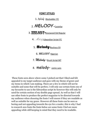
- 1. FONT STYLES 1. Melody -Blackadder ITC 2. Melody-Castellar 3. Rosewood Std Regular 4. Melody-Edwardian Script ITC 5. Melody-Bauhaus 93 6. melody-Algerian 7. Melody-Brush Script MT 8. melody- comic sans These fonts seen above where some I picked out that I liked and felt appealed to my target audience and goes with my theme of genre and my items in which I am making. There are a few in which will not be suitable and some that will be perfect, I will only use certain fonts one of my favourite to use is the Edwardian script itc however this will only be used for certain section of my double page spread. As well as that I will use other fonts to produce the perfect magazine to be directed towards my audience when choosing the fonts I will ensure if they are readable as well as suitable for my genre. However all these fonts can be seen as boring and not appealing towards the eye for a reader, this is why I had to research new fonts the fonts below are some fonts I feel are more appealing while still keeping in mind that they need to be readable.
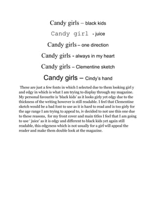
- 2. Candy girls â black kids Candy girl - juice Candy girls â one direction Candy girls - always in my heart Candy girls â Clementine sketch Candy girls â Cindyâs hand These are just a few fonts in which I selected due to them looking girl y and edgy in which is what I am trying to display through my magazine. My personal favourite is âblack kidsâ as it looks girly yet edgy due to the thickness of the writing however is still readable. I feel that Clementine sketch would be a bad font to use as it is hard to read and is too girly for the age range I am trying to appeal to, iv decided to not use this one due to these reasons, for my front cover and main titles I feel that I am going to use â juiceâ as it is edgy and different to black kids yet again still readable, this edgyness which is not usually for a girl will appeal the reader and make them double look at the magazine.