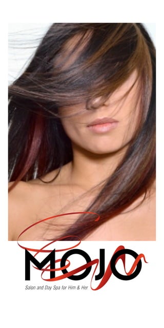
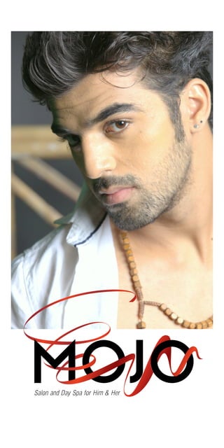
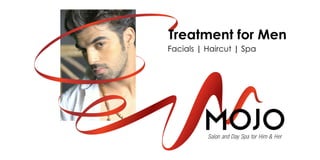
Mojo Unisex Hair Saloon
0 likes98 views

What happens when uptown outskirts of Pune ...Baner gets its first aww so sexy unisex saloon?.....Its gets its MOJO ....:)
1 of 7
Download to read offline


Ad
Recommended
HealthyAlways.com
HealthyAlways.comDigital Picasso
?
The document describes a website called www.HealthyAlways.com that provides wellness and medical lifestyle information. It offers an unbiased overview of local services and products in different health categories like fitness, nutrition, and skin care. Doctors can create a profile on the site to help market themselves and potentially gain new patients by being accessible online. The site aims to help doctors promote their brand to a younger audience at low cost through an always-available online presence.Wall putty brand
Wall putty brandDigital Picasso
?
The document presents a brand design proposal for a wall putty product, emphasizing the need for effective communication and marketing strategy to enhance sales. It includes various design concepts, including hand and computer sketches, tailored for mass production with color adaptations. The author expresses willingness to discuss the proposal in detail and offers to meet in person.Cosmopolitan Pre-School Logo Rewamp
Cosmopolitan Pre-School Logo RewampDigital Picasso
?
The document discusses the redesign of the Cosmopolitan School logo, emphasizing that it should maintain familiarity while incorporating meaningful updates. Proposed variants include incorporating symbols like the phoenix and a sheaf of wheat to represent aspirations and prosperity. The rationale highlights the importance of symbolism in reflecting the school's values and mission.Index page Image & concept ideas
Index page Image & concept ideasDigital Picasso
?
This document provides images and suggestions for the SAVANI travel portal website. It discusses using a common element like a mug or cup of tea in all images to make them feel like a cohesive campaign. It also includes potential image sources and tips for searching. Finally, it outlines a question set from Samir, providing suggested headers and responses to showcase above images on the site. The overarching theme is building a customized travel experience focused on the user's needs and priorities.Inspiring Ideas to build your Web Portal
Inspiring Ideas to build your Web PortalDigital Picasso
?
The document proposes an alternative design idea for the Savani Travels website that positions it as a value-added resource to help visitors find the perfect holiday. It suggests taking a family business approach by emphasizing the decades of experience the family has in the travel industry. Specific recommendations include highlighting different types of customized and pre-designed holiday experiences, popular destinations and experiences, an FAQ/chat section, and changing the tone to differentiate from competitors. The goal is to convince visitors to pay a predefined fee and stand out from other travel sites.YOLO Integrated media prop
YOLO Integrated media propDigital Picasso
?
The document outlines a comprehensive 360-degree integrated media management plan, combining both above-the-line and below-the-line strategies. Key elements include various advertising methods (print, radio, television, online), strategic partnerships, youth-focused content, and interactive engagements like road shows and contests. The proposal aims to create a strong brand presence through continuous engagement with targeted audiences, particularly the youth.Vidstar presentation
Vidstar presentationDigital Picasso
?
The document discusses creating a unified brand identity for a television company that is three generations old, including designing a letterhead, visiting card, envelope, and packaging for products like TVs. The packaging design aims to clearly communicate handling instructions to prevent damage during shipping.Carters Corner Casestuy
Carters Corner CasestuyDigital Picasso
?
This document summarizes a case study for a branding project for a caf©” called Carters Corner located in the posh Bandra neighborhood of Mumbai. It describes the branding elements developed, including positioning the caf©” as a happy, celebratory place. A logo was designed featuring the words "Carter's Corner" stylized and overlapping. Brand colors like turquoise blue were chosen to represent meanings like joy, tranquility and energy. Graphic designs were created for menu items, wall paintings, and other areas. The branding project was a success, with the caf©” becoming popular upon opening and feeling like an established international brand.Presentation for a Television Brand
Presentation for a Television BrandDigital Picasso
?
The document discusses branding and packaging for a television company, detailing aspects such as name identity and marketing materials like letterhead and business cards. It emphasizes careful handling instructions for product packaging, noting specific warnings like 'fragile' and 'do not tumble down.' The document also includes references to digital design resources for package design.Marketing Ideas for a Dry Fruit Brand
Marketing Ideas for a Dry Fruit Brand Digital Picasso
?
The document outlines various marketing strategies for a dry fruit store, focusing on targeting affluent clients and establishing trust through quality and knowledge of health benefits. It presents multiple campaign ideas, including publicizing the advantages of dry fruits, engaging customers with competitions and events, and creating an authentic brand image. The proposals aim to connect with the target audience effectively and elevate the store's presence in the market.Carters Corner - Brand Development Presentation
Carters Corner - Brand Development Presentation Digital Picasso
?
The document describes a concept for a relaxed social spot named 'Carter's Corner' that emphasizes a positive ambiance, affordability, and community vibes. It includes plans for a juice section focused on takeaway and subscriptions, with a fun, youthful marketing angle that incorporates flowers and selfies. The vision promotes a cozy atmosphere for socializing, relaxation, and happy experiences.Logo Design & Adaptation
Logo Design & AdaptationDigital Picasso
?
A concept taken to the next level from a simple sketch to the work-shop and then the clients mind and heart. Meraki Chineese QSR Packaging case study
Meraki Chineese QSR Packaging case studyDigital Picasso
?
The document describes a case study for a Chinese quick service restaurant named Meraki, which emphasizes creativity and personal touch in cooking. It discusses the branding and design elements inspired by traditional Chinese art, particularly dry brush strokes and script, to create an authentic brand identity. The successful launch of Meraki is attributed to effective design and quality food, resulting in immediate consumer trust and recognition.Ha investment proposal v4
Ha investment proposal v4Digital Picasso
?
This document is an investor deck for HealthyAlways.com, which provides a one-stop patient engagement solution connecting patients with doctors. It outlines HealthyAlways.com's vision to be a trusted source for patients to ask doctors questions and refer to their expertise. The document discusses HealthyAlways.com's products and services, target markets, team, progress to date with over 100 registered doctors, and financial projections based on annual subscriptions from doctors and partnerships with hospitals and pharmaceutical companies.Resuapp How It Works
Resuapp How It WorksDigital Picasso
?
Resu App is the complete Resume Management System. This presentation shows how the system works.Digital Picasso Presentation
Digital Picasso PresentationDigital Picasso
?
Digital Picasso - "'we bring brands to live and life to brands" this presentation is dedicated to all those people who feel design is really not important as numbers are. Crown lifters-logo-rationale
Crown lifters-logo-rationaleDigital Picasso
?
The document discusses the rationale behind a company logo. The five interconnected bars represent the five pillars and brothers who have supported the company's organic growth. The bars also resemble the arms of cranes in a yard ready for service, with their varying sizes depicting the different crane types. The logo symbolizes the company's 28 years in business, competitive spirit, flexibility, and continued growth through building lasting relationships.Obo universal logo2 ver13
Obo universal logo2 ver13Digital Picasso
?
The document discusses garment details and care instructions, emphasizing the importance of readable content in layout design. It notes that the text used provides a normal distribution of letters for better readability. Relevant brand content is expected to replace placeholder information soon.ūŅą┬░µ├└╣·═■╦╣┐ĄąŪ┤¾č¦╦š▒ž└¹Č¹ĘųąŻ▒ŽęĄųżŻ©▒½░┬│¦▒ŽęĄųż╩ķŻ®įŁ░µČ©ųŲ
ūŅą┬░µ├└╣·═■╦╣┐ĄąŪ┤¾č¦╦š▒ž└¹Č¹ĘųąŻ▒ŽęĄųżŻ©▒½░┬│¦▒ŽęĄųż╩ķŻ®įŁ░µČ©ųŲTaqyea
?
╝°ė┌┤╦Ż¼Č©ųŲ═■╦╣┐ĄąŪ┤¾č¦╦š▒ž└¹Č¹ĘųąŻč¦╬╗ųż╩ķ╠ß╔²┬─└·ĪŠq▐▒1954292140Ī┐įŁ░µĖ▀Ę┬═■╦╣┐ĄąŪ┤¾č¦╦š▒ž└¹Č¹ĘųąŻ▒ŽęĄųż(UWS▒ŽęĄųż╩ķ)┐╔Ž╚┐┤│╔ŲĘč∙▒ŠĪŠq▐▒1954292140Ī┐░’─·ĮŌŠ÷į┌├└╣·═■╦╣┐ĄąŪ┤¾č¦╦š▒ž└¹Č¹ĘųąŻ╬┤▒ŽęĄ─č╠ŌŻ¼├└╣·▒ŽęĄųż╣║┬“Ż¼├└╣·╬─ŲŠ╣║┬“Ż¼ĪŠq╬ó1954292140Ī┐├└╣·╬─ŲŠ╣║┬“Ż¼├└╣·╬─ŲŠČ©ųŲŻ¼├└╣·╬─ŲŠ▓╣░ņĪŻū©ęĄį┌Ž▀Č©ųŲ├└╣·┤¾č¦╬─ŲŠŻ¼Č©ū÷├└╣·▒Š┐Ų╬─ŲŠŻ¼ĪŠq╬ó1954292140Ī┐Ė┤ųŲ├└╣·University of Wisconsin-Superior completion letterĪŻį┌Ž▀┐ņ╦┘▓╣░ņ├└╣·▒Š┐Ų▒ŽęĄųżĪó╦Č╩┐╬─ŲŠųż╩ķŻ¼╣║┬“├└╣·č¦╬╗ųżĪó═■╦╣┐ĄąŪ┤¾č¦╦š▒ž└¹Č¹ĘųąŻOfferŻ¼├└╣·┤¾č¦╬─ŲŠį┌Ž▀╣║┬“ĪŻ
╚ń╣¹─·┤”ė┌ęįŽ┬╝ĖųųŪķ┐÷Ż║
Ī¾į┌ąŻŲ┌╝õŻ¼ę“Ė„ųųįŁę“╬┤─▄╦│└¹▒ŽęĄĪŁĪŁ─├▓╗ĄĮ╣┘ĘĮ▒ŽęĄųż
Ī¾├µČįĖĖ─ĖĄ─č╣┴”Ż¼ŽŻ═¹ŠĪ┐ņ─├ĄĮŻ╗
Ī¾▓╗ŪÕ│■╚Žųż┴„│╠ęį╝░▓─┴ŽĖ├╚ń║╬ū╝▒ĖŻ╗
Ī¾╗ž╣·╩▒╝õ║▄│żŻ¼═³╝Ū░ņ└ĒŻ╗
Ī¾╗ž╣·┬Ē╔ŽŠ═꬚ę╣żū„Ż¼░ņĖ°ė├╚╦Ąź╬╗┐┤Ż╗
Ī¾Ų¾╩┬ꥥź╬╗▒žąļę¬Ū¾░ņ└ĒĄ─
Ī¾ąĶę¬▒©┐╝╣½╬±į▒Īó╣║┬“├Ō╦░│ĄĪó┬õū¬╗¦┐┌
Ī¾╔ĻŪļ┴¶č¦╔·┤┤ęĄ╗∙Į
ĪŠĖ┤┐╠ę╗╠ū═■╦╣┐ĄąŪ┤¾č¦╦š▒ž└¹Č¹ĘųąŻ▒ŽęĄųż│╔╝©Ąźą┼ĘŌĄ╚▓─┴ŽūŅŪ┐╣ź┬į,Buy University of Wisconsin-Superior TranscriptsĪ┐
╣║┬“╚š║½│╔╝©ĄźĪóėó╣·┤¾č¦│╔╝©ĄźĪó├└╣·┤¾č¦│╔╝©ĄźĪó░─ų▐┤¾č¦│╔╝©ĄźĪó╝ė─├┤¾┤¾č¦│╔╝©ĄźŻ©q╬ó1954292140Ż®ą┬╝ėŲ┬┤¾č¦│╔╝©ĄźĪóą┬╬„└╝┤¾č¦│╔╝©ĄźĪó░«Č¹└╝│╔╝©ĄźĪó╬„░Óč└│╔╝©ĄźĪóĄ┬╣·│╔╝©ĄźĪŻ│╔╝©ĄźĄ─ęŌęÕų„ę¬╠ÕŽųį┌ųż├„覎░─▄┴”ĪóŲ└╣└č¦╩§▒│Š░Īóš╣╩Šū█║Ž╦žų╩Īó╠ßĖ▀┬╝╚Ī┬╩Ż¼ęį╝░╩Ūū„╬¬┴¶ą┼╚Žųż╔ĻŪļ▓─┴ŽĄ─ę╗▓┐ĘųĪŻ
═■╦╣┐ĄąŪ┤¾č¦╦š▒ž└¹Č¹ĘųąŻ│╔╝©Ąź─▄╣╗╠ÕŽų─·Ą─Ą─覎░─▄┴”Ż¼░³└©═■╦╣┐ĄąŪ┤¾č¦╦š▒ž└¹Č¹ĘųąŻ┐╬│╠│╔╝©Īóū©ęĄ─▄┴”Īó蹊┐─▄┴”ĪŻŻ©q╬ó1954292140Ż®Š▀╠Õ└┤╦ĄŻ¼│╔╝©▒©ĖµĄź═©│Ż░³║¼č¦╔·Ą─覎░╝╝─▄ėļŽ░╣▀ĪóĖ„┐Ų│╔╝©ęį╝░└Ž╩”Ų└ė’Ą╚▓┐ĘųŻ¼ę“┤╦Ż¼│╔╝©Ąź▓╗Į÷╩Ūč¦╔·č¦╩§─▄┴”Ą─ųż├„Ż¼ę▓╩ŪŲ└╣└č¦╔·╩Ūʱ╩╩║Ž─│Ė÷Į╠ė²ŽŅ─┐Ą─ųžę¬ę└Š▌ŻĪųŲū„░õŠ▒│┘▓Ōč¦Ę襟ėó╣·┬ūČž│Ū╩ą┤¾č¦č¦└·╚ŽųżĘČ▒Š,░õŠ▒│┘▓Ō│╔╝©Ąź│ę▒╩┤Īą▐Ė─
ųŲū„░õŠ▒│┘▓Ōč¦Ę襟ėó╣·┬ūČž│Ū╩ą┤¾č¦č¦└·╚ŽųżĘČ▒Š,░õŠ▒│┘▓Ō│╔╝©Ąź│ę▒╩┤Īą▐Ė─taqyed
?
2025─Ļ╝½╦┘░ņ┬ūČž│Ū╩ą┤¾č¦▒ŽęĄųżĪŠq▐▒1954292140Ī┐č¦└·╚Žųż┴„│╠┬ūČž│Ū╩ą┤¾č¦▒ŽęĄųżėó╣·▒Š┐Ų│╔╝©ĄźųŲū„ĪŠq▐▒1954292140Ī┐║Ż═ŌĖ„┤¾č¦Diploma░µ▒ŠŻ¼ę“╬¬ę▀Ūķ覹Ż═Ų│┘ĘóĘ┼ųż╩ķĪóųż╩ķįŁ╝■Ȭ╩¦▓╣░ņĪó├╗ėąš²│Ż▒ŽęĄ╬┤─▄╚Žųżč¦└·├µ┴┘Š═ęĄ╠ß╣®ĮŌŠ÷░ņĘ©ĪŻĄ▒įŌė÷╣ę┐ŲĪó┐§┐╬Ą╝ų┬╬▐Ę©ą▐┬·č¦ĘųŻ¼╗“š▀ų▒Įė▒╗覹Ż═╦覯¼ūŅ║¾╬▐Ę©▒ŽęĄ─├▓╗ĄĮ▒ŽęĄųżĪŻ┤╦╩▒Ą──Ńę╗Č©╩ųūŃ╬▐┤ļŻ¼ę“╬¬┴¶č¦ę╗│ĪŻ¼├╗ėą╗±Ą├▒ŽęĄųżęį╝░č¦└·ųż├„┐ŽČ©╩Ū╬▐Ę©Ė°ūį╝║║═ĖĖ─Ėę╗Ė÷Į╗┤·Ą─ĪŻ
ĪŠĖ┤┐╠┬ūČž│Ū╩ą┤¾č¦│╔╝©Ąźą┼ĘŌ,Buy London Metropolitan University TranscriptsĪ┐
╣║┬“╚š║½│╔╝©ĄźĪóėó╣·┤¾č¦│╔╝©ĄźĪó├└╣·┤¾č¦│╔╝©ĄźĪó░─ų▐┤¾č¦│╔╝©ĄźĪó╝ė─├┤¾┤¾č¦│╔╝©ĄźŻ©q╬ó1954292140Ż®ą┬╝ėŲ┬┤¾č¦│╔╝©ĄźĪóą┬╬„└╝┤¾č¦│╔╝©ĄźĪó░«Č¹└╝│╔╝©ĄźĪó╬„░Óč└│╔╝©ĄźĪóĄ┬╣·│╔╝©ĄźĪŻ│╔╝©ĄźĄ─ęŌęÕų„ę¬╠ÕŽųį┌ųż├„覎░─▄┴”ĪóŲ└╣└č¦╩§▒│Š░Īóš╣╩Šū█║Ž╦žų╩Īó╠ßĖ▀┬╝╚Ī┬╩Ż¼ęį╝░╩Ūū„╬¬┴¶ą┼╚Žųż╔ĻŪļ▓─┴ŽĄ─ę╗▓┐ĘųĪŻ
┬ūČž│Ū╩ą┤¾č¦│╔╝©Ąź─▄╣╗╠ÕŽų─·Ą─Ą─覎░─▄┴”Ż¼░³└©┬ūČž│Ū╩ą┤¾č¦┐╬│╠│╔╝©Īóū©ęĄ─▄┴”Īó蹊┐─▄┴”ĪŻŻ©q╬ó1954292140Ż®Š▀╠Õ└┤╦ĄŻ¼│╔╝©▒©ĖµĄź═©│Ż░³║¼č¦╔·Ą─覎░╝╝─▄ėļŽ░╣▀ĪóĖ„┐Ų│╔╝©ęį╝░└Ž╩”Ų└ė’Ą╚▓┐ĘųŻ¼ę“┤╦Ż¼│╔╝©Ąź▓╗Į÷╩Ūč¦╔·č¦╩§─▄┴”Ą─ųż├„Ż¼ę▓╩ŪŲ└╣└č¦╔·╩Ūʱ╩╩║Ž─│Ė÷Į╠ė²ŽŅ─┐Ą─ųžę¬ę└Š▌ŻĪ
╬ę├Ū│ą┼Ą▓╔ė├Ą─╩Ū覹ŻįŁ░µųĮš┼Ż©įŁ░µųĮų╩ĪóĄū╔½Īó╬Ų┬ĘŻ®╬ę├Ū╣ż│¦ėĄėą╚½╠ūĮ°┐┌įŁū░╔Ķ▒ĖŻ¼╠ž╩Ō╣żęšČ╝╩Ū▓╔ė├▓╗═¼╗·Ų„ųŲū„Ż¼Ę┬šµČ╚╗∙▒Š┐╔ęį┤’ĄĮ100%Ż¼╦∙ėą│╔ŲĘęį╝░╣żęšą¦╣¹Č╝┐╔╠ßŪ░Ė°┐═╗¦š╣╩ŠŻ¼▓╗┬·ęŌ┐╔ęįĖ∙Š▌┐═╗¦ę¬Ū¾Į°ąąĄ„š¹Ż¼ų▒ĄĮ┬·ęŌ╬¬ų╣ŻĪ
ĪŠų„ė¬ŽŅ─┐Ī┐
ę╗.┬ūČž│Ū╩ą┤¾č¦▒ŽęĄųżĪŠq╬ó1954292140Ī┐┬ūČž│Ū╩ą┤¾č¦│╔╝©ĄźĪó┴¶ą┼╚ŽųżĪó╩╣╣▌╚ŽųżĪóĮ╠ė²▓┐╚ŽųżĪóč┼╦╝═ąĖŻ│╔╝©ĄźĪóč¦╔·┐©Ą╚ŻĪ
Č■.šµ╩Ą╩╣╣▌╣½ųż(╝┤┴¶č¦╗ž╣·╚╦į▒ųż├„,▓╗│╔╣”▓╗╩šĘč)
╚².šµ╩ĄĮ╠ė²▓┐č¦└·č¦╬╗╚ŽųżŻ©Į╠ė²▓┐┤µĄĄŻĪĮ╠ė²▓┐┴¶Ę■═°šŠė└Š├┐╔▓ķŻ®
╦─.░ņ└Ē╣·═ŌĖ„┤¾č¦╬─ŲŠ(ę╗Čįę╗ū©ęĄĘ■╬±,┐╔╚½│╠╝Ó┐žĖ·ū┘Į°Č╚)Learn the basic of illustration with examples.pptx
Learn the basic of illustration with examples.pptxrodelrimando83
?
Ppt for illustration. good for classroom tools class observation (JHS and SHS) animationa and Illustration classesI?NCI? EVI?NER RETROSPEKTI?FI?, RETROSPECTIVE (3).ppsx
I?NCI? EVI?NER RETROSPEKTI?FI?, RETROSPECTIVE (3).ppsx***
?
I?NCI? EVI?NER RETROSPEKTI?FI?, RETROSPECTIVE (3).ppsxMore Related Content
More from Digital Picasso (11)
Carters Corner Casestuy
Carters Corner CasestuyDigital Picasso
?
This document summarizes a case study for a branding project for a caf©” called Carters Corner located in the posh Bandra neighborhood of Mumbai. It describes the branding elements developed, including positioning the caf©” as a happy, celebratory place. A logo was designed featuring the words "Carter's Corner" stylized and overlapping. Brand colors like turquoise blue were chosen to represent meanings like joy, tranquility and energy. Graphic designs were created for menu items, wall paintings, and other areas. The branding project was a success, with the caf©” becoming popular upon opening and feeling like an established international brand.Presentation for a Television Brand
Presentation for a Television BrandDigital Picasso
?
The document discusses branding and packaging for a television company, detailing aspects such as name identity and marketing materials like letterhead and business cards. It emphasizes careful handling instructions for product packaging, noting specific warnings like 'fragile' and 'do not tumble down.' The document also includes references to digital design resources for package design.Marketing Ideas for a Dry Fruit Brand
Marketing Ideas for a Dry Fruit Brand Digital Picasso
?
The document outlines various marketing strategies for a dry fruit store, focusing on targeting affluent clients and establishing trust through quality and knowledge of health benefits. It presents multiple campaign ideas, including publicizing the advantages of dry fruits, engaging customers with competitions and events, and creating an authentic brand image. The proposals aim to connect with the target audience effectively and elevate the store's presence in the market.Carters Corner - Brand Development Presentation
Carters Corner - Brand Development Presentation Digital Picasso
?
The document describes a concept for a relaxed social spot named 'Carter's Corner' that emphasizes a positive ambiance, affordability, and community vibes. It includes plans for a juice section focused on takeaway and subscriptions, with a fun, youthful marketing angle that incorporates flowers and selfies. The vision promotes a cozy atmosphere for socializing, relaxation, and happy experiences.Logo Design & Adaptation
Logo Design & AdaptationDigital Picasso
?
A concept taken to the next level from a simple sketch to the work-shop and then the clients mind and heart. Meraki Chineese QSR Packaging case study
Meraki Chineese QSR Packaging case studyDigital Picasso
?
The document describes a case study for a Chinese quick service restaurant named Meraki, which emphasizes creativity and personal touch in cooking. It discusses the branding and design elements inspired by traditional Chinese art, particularly dry brush strokes and script, to create an authentic brand identity. The successful launch of Meraki is attributed to effective design and quality food, resulting in immediate consumer trust and recognition.Ha investment proposal v4
Ha investment proposal v4Digital Picasso
?
This document is an investor deck for HealthyAlways.com, which provides a one-stop patient engagement solution connecting patients with doctors. It outlines HealthyAlways.com's vision to be a trusted source for patients to ask doctors questions and refer to their expertise. The document discusses HealthyAlways.com's products and services, target markets, team, progress to date with over 100 registered doctors, and financial projections based on annual subscriptions from doctors and partnerships with hospitals and pharmaceutical companies.Resuapp How It Works
Resuapp How It WorksDigital Picasso
?
Resu App is the complete Resume Management System. This presentation shows how the system works.Digital Picasso Presentation
Digital Picasso PresentationDigital Picasso
?
Digital Picasso - "'we bring brands to live and life to brands" this presentation is dedicated to all those people who feel design is really not important as numbers are. Crown lifters-logo-rationale
Crown lifters-logo-rationaleDigital Picasso
?
The document discusses the rationale behind a company logo. The five interconnected bars represent the five pillars and brothers who have supported the company's organic growth. The bars also resemble the arms of cranes in a yard ready for service, with their varying sizes depicting the different crane types. The logo symbolizes the company's 28 years in business, competitive spirit, flexibility, and continued growth through building lasting relationships.Obo universal logo2 ver13
Obo universal logo2 ver13Digital Picasso
?
The document discusses garment details and care instructions, emphasizing the importance of readable content in layout design. It notes that the text used provides a normal distribution of letters for better readability. Relevant brand content is expected to replace placeholder information soon.Recently uploaded (20)
ūŅą┬░µ├└╣·═■╦╣┐ĄąŪ┤¾č¦╦š▒ž└¹Č¹ĘųąŻ▒ŽęĄųżŻ©▒½░┬│¦▒ŽęĄųż╩ķŻ®įŁ░µČ©ųŲ
ūŅą┬░µ├└╣·═■╦╣┐ĄąŪ┤¾č¦╦š▒ž└¹Č¹ĘųąŻ▒ŽęĄųżŻ©▒½░┬│¦▒ŽęĄųż╩ķŻ®įŁ░µČ©ųŲTaqyea
?
╝°ė┌┤╦Ż¼Č©ųŲ═■╦╣┐ĄąŪ┤¾č¦╦š▒ž└¹Č¹ĘųąŻč¦╬╗ųż╩ķ╠ß╔²┬─└·ĪŠq▐▒1954292140Ī┐įŁ░µĖ▀Ę┬═■╦╣┐ĄąŪ┤¾č¦╦š▒ž└¹Č¹ĘųąŻ▒ŽęĄųż(UWS▒ŽęĄųż╩ķ)┐╔Ž╚┐┤│╔ŲĘč∙▒ŠĪŠq▐▒1954292140Ī┐░’─·ĮŌŠ÷į┌├└╣·═■╦╣┐ĄąŪ┤¾č¦╦š▒ž└¹Č¹ĘųąŻ╬┤▒ŽęĄ─č╠ŌŻ¼├└╣·▒ŽęĄųż╣║┬“Ż¼├└╣·╬─ŲŠ╣║┬“Ż¼ĪŠq╬ó1954292140Ī┐├└╣·╬─ŲŠ╣║┬“Ż¼├└╣·╬─ŲŠČ©ųŲŻ¼├└╣·╬─ŲŠ▓╣░ņĪŻū©ęĄį┌Ž▀Č©ųŲ├└╣·┤¾č¦╬─ŲŠŻ¼Č©ū÷├└╣·▒Š┐Ų╬─ŲŠŻ¼ĪŠq╬ó1954292140Ī┐Ė┤ųŲ├└╣·University of Wisconsin-Superior completion letterĪŻį┌Ž▀┐ņ╦┘▓╣░ņ├└╣·▒Š┐Ų▒ŽęĄųżĪó╦Č╩┐╬─ŲŠųż╩ķŻ¼╣║┬“├└╣·č¦╬╗ųżĪó═■╦╣┐ĄąŪ┤¾č¦╦š▒ž└¹Č¹ĘųąŻOfferŻ¼├└╣·┤¾č¦╬─ŲŠį┌Ž▀╣║┬“ĪŻ
╚ń╣¹─·┤”ė┌ęįŽ┬╝ĖųųŪķ┐÷Ż║
Ī¾į┌ąŻŲ┌╝õŻ¼ę“Ė„ųųįŁę“╬┤─▄╦│└¹▒ŽęĄĪŁĪŁ─├▓╗ĄĮ╣┘ĘĮ▒ŽęĄųż
Ī¾├µČįĖĖ─ĖĄ─č╣┴”Ż¼ŽŻ═¹ŠĪ┐ņ─├ĄĮŻ╗
Ī¾▓╗ŪÕ│■╚Žųż┴„│╠ęį╝░▓─┴ŽĖ├╚ń║╬ū╝▒ĖŻ╗
Ī¾╗ž╣·╩▒╝õ║▄│żŻ¼═³╝Ū░ņ└ĒŻ╗
Ī¾╗ž╣·┬Ē╔ŽŠ═꬚ę╣żū„Ż¼░ņĖ°ė├╚╦Ąź╬╗┐┤Ż╗
Ī¾Ų¾╩┬ꥥź╬╗▒žąļę¬Ū¾░ņ└ĒĄ─
Ī¾ąĶę¬▒©┐╝╣½╬±į▒Īó╣║┬“├Ō╦░│ĄĪó┬õū¬╗¦┐┌
Ī¾╔ĻŪļ┴¶č¦╔·┤┤ęĄ╗∙Į
ĪŠĖ┤┐╠ę╗╠ū═■╦╣┐ĄąŪ┤¾č¦╦š▒ž└¹Č¹ĘųąŻ▒ŽęĄųż│╔╝©Ąźą┼ĘŌĄ╚▓─┴ŽūŅŪ┐╣ź┬į,Buy University of Wisconsin-Superior TranscriptsĪ┐
╣║┬“╚š║½│╔╝©ĄźĪóėó╣·┤¾č¦│╔╝©ĄźĪó├└╣·┤¾č¦│╔╝©ĄźĪó░─ų▐┤¾č¦│╔╝©ĄźĪó╝ė─├┤¾┤¾č¦│╔╝©ĄźŻ©q╬ó1954292140Ż®ą┬╝ėŲ┬┤¾č¦│╔╝©ĄźĪóą┬╬„└╝┤¾č¦│╔╝©ĄźĪó░«Č¹└╝│╔╝©ĄźĪó╬„░Óč└│╔╝©ĄźĪóĄ┬╣·│╔╝©ĄźĪŻ│╔╝©ĄźĄ─ęŌęÕų„ę¬╠ÕŽųį┌ųż├„覎░─▄┴”ĪóŲ└╣└č¦╩§▒│Š░Īóš╣╩Šū█║Ž╦žų╩Īó╠ßĖ▀┬╝╚Ī┬╩Ż¼ęį╝░╩Ūū„╬¬┴¶ą┼╚Žųż╔ĻŪļ▓─┴ŽĄ─ę╗▓┐ĘųĪŻ
═■╦╣┐ĄąŪ┤¾č¦╦š▒ž└¹Č¹ĘųąŻ│╔╝©Ąź─▄╣╗╠ÕŽų─·Ą─Ą─覎░─▄┴”Ż¼░³└©═■╦╣┐ĄąŪ┤¾č¦╦š▒ž└¹Č¹ĘųąŻ┐╬│╠│╔╝©Īóū©ęĄ─▄┴”Īó蹊┐─▄┴”ĪŻŻ©q╬ó1954292140Ż®Š▀╠Õ└┤╦ĄŻ¼│╔╝©▒©ĖµĄź═©│Ż░³║¼č¦╔·Ą─覎░╝╝─▄ėļŽ░╣▀ĪóĖ„┐Ų│╔╝©ęį╝░└Ž╩”Ų└ė’Ą╚▓┐ĘųŻ¼ę“┤╦Ż¼│╔╝©Ąź▓╗Į÷╩Ūč¦╔·č¦╩§─▄┴”Ą─ųż├„Ż¼ę▓╩ŪŲ└╣└č¦╔·╩Ūʱ╩╩║Ž─│Ė÷Į╠ė²ŽŅ─┐Ą─ųžę¬ę└Š▌ŻĪųŲū„░õŠ▒│┘▓Ōč¦Ę襟ėó╣·┬ūČž│Ū╩ą┤¾č¦č¦└·╚ŽųżĘČ▒Š,░õŠ▒│┘▓Ō│╔╝©Ąź│ę▒╩┤Īą▐Ė─
ųŲū„░õŠ▒│┘▓Ōč¦Ę襟ėó╣·┬ūČž│Ū╩ą┤¾č¦č¦└·╚ŽųżĘČ▒Š,░õŠ▒│┘▓Ō│╔╝©Ąź│ę▒╩┤Īą▐Ė─taqyed
?
2025─Ļ╝½╦┘░ņ┬ūČž│Ū╩ą┤¾č¦▒ŽęĄųżĪŠq▐▒1954292140Ī┐č¦└·╚Žųż┴„│╠┬ūČž│Ū╩ą┤¾č¦▒ŽęĄųżėó╣·▒Š┐Ų│╔╝©ĄźųŲū„ĪŠq▐▒1954292140Ī┐║Ż═ŌĖ„┤¾č¦Diploma░µ▒ŠŻ¼ę“╬¬ę▀Ūķ覹Ż═Ų│┘ĘóĘ┼ųż╩ķĪóųż╩ķįŁ╝■Ȭ╩¦▓╣░ņĪó├╗ėąš²│Ż▒ŽęĄ╬┤─▄╚Žųżč¦└·├µ┴┘Š═ęĄ╠ß╣®ĮŌŠ÷░ņĘ©ĪŻĄ▒įŌė÷╣ę┐ŲĪó┐§┐╬Ą╝ų┬╬▐Ę©ą▐┬·č¦ĘųŻ¼╗“š▀ų▒Įė▒╗覹Ż═╦覯¼ūŅ║¾╬▐Ę©▒ŽęĄ─├▓╗ĄĮ▒ŽęĄųżĪŻ┤╦╩▒Ą──Ńę╗Č©╩ųūŃ╬▐┤ļŻ¼ę“╬¬┴¶č¦ę╗│ĪŻ¼├╗ėą╗±Ą├▒ŽęĄųżęį╝░č¦└·ųż├„┐ŽČ©╩Ū╬▐Ę©Ė°ūį╝║║═ĖĖ─Ėę╗Ė÷Į╗┤·Ą─ĪŻ
ĪŠĖ┤┐╠┬ūČž│Ū╩ą┤¾č¦│╔╝©Ąźą┼ĘŌ,Buy London Metropolitan University TranscriptsĪ┐
╣║┬“╚š║½│╔╝©ĄźĪóėó╣·┤¾č¦│╔╝©ĄźĪó├└╣·┤¾č¦│╔╝©ĄźĪó░─ų▐┤¾č¦│╔╝©ĄźĪó╝ė─├┤¾┤¾č¦│╔╝©ĄźŻ©q╬ó1954292140Ż®ą┬╝ėŲ┬┤¾č¦│╔╝©ĄźĪóą┬╬„└╝┤¾č¦│╔╝©ĄźĪó░«Č¹└╝│╔╝©ĄźĪó╬„░Óč└│╔╝©ĄźĪóĄ┬╣·│╔╝©ĄźĪŻ│╔╝©ĄźĄ─ęŌęÕų„ę¬╠ÕŽųį┌ųż├„覎░─▄┴”ĪóŲ└╣└č¦╩§▒│Š░Īóš╣╩Šū█║Ž╦žų╩Īó╠ßĖ▀┬╝╚Ī┬╩Ż¼ęį╝░╩Ūū„╬¬┴¶ą┼╚Žųż╔ĻŪļ▓─┴ŽĄ─ę╗▓┐ĘųĪŻ
┬ūČž│Ū╩ą┤¾č¦│╔╝©Ąź─▄╣╗╠ÕŽų─·Ą─Ą─覎░─▄┴”Ż¼░³└©┬ūČž│Ū╩ą┤¾č¦┐╬│╠│╔╝©Īóū©ęĄ─▄┴”Īó蹊┐─▄┴”ĪŻŻ©q╬ó1954292140Ż®Š▀╠Õ└┤╦ĄŻ¼│╔╝©▒©ĖµĄź═©│Ż░³║¼č¦╔·Ą─覎░╝╝─▄ėļŽ░╣▀ĪóĖ„┐Ų│╔╝©ęį╝░└Ž╩”Ų└ė’Ą╚▓┐ĘųŻ¼ę“┤╦Ż¼│╔╝©Ąź▓╗Į÷╩Ūč¦╔·č¦╩§─▄┴”Ą─ųż├„Ż¼ę▓╩ŪŲ└╣└č¦╔·╩Ūʱ╩╩║Ž─│Ė÷Į╠ė²ŽŅ─┐Ą─ųžę¬ę└Š▌ŻĪ
╬ę├Ū│ą┼Ą▓╔ė├Ą─╩Ū覹ŻįŁ░µųĮš┼Ż©įŁ░µųĮų╩ĪóĄū╔½Īó╬Ų┬ĘŻ®╬ę├Ū╣ż│¦ėĄėą╚½╠ūĮ°┐┌įŁū░╔Ķ▒ĖŻ¼╠ž╩Ō╣żęšČ╝╩Ū▓╔ė├▓╗═¼╗·Ų„ųŲū„Ż¼Ę┬šµČ╚╗∙▒Š┐╔ęį┤’ĄĮ100%Ż¼╦∙ėą│╔ŲĘęį╝░╣żęšą¦╣¹Č╝┐╔╠ßŪ░Ė°┐═╗¦š╣╩ŠŻ¼▓╗┬·ęŌ┐╔ęįĖ∙Š▌┐═╗¦ę¬Ū¾Į°ąąĄ„š¹Ż¼ų▒ĄĮ┬·ęŌ╬¬ų╣ŻĪ
ĪŠų„ė¬ŽŅ─┐Ī┐
ę╗.┬ūČž│Ū╩ą┤¾č¦▒ŽęĄųżĪŠq╬ó1954292140Ī┐┬ūČž│Ū╩ą┤¾č¦│╔╝©ĄźĪó┴¶ą┼╚ŽųżĪó╩╣╣▌╚ŽųżĪóĮ╠ė²▓┐╚ŽųżĪóč┼╦╝═ąĖŻ│╔╝©ĄźĪóč¦╔·┐©Ą╚ŻĪ
Č■.šµ╩Ą╩╣╣▌╣½ųż(╝┤┴¶č¦╗ž╣·╚╦į▒ųż├„,▓╗│╔╣”▓╗╩šĘč)
╚².šµ╩ĄĮ╠ė²▓┐č¦└·č¦╬╗╚ŽųżŻ©Į╠ė²▓┐┤µĄĄŻĪĮ╠ė²▓┐┴¶Ę■═°šŠė└Š├┐╔▓ķŻ®
╦─.░ņ└Ē╣·═ŌĖ„┤¾č¦╬─ŲŠ(ę╗Čįę╗ū©ęĄĘ■╬±,┐╔╚½│╠╝Ó┐žĖ·ū┘Į°Č╚)Learn the basic of illustration with examples.pptx
Learn the basic of illustration with examples.pptxrodelrimando83
?
Ppt for illustration. good for classroom tools class observation (JHS and SHS) animationa and Illustration classesI?NCI? EVI?NER RETROSPEKTI?FI?, RETROSPECTIVE (3).ppsx
I?NCI? EVI?NER RETROSPEKTI?FI?, RETROSPECTIVE (3).ppsx***
?
I?NCI? EVI?NER RETROSPEKTI?FI?, RETROSPECTIVE (3).ppsxCourt_Film_Presentation and the represtaion
Court_Film_Presentation and the represtaionNaveenLV3
?
this is about the presentaion of the movie court in the film about caseCatfish_Night_Micha?l_Houde_Storyboard.pdf
Catfish_Night_Micha?l_Houde_Storyboard.pdfmichaelhoud
?
Storyboard to show acting, emotion, dialog, etc.I?NCI? EVI?NER RETROSPEKTI?FI?, RETROSPECTIVE (1).ppsx
I?NCI? EVI?NER RETROSPEKTI?FI?, RETROSPECTIVE (1).ppsx***
?
I?NCI? EVI?NER RETROSPEKTI?FI?, RETROSPECTIVE (1).ppsx░─ų▐č¦└·╚Žųż▓ķč»╦■╦╣┬Ē─ßčŪ┤¾č¦│╔╝©Ąź▒½░š┤Ī│¦į┌Č┴ųż├„ą┼Č©ū÷
░─ų▐č¦└·╚Žųż▓ķč»╦■╦╣┬Ē─ßčŪ┤¾č¦│╔╝©Ąź▒½░š┤Ī│¦į┌Č┴ųż├„ą┼Č©ū÷ taqyed
?
UTAS╦■╦╣┬Ē─ßčŪ┤¾č¦▒ŽęĄųż╩ķČÓ╔┘Ū«ĪŠq▐▒1954292140Ī┐1:1įŁ░µ╦■╦╣┬Ē─ßčŪ┤¾č¦▒ŽęĄųż+UTAS│╔╝©ĄźĪŠq▐▒1954292140Ī┐═Ļ├└╗╣įŁ║Ż═ŌĖ„┤¾č¦▒ŽęĄ▓─┴Ž╔ŽĄ─╣żęšŻ║╦«ėĪŻ¼ę§ė░Ąū╬ŲŻ¼ĖųėĪLOGO╠╠Į╠╠ę°Ż¼LOGO╠╠Į╠╠ę°Ė┤║ŽųžĄ■ĪŻ╬─ūų═╝░ĖĖĪĄ±Īó╝ż╣Ō└ž╔õĪóūŽ═Ōė½╣ŌĪó╬┬ĖąĪóĖ┤ėĪĘ└╬▒Ą╚Ę└╬▒╣żęšĪŻ
ĪŠų„ė¬ŽŅ─┐Ī┐
ę╗Īó╣żū„╬┤╚ĘČ©Ż¼╗ž╣·ąĶŽ╚Ė°ĖĖ─ĖĪóŪūŲ▌┼¾ėč┐┤Ž┬╬─ŲŠĄ─Ūķ┐÷Ż¼░ņ└Ē▒ŽęĄųż|░ņ└Ē╬─ŲŠ: ┬“┤¾č¦▒ŽęĄųż|┬“┤¾č¦╬─ŲŠĪŠq▐▒1954292140Ī┐č¦╬╗ųż├„╩ķ╚ń║╬░ņ└Ē╔ĻŪļŻ┐
Č■Īó╗ž╣·Į°╦ĮŲ¾Īó═ŌŲ¾Īóūį╝║ū÷╔·ęŌĄ─Ūķ┐÷Ż¼šŌą®Ąź╬╗╩Ū▓╗▓ķč»▒ŽęĄųżšµ╬▒Ą─Ż¼Č°Ūę╣·─┌├╗ėąŪ■Ą└╚ź▓ķč»╣·═Ō╬─ŲŠĄ─šµ╝┘Ż¼ę▓▓╗ąĶę¬╠ß╣®šµ╩ĄĮ╠ė²▓┐╚ŽųżĪŻ╝°ė┌┤╦Ż¼░ņ└Ē╦■╦╣┬Ē─ßčŪ┤¾č¦▒ŽęĄųż|UTAS│╔╝©ĄźĪŠq▐▒1954292140Ī┐╣·═Ō┤¾č¦▒ŽęĄųż, ╬─ŲŠ░ņ└Ē, ╣·═Ō╬─ŲŠ░ņ└Ē, ┴¶ą┼═°╚Žųż
╚².▓─┴Žū╔č»░ņ└ĒĪó╚Žųżū╔č»░ņ└ĒŪļ╝ėč¦└·╣╦╬╩ĪŠ╬óą┼:1954292140Ī┐▒ŽęĄųż╣║┬“ųĖ┤¾č¦╬─ŲŠ╣║┬“Ż¼▒ŽęĄųż░ņ└Ē║═╬─ŲŠ░ņ└ĒĪŻč¦į║╬─ŲŠČ©ųŲŻ¼č¦ąŻįŁ░µ╬─ŲŠ▓╣░ņŻ¼╔©├Ķ╝■╬─ŲŠČ©ū÷Ż¼100%╬─ŲŠĖ┤┐╠ĪŻūŅą┬░µ├└╣·ųąĘ┬▐└’┤’┤¾č¦▒ŽęĄųżŻ©▒½░õ╣¾▒ŽęĄųż╩ķŻ®įŁ░µČ©ųŲ
ūŅą┬░µ├└╣·ųąĘ┬▐└’┤’┤¾č¦▒ŽęĄųżŻ©▒½░õ╣¾▒ŽęĄųż╩ķŻ®įŁ░µČ©ųŲtaqyea
?
2025įŁ░µųąĘ┬▐└’┤’┤¾č¦▒ŽęĄųż╩ķpdfĄńūė░µĪŠq▐▒1954292140Ī┐├└╣·▒ŽęĄųż░ņ└ĒUCFųąĘ┬▐└’┤’┤¾č¦▒ŽęĄųż╩ķČÓ╔┘Ū«Ż┐ĪŠq▐▒1954292140Ī┐║Ż═ŌĖ„┤¾č¦Diploma░µ▒ŠŻ¼ę“╬¬ę▀Ūķ覹Ż═Ų│┘ĘóĘ┼ųż╩ķĪóųż╩ķįŁ╝■Ȭ╩¦▓╣░ņĪó├╗ėąš²│Ż▒ŽęĄ╬┤─▄╚Žųżč¦└·├µ┴┘Š═ęĄ╠ß╣®ĮŌŠ÷░ņĘ©ĪŻĄ▒įŌė÷╣ę┐ŲĪó┐§┐╬Ą╝ų┬╬▐Ę©ą▐┬·č¦ĘųŻ¼╗“š▀ų▒Įė▒╗覹Ż═╦覯¼ūŅ║¾╬▐Ę©▒ŽęĄ─├▓╗ĄĮ▒ŽęĄųżĪŻ┤╦╩▒Ą──Ńę╗Č©╩ųūŃ╬▐┤ļŻ¼ę“╬¬┴¶č¦ę╗│ĪŻ¼├╗ėą╗±Ą├▒ŽęĄųżęį╝░č¦└·ųż├„┐ŽČ©╩Ū╬▐Ę©Ė°ūį╝║║═ĖĖ─Ėę╗Ė÷Į╗┤·Ą─ĪŻ
ĪŠĖ┤┐╠ųąĘ┬▐└’┤’┤¾č¦│╔╝©Ąźą┼ĘŌ,Buy University of Central Florida TranscriptsĪ┐
╣║┬“╚š║½│╔╝©ĄźĪóėó╣·┤¾č¦│╔╝©ĄźĪó├└╣·┤¾č¦│╔╝©ĄźĪó░─ų▐┤¾č¦│╔╝©ĄźĪó╝ė─├┤¾┤¾č¦│╔╝©ĄźŻ©q╬ó1954292140Ż®ą┬╝ėŲ┬┤¾č¦│╔╝©ĄźĪóą┬╬„└╝┤¾č¦│╔╝©ĄźĪó░«Č¹└╝│╔╝©ĄźĪó╬„░Óč└│╔╝©ĄźĪóĄ┬╣·│╔╝©ĄźĪŻ│╔╝©ĄźĄ─ęŌęÕų„ę¬╠ÕŽųį┌ųż├„覎░─▄┴”ĪóŲ└╣└č¦╩§▒│Š░Īóš╣╩Šū█║Ž╦žų╩Īó╠ßĖ▀┬╝╚Ī┬╩Ż¼ęį╝░╩Ūū„╬¬┴¶ą┼╚Žųż╔ĻŪļ▓─┴ŽĄ─ę╗▓┐ĘųĪŻ
ųąĘ┬▐└’┤’┤¾č¦│╔╝©Ąź─▄╣╗╠ÕŽų─·Ą─Ą─覎░─▄┴”Ż¼░³└©ųąĘ┬▐└’┤’┤¾č¦┐╬│╠│╔╝©Īóū©ęĄ─▄┴”Īó蹊┐─▄┴”ĪŻŻ©q╬ó1954292140Ż®Š▀╠Õ└┤╦ĄŻ¼│╔╝©▒©ĖµĄź═©│Ż░³║¼č¦╔·Ą─覎░╝╝─▄ėļŽ░╣▀ĪóĖ„┐Ų│╔╝©ęį╝░└Ž╩”Ų└ė’Ą╚▓┐ĘųŻ¼ę“┤╦Ż¼│╔╝©Ąź▓╗Į÷╩Ūč¦╔·č¦╩§─▄┴”Ą─ųż├„Ż¼ę▓╩ŪŲ└╣└č¦╔·╩Ūʱ╩╩║Ž─│Ė÷Į╠ė²ŽŅ─┐Ą─ųžę¬ę└Š▌ŻĪ
╬ę├Ū│ą┼Ą▓╔ė├Ą─╩Ū覹ŻįŁ░µųĮš┼Ż©įŁ░µųĮų╩ĪóĄū╔½Īó╬Ų┬ĘŻ®╬ę├Ū╣ż│¦ėĄėą╚½╠ūĮ°┐┌įŁū░╔Ķ▒ĖŻ¼╠ž╩Ō╣żęšČ╝╩Ū▓╔ė├▓╗═¼╗·Ų„ųŲū„Ż¼Ę┬šµČ╚╗∙▒Š┐╔ęį┤’ĄĮ100%Ż¼╦∙ėą│╔ŲĘęį╝░╣żęšą¦╣¹Č╝┐╔╠ßŪ░Ė°┐═╗¦š╣╩ŠŻ¼▓╗┬·ęŌ┐╔ęįĖ∙Š▌┐═╗¦ę¬Ū¾Į°ąąĄ„š¹Ż¼ų▒ĄĮ┬·ęŌ╬¬ų╣ŻĪ
ĪŠų„ė¬ŽŅ─┐Ī┐
ę╗Īó╣żū„╬┤╚ĘČ©Ż¼╗ž╣·ąĶŽ╚Ė°ĖĖ─ĖĪóŪūŲ▌┼¾ėč┐┤Ž┬╬─ŲŠĄ─Ūķ┐÷Ż¼░ņ└Ē▒ŽęĄųż|░ņ└Ē╬─ŲŠ: ┬“┤¾č¦▒ŽęĄųż|┬“┤¾č¦╬─ŲŠĪŠq▐▒1954292140Ī┐ųąĘ┬▐└’┤’┤¾č¦č¦╬╗ųż├„╩ķ╚ń║╬░ņ└Ē╔ĻŪļŻ┐
Č■Īó╗ž╣·Į°╦ĮŲ¾Īó═ŌŲ¾Īóūį╝║ū÷╔·ęŌĄ─Ūķ┐÷Ż¼šŌą®Ąź╬╗╩Ū▓╗▓ķč»▒ŽęĄųżšµ╬▒Ą─Ż¼Č°Ūę╣·─┌├╗ėąŪ■Ą└╚ź▓ķč»╣·═Ō╬─ŲŠĄ─šµ╝┘Ż¼ę▓▓╗ąĶę¬╠ß╣®šµ╩ĄĮ╠ė²▓┐╚ŽųżĪŻ╝°ė┌┤╦Ż¼░ņ└Ē├└╣·│╔╝©ĄźųąĘ┬▐└’┤’┤¾č¦▒ŽęĄųżĪŠq▐▒1954292140Ī┐╣·═Ō┤¾č¦▒ŽęĄųż, ╬─ŲŠ░ņ└Ē, ╣·═Ō╬─ŲŠ░ņ└Ē, ┴¶ą┼═°╚ŽųżAd