Presentation Capita Selecta CHI - final
0 likes594 views
The document describes the process of developing a visualization tool to map research publications about learning analytics and educational data mining topics to their geographic locations. It discusses design choices like using pop-ups versus other visualization methods. It outlines creating paper and digital prototypes, getting expert feedback, and improving the tool based on evaluations. Key findings were that some topics are more popular in certain locations and conferences, and visualizing both was important. Future work could include more detailed information and searching capabilities.
1 of 58
Download to read offline


Ad
Recommended
Where to go with your subject - status report
Where to go with your subject - status reportAnne Everars
╠²
The document discusses visualizing differences in topics between two conferences: LAK and EDM. It describes creating a map to show the geographic localization of research on various subjects for each conference based on the number of papers. Several visualization options were considered, including markers on a map, bar charts and pie charts. A paper prototype was created to test displaying information on selected locations in pop-ups. User testing revealed some interface issues to address, and the prototype scored well on a usability scale. Further refinements to the visualization were discussed.Presentatie Geschiedenis van de Informatica
Presentatie Geschiedenis van de InformaticaAnne Everars
╠²
Presentatie voor de cursus "Geschiedenis van de informatica" aan de KULeuven. Deze presentatie behandelt sociale netwerken en hun invloed op de maatschappij.Presentation project Computer Vision - Teeth segmentation
Presentation project Computer Vision - Teeth segmentationAnne Everars
╠²
This document outlines a project for segmenting and classifying teeth in dental x-ray images. The key steps include pre-processing the images through grayscaling, cropping the region of interest, separating the jaws, and separating individual teeth. Teeth segmentation is done using watershedding and mean shift filtering. Potential classification methods mentioned are hamming distance, eigenfaces, and principal component analysis.Thesispresentation
ThesispresentationAnne Everars
╠²
This presentation summarizes Anne Everars' work on developing a mobile application to help users track personal health metrics using quantified self techniques. It begins with background on quantified self and personal health goals. Anne then summarizes her literature review of existing applications, identifying criteria for comparison. Two initial prototypes were developed for an iPad application, with plans to create a second prototype focused on faster data entry using an iPhone. The presentation outlines Anne's process and timeline for continued development and evaluation of the application to help users improve personal health through self-tracking.Second thesis presentation
Second thesis presentationAnne Everars
╠²
This presentation summarizes the development of a mobile application to help users track personal health metrics. It describes an initial paper prototype of the application, followed by the creation of a digital prototype in Xcode. The digital prototype was evaluated through user testing, which provided feedback on difficulties with adding data and inconsistent views of information. Based on the feedback, future iterations of the application will allow for multiple health goals and include social networking features to encourage motivation. Statistics on the project development time and activities were also presented.Vittles - Quantified Self for Personal Health
Vittles - Quantified Self for Personal Health Anne Everars
╠²
The document summarizes Anne Everars' presentation on developing a mobile application to help users track personal health metrics for weight loss. It describes conducting research on existing applications, designing prototypes based on literature and evaluating them with users. Prototypes were improved based on feedback, focusing the design on easily adding food/activity items and motivation through goals rather than social/gamification features. The final conclusion was that while the design scored well overall, adding items simply and providing visual feedback could be further improved to help users better track their lifestyle and progress toward weight loss.Draft scientific paper
Draft scientific paperAnne Everars
╠²
This document describes the design of a mobile application called Vittles that aims to help users achieve a healthier lifestyle and lose weight. It discusses important risk factors related to illness such as diet, physical activity, and sedentary behavior. The document then outlines the design process using rapid prototyping with multiple iterations of paper and digital prototypes that were evaluated with users. Key features of the app design include easy input of food/activity diaries, setting goals, social connections, and gamification elements to motivate users. The final result is a mobile application that provides feedback and suggestions to help users develop healthier habits.25 march introducing design methods
25 march introducing design methodsAbhishek Sagar
╠²
The document introduces design methods categorized into three phases: Discover, Define, and Develop. The Discover phase focuses on research methods like observation, user diaries, and surveys. The Define phase is used to analyze findings and prioritize ideas through methods like assessment criteria and focus groups. Finally, the Develop phase develops solutions using profiles, scenarios, prototyping, and other techniques. Overall, the document outlines various qualitative and quantitative design research methods that can be applied at different stages of the design process.25 march introducing design methods
25 march introducing design methodsAbhishek Sagar
╠²
The document introduces design methods categorized into three phases: Discover, Define, and Develop. The Discover phase focuses on research methods like observation, interviews, and brainstorming. The Define phase is used to analyze research findings and prioritize ideas through methods like focus groups and customer journey mapping. Finally, the Develop phase employs creative techniques such as scenarios, prototyping, and role playing to refine ideas into viable solutions.Useful interactions
Useful interactionsRaymond Monaco
╠²
The document discusses various methods to enhance user experience dimensions, emphasizing areas such as learnability, wayfinding, and responsiveness. It addresses the importance of understanding user behavior and creating intuitive system designs through methods like design anthropology and card sorting. The future of user interaction is linked to the evolution of semantic taxonomies, artificial intelligence, and improved categorization techniques.User Research 101: DIY Quick Course - CodeMash 2.0.1.1.
User Research 101: DIY Quick Course - CodeMash 2.0.1.1.Carol Smith
╠²
The document is a guide on user research, focusing on methods like observations, interviews, and card sorting to understand user needs and behaviors. It emphasizes the importance of iterative processes, defining user groups, and employing various techniques to collect and analyze data. Key recommendations include maintaining a user-centered approach and continuously sharing findings with the team to foster communication and decision-making.UI / UX Engineering for Web Applications
UI / UX Engineering for Web ApplicationsReggie Niccolo Santos
╠²
The document discusses the differences between websites and web applications, highlighting that websites serve primarily to inform with static content, while web applications are dynamic and support business-critical tasks. It outlines user research techniques, task analysis methods, and essential UI/UX design principles like usability, affordance, and responsiveness that enhance user experience. The document also covers validation processes for web forms, emphasizing the importance of client-side and server-side validation for secure and efficient user interactions.Understanding Online Audiences Bazley Ma Wonder Web 10 Jun09
Understanding Online Audiences Bazley Ma Wonder Web 10 Jun09Martin Bazley
╠²
The document discusses the importance of understanding online audiences through research in order to improve websites and ensure users understand what is being offered. It provides examples of why audience research is needed and outlines common goals, methods, and tools used for audience research including qualitative and quantitative data collection and analysis. Key reasons for doing audience research include evaluation, promotion, and planning.Understanding online audiences ux day oxford 18 mar 13
Understanding online audiences ux day oxford 18 mar 13Martin Bazley
╠²
The document outlines methods for understanding online audiences through various research techniques, emphasizing the importance of audience evaluation, promotion, and planning for digital projects. It discusses data gathering tools including qualitative, quantitative, and observational research methods, and highlights the strengths and weaknesses of each. Key points include the iterative nature of testing, the significance of real classroom user testing, and the necessity for independent evaluation to ensure objectivity in the research process.Understand people to design great experiences: An introduction to user research
Understand people to design great experiences: An introduction to user researchMing Lee
╠²
The document serves as an introductory guide to user research, emphasizing its importance in understanding user behaviors, needs, and motivations to enhance design experiences. It covers various research methods, dimensions of user research, and the collaboration needed between researchers and designers to drive effective product development. Additionally, it discusses the differences between market research and user research, highlighting their complementary roles in understanding users.UX Research - The Most Powerful Tool in Your Kit
UX Research - The Most Powerful Tool in Your KitMary Wharmby
╠²
The document by Mary Wharmby emphasizes the significance of UX research in understanding user needs and informing design solutions. It outlines the types of research (generative and evaluative), approaches, methods, and the importance of planning, execution, and analyzing results. Additionally, it discusses creating personas and journey maps to capture user experiences and highlight design opportunities.User Experience Webinar 1 - Eye-popping Content: Creating a User-friendly Fra...
User Experience Webinar 1 - Eye-popping Content: Creating a User-friendly Fra...springshare
╠²
The document discusses the importance of user experience (UX) in libraries, emphasizing a user-centered design approach that prioritizes user needs and context over mere aesthetics or usability. It outlines practical steps for improving UX, including understanding users through personas, reorganizing content contextually, and integrating engaging 'sticky' content. Librarians are highlighted as key resources in fulfilling users' information needs while facilitating accessible and authoritative information organization.UX Design with Limited Resources
UX Design with Limited ResourcesZeke Franco
╠²
The document outlines strategies for enhancing UX design within organizations, emphasizing the importance of attracting and retaining talented designers and the necessity of user research to inform effective design strategies. It highlights common challenges in hiring and budgeting for UX teams while recommending collaboration and flexibility in team structures for improved outcomes. Furthermore, it discusses the need for refined processes, innovative approaches, and ongoing research to align design practices with user needs and business objectives.Digital learning martin bazley gem conference swansea
Digital learning martin bazley gem conference swanseaMartin Bazley
╠²
The document outlines a conference focused on planning, developing, and evaluating digital learning, led by Martin Bazley, a digital heritage consultant with extensive experience in e-learning. It includes various sessions on digital learning examples, audience research, user testing, and develops strategies for creating effective online resources. Key points emphasize the importance of understanding audience needs, iterative testing, and effective web usability practices.ARTDM 171, Week 9: User Experience
ARTDM 171, Week 9: User ExperienceGilbert Guerrero
╠²
This document provides an overview and schedule for an Art and Design course on user experience design. It includes assignments due for the next few weeks, which are two GIF animations, creative briefs as PDFs, conducting user research through interviews to inform a user persona, creating a sitemap, and two wireframes for a home page and sublevel page. It also outlines the design process phases of strategy, research and discovery, creative briefs, user research, personas, sitemaps, wireframes, and production. Key dates are provided on a timeline for the quarter.15 Strategies for a Better User Experience
15 Strategies for a Better User ExperienceSuzanne Chapman
╠²
This document outlines 15 strategies for improving user experience across 5 areas: planning, discovery, design, content, and testing. It discusses keeping the focus on users, keeping things simple, and keeping things real by using actual user data and tasks rather than assumed needs. For planning, it emphasizes establishing strategic goals, priorities, and project briefs. Discovery involves understanding user goals, needs, and how the website currently meets or fails to meet those needs. The document provides examples and activities to help apply these strategies with limited resources.Mobile UX London 2016 Conference Workshop - Chi Chung Tsang - User Research
Mobile UX London 2016 Conference Workshop - Chi Chung Tsang - User ResearchNaveed R
╠²
The document outlines the objectives and methodologies for conducting user research on mobile devices, focusing on understanding users' goals, skills, and barriers. It emphasizes the importance of context in user experience and includes a variety of research tools and planning strategies. Additionally, it discusses recruitment of participants and the creation of a research plan to improve services, exemplified through a case study with Citymapper.Field research and interaction design: course #5
Field research and interaction design: course #5nicolas nova
╠²
The document outlines a data analysis course led by Nicolas Nova, focusing on user research processes, design implications, and methodologies for analyzing qualitative data collected from fieldwork. It emphasizes the importance of understanding user context, employing various data gathering techniques, and developing coding strategies to identify patterns and themes. Additionally, it provides recommendations for students' projects, including creating personas and summarizing findings in a detailed report.Introduction to UX and Turning Research into Insight and Action - Angelhack D...
Introduction to UX and Turning Research into Insight and Action - Angelhack D...Jonathan Steingiesser
╠²
The document explores the concept of user experience (UX) and its importance in understanding user interactions with products or services. It outlines methods for planning, conducting user research, and presenting insights, including guerilla research techniques and user stories. The goal is to continuously improve UX through iterative feedback and apply these insights to design solutions.Developing innovative qualitative research techniques for effective digital m...
Developing innovative qualitative research techniques for effective digital m...Merlien Institute
╠²
This document provides an overview of ConsumerVisions, a digital media research agency. It discusses how the internet has evolved and consumers have become more savvy. ConsumerVisions uses qualitative research methods like workshops and interviews to understand consumer needs and develop effective digital strategies for clients. One case study describes how they helped redevelop an Australian government website through iterative user testing and recommendations. Their work has helped clients improve websites, apps, and online sales.Bazley understanding online audiences vsg conf march 2016 for uploading
Bazley understanding online audiences vsg conf march 2016 for uploadingMartin Bazley
╠²
The document provides guidance on understanding online audiences from Martin Bazley, a digital heritage consultant. It discusses defining audience research goals, collecting and analyzing data, and using the results to guide changes. It offers tips on tools for gathering data like surveys, web analytics, and user testing. The goal is to learn about users in order to improve websites and ensure they meet user needs.Highlights from Just Enough Research by Erika Hall - User Experience Abu Dhab...
Highlights from Just Enough Research by Erika Hall - User Experience Abu Dhab...Jonathan Steingiesser
╠²
The document discusses the importance of user research in design, emphasizing that research is a critical thinking tool that enhances innovation and informs design decisions. It outlines a structured six-step approach to conducting effective research, from defining the problem to reporting results, while also encouraging a mindset open to learning from unexpected findings. Additionally, it promotes upcoming UX events in Abu Dhabi, including a usability critique session and talks by experienced practitioners.Max hammond- Curtis and Cartwright
Max hammond- Curtis and CartwrightSarahFahmy
╠²
Dr. Max Hammond gave a presentation on audience analysis and understanding users. The presentation covered defining target audiences, planning research methods like surveys, interviews and analytics, analyzing data to develop user personas, and applying findings to improve and develop new services. It emphasized that research should have a clear purpose like product development, marketing or meeting funder requirements. Different methods are needed as no single approach provides a full picture of users.Wenn alles versagt - IBM Tape sch├╝tzt, was z├żhlt! Und besonders mit dem neust...
Wenn alles versagt - IBM Tape sch├╝tzt, was z├żhlt! Und besonders mit dem neust...Josef Weingand
╠²
IBM LTO10MuleSoft for AgentForce : Topic Center and API Catalog
MuleSoft for AgentForce : Topic Center and API Catalogshyamraj55
╠²
This presentation dives into how MuleSoft empowers AgentForce with organized API discovery and streamlined integration using Topic Center and the API Catalog. Learn how these tools help structure APIs around business needs, improve reusability, and simplify collaboration across teams. Ideal for developers, architects, and business stakeholders looking to build a connected and scalable API ecosystem within AgentForce.More Related Content
Similar to Presentation Capita Selecta CHI - final (20)
25 march introducing design methods
25 march introducing design methodsAbhishek Sagar
╠²
The document introduces design methods categorized into three phases: Discover, Define, and Develop. The Discover phase focuses on research methods like observation, interviews, and brainstorming. The Define phase is used to analyze research findings and prioritize ideas through methods like focus groups and customer journey mapping. Finally, the Develop phase employs creative techniques such as scenarios, prototyping, and role playing to refine ideas into viable solutions.Useful interactions
Useful interactionsRaymond Monaco
╠²
The document discusses various methods to enhance user experience dimensions, emphasizing areas such as learnability, wayfinding, and responsiveness. It addresses the importance of understanding user behavior and creating intuitive system designs through methods like design anthropology and card sorting. The future of user interaction is linked to the evolution of semantic taxonomies, artificial intelligence, and improved categorization techniques.User Research 101: DIY Quick Course - CodeMash 2.0.1.1.
User Research 101: DIY Quick Course - CodeMash 2.0.1.1.Carol Smith
╠²
The document is a guide on user research, focusing on methods like observations, interviews, and card sorting to understand user needs and behaviors. It emphasizes the importance of iterative processes, defining user groups, and employing various techniques to collect and analyze data. Key recommendations include maintaining a user-centered approach and continuously sharing findings with the team to foster communication and decision-making.UI / UX Engineering for Web Applications
UI / UX Engineering for Web ApplicationsReggie Niccolo Santos
╠²
The document discusses the differences between websites and web applications, highlighting that websites serve primarily to inform with static content, while web applications are dynamic and support business-critical tasks. It outlines user research techniques, task analysis methods, and essential UI/UX design principles like usability, affordance, and responsiveness that enhance user experience. The document also covers validation processes for web forms, emphasizing the importance of client-side and server-side validation for secure and efficient user interactions.Understanding Online Audiences Bazley Ma Wonder Web 10 Jun09
Understanding Online Audiences Bazley Ma Wonder Web 10 Jun09Martin Bazley
╠²
The document discusses the importance of understanding online audiences through research in order to improve websites and ensure users understand what is being offered. It provides examples of why audience research is needed and outlines common goals, methods, and tools used for audience research including qualitative and quantitative data collection and analysis. Key reasons for doing audience research include evaluation, promotion, and planning.Understanding online audiences ux day oxford 18 mar 13
Understanding online audiences ux day oxford 18 mar 13Martin Bazley
╠²
The document outlines methods for understanding online audiences through various research techniques, emphasizing the importance of audience evaluation, promotion, and planning for digital projects. It discusses data gathering tools including qualitative, quantitative, and observational research methods, and highlights the strengths and weaknesses of each. Key points include the iterative nature of testing, the significance of real classroom user testing, and the necessity for independent evaluation to ensure objectivity in the research process.Understand people to design great experiences: An introduction to user research
Understand people to design great experiences: An introduction to user researchMing Lee
╠²
The document serves as an introductory guide to user research, emphasizing its importance in understanding user behaviors, needs, and motivations to enhance design experiences. It covers various research methods, dimensions of user research, and the collaboration needed between researchers and designers to drive effective product development. Additionally, it discusses the differences between market research and user research, highlighting their complementary roles in understanding users.UX Research - The Most Powerful Tool in Your Kit
UX Research - The Most Powerful Tool in Your KitMary Wharmby
╠²
The document by Mary Wharmby emphasizes the significance of UX research in understanding user needs and informing design solutions. It outlines the types of research (generative and evaluative), approaches, methods, and the importance of planning, execution, and analyzing results. Additionally, it discusses creating personas and journey maps to capture user experiences and highlight design opportunities.User Experience Webinar 1 - Eye-popping Content: Creating a User-friendly Fra...
User Experience Webinar 1 - Eye-popping Content: Creating a User-friendly Fra...springshare
╠²
The document discusses the importance of user experience (UX) in libraries, emphasizing a user-centered design approach that prioritizes user needs and context over mere aesthetics or usability. It outlines practical steps for improving UX, including understanding users through personas, reorganizing content contextually, and integrating engaging 'sticky' content. Librarians are highlighted as key resources in fulfilling users' information needs while facilitating accessible and authoritative information organization.UX Design with Limited Resources
UX Design with Limited ResourcesZeke Franco
╠²
The document outlines strategies for enhancing UX design within organizations, emphasizing the importance of attracting and retaining talented designers and the necessity of user research to inform effective design strategies. It highlights common challenges in hiring and budgeting for UX teams while recommending collaboration and flexibility in team structures for improved outcomes. Furthermore, it discusses the need for refined processes, innovative approaches, and ongoing research to align design practices with user needs and business objectives.Digital learning martin bazley gem conference swansea
Digital learning martin bazley gem conference swanseaMartin Bazley
╠²
The document outlines a conference focused on planning, developing, and evaluating digital learning, led by Martin Bazley, a digital heritage consultant with extensive experience in e-learning. It includes various sessions on digital learning examples, audience research, user testing, and develops strategies for creating effective online resources. Key points emphasize the importance of understanding audience needs, iterative testing, and effective web usability practices.ARTDM 171, Week 9: User Experience
ARTDM 171, Week 9: User ExperienceGilbert Guerrero
╠²
This document provides an overview and schedule for an Art and Design course on user experience design. It includes assignments due for the next few weeks, which are two GIF animations, creative briefs as PDFs, conducting user research through interviews to inform a user persona, creating a sitemap, and two wireframes for a home page and sublevel page. It also outlines the design process phases of strategy, research and discovery, creative briefs, user research, personas, sitemaps, wireframes, and production. Key dates are provided on a timeline for the quarter.15 Strategies for a Better User Experience
15 Strategies for a Better User ExperienceSuzanne Chapman
╠²
This document outlines 15 strategies for improving user experience across 5 areas: planning, discovery, design, content, and testing. It discusses keeping the focus on users, keeping things simple, and keeping things real by using actual user data and tasks rather than assumed needs. For planning, it emphasizes establishing strategic goals, priorities, and project briefs. Discovery involves understanding user goals, needs, and how the website currently meets or fails to meet those needs. The document provides examples and activities to help apply these strategies with limited resources.Mobile UX London 2016 Conference Workshop - Chi Chung Tsang - User Research
Mobile UX London 2016 Conference Workshop - Chi Chung Tsang - User ResearchNaveed R
╠²
The document outlines the objectives and methodologies for conducting user research on mobile devices, focusing on understanding users' goals, skills, and barriers. It emphasizes the importance of context in user experience and includes a variety of research tools and planning strategies. Additionally, it discusses recruitment of participants and the creation of a research plan to improve services, exemplified through a case study with Citymapper.Field research and interaction design: course #5
Field research and interaction design: course #5nicolas nova
╠²
The document outlines a data analysis course led by Nicolas Nova, focusing on user research processes, design implications, and methodologies for analyzing qualitative data collected from fieldwork. It emphasizes the importance of understanding user context, employing various data gathering techniques, and developing coding strategies to identify patterns and themes. Additionally, it provides recommendations for students' projects, including creating personas and summarizing findings in a detailed report.Introduction to UX and Turning Research into Insight and Action - Angelhack D...
Introduction to UX and Turning Research into Insight and Action - Angelhack D...Jonathan Steingiesser
╠²
The document explores the concept of user experience (UX) and its importance in understanding user interactions with products or services. It outlines methods for planning, conducting user research, and presenting insights, including guerilla research techniques and user stories. The goal is to continuously improve UX through iterative feedback and apply these insights to design solutions.Developing innovative qualitative research techniques for effective digital m...
Developing innovative qualitative research techniques for effective digital m...Merlien Institute
╠²
This document provides an overview of ConsumerVisions, a digital media research agency. It discusses how the internet has evolved and consumers have become more savvy. ConsumerVisions uses qualitative research methods like workshops and interviews to understand consumer needs and develop effective digital strategies for clients. One case study describes how they helped redevelop an Australian government website through iterative user testing and recommendations. Their work has helped clients improve websites, apps, and online sales.Bazley understanding online audiences vsg conf march 2016 for uploading
Bazley understanding online audiences vsg conf march 2016 for uploadingMartin Bazley
╠²
The document provides guidance on understanding online audiences from Martin Bazley, a digital heritage consultant. It discusses defining audience research goals, collecting and analyzing data, and using the results to guide changes. It offers tips on tools for gathering data like surveys, web analytics, and user testing. The goal is to learn about users in order to improve websites and ensure they meet user needs.Highlights from Just Enough Research by Erika Hall - User Experience Abu Dhab...
Highlights from Just Enough Research by Erika Hall - User Experience Abu Dhab...Jonathan Steingiesser
╠²
The document discusses the importance of user research in design, emphasizing that research is a critical thinking tool that enhances innovation and informs design decisions. It outlines a structured six-step approach to conducting effective research, from defining the problem to reporting results, while also encouraging a mindset open to learning from unexpected findings. Additionally, it promotes upcoming UX events in Abu Dhabi, including a usability critique session and talks by experienced practitioners.Max hammond- Curtis and Cartwright
Max hammond- Curtis and CartwrightSarahFahmy
╠²
Dr. Max Hammond gave a presentation on audience analysis and understanding users. The presentation covered defining target audiences, planning research methods like surveys, interviews and analytics, analyzing data to develop user personas, and applying findings to improve and develop new services. It emphasized that research should have a clear purpose like product development, marketing or meeting funder requirements. Different methods are needed as no single approach provides a full picture of users.Introduction to UX and Turning Research into Insight and Action - Angelhack D...
Introduction to UX and Turning Research into Insight and Action - Angelhack D...Jonathan Steingiesser
╠²
Highlights from Just Enough Research by Erika Hall - User Experience Abu Dhab...
Highlights from Just Enough Research by Erika Hall - User Experience Abu Dhab...Jonathan Steingiesser
╠²
Recently uploaded (20)
Wenn alles versagt - IBM Tape sch├╝tzt, was z├żhlt! Und besonders mit dem neust...
Wenn alles versagt - IBM Tape sch├╝tzt, was z├żhlt! Und besonders mit dem neust...Josef Weingand
╠²
IBM LTO10MuleSoft for AgentForce : Topic Center and API Catalog
MuleSoft for AgentForce : Topic Center and API Catalogshyamraj55
╠²
This presentation dives into how MuleSoft empowers AgentForce with organized API discovery and streamlined integration using Topic Center and the API Catalog. Learn how these tools help structure APIs around business needs, improve reusability, and simplify collaboration across teams. Ideal for developers, architects, and business stakeholders looking to build a connected and scalable API ecosystem within AgentForce.Oh, the Possibilities - Balancing Innovation and Risk with Generative AI.pdf
Oh, the Possibilities - Balancing Innovation and Risk with Generative AI.pdfPriyanka Aash
╠²
Oh, the Possibilities - Balancing Innovation and Risk with Generative AIGenAI Opportunities and Challenges - Where 370 Enterprises Are Focusing Now.pdf
GenAI Opportunities and Challenges - Where 370 Enterprises Are Focusing Now.pdfPriyanka Aash
╠²
GenAI Opportunities and Challenges - Where 370 Enterprises Are Focusing Now"Scaling in space and time with Temporal", Andriy Lupa.pdf
"Scaling in space and time with Temporal", Andriy Lupa.pdfFwdays
╠²
Design patterns like Event Sourcing and Event Streaming have long become standards for building real-time analytics systems. However, when the system load becomes nonlinear with fast and often unpredictable spikes, it's crucial to respond quickly in order not to lose real-time operating itself.
In this talk, IŌĆÖll share my experience implementing and using a tool like Temporal.io. We'll explore the evolution of our system for maintaining real-time report generation and discuss how we use Temporal both for short-lived pipelines and long-running background tasks.OpenACC and Open Hackathons Monthly Highlights June 2025
OpenACC and Open Hackathons Monthly Highlights June 2025OpenACC
╠²
The OpenACC organization focuses on enhancing parallel computing skills and advancing interoperability in scientific applications through hackathons and training. The upcoming 2025 Open Accelerated Computing Summit (OACS) aims to explore the convergence of AI and HPC in scientific computing and foster knowledge sharing. This year's OACS welcomes talk submissions from a variety of topics, from Using Standard Language Parallelism to Computer Vision Applications. The document also highlights several open hackathons, a call to apply for NVIDIA Academic Grant Program and resources for optimizing scientific applications using OpenACC directives.EIS-Webinar-Engineering-Retail-Infrastructure-06-16-2025.pdf
EIS-Webinar-Engineering-Retail-Infrastructure-06-16-2025.pdfEarley Information Science
╠²
As AI reshapes expectations in retail and B2B commerce, organizations are recognizing a critical reality: meaningful AI outcomes depend on well-structured, adaptable infrastructure. In this session, Seth Earley is joined by Phil Ryan - AI strategist, search technologist, and founder of Glass Leopard Technologies - for a candid conversation on what it truly means to engineer systems for scale, agility, and intelligence.
Phil draws on more than two decades of experience leading search and AI initiatives for enterprise organizations. Together, he and Seth explore the challenges businesses face when legacy architectures limit personalization, agility, and real-time decisioning - and what needs to change to support agentic technologies and next-best-action capabilities.
Key themes from the webinar include:
Composability as a prerequisite for AI╠²- Why modular, loosely coupled systems are essential for adapting to rapid innovation and evolving business needs
Search and relevance as foundational to AI╠²- How techniques honed-in enterprise search have laid the groundwork for more responsive and intelligent customer experiences
From MDM and CDP to agentic systems╠²- How data platforms are evolving to support richer customer context and dynamic orchestration
Engineering for business alignment╠²- Why successful AI programs require architectural decisions grounded in measurable outcomes
The conversation is practical and forward-looking, connecting deep technical understanding with real-world business needs. Whether youŌĆÖre modernizing your commerce stack or exploring how AI can enhance product discovery, personalization, or customer journeys, this session provides a clear-eyed view of the capabilities, constraints, and priorities that matter most."Database isolation: how we deal with hundreds of direct connections to the d...
"Database isolation: how we deal with hundreds of direct connections to the d...Fwdays
╠²
What can go wrong if you allow each service to access the database directly? In a startup, this seems like a quick and easy solution, but as the system scales, problems appear that no one could have guessed.
In my talk, I'll share Solidgate's experience in transforming its architecture: from the chaos of direct connections to a service-based data access model. I will talk about the transition stages, bottlenecks, and how isolation affected infrastructure support. I will honestly show what worked and what didn't. In short, we will analyze the controversy of this talk.The Future of Product Management in AI ERA.pdf
The Future of Product Management in AI ERA.pdfAlyona Owens
╠²
Hi, IŌĆÖm Aly Owens, I have a special pleasure to stand here as over a decade ago I graduated from CityU as an international student with an MBA program. I enjoyed the diversity of the school, ability to work and study, the network that came with being here, and of course the price tag for students here has always been more affordable than most around.
Since then I have worked for major corporations like T-Mobile and Microsoft and many more, and I have founded a startup. I've also been teaching product management to ensure my students save time and money to get to the same level as me faster avoiding popular mistakes. Today as IŌĆÖve transitioned to teaching and focusing on the startup, I hear everybody being concerned about Ai stealing their jobsŌĆ” WeŌĆÖll talk about it shortly.
But before that, I want to take you back to 1997. One of my favorite movies is ŌĆ£Fifth ElementŌĆØ. It wowed me with futuristic predictions when I was a kid and IŌĆÖm impressed by the number of these predictions that have already come true. Self-driving cars, video calls and smart TV, personalized ads and identity scanning. Sci-fi movies and books gave us many ideas and some are being implemented as we speak. But we often get ahead of ourselves:
Flying cars,Colonized planets, Human-like AI: not yet, Time travel, Mind-machine neural interfaces for everyone: Only in experimental stages (e.g. Neuralink).
Cyberpunk dystopias: Some vibes (neon signs + inequality + surveillance), but not total dystopia (thankfully).
On the bright side, we predict that the working hours should drop as Ai becomes our helper and there shouldnŌĆÖt be a need to work 8 hours/day. Nobody knows for sure but we can require that from legislation. Instead of waiting to see what the government and billionaires come up with, I say we should design our own future.
So, we as humans, when we donŌĆÖt know something - fear takes over. The same thing happened during the industrial revolution. In the Industrial Era, machines didnŌĆÖt steal jobsŌĆöthey transformed them but people were scared about their jobs. The AI era is making similar changes except it feels like robots will take the center stage instead of a human. First off, even when it comes to the hottest space in the military - drones, Ai does a fraction of work. AI algorithms enable real-time decision-making, obstacle avoidance, and mission optimization making drones far more autonomous and capable than traditional remote-controlled aircraft. Key technologies include computer vision for object detection, GPS-enhanced navigation, and neural networks for learning and adaptation. But guess what? There are only 2 companies right now that utilize Ai in drones to make autonomous decisions - Skydio and DJI.
Enhance GitHub Copilot using MCP - Enterprise version.pdf
Enhance GitHub Copilot using MCP - Enterprise version.pdfNilesh Gule
╠²
║▌║▌▀Ż deck related to the GitHub Copilot Bootcamp in Melbourne on 17 June 2025OpenPOWER Foundation & Open-Source Core Innovations
OpenPOWER Foundation & Open-Source Core InnovationsIBM
╠²
penPOWER offers a fully open, royalty-free CPU architecture for custom chip design.
It enables both lightweight FPGA cores (like Microwatt) and high-performance processors (like POWER10).
Developers have full access to source code, specs, and tools for end-to-end chip creation.
It supports AI, HPC, cloud, and embedded workloads with proven performance.
Backed by a global community, it fosters innovation, education, and collaboration.cnc-processing-centers-centateq-p-110-en.pdf
cnc-processing-centers-centateq-p-110-en.pdfAmirStern2
╠²
ū×ū©ūøū¢ ūóūÖūæūĢūōūÖūØ ū¬ūóū®ūÖūÖū¬ūÖ ūæūóū£ 3/4/5 ū”ūÖū©ūÖūØ, ūóūō 22 ūöūŚū£ūżūĢū¬ ūøū£ūÖūØ ūóūØ ūøū£ ūÉūżū®ū©ūĢūÖūĢū¬ ūöūóūÖūæūĢūō ūöūōū©ūĢū®ūĢū¬.╠²ūæūóū£ ū®ūśūŚ ūóūæūĢūōūö ūÆūōūĢū£ ūĢū×ūŚū®ūæ ūĀūĢūŚ ūĢū¦ū£ ū£ūöūżūóū£ūö ūæū®ūżūö ūöūóūæū©ūÖū¬/ū©ūĢūĪūÖū¬/ūÉūĀūÆū£ūÖū¬/ūĪūżū©ūōūÖū¬/ūóū©ūæūÖū¬ ūĢūóūĢūō..
ū×ūĪūĢūÆū£ ū£ūæū”ūó ūżūóūĢū£ūĢū¬ ūóūÖūæūĢūō ū®ūĢūĀūĢū¬ ūöū×ū¬ūÉūÖū×ūĢū¬ ū£ūóūĀūżūÖūØ ū®ūĢūĀūÖūØ: ū¦ūÖūōūĢūŚ ūÉūĀūøūÖ, ūÉūĢūżū¦ūÖ, ūĀūÖūĪūĢū©, ūĢūøū©ūĪūĢūØ ūÉūĀūøūÖ.Mastering AI Workflows with FME by Mark Do╠łring
Mastering AI Workflows with FME by Mark Do╠łringSafe Software
╠²
Harness the full potential of AI with FME: From creating high-quality training data to optimizing models and utilizing results, FME supports every step of your AI workflow. Seamlessly integrate a wide range of models, including those for data enhancement, forecasting, image and object recognition, and large language models. Customize AI models to meet your exact needs with FMEŌĆÖs powerful tools for training, optimization, and seamless integrationSmarter Aviation Data Management: Lessons from Swedavia Airports and Sweco
Smarter Aviation Data Management: Lessons from Swedavia Airports and SwecoSafe Software
╠²
Managing airport and airspace data is no small task, especially when youŌĆÖre expected to deliver it in AIXM format without spending a fortune on specialized tools. But what if there was a smarter, more affordable way?
Join us for a behind-the-scenes look at how Sweco partnered with Swedavia, the Swedish airport operator, to solve this challenge using FME and Esri.
Learn how they built automated workflows to manage periodic updates, merge airspace data, and support data extracts ŌĆō all while meeting strict government reporting requirements to the Civil Aviation Administration of Sweden.
Even better? Swedavia built custom services and applications that use the FME Flow REST API to trigger jobs and retrieve results ŌĆō streamlining tasks like securing the quality of new surveyor data, creating permdelta and baseline representations in the AIS schema, and generating AIXM extracts from their AIS data.
To conclude, FME expert Dean Hintz will walk through a GeoBorders reading workflow and highlight recent enhancements to FMEŌĆÖs AIXM (Aeronautical Information Exchange Model) processing and interpretation capabilities.
Discover how airports like Swedavia are harnessing the power of FME to simplify aviation data management, and how you can too.Cluster-Based Multi-Objective Metamorphic Test Case Pair Selection for Deep N...
Cluster-Based Multi-Objective Metamorphic Test Case Pair Selection for Deep N...janeliewang985
╠²
the slides of the MP selection approach CMPSCapCut Pro Crack For PC Latest Version {Fully Unlocked} 2025
CapCut Pro Crack For PC Latest Version {Fully Unlocked} 2025pcprocore
╠²
¤æēØŚĪØŚ╝ØśüØŚ▓:ØŚ¢ØŚ╝ØŚĮØśå ØŚ╣ØŚČØŚ╗ØŚĖ & ØŚĮØŚ«ØśĆØśüØŚ▓ ØŚČØŚ╗ØśüØŚ╝ ØŚÜØŚ╝ØŚ╝ØŚ┤ØŚ╣ØŚ▓ ØŚ╗ØŚ▓Øśä ØśüØŚ«ØŚ»> https://pcprocore.com/ ¤æłŌŚĆ
CapCut Pro Crack is a powerful tool that has taken the digital world by storm, offering users a fully unlocked experience that unleashes their creativity. With its user-friendly interface and advanced features, itŌĆÖs no wonder why aspiring videographers are turning to this software for their projects.Curietech AI in action - Accelerate MuleSoft development
Curietech AI in action - Accelerate MuleSoft developmentshyamraj55
╠²
CurieTech AI in Action ŌĆō Accelerate MuleSoft Development
Overview:
This presentation demonstrates how CurieTech AIŌĆÖs purpose-built agents empower MuleSoft developers to create integration workflows faster, more accurately, and with less manual effort
linkedin.com
+12
curietech.ai
+12
meetups.mulesoft.com
+12
.
Key Highlights:
Dedicated AI agents for every stage: Coding, Testing (MUnit), Documentation, Code Review, and Migration
curietech.ai
+7
curietech.ai
+7
medium.com
+7
DataWeave automation: Generate mappings from tables or samplesŌĆö95%+ complete within minutes
linkedin.com
+7
curietech.ai
+7
medium.com
+7
Integration flow generation: Auto-create Mule flows based on specificationsŌĆöspeeds up boilerplate development
curietech.ai
+1
medium.com
+1
Efficient code reviews: Gain intelligent feedback on flows, patterns, and error handling
youtube.com
+8
curietech.ai
+8
curietech.ai
+8
Test & documentation automation: Auto-generate MUnit test cases, sample data, and detailed docs from code
curietech.ai
+5
curietech.ai
+5
medium.com
+5
Why Now?
Achieve 10├Ś productivity gains, slashing development time from hours to minutes
curietech.ai
+3
curietech.ai
+3
medium.com
+3
Maintain high accuracy with code quality matching or exceeding manual efforts
curietech.ai
+2
curietech.ai
+2
curietech.ai
+2
Ideal for developers, architects, and teams wanting to scale MuleSoft projects with AI efficiency
Conclusion:
CurieTech AI transforms MuleSoft development into an AI-accelerated workflowŌĆöletting you focus on innovation, not repetition.2025_06_18 - OpenMetadata Community Meeting.pdf
2025_06_18 - OpenMetadata Community Meeting.pdfOpenMetadata
╠²
The community meetup was held Wednesday June 18, 2025 @ 9:00 AM PST.
Catch the next OpenMetadata Community Meetup @ https://www.meetup.com/openmetadata-meetup-group/
In this month's OpenMetadata Community Meetup, "Enforcing Quality & SLAs with OpenMetadata Data Contracts," we covered data contracts, why they matter, and how to implement them in OpenMetadata to increase the quality of your data assets!
Agenda Highlights:
¤æŗ Introducing Data Contracts: An agreement between data producers and consumers
¤ōØ Data Contracts key components: Understanding a contract and its purpose
¤¦æŌĆŹ¤Ä© Writing your first contract: How to create your own contracts in OpenMetadata
¤”Š An OpenMetadata MCP Server update!
Ō×Ģ And More!" How to survive with 1 billion vectors and not sell a kidney: our low-cost c...
" How to survive with 1 billion vectors and not sell a kidney: our low-cost c...Fwdays
╠²
Let's talk about our history. How we started the project with a small vector database of less than 2 million records. Later, we received a request for +100 million records, then another +100... And so gradually we reached almost 1 billion. Standard tools were quickly running out of steam - we were running into performance, index size, and very limited resources. After a long series of trials and errors, we built our own low-cost cluster, which today stably processes thousands of queries to more than 1B vectors.Ad
Presentation Capita Selecta CHI - final
- 1. Where to go with your subject?! Anne Everars, Greet Robijns en Ward Cools woensdag 22 mei 13
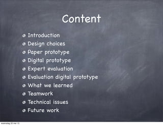
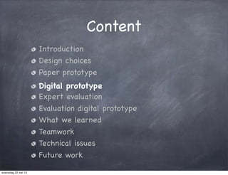
- 2. Content Introduction Design choices Paper prototype Digital prototype Expert evaluation Evaluation digital prototype What we learned Teamwork Technical issues Future work woensdag 22 mei 13
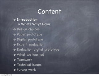
- 3. Content Introduction What? Why? How? Design choices Paper prototype Digital prototype Expert evaluation Evaluation digital prototype What we learned Teamwork Technical issues Future work woensdag 22 mei 13
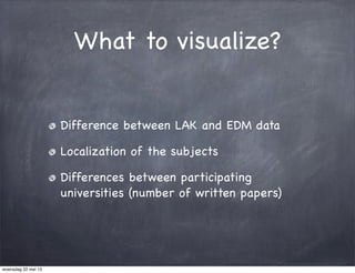
- 4. What to visualize? Difference between LAK and EDM data Localization of the subjects Differences between participating universities (number of written papers) woensdag 22 mei 13
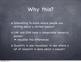
- 5. Why this? Interesting to know where people are writing about a certain subject LAK and EDM have a comparable research domain Ō×Ā visualize the differences Quantity is also visualized, to see where a lot of research is done about a subject woensdag 22 mei 13
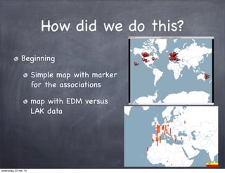
- 6. How did we do this? Beginning Simple map with marker for the associations map with EDM versus LAK data woensdag 22 mei 13
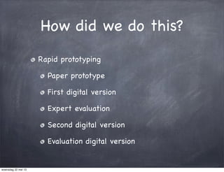
- 7. How did we do this? Rapid prototyping Paper prototype First digital version Expert evaluation Second digital version Evaluation digital version woensdag 22 mei 13
- 8. Content Introduction Design choices Paper prototype Digital prototype Expert evaluation Evaluation digital prototype What we learned Teamwork Technical issues Future work woensdag 22 mei 13
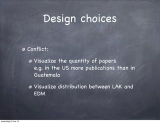
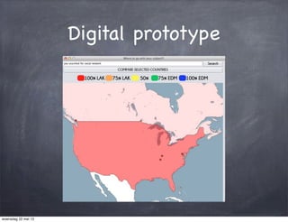
- 9. Design choices Con’¼éict: Visualize the quantity of papers e.g. in the US more publications than in Guatemala Visualize distribution between LAK and EDM woensdag 22 mei 13
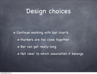
- 10. Design choices Continue working with bar charts Markers are too close together Bar can get really long Not clear to which association it belongs woensdag 22 mei 13
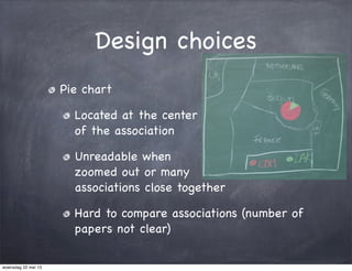
- 11. Design choices Pie chart Located at the center of the association Unreadable when zoomed out or many associations close together Hard to compare associations (number of papers not clear) woensdag 22 mei 13
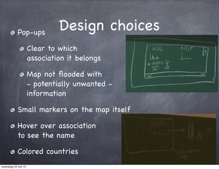
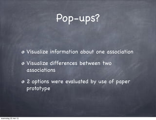
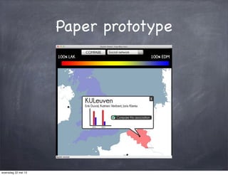
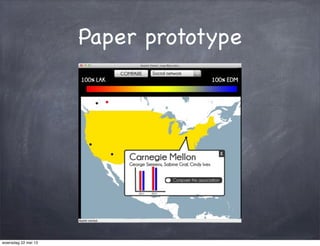
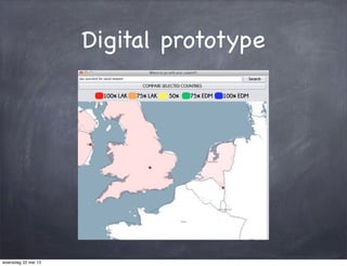
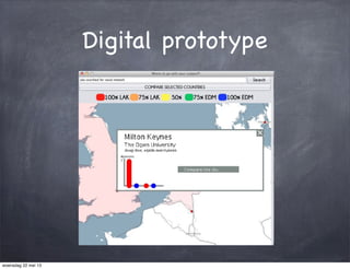
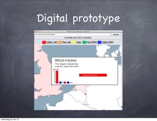
- 12. Design choicesPop-ups Clear to which association it belongs Map not ’¼éooded with - potentially unwanted - information Small markers on the map itself Hover over association to see the name Colored countries woensdag 22 mei 13
- 13. Design choices woensdag 22 mei 13
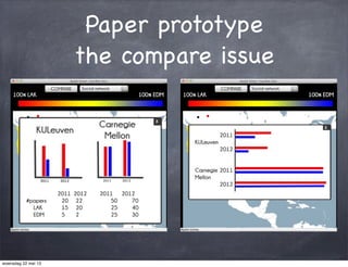
- 14. Pop-ups? Visualize information about one association Visualize differences between two associations 2 options were evaluated by use of paper prototype woensdag 22 mei 13
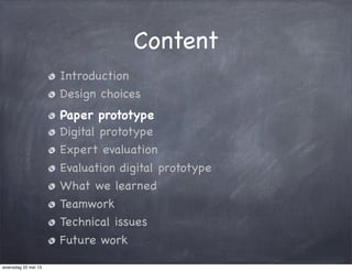
- 15. Content Introduction Design choices Paper prototype Digital prototype Expert evaluation Evaluation digital prototype What we learned Teamwork Technical issues Future work woensdag 22 mei 13
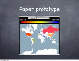
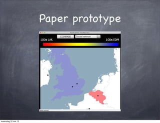
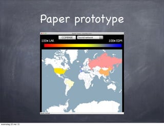
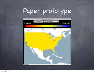
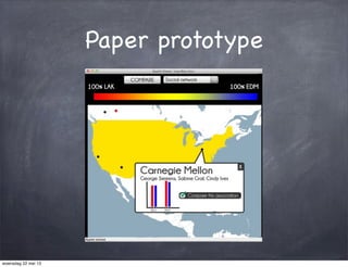
- 16. Paper prototype woensdag 22 mei 13
- 17. Paper prototype woensdag 22 mei 13
- 18. Paper prototype woensdag 22 mei 13
- 19. Paper prototype woensdag 22 mei 13
- 20. Paper prototype woensdag 22 mei 13
- 21. Paper prototype woensdag 22 mei 13
- 22. Paper prototype woensdag 22 mei 13
- 23. Paper prototype woensdag 22 mei 13
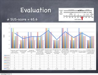
- 24. Paper prototype woensdag 22 mei 13
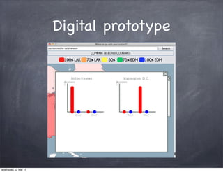
- 25. Paper prototype the compare issue woensdag 22 mei 13
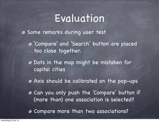
- 26. Evaluation Some remarks during user test ŌĆśCompareŌĆÖ and ŌĆśSearchŌĆÖ button are placed too close together. Dots in the map might be mistaken for capital cities Axis should be calibrated on the pop-ups Can you only push the ŌĆśCompareŌĆÖ button if (more than) one association is selected? Compare more than two associations? woensdag 22 mei 13
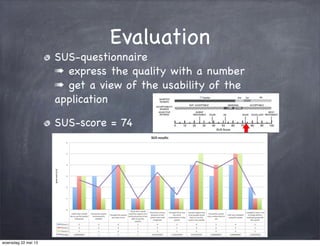
- 27. Evaluation SUS-questionnaire Ō×Ā express the quality with a number Ō×Ā get a view of the usability of the application SUS-score = 74 woensdag 22 mei 13
- 28. Content Introduction Design choices Paper prototype Digital prototype Expert evaluation Evaluation digital prototype What we learned Teamwork Technical issues Future work woensdag 22 mei 13
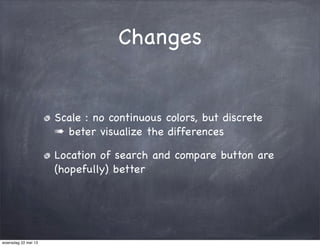
- 29. Changes Scale : no continuous colors, but discrete Ō×Ā beter visualize the differences Location of search and compare button are (hopefully) better woensdag 22 mei 13
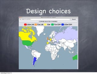
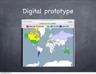
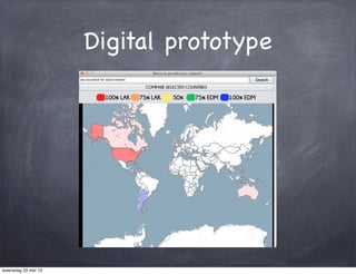
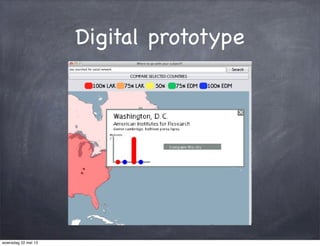
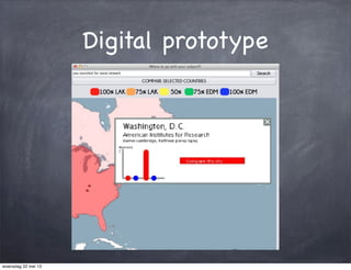
- 30. Digital prototype woensdag 22 mei 13
- 31. Digital prototype woensdag 22 mei 13
- 32. Digital prototype woensdag 22 mei 13
- 33. Digital prototype woensdag 22 mei 13
- 34. Digital prototype woensdag 22 mei 13
- 35. Digital prototype woensdag 22 mei 13
- 36. Digital prototype woensdag 22 mei 13
- 37. Digital prototype woensdag 22 mei 13
- 38. Digital prototype woensdag 22 mei 13
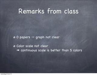
- 39. Remarks from class 0 papers graph not clear Color scale not clear Ō×Ā continuous scale is better than 5 colors woensdag 22 mei 13
- 40. Content Introduction Design choices Paper prototype Digital prototype Expert evaluation Evaluation digital prototype What we learned Teamwork Technical issues Future work woensdag 22 mei 13
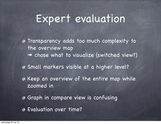
- 41. Expert evaluation Transparency adds too much complexity to the overview map Ō×Ā chose what to visualize (switched view?) Small markers visible at a higher level? Keep an overview of the entire map while zoomed in Graph in compare view is confusing Evaluation over time? woensdag 22 mei 13
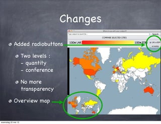
- 42. Changes Added radiobuttons Two levels : - quantity - conference No more transparency Overview map woensdag 22 mei 13
- 43. Content Introduction Design choices Paper prototype Digital prototype Expert evaluation Evaluation digital prototype What we learned Teamwork Technical issues Future work woensdag 22 mei 13
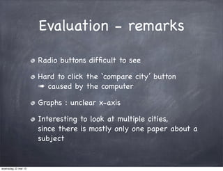
- 44. Evaluation - remarks Radio buttons dif’¼ücult to see Hard to click the ŌĆścompare cityŌĆÖ button Ō×Ā caused by the computer Graphs : unclear x-axis Interesting to look at multiple cities, since there is mostly only one paper about a subject woensdag 22 mei 13
- 45. Evaluation SUS-score = 65.6 woensdag 22 mei 13
- 46. Content Introduction Design choices Paper prototype Digital prototype Expert evaluation Evaluation digital prototype What we learned Teamwork Technical issues Future work woensdag 22 mei 13
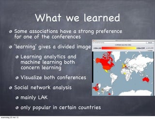
- 47. What we learned Some associations have a strong preference for one of the conferences ŌĆślearningŌĆÖ gives a divided image Learning analytics and machine learning both concern learning Visualize both conferences Social network analysis mainly LAK only popular in certain countries woensdag 22 mei 13
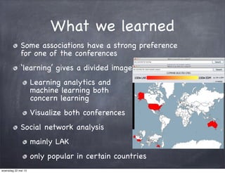
- 48. What we learned Some associations have a strong preference for one of the conferences ŌĆślearningŌĆÖ gives a divided image Learning analytics and machine learning both concern learning Visualize both conferences Social network analysis mainly LAK only popular in certain countries woensdag 22 mei 13
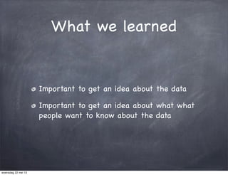
- 49. What we learned Important to get an idea about the data Important to get an idea about what what people want to know about the data woensdag 22 mei 13
- 50. Content Introduction Design choices Paper prototype Digital prototype Expert evaluation Evaluation digital prototype What we learned Teamwork Technical issues Future work woensdag 22 mei 13
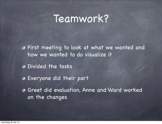
- 51. Teamwork? First meeting to look at what we wanted and how we wanted to do visualize it Divided the tasks Everyone did their part Greet did evaluation, Anne and Ward worked on the changes woensdag 22 mei 13
- 52. Content Introduction Design choices Paper prototype Digital prototype Expert evaluation Evaluation digital prototype What we learned Teamwork Technical issues Future work woensdag 22 mei 13
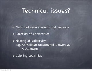
- 53. Technical issues? Clash between markers and pop-ups Location of universities Naming of university e.g. Katholieke Universiteit Leuven vs. K.U.Leuven Coloring countries woensdag 22 mei 13
- 54. Content Introduction Design choices Paper prototype Digital prototype Expert evaluation Evaluation digital prototype What we learned Teamwork Technical issues Future work woensdag 22 mei 13
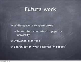
- 55. Future work White-space in compare boxes More information about a paper or university Evaluation over time Search option when selected ŌĆ£# papersŌĆØ woensdag 22 mei 13
- 56. DEMO woensdag 22 mei 13
- 57. woensdag 22 mei 13
- 58. ?Questions? woensdag 22 mei 13