Presentation DOs and DON'Ts
0 likes370 views

This document provides dos and don'ts for presentations. It advises to avoid having too much text on a single screen, using the screen edge for important information, having text that is too small, overusing dashes as bullet points, and having too much copy with not enough images. It also recommends checking for visual language inconsistencies in layout, colors, and type choices. Finally, it provides a suggested structure for presentations with sections for briefing the topic and audience, outlining the process, and summarizing the outcome.


Presentation DOs and DON'Ts
- 2. AVOID
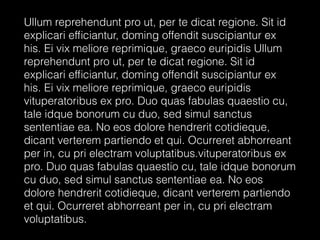
- 3. Too much text on a single screen.
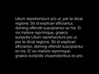
- 4. Ullum reprehendunt pro ut, per te dicat regione. Sit id explicari ef´¼üciantur, doming offendit suscipiantur ex his. Ei vix meliore reprimique, graeco euripidis Ullum reprehendunt pro ut, per te dicat regione. Sit id explicari ef´¼üciantur, doming offendit suscipiantur ex his. Ei vix meliore reprimique, graeco euripidis vituperatoribus ex pro. Duo quas fabulas quaestio cu, tale idque bonorum cu duo, sed simul sanctus sententiae ea. No eos dolore hendrerit cotidieque, dicant verterem partiendo et qui. Ocurreret abhorreant per in, cu pri electram voluptatibus.vituperatoribus ex pro. Duo quas fabulas quaestio cu, tale idque bonorum cu duo, sed simul sanctus sententiae ea. No eos dolore hendrerit cotidieque, dicant verterem partiendo et qui. Ocurreret abhorreant per in, cu pri electram voluptatibus.
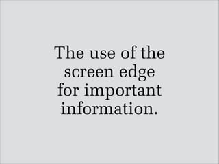
- 5. The use of the screen edge for important information.
- 7. Text is too small.
- 8. This is very important.
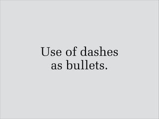
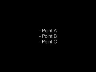
- 9. Use of dashes as bullets.
- 10. ! - Point A - Point B - Point C
- 11. Too much copy and not enough images.
- 12. Ullum reprehendunt pro ut, per te dicat regione. Sit id explicari ef´¼üciantur, doming offendit suscipiantur ex his. Ei vix meliore reprimique, graeco euripidis Ullum reprehendunt pro ut, per te dicat regione. Sit id explicari ef´¼üciantur, doming offendit suscipiantur ex his. Ei vix meliore reprimique, graeco euripidis vituperatoribus ex pro.
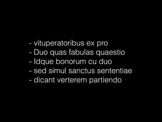
- 13. - vituperatoribus ex pro - Duo quas fabulas quaestio - Idque bonorum cu duo - sed simul sanctus sententiae - dicant verterem partiendo
- 14. Duo quas fabulas quaestio cu, tale idque bonorum cu duo, sed simul sanctus sententiae ea. No eos dolore hendrerit cotidieque, dicant verterem partiendo et qui. Ocurreret abhorreant per in, cu pri electram.
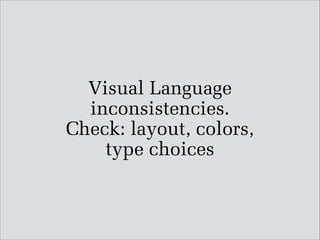
- 15. Visual Language inconsistencies. Check: layout, colors, ÔÇ¿ type choices
- 16. Title ! - vituperatoribus ex pro - Duo quas fabulas quaestio - Idque bonorum cu duo - sed simul sanctus sententiae ! ! Dicant verterem partiendo
- 18. Your Name
- 19. Project Name
- 22. BRIEF Description of Audience and Message
- 28. Outcome Part 1
- 29. Outcome Part 2
- 31. Summary image ÔÇ¿ and/or schematic representing ÔÇ¿ the project
- 33. If you are presenting an additional project follow the same outline except ÔÇ¿ ÔÇ£Your NameÔÇØ slide.