Question 2 comparison
Download as DOCX, PDF0 likes73 views
This document provides an analysis of the designer's digipack and poster for a band. It discusses how one panel of the digipack is similar to a panel in the designer's magazine because they liked the design. Both the digipack and poster use the same three main colors of red, blue, and green which were inspired by nature. The simple poster design effectively attracts audiences through the inclusion of flowers seen in the digipack panels. While the colorful design stands out from other genres, the dim tour dates can make the information hard to read quickly. The digipack breaks conventions through its use of a dark background with light colors.
1 of 2
Download to read offline

Recommended
Eval 2
Eval 2Rathina159
╠²
The document discusses how various ancillary texts like a music video, magazine advertisement, poster, and CD cover work together to promote an independent folk rock band called The Bible Code Sundays. Specifically, it aims to create synergy across the materials by using consistent visual elements like black and white color schemes, natural lighting, and locations. It also establishes intertextual references to Oscar Wilde's The Picture of Dorian Gray to give the music video deeper literary meaning for audiences familiar with the novel. However, promoting through digital platforms could encourage piracy that reduces CD sales, so the band may need to partner with larger companies to survive as an independent act.Evaluation Question 2
Evaluation Question 2chloebishop7
╠²
The student created a digipak (CD packaging) for a band's single that was meant to complement the music video and attract the intended audience. To do this, the student used photos from the music video shoot and incorporated similar dark, dreary elements like woods in the background of the CD cover and mug shots of the band in a magazine article. This was to ensure the digipak had the same theme and atmosphere as the music video. Effectively matching the style of the ancillary materials to the music video would help attract the right rock music audience to the band.Digipak Inspiration
Digipak Inspirationholbeau
╠²
I took a variety of images from google of different digipak and analysed particular elements of each, stating how these would link to my product and influence its production.How effective is the combination of your main product and ancillary texts
How effective is the combination of your main product and ancillary textshayleysollis
╠²
The document discusses the effectiveness of combining a band's main media products, including a music video, digipaks, and posters. The creator aimed to consistently portray the band's quirky image across all products. For the digipaks, similar locations, colors, and images from the music video were used to achieve correspondence. Multiple drafts were made to match the lighting and style of the video. The digipaks also incorporate the band's carefree nature and subtle references to their genre. By using consistent visuals and typography throughout the products, as well as social media links, the band is portrayed as fun, unique, and interactive with their audience. The creator believes the combination of products effectively conveys the intendedMedia evaluation question 2
Media evaluation question 2zorannffc
╠²
The document summarizes how the author created related ancillary texts (a digipack and magazine advert) for a music video. Key elements were carried over between the media products to reinforce the band's identity and ensure continuity. These included using similar images of the band members, fonts, colors, and edited photographic styles. Links and reviews were included to appeal to the target audience and encourage purchasing. The goal was to strategically connect the materials and construct a cohesive "star image" of the band using a range of interrelated elements.Magazine Advert Analysis
Magazine Advert Analysisjoereeves1999
╠²
The document discusses the design choices made for a band's promotional magazine advertisement. Key points include:
- The same font was used for the band and album names to create a consistent brand identity.
- An iTunes visualizer screenshot was used instead of a band image to focus on branding over personality.
- Standard elements like the record label logo, release date, and website were included in the same font for cohesive branding.
- Including multiple formats (vinyl, digital) shows the band appeals to a wide audience. Specifying iTunes ensures wide digital access.Evaluation question 2
Evaluation question 2DavidFlaherty1
╠²
The document discusses the design of a poster for a band and how it relates to the design of the band's digipak and music video. The key points are:
1) The poster design uses the same fonts and color scheme as the digipak to create consistency between the two ancillary texts and link them to the music video.
2) Elements of the digipak, like a close-up of the band members, are also included in the poster design to easily connect the two.
3) The styles and clothing of the band were chosen to fit the rock genre and establish a connection between the ancillary texts and music video.
4) Research into existing band designs informed choicesDemon cleaner poster
Demon cleaner posterhurtwoodhousemedia5
╠²
The band members and their style of dress represent the genre of music they play. The bold font of the band's title draws attention for advertising the group. The font and color choice imitates signs on buildings to blend the title into the city scape. The record label advertises the band and genre of music, and influences the audience. The location and music video setting represent the genre and package. Tour dates appeal to audiences and allow more time for fans to see the band.Demon cleaner poster
Demon cleaner posterhurtwoodhousemedia5
╠²
The band members and their style of dress represent the genre of music they play. The bold font of the band's title draws attention for advertising the group. The font and color choice blends the title into the cityscape backdrop, imitating signs on buildings. The record label advertises the band and genre of music it represents to appeal to audiences familiar with the label. The location and music video setting represent the genre and style of the whole project. Listing tour dates in multiple cities gives more opportunities for audiences to see the band live and is another advertising method. The font and color choices for the advertisements relate to the genre and vibe of the band and background setting.Digipak Analysis (Inside Cover)
Digipak Analysis (Inside Cover)Hitchin Girls School
╠²
The document discusses including a short biography and everyday pictures of the unsigned artist Jose Vanders in the digipak to present her as down-to-earth and relatable to her target audience of young girls. It also mentions adding a handwritten thank you message from Jose to make the audience feel appreciated and improve their relationship with the artist.Evaluation Question 2
Evaluation Question 2zachhl
╠²
This document discusses the design elements and links between a digipack, magazine advertisement, and music video created by the group. Similarities were created between the digipack and magazine ad to promote the album, using a black and white theme and red font. Links were also made between the digipack and music video to connect the projects. Social media links were added to the magazine ad to promote the artist online.Lana del rey digipak analysis
Lana del rey digipak analysisCVSmediastudies
╠²
The digipak features pastel colors and a simple design focused on the artist's face to represent the alternative pop genre. Key information about the album is prominently displayed on the front in bold blue font. The back provides the tracklist and production details in a complementary color scheme and font. The disc features a minimal design with red roses added to appeal to its target female audience. Inside, cream and black colors are used to provide background on the album's creation and lyrics in an accessible format for fans of the alternative pop style.Jay z digipack analysis
Jay z digipack analysisCVSmediastudies
╠²
This document analyzes the design of a digipack album by Jay-Z and Linkin Park. It discusses the use of graffiti-style fonts, splattered paint effects, and a limited color palette of blue, black, and white throughout the packaging. Key elements include bold lettering and illustrations in place of photographs. The design focuses on typography and layout over images to create a simple yet eye-catching package that effectively conveys the rap/R&B genre through its style.TASK 2A
TASK 2Adorcasnzita
╠²
Visuals are included in various media like newspapers, magazines, CD covers, DVD covers, book covers, and instruction manuals to provide context and information about their content. Images allow readers and audiences to see what is being described or see examples to make following instructions easier. Covers and illustrations attract audiences by representing genres and storylines or featuring characters and scenes to engage relevant fan bases.Evaluation question 1
Evaluation question 1Daniel Abraham
╠²
The document discusses the conventions used in the magazine, including the masthead, brand identity, puffs, cover lines, and images. For the masthead, bold capital letters are used in red and black to signify being loud and energetic like rock music. The brand identity connects to rock music through the use of red, black, and white colors and informal language to appeal to the target audience. Puffs are included to add value compared to other magazines. The images are brighter and feature relaxed, smiling poses atypical of rock bands to appeal to a wider audience rather than a niche audience.Media CW A2 Question 2 
Media CW A2 Question 2 brown2r
╠²
The combination of the main product (music video) and ancillary texts (poster and digipak) are effective because they all convey similar themes of being alone, struggling with loss, or trying to break away. This is shown through the lone actor in the music video, the character alone in the poster, and the colors on the digipak representing emotion, pain, and hope. The package fits the pop rock genre through a focus on the lead singer in the video and poster similar to other pop rock bands, and conventions like not showing the band on the digipak but representing the music. The text and ancillary materials look like real world products through following typical conventions for things like credits, track lists and design onEvaluation question 1
Evaluation question 1Lauren Turner
╠²
The document discusses conventions used in promotional packages for music albums. It analyzes the promotional package for Arctic Monkeys' album AM as a point of reference. Key conventions discussed include using a memorable logo, minimalist designs, release dates to generate excitement, clear artist names, and track lists on discs and packaging. The document also describes research on other album packaging, including using full wraparound images and information primarily on the outside. Overall, the document examines typical promotional elements and how they were applied or adapted in the author's own package design.Q2 Improved
Q2 ImprovedCaden Sherrard
╠²
The combination of the main product and ancillary texts is effective because it establishes a consistent theme through continuity in color scheme, font, and imagery. The red and white color scheme and font style are used across the album cover, magazine ad, and digipak to make the products visually cohesive and recognizable as part of the same brand. Specifically, both the magazine ad and digipak feature the same central image from the album cover. Additionally, the use of roses as a symbol links the products to the music video's narrative and theme. While some elements diverge from conventions to make the products unique, such as featuring the singer prominently, the overall combination of continuity and variation across the products is successful at promoting theKings of leon
Kings of leonCVSmediastudies
╠²
The document analyzes the album cover design for Kings of Leon's "Only by the Night". It uses Photoshop editing techniques to create an effective look and feel. Conventions like the artist's face are used, along with symbolic imagery like owls at night relating to the album title. Bright primary colors and a vintage yellow wash give it a retro style appealing to the target 20-35 male audience. The layout is basic with minimal text to portray a rough, niche rock style different from polished pop music covers.Q7
Q7MBangura1995
╠²
The document discusses improvements made to a magazine cover design project. For the preliminary task, an orange color scheme was used that did not fit conventions. Market research then found that black, white, and red would be easier to read. Photos used in each task also differed, with the preliminary one being more conventional and aimed at college students. The main task photo somewhat followed conventions while covering the model's flesh. Picture quality was better due to using a higher-quality camera and basic editing. Placement of text boxes also improved by following the model's shape rather than arbitrary placement.Q2
Q2Caden Sherrard
╠²
The document discusses the effectiveness of combining a main product (music video) with ancillary texts (digipak and magazine advert). The key themes across the products are the model and roses, drawing from The Smiths' symbolism of flowers representing love. Both the digipak and advert feature the same front cover image and color scheme to clearly promote the album. Multiple photos of the performer in different outfits in the digipak help link it to the music video while providing variety. Consistency in font, logo, and theme across the products helps maintain brand identity and recognition.Media Evaluation 2
Media Evaluation 2harrywbfmv
╠²
The document discusses promotional products created for an unsigned artist, including a music video, magazine advert, and digipack. The creator aimed to include recurring themes across the products to associate them and increase awareness of the artist. One theme was a key chain necklace worn by the artist. The artist was also featured visually in the music video and print products. Additionally, themes of love from the song and music video narrative carried through to images on the print materials. Consistent fonts and colors were also used to link the different promotional items.Magazine Advert
Magazine Advertcharbyrne
╠²
The document describes a magazine advertisement created for a band. The ad was kept simple to meet criteria and stayed black and white to match the band's DVD packaging. A live action photo of the band was used rather than a posed shot to show them performing, and Photoshop effects were added to make the poster look handmade and suit the band's rock genre.Digipack evaluation Q1
Digipack evaluation Q1crowny1997
╠²
The document summarizes the design choices for a digipak album cover. It describes using individual images of band members on the front cover to help build recognition. Font, colors, and effects like a glass effect were chosen to represent the post-hardcore genre and attract fans. Inside, a graffiti background photo ties the theme together and credits are listed as is standard. Overall, conventions were challenged by focusing on building the band's image while representing their genre through visual elements.How effective is the combination of your main product and ancillary texts?
How effective is the combination of your main product and ancillary texts?ATinti
╠²
The combination of the main music product (album) and ancillary texts (digipack, advertisements) is effective in promoting the band's image and music. They share consistent visual elements like fonts, images, and design to create a cohesive brand. Using brighter shots in the digipack than the music video differentiates the products while still relating them. Between products, costumes and lighting are altered to emphasize uniqueness of different tracks and appeal to audiences. The ancillary texts effectively promote the singles, music over image for a new indie band, and reinforce the fan base through recognition on the record label, website and digital stores.Media evaluation question 2
Media evaluation question 2zorannffc
╠²
The document discusses how the author ensured their music video, magazine advert, and digipack were closely related. Images of the band and characters from the music video were used in both the digipack and magazine advert. Similar editing was applied to the images and the same fonts and colors were used for the band and album names across products. Reviews, social media links, and release dates were included in the magazine advert to appeal to the target audience and promote purchases. Costumes, lighting, and materials were chosen to create a consistent star image and fit within the indie genre across all media products.Q2 powerpoint
Q2 powerpointgiaamarie
╠²
The document discusses how the combination of a main product (music video) with ancillary texts (print productions) can effectively create and strengthen an artist's brand. It describes how the music video and print productions feature consistent themes of traveling and outdoor locations that communicate the artist's personality. Specifically, photos from the print productions were taken on Cadair Idris mountain in Wales to link the themes to the target audience. Fonts, editing styles, and image placements are also kept consistent between products to clearly link them together and reinforce the developing brand.Digipak improvments 
Digipak improvments godsell1999
╠²
The document discusses improvements made to a digipak based on audience feedback. The key changes included:
1) Adding the song listings to the back cover so they were visible from the outside.
2) Redesigning the inside left page to have a simpler background that was consistent with the rest of the design.
3) Making the eyes on the front cover symmetrical by enlarging one eye and cropping the images.
4) Changing the magazine advert design based on feedback about the picture, fonts, and lack of social media links. The redesign used a black and white photo, consolidated the band name/album above the photo, limited fonts, and added social media links.Cis017 6 revision-2015_distributed
Cis017 6 revision-2015_distributedabdullah al-Thani
╠²
The document discusses key concepts in distributed systems including four goals (accessibility, transparency, openness, and scalability), performance measures, types of transparency, communicating entities, middleware, system architectures, communication paradigms, and models of communication. It provides details on remote procedure call, message-oriented middleware, data streaming, grids and clouds, and web services.Question 2 extended 
Question 2 extended maxcollins175
╠²
This 6-panel digipack contains conventions found in CD packaging such as a CD, track list, booklet or lyric book, and front cover.More Related Content
What's hot (20)
Demon cleaner poster
Demon cleaner posterhurtwoodhousemedia5
╠²
The band members and their style of dress represent the genre of music they play. The bold font of the band's title draws attention for advertising the group. The font and color choice blends the title into the cityscape backdrop, imitating signs on buildings. The record label advertises the band and genre of music it represents to appeal to audiences familiar with the label. The location and music video setting represent the genre and style of the whole project. Listing tour dates in multiple cities gives more opportunities for audiences to see the band live and is another advertising method. The font and color choices for the advertisements relate to the genre and vibe of the band and background setting.Digipak Analysis (Inside Cover)
Digipak Analysis (Inside Cover)Hitchin Girls School
╠²
The document discusses including a short biography and everyday pictures of the unsigned artist Jose Vanders in the digipak to present her as down-to-earth and relatable to her target audience of young girls. It also mentions adding a handwritten thank you message from Jose to make the audience feel appreciated and improve their relationship with the artist.Evaluation Question 2
Evaluation Question 2zachhl
╠²
This document discusses the design elements and links between a digipack, magazine advertisement, and music video created by the group. Similarities were created between the digipack and magazine ad to promote the album, using a black and white theme and red font. Links were also made between the digipack and music video to connect the projects. Social media links were added to the magazine ad to promote the artist online.Lana del rey digipak analysis
Lana del rey digipak analysisCVSmediastudies
╠²
The digipak features pastel colors and a simple design focused on the artist's face to represent the alternative pop genre. Key information about the album is prominently displayed on the front in bold blue font. The back provides the tracklist and production details in a complementary color scheme and font. The disc features a minimal design with red roses added to appeal to its target female audience. Inside, cream and black colors are used to provide background on the album's creation and lyrics in an accessible format for fans of the alternative pop style.Jay z digipack analysis
Jay z digipack analysisCVSmediastudies
╠²
This document analyzes the design of a digipack album by Jay-Z and Linkin Park. It discusses the use of graffiti-style fonts, splattered paint effects, and a limited color palette of blue, black, and white throughout the packaging. Key elements include bold lettering and illustrations in place of photographs. The design focuses on typography and layout over images to create a simple yet eye-catching package that effectively conveys the rap/R&B genre through its style.TASK 2A
TASK 2Adorcasnzita
╠²
Visuals are included in various media like newspapers, magazines, CD covers, DVD covers, book covers, and instruction manuals to provide context and information about their content. Images allow readers and audiences to see what is being described or see examples to make following instructions easier. Covers and illustrations attract audiences by representing genres and storylines or featuring characters and scenes to engage relevant fan bases.Evaluation question 1
Evaluation question 1Daniel Abraham
╠²
The document discusses the conventions used in the magazine, including the masthead, brand identity, puffs, cover lines, and images. For the masthead, bold capital letters are used in red and black to signify being loud and energetic like rock music. The brand identity connects to rock music through the use of red, black, and white colors and informal language to appeal to the target audience. Puffs are included to add value compared to other magazines. The images are brighter and feature relaxed, smiling poses atypical of rock bands to appeal to a wider audience rather than a niche audience.Media CW A2 Question 2
Media CW A2 Question 2 brown2r
╠²
The combination of the main product (music video) and ancillary texts (poster and digipak) are effective because they all convey similar themes of being alone, struggling with loss, or trying to break away. This is shown through the lone actor in the music video, the character alone in the poster, and the colors on the digipak representing emotion, pain, and hope. The package fits the pop rock genre through a focus on the lead singer in the video and poster similar to other pop rock bands, and conventions like not showing the band on the digipak but representing the music. The text and ancillary materials look like real world products through following typical conventions for things like credits, track lists and design onEvaluation question 1
Evaluation question 1Lauren Turner
╠²
The document discusses conventions used in promotional packages for music albums. It analyzes the promotional package for Arctic Monkeys' album AM as a point of reference. Key conventions discussed include using a memorable logo, minimalist designs, release dates to generate excitement, clear artist names, and track lists on discs and packaging. The document also describes research on other album packaging, including using full wraparound images and information primarily on the outside. Overall, the document examines typical promotional elements and how they were applied or adapted in the author's own package design.Q2 Improved
Q2 ImprovedCaden Sherrard
╠²
The combination of the main product and ancillary texts is effective because it establishes a consistent theme through continuity in color scheme, font, and imagery. The red and white color scheme and font style are used across the album cover, magazine ad, and digipak to make the products visually cohesive and recognizable as part of the same brand. Specifically, both the magazine ad and digipak feature the same central image from the album cover. Additionally, the use of roses as a symbol links the products to the music video's narrative and theme. While some elements diverge from conventions to make the products unique, such as featuring the singer prominently, the overall combination of continuity and variation across the products is successful at promoting theKings of leon
Kings of leonCVSmediastudies
╠²
The document analyzes the album cover design for Kings of Leon's "Only by the Night". It uses Photoshop editing techniques to create an effective look and feel. Conventions like the artist's face are used, along with symbolic imagery like owls at night relating to the album title. Bright primary colors and a vintage yellow wash give it a retro style appealing to the target 20-35 male audience. The layout is basic with minimal text to portray a rough, niche rock style different from polished pop music covers.Q7
Q7MBangura1995
╠²
The document discusses improvements made to a magazine cover design project. For the preliminary task, an orange color scheme was used that did not fit conventions. Market research then found that black, white, and red would be easier to read. Photos used in each task also differed, with the preliminary one being more conventional and aimed at college students. The main task photo somewhat followed conventions while covering the model's flesh. Picture quality was better due to using a higher-quality camera and basic editing. Placement of text boxes also improved by following the model's shape rather than arbitrary placement.Q2
Q2Caden Sherrard
╠²
The document discusses the effectiveness of combining a main product (music video) with ancillary texts (digipak and magazine advert). The key themes across the products are the model and roses, drawing from The Smiths' symbolism of flowers representing love. Both the digipak and advert feature the same front cover image and color scheme to clearly promote the album. Multiple photos of the performer in different outfits in the digipak help link it to the music video while providing variety. Consistency in font, logo, and theme across the products helps maintain brand identity and recognition.Media Evaluation 2
Media Evaluation 2harrywbfmv
╠²
The document discusses promotional products created for an unsigned artist, including a music video, magazine advert, and digipack. The creator aimed to include recurring themes across the products to associate them and increase awareness of the artist. One theme was a key chain necklace worn by the artist. The artist was also featured visually in the music video and print products. Additionally, themes of love from the song and music video narrative carried through to images on the print materials. Consistent fonts and colors were also used to link the different promotional items.Magazine Advert
Magazine Advertcharbyrne
╠²
The document describes a magazine advertisement created for a band. The ad was kept simple to meet criteria and stayed black and white to match the band's DVD packaging. A live action photo of the band was used rather than a posed shot to show them performing, and Photoshop effects were added to make the poster look handmade and suit the band's rock genre.Digipack evaluation Q1
Digipack evaluation Q1crowny1997
╠²
The document summarizes the design choices for a digipak album cover. It describes using individual images of band members on the front cover to help build recognition. Font, colors, and effects like a glass effect were chosen to represent the post-hardcore genre and attract fans. Inside, a graffiti background photo ties the theme together and credits are listed as is standard. Overall, conventions were challenged by focusing on building the band's image while representing their genre through visual elements.How effective is the combination of your main product and ancillary texts?
How effective is the combination of your main product and ancillary texts?ATinti
╠²
The combination of the main music product (album) and ancillary texts (digipack, advertisements) is effective in promoting the band's image and music. They share consistent visual elements like fonts, images, and design to create a cohesive brand. Using brighter shots in the digipack than the music video differentiates the products while still relating them. Between products, costumes and lighting are altered to emphasize uniqueness of different tracks and appeal to audiences. The ancillary texts effectively promote the singles, music over image for a new indie band, and reinforce the fan base through recognition on the record label, website and digital stores.Media evaluation question 2
Media evaluation question 2zorannffc
╠²
The document discusses how the author ensured their music video, magazine advert, and digipack were closely related. Images of the band and characters from the music video were used in both the digipack and magazine advert. Similar editing was applied to the images and the same fonts and colors were used for the band and album names across products. Reviews, social media links, and release dates were included in the magazine advert to appeal to the target audience and promote purchases. Costumes, lighting, and materials were chosen to create a consistent star image and fit within the indie genre across all media products.Q2 powerpoint
Q2 powerpointgiaamarie
╠²
The document discusses how the combination of a main product (music video) with ancillary texts (print productions) can effectively create and strengthen an artist's brand. It describes how the music video and print productions feature consistent themes of traveling and outdoor locations that communicate the artist's personality. Specifically, photos from the print productions were taken on Cadair Idris mountain in Wales to link the themes to the target audience. Fonts, editing styles, and image placements are also kept consistent between products to clearly link them together and reinforce the developing brand.Digipak improvments
Digipak improvments godsell1999
╠²
The document discusses improvements made to a digipak based on audience feedback. The key changes included:
1) Adding the song listings to the back cover so they were visible from the outside.
2) Redesigning the inside left page to have a simpler background that was consistent with the rest of the design.
3) Making the eyes on the front cover symmetrical by enlarging one eye and cropping the images.
4) Changing the magazine advert design based on feedback about the picture, fonts, and lack of social media links. The redesign used a black and white photo, consolidated the band name/album above the photo, limited fonts, and added social media links.Viewers also liked (19)
Cis017 6 revision-2015_distributed
Cis017 6 revision-2015_distributedabdullah al-Thani
╠²
The document discusses key concepts in distributed systems including four goals (accessibility, transparency, openness, and scalability), performance measures, types of transparency, communicating entities, middleware, system architectures, communication paradigms, and models of communication. It provides details on remote procedure call, message-oriented middleware, data streaming, grids and clouds, and web services.Question 2 extended
Question 2 extended maxcollins175
╠²
This 6-panel digipack contains conventions found in CD packaging such as a CD, track list, booklet or lyric book, and front cover.

Presentaci├│n bullying 1Maria Andrea Giulietti
╠²
Este documento discute el problema del acoso escolar o bullying. Propone que la educaci├│n emocional y el desarrollo de habilidades socioemocionales pueden ayudar a prevenir el bullying. Tambi├®n recomienda estrategias como establecer normas contra la intimidaci├│n, apoyar a las v├Łctimas, y hablar con los agresores y sus padres. El objetivo es crear un ambiente escolar de respeto donde los estudiantes se sientan seguros y capaces de manejar sus emociones.
Ejercio 17aJavi Fluxa Lopez
╠²
El Real Valladolid desperdici├│ una oportunidad de ganar su primer partido fuera de casa al empatar 2-2 contra el Tenerife a tres minutos del final. El Barcelona perdi├│ 1-2 contra el Oviedo en los ├║ltimos cinco minutos del partido, perdiendo la posibilidad de ganar el campeonato espa├▒ol. El quesos derrot├│ 300-0 al Tecnidex y se convirti├│ en el l├Łder de la Superliga de rugby despu├®s de conseguir su segunda victoria de la temporada. Carlos Sainz necesita ganar el ├║ltimo rally brit├Īnico o terminQuestion 2 extended 2 
Question 2 extended 2 maxcollins175
╠²
This document describes a finished digipack design with standard elements labeled, including a front cover with the album name and indication that it contains a CD, an inner cover with text, and information listing the promoters, record label, and track list.
Ejercicio 16Javi Fluxa Lopez
╠²
El documento presenta dos ejercicios de matem├Īticas. El primero pide simplificar una expresi├│n algebraica compleja. El segundo solicita representar gr├Īficamente una funci├│n definida por partes, con diferentes expresiones en diferentes intervalos de x.
22 uma escola perambulante niveaNivea Andrade
╠²
O texto discute educa├¦├Żo patrimonial e conhecimento em rede a partir dos estudos com os cotidianos em educa├¦├ŻoTILTH & TILLAGE
TILTH & TILLAGEarnab das
╠²
Tillage and tith are important for soil health and crop growth. Tillage refers to working the surface soil to create favorable conditions for crop establishment, growth, and yield. There are two types of tillage - preparatory and special purpose. Preparatory tillage includes primary tillage using plows or tractors on new land, and secondary tillage like harrowing to create good soil structure. Zero tillage involves minimum soil disturbance and control of weeds through non-mechanical means. Tillage provides benefits like improved water holding capacity, aeration, and nutrient availability through enhanced organic matter breakdown. However, too much or improperly timed tillage can damage soil structure and increase erosion.Resume 2 - 2014
Resume 2 - 2014Sandra Kubo
╠²
Sandra Lumiko Kubo has over 30 years of experience in architecture, construction supervision, machine operation, and interpretation. She held positions in Brazil and Japan, including field surveyor, architect, construction supervisor, and most recently as a machine operator for electronics manufacturing in Japan. Kubo has a Bachelor's degree in Architecture from Faculdade de Arquitetura e Urbanismo Braz Cubas in Brazil and has additional training in interior design, Japanese language and culture, and business procedures. She is fluent in English, French and Portuguese.
Mapa conceptual de tecnologia educativaNo TrABAjO mIS pAPas Me Mantienen xD
╠²
La tecnolog├Ła educativa involucra el uso de m├®todos de ense├▒anza modernos que se desarrollan diariamente en diferentes ├Īreas, como planes de estudio con fotos, videos y diapositivas. Estos m├®todos permiten procesos did├Īcticos y de planificaci├│n mediante la ense├▒anza, lo que genera cambios y ├®xitos. La tecnolog├Ła y la computaci├│n son fundamentales en la educaci├│n moderna ya que permiten la interacci├│n entre alumnos y maestros.
Ratio of Raw Material to Finished Material
Ratio of Raw Material to Finished Materialarnab das
╠²
The document outlines various raw material to finished material ratios for agricultural products. It lists ratios such as paddy to rice at 3:2, sugarcane to molasses at 8:1, sugarcane to sugar at 10:1, and cotton to fiber at 3:1. Jute, jute bark, and fiber are produced from 100, 40, and 5 units of raw jute respectively.
Halloween partyYo Misma
╠²
El documento habla brevemente sobre una fiesta de Halloween en 2013/2014. Menciona la fiesta de Halloween pero no proporciona detalles sobre ella. Indica que la informaci├│n continuar├Ī el pr├│ximo a├▒o.Media question2
Media question2maxcollins175
╠²
Our group created a music video for a pop rock song along with a digipack and poster to advertise the album. We researched other pop rock music videos to incorporate successful elements and appeal to a wide audience. For one ancillary task, I designed a magazine advertisement for the band's new poster. The poster features only the band name and tour dates, album title, and record label, but not the band's image or website to stand out from normal posters.

Las pizarras y us modalidadesNo TrABAjO mIS pAPas Me Mantienen xD
╠²
Este documento describe diferentes tipos de pizarras, incluyendo pizarras de madera, cemento, lienzo, acero y electr├│nicas. Cada tipo tiene sus propias caracter├Łsticas, ventajas y desventajas. Por ejemplo, las pizarras de madera y cemento son m├Īs duraderas pero menos port├Ītiles, mientras que las pizarras de lienzo y acero son m├Īs ligeras y port├Ītiles aunque m├Īs fr├Īgiles. Las pizarras electr├│nicas permiten proyecciones interactivas pero requieren equipo adicional.
║▌║▌▀Żshare de su proceso ddacticoNo TrABAjO mIS pAPas Me Mantienen xD
╠²
El documento describe un plan de lecci├│n sobre ecosistemas. La lecci├│n comenzar├Ī con una din├Īmica para motivar a los estudiantes llamada "La palmera". Luego, el maestro presentar├Ī el tema de los ecosistemas utilizando materiales did├Īcticos como marcadores y pizarras. Despu├®s habr├Ī una discusi├│n interactiva sobre el tema y se realizar├Īn evaluaciones orales para verificar la comprensi├│n de los estudiantes. El objetivo es que los estudiantes aprendan sobre los componentes bi├│ticos y abi├│ticos de los
Similar to Question 2 comparison (20)
Digipak ideas - initial (album art)
Digipak ideas - initial (album art)nathanbeardlcm1415
╠²
This document discusses inspiration for digipak album cover designs. It analyzes 7 different digipak designs, summarizing what elements are effective and could be applied to the designer's own digipak. Common elements that drew the designer's attention included minimalist and abstract designs that leave intrigue, grayscale or unique color schemes, textures, and bold yet consistent fonts that clearly convey the artist's identity. The designer aims to create a digipak that stands out visually while representing the band's indie style through a simple but memorable design.digipak anlysis 
digipak anlysis louisahill99
╠²
The document discusses the design elements of several music album digipaks and promotional materials. It analyzes how bands like The 1975, CHVRCHES, and Twenty One Pilots use simple yet distinctive designs that establish recognizable branding across their different releases. Elements like consistent color schemes, fonts, and imagery help fans instantly identify the artists. The author indicates they will consider these design conventions when creating their own digipak.Evaluation question 2
Evaluation question 2Ciaurro
╠²
The document discusses the design process for ancillary products like a digipak and magazine advertisement to accompany a main music product. Extensive research was conducted on designs of similar products in genres like house music. Trials were made and feedback received to help determine the design approach. The final digipak design features the album cover art with a red filter and image of the artist to create brand identity. The magazine ad also features the album art to link it to the digipak while using a formal style to clearly convey information to audiences. The products were designed to have consistent branding that would help popularize and sell all of the items.Evaluation question 2
Evaluation question 2Ciaurro
╠²
The document discusses the effectiveness of combining a main music product (an album) with ancillary tasks (a digipak and magazine advertisement). It describes the extensive research conducted on similar products in genres like house music to determine design choices. This included looking at albums by Daft Punk and The Beatles. Mockups were created and feedback was gathered to help decide on a quirky yet professional style that matched the lighthearted video. The final digipak and ad featured consistent branding elements like a red filter and space theme to tie the products together cohesively and effectively promote the artist.My digipak
My digipak09knepalimedia
╠²
Here is the planning, contruciton, production of my digipak also, the way that I chose the different aspects of it.Evaluation Question 2
Evaluation Question 2liamouse96
╠²
The document discusses the design and purpose of a digipak and magazine advertisement for a band's new album. The digipak uses a pink and blue color scheme inspired by other albums in the same genre. It features photos related to the band's music video, including images of a pylon, to create branding and links between the products. The ad in the magazine also uses the front cover photo for consistency. Together, the digipak, ad, and music video employ genre-related codes and imagery of a pylon to promote the band and form connections that will increase audience recognition and satisfaction.Q1 Section 2 Final
Q1 Section 2 FinalJames Coy
╠²
The document discusses how the media product uses and develops conventions of the indie folk genre.
It uses a 4 panel digipak layout, natural and handwritten fonts, and imagery of nature - all conventions of indie folk albums. However, it develops these conventions by using beach imagery rather than forests to convey themes.
Inside the CD case, a single spanning image is used, as in other albums, but it is developed to show loneliness. Lens flares and nature imagery also follow conventions but are developed symbolically.
The track list on the back panel follows convention, while the photo is developed to look like celluloid film to build emotion. Magazine ads usually have the artist's name large,First evaluation question
First evaluation questionLauraAmyWard
╠²
Laura Ward analyzed conventions used in real pop media products to incorporate into her own media products for a band called The Laze Lights. She researched conventions like bright colors, varied locations, fast-paced action shots, trendy costumes, close-ups and group shots. These conventions were used in her music video through techniques like lighting, camera angles, and editing. She also applied conventions like consistent color schemes and positioning to her ancillary texts like advertisements and album artwork to develop a cohesive brand for The Laze Lights that challenges conventions in some ways but remains grounded in researched pop conventions.Ancillary Texts
Ancillary TextsHolly F
╠²
The document discusses the design of various materials to promote an indie artist, including a digipak, magazine advertisement, and their analysis. It examines examples from other artists and incorporates conventions of the indie genre. The final designs chosen for the digipak and magazine ad utilize consistent imagery, fonts, and colors to create recognition and brand identity while maintaining an indie aesthetic focused on the music over the individual artist.Evaluation question 2
Evaluation question 209simsd
╠²
The document discusses the effectiveness of combining a music video with ancillary texts like a poster and digipack. It describes how the group ensured consistency between the color scheme, themes, and storytelling elements across all elements. Fonts, costumes, and imagery were also kept consistent to clearly link the products and represent the pop genre and love story theme. The digipack and poster complement each other through similar background imagery and shots that reflect the mixed emotions of the artists and narrative.Analysis of digipak and magazine advert drafts
Analysis of digipak and magazine advert draftsAbigail Downes
╠²
This document analyzes four draft designs for Digipaks and magazine advertisements. For each draft, the document discusses design elements and how they relate to audience feedback or conventions of the indie genre. Key points addressed include color schemes, use of images versus text, placement of band name and album title, and maintaining continuity across panels. The document provides feedback on what elements were effective and which designs could be improved for a final product.+ Covers for my digipack
+ Covers for my digipackcaitlinejm
╠²
The document discusses choosing a photo for a digipack album cover. The artist considered using self-portraits, as many pop artists do, but wanted something more mysterious since their genre is alternative. They explored using half of a model or dark scenic shots. They liked a photo with a model in shadow but wanted more options. After getting feedback that picture two was the favorite, they decided to do a new photoshoot to have more choices for the alternative genre digipack cover.Idea digi pak 
Idea digi pak BrittanyHannah
╠²
The document discusses research conducted for the design of a digi-pak for an indie artist. Key findings from the research included that audiences preferred designs with simple graphic elements combined with personal photos. Common color schemes for the indie genre were identified as neutral tones like blues, greens, browns and creams. Specific colors proposed for the design were light blue, purple and grey to appeal to both male and female audiences. Inspiration was drawn from existing album designs including the use of tape and leaf prints. Further research on typography and printing techniques was discussed to incorporate artistic elements into the final design.Blogger Kelly Q1 Evaluation
Blogger Kelly Q1 EvaluationKellyeastwood
╠²
The document discusses the media creator's music video, digipack, and magazine advertisement for a new album. The music video uses an unconventional style of staying with the same story throughout rather than cutting between scenes. The digipack is different in having half the front and back in color and half in black and white. The magazine ad challenges conventions by including minimal information and getting straight to the point. The goal was to create a cohesive package that both develops and challenges conventions while appealing to the target audience of party-loving 16-30 year olds who enjoy R&B music.Q1 Section 2 FINAL
Q1 Section 2 FINALJames Coy
╠²
The document discusses conventions used in the design of various media products for an indie folk artist named Natasha North. Key conventions discussed include:
- Using a 4 panel layout for the digipak, as seen in other artists' works.
- Incorporating natural, handwritten fonts and imagery of nature/landscapes, popular within the indie folk genre.
- Spanning a single image across the CD case, as done by other indie folk artists.
- Including the track list on the back panel, following convention.
- Featuring the artist's name prominently in magazine ads to catch readers' attention.
The document also discusses ways some conventions were developed or challengedDigipak and music magazine advertisement pitch
Digipak and music magazine advertisement pitchalbinosmurf
╠²
The document discusses plans for designing a Digipak album cover and advertisement for a folk rock band. Key points include:
- The target audience is 16-30 years old and research from a music video will inform the design.
- Examples of successful album artwork show the importance of linking to the band's genre, using nature themes, and having a unique yet memorable design.
- The planned Digipak design features a tree spreading across the cover with branches and track listings. Nature tones and a vintage font will be used.
- An example advertisement is praised for effectively representing the artist's style through imagery, font, and linking to their album design.
- The artist's advertisement will similarlyDigipak analysiss
Digipak analysissCeri Lewis
╠²
The document analyzes and summarizes key elements of digipak album covers from three indie artists - Gabrielle Aplin, Imagine Dragons, and Lana Del Rey. Some elements that the author notes as effective include contrasting fonts that make the albums stand out, continuity of design elements across the front and back covers, inclusion of the artist's website, and bold positioning of song titles that catches the viewer's attention. The author indicates they will consider incorporating inspirations from these digipaks, such as continued colors, layouts, and inclusion of legal/website information, into their own designed digipak.Evaluation Question 1 
Evaluation Question 1 Molly Turner
╠²
The document discusses the conventions of music videos, digipak album covers, and magazine advertisements. It analyzes how the student's media products for an indie artist used, developed, or challenged these conventions.
The student created a narrative music video with performance elements, sticking to conventions. For the digipak, conventions like close-up shots and direct gaze were followed, while placement of text was challenged. Inspiration from other designs was taken. The magazine ad used the front cover photo per convention, while information style and platforms listed developed conventions. Overall, synergy between products and an earth tone color scheme linked the promotional package within conventions.Media evaluation question 1 part 3
Media evaluation question 1 part 3msharrattmedia
╠²
This document summarizes the typical conventions of a digipack and how the student's digipack design conforms and subverts those conventions. The front cover typically includes the artist name and album title, which the student included. However, the student subverted conventions by placing the album title to the side rather than centered. The back cover normally lists the tracklist, which the student included, along with other typical information. The inside tray is meant to have consistent style with the covers, which the student achieved while also changing the tray image style. The CD disk and spine also conformed to standard conventions. Overall, the student strategically followed and diverged from conventions to make the digipack stand out while still being recognMedia evaluation question 1 part 2
Media evaluation question 1 part 2msharrattmedia
╠²
The document discusses the design of a digipack for an album. It begins by outlining typical conventions of digipacks, such as including the artist name and image on the front cover.
The document then describes how the author's digipack design conforms to and subverts some conventions. The front cover includes the artist's image and name but positions the album title to the side rather than in the center.
Multiple elements of the digipack design are then examined in more detail, including the back cover layout, tray design, and CD design. Throughout, the author notes how aspects conform to typical conventions like including track listings, while other aspects take a more unconventional approach.Question 2 comparison
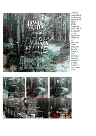
- 1. This is a comparison between my digipack and poster. While designing them. One of the panels on my digipack is similar to my magazine, this is because I like the design of that particular panel, so I wanted to include elsewhere on a larger scale.
- 2. In both of my ancillary tasks, I have kept to the same colourŌĆÖs being, red, blue and green. As these are predominantly the main colourŌĆÖs in nature, which I have said in previous posts was the inspiration to my designs. This can also be seen within the music video, as there are shots of nature in there are shots of surroundings of the local area and TripoliŌĆÖs in there as well. Poster analysis Even though the poster is simple, I believe that it is effective because it attracts the target audience and is associated with one of the digipack panels. This is mainly done through the variety of flowers, which can be seen on a variety of the panels. Since the band is all male, it is more likely that the audience at a show will be predominantly male. The inclusion of the flowers will hopefully attract a more female audience as well. The bright colourŌĆÖs used in both the poster and magazine, are different to posters and digipacks found in that particular genre of music. I have made the tour dates that colour for a number of reasons. One advantage of not having it so clear, is that a potential audience, will have to take a closer look at the poster and not just be able to walk past it, meaning they are more likely to gather the information in as they look at it longer. This also has a downside though as it isnŌĆÖt clear, which makes it difficult for people to read, thus losing some of the audience who may be busy when they see the poster. Digipack analysis After researching and annotating digipacks especially ones within our genre, I noticed certain conventions through the ones I have looked at and annotated. Although one convention, which is unique to my digipack, is the use of the dark background and really light colors on top of it. Since many bands use the same colourŌĆÖs repeatedly, I decided to break away from this to make the digipack unique.