Rwd design pattern
28 likes2,100 views

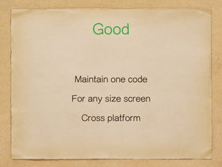
This document discusses responsive web design (RWD). It defines RWD as maintaining one code for any size screen and being cross-platform. It recommends prototyping by focusing on content and functions first before design. Key aspects of RWD include grid systems, fluid layouts, media queries, and responsive layouts that adapt to different screen sizes and devices with one page.
1 of 31
Downloaded 34 times


Ad
Recommended
WDEV118 Overview
WDEV118 OverviewGene Babon
?
This module introduces designing for mobile devices and all platforms using responsive design. Students will learn to design mobile sites without scripting using media queries and fluid layout techniques. Exercises include designing a mobile version of an existing site at 320px wide, making it usable on any size screen, and optimizing it for all screen sizes using responsive techniques.Gulp.js & webpack
Gulp.js & webpackTed Hsu
?
Gulp and webpack are development tools that can automate front-end tasks like compiling Sass to CSS, minifying files, and more. Gulp is powerful and supports asynchronous tasks via plugins. Webpack is suited for modular development, packaging code into bundles, and can be used with other tools. The key differences are that webpack bundles modules whereas gulp does not, webpack runs synchronously while gulp supports async tasks, and webpack handles assets like CSS and images in addition to JavaScript.Mobile Monday Presentation: Responsive Web Design
Mobile Monday Presentation: Responsive Web DesignCantina
?
The document discusses the fundamentals of responsive web design, emphasizing its importance in adapting to various devices using HTML, CSS, and JavaScript. It outlines key elements such as fluid grids, flexible images, and media queries while providing examples of basic boilerplate code. The document also touches on related concepts like mobile-first design and progressive enhancement to enhance user experience across different platforms.The Magic and Pain of Responsive Design
The Magic and Pain of Responsive DesignMatthias Lau
?
Matthias Lau's presentation discusses the complexities and benefits of responsive design, emphasizing the need for websites to be usable across various devices. It highlights the importance of fluid layouts, device classification, and testing while addressing common challenges in implementing responsive practices. The talk encourages web designers to embrace a flexible approach rather than optimizing exclusively for mobile or desktop experiences.Responsive Web Design
Responsive Web DesignJason Harwig
?
The document discusses responsive web design and how it offers a way forward to design work meant for different experiences across a gradient of devices. It provides examples of using CSS media queries to serve different stylesheets based on screen width and other device features. This allows content to adapt to different screens from mobile to desktop in a fluid, responsive way.Responsive web design ppt
Responsive web design pptNAWAZ KHAN
?
This document discusses the history and concepts of responsive web design. It covers topics like fluid grids and layouts, flexible images and videos, media queries, and the advantages of responsive design. The key points are:
- Responsive web design allows websites to automatically adjust to different screen sizes through fluid grids and layouts, flexible images and media queries.
- Media queries allow different CSS styles to be applied based on screen width and orientation.
- Responsive design helps create a better user experience by optimizing websites for various devices like desktops, tablets and phones.Responsive design
Responsive designJohn Doxaras
?
This document discusses responsive web design techniques including:
- Using viewports and media queries to adapt layouts for different screen sizes.
- Sizing images fluidly using max-width: 100% so they are responsive.
- Design patterns for responsive tables, hiding/showing content, and converting menus to dropdowns.
- Tools like Modernizr, Respond.js, and frameworks like LESS to support responsive design goals.
- Tips like using relative units (ems/percentages) over fixed pixels and transitions for visual changes.Responsive Web Design
Responsive Web Designdanpastori
?
Responsive web design displays content clearly across all screen sizes using a consistent theme. It uses techniques like fluid grids, flexible images and CSS media queries to automatically adapt the layout depending on screen size. The benefits are that content is accessible on any device, it improves SEO by having one optimized site, and only needs to be designed once. Common technologies used are CSS media queries and JavaScript. The process involves designing mobile-first and scaling up, avoiding multiple scroll bars, and keeping a consistent look and feel across devices.Responsive web design
Responsive web designBen MacNeill
?
This presentation introduces responsive web design which allows websites to automatically adapt their layout to different screen sizes. It discusses using a flexible grid system, flexible images and media, and media queries to create a single adaptive design. The strategy is to use a linear mobile-first approach and progressively enhance the design for larger screens using media queries. This allows the site to work on any device while providing the best experience for each form factor.Responsive Web Site Design
Responsive Web Site DesignJussi Pohjolainen
?
This document discusses responsive web design (RWD), an approach that makes web content accessible and usable across various devices and screen sizes. It recommends designing first for mobile screens and using fluid grids, flexible images and CSS3 media queries to dynamically adapt layouts. Key aspects of RWD covered include viewing on different devices, orientations and resolutions using media features and queries to apply distinct styling rules. Examples are provided for implementing breakpoints and adapting designs for large, medium and small screens.Responsive Web Design & Workflow
Responsive Web Design & Workflowhouhr
?
The document introduces responsive web design (RWD) and its significance in creating adaptable websites for various devices and browsers using CSS media queries and fluid grids. It contrasts responsive and adaptive web design, emphasizing mobile-first approaches and progressive enhancement for better user experiences. Additionally, it outlines workflows and tools for development, including the importance of viewports, media queries, and debugging techniques.Responsible Web Design
Responsible Web DesignJonas P?ckos
?
The document discusses the principles and practices of responsive web design, emphasizing a device-agnostic approach that accommodates various screen sizes using fluid grids, flexible media, and media queries. It highlights the importance of fast loading times and performance metrics for mobile users while advocating for a mobile-first strategy. Additionally, it touches on the necessity of making web pages accessible across different platforms and browsers, promoting responsible and adaptable design.Å─╝╝ągĮŪČ╚┐┤ RWD - Technical Approaches to RWD
Å─╝╝ągĮŪČ╚┐┤ RWD - Technical Approaches to RWDChris Wu
?
The document discusses the technical approaches to responsive web design (RWD), highlighting its significance in providing suitable content for various devices through methods like media queries. It mentions the challenges faced in RWD development, such as screen sizes, loading speed, and content quality. Additionally, it emphasizes the importance of handling images and ensuring high-quality content for optimal user experience.Possible_EOnline_responsive_design_sxsw2013
Possible_EOnline_responsive_design_sxsw2013asupawanich
?
Responsive web design enables a site's design to change dynamically based on the size of the browser window to optimize the experience on different devices. It uses fluid grids that allow designs to switch seamlessly between widths, flexible images that scale appropriately, and media queries that ensure font sizes and layouts are delivered correctly for each device. The approach works across Internet Explorer 9+, Chrome 4+, Firefox 3.5+, Opera 9.5+ and on iOS 3.2+ and Android 2.1+. The responsive design process focuses on content and functionality needs first before designing cross-platform variations and embracing flexibility, as not all scenarios can be anticipated.Responsive web design
Responsive web designpsophy
?
This document discusses responsive design and how it can be implemented in TYPO3. It defines responsive design as using fluid grids that resize based on browser width rather than fixed width layouts. It recommends using flexible layouts, images, and media queries to build responsive sites. Popular frameworks like Bootstrap and Foundation are introduced to help with responsive design. The document provides examples and resources for creating responsive sites that adapt to different screen sizes.Responsive UX - One size fits all @BigDesign conference #BigD12
Responsive UX - One size fits all @BigDesign conference #BigD12touchtitans
?
The document discusses responsive UX, which is designing websites and applications that adapt to different screen sizes and devices using fluid grids, media queries, and responsive images; it provides examples of how to implement responsive design principles through fluid grids, image scaling, and media queries to build sites that automatically adjust for smartphones, tablets, and other devices.Responsive Web Design
Responsive Web DesignChiheb Chebbi
?
Responsive web design (RWD) involves optimizing images and layouts for different screen sizes to provide an easy viewing experience across devices. As mobile devices are increasingly used to access the internet, responsive design ensures usability regardless of whether someone is on a phone, tablet, or desktop computer. Key techniques include using relative font sizes and fluid grids that flow and adapt to different screen widths, as well as media queries to load different CSS styles for specific screen sizes. Frameworks like Sencha.io and JavaScript libraries can also help serve responsive content to older browsers.Responsive Web Design - Drupal Camp CPH
Responsive Web Design - Drupal Camp CPHPeytz Design
?
This document discusses responsive web design. It begins by explaining that current grid/layout thinking is based on pages, but with responsive design there is no page. It then discusses how responsive design works by using fluid grids, flexible images and media, and media queries to adapt the layout based on screen size. It provides examples of how to implement a fluid grid and make images flexible. Finally, it gives some tips for responsive design such as using relative sizing and media queries to define breakpoints for different screen widths.Responsive web design
Responsive web designZeeshan Khan
?
This document discusses responsive web design. It defines responsive design as adjusting a website's layout to different screen sizes and devices. Key aspects of responsive design include fluid grids that adapt to different widths, responsive images that scale appropriately, and responsive fonts whose size adjusts. Media queries allow applying CSS styles conditionally based on screen width. The ideal fluid layout works across browsers from 780px to 1260px, accommodating most users. Responsive images avoid sending large files to small devices. Responsive typography optimizes line lengths for readability.Responsive Web Design
Responsive Web DesignJustin Avery
?
Responsive web design is an approach to web design that makes web pages render well on a variety of devices and screen sizes. It uses flexible grids and layouts, flexible images and media queries. Media queries allow the page styling to adapt to different screen sizes and resolutions by applying different CSS styles. A responsive web design uses a flexible grid system, flexible images and media, and media queries to automatically adjust for different screen sizes and devices.Module 08: Responsive Web Design
Module 08: Responsive Web DesignDaniel Drew Turner
?
This document discusses responsive web design. It begins by defining the problem of desktop designs being unusable on mobile devices and having separate mobile sites. It then describes the key aspects of responsive web design: 1) fluid grids and flexible layouts based on proportions rather than pixels, 2) media queries to deliver different styles based on screen size, and 3) flexible images that scale to fit their container. It encourages researching users and sketching out the mobile experience before developing with a responsive grid, media queries, and frameworks.Why Customers Love Responsive Design (And You Should Too!)
Why Customers Love Responsive Design (And You Should Too!)BrightEdge
?
This document discusses the benefits of responsive web design. It notes that 90% of people use multiple devices to accomplish goals online and 38% of daily media interactions occur on smartphones. Responsive design allows a website to automatically adjust for viewing on any size screen. While separate mobile sites were once common, they have disadvantages like separate URLs and content duplication. Responsive design overcomes these issues by using fluid grids and media queries to dynamically change the layout. Studies show responsive design can significantly increase conversions, transactions and revenue for mobile visitors. Mobile commerce is growing and responsive design ensures a website is accessible and usable on any device.Proactive Responsive Design
Proactive Responsive DesignNathan Smith
?
The document discusses responsive web design (RWD), which adapts web content to various screen sizes using fluid grids and CSS media queries. It highlights the importance of RWD's mainstream adoption among notable websites and offers best practices for its implementation, including considerations for user experience on mobile versus desktop. Additionally, it touches on the challenges of responsive design, such as handling images and providing concise content for mobile users.S. Responsive Web Design
S. Responsive Web Designshelly3160
?
The document discusses responsive web design (RWD) which uses a single code base that adapts layout and functionality based on screen size. RWD uses flexible layouts with percentages instead of pixels, flexible images that scale proportionally, and media queries to apply different CSS styles based on screen width. This allows websites to automatically adapt to phones, tablets, laptops and other devices to provide the best possible viewing and interaction experience for the user. Testing across devices is important for RWD to ensure proper functionality and performance.Responsive design
Responsive designIvan Frantar
?
The document provides an overview of responsive web design, emphasizing the need for flexible layouts, typography, and adaptive images that enhance user experience across various devices. It discusses the importance of media queries and tools that support browser compatibility, as well as the influence of mobile usage on design practices. Key concepts include fluid design, adapting to context, and optimizing content delivery for different screen sizes.PROFESSIONAL WEBSITE DESIGN
PROFESSIONAL WEBSITE DESIGNDeloraTong28
?
Responsive website design has become essential due to the rise of mobile device usage and the need for adaptable web layouts. It involves fluid grids that adjust elements according to the device's display, enhancing usability across different screen sizes. This new design approach allows websites to maintain functionality and aesthetics on various platforms, from smartphones to large monitors.An Introduction to Responsive Web Design
An Introduction to Responsive Web DesignShanna Kurpe
?
This document introduces responsive web design, explaining its definition, advantages and disadvantages. It outlines techniques for creating adaptable websites, including the use of CSS3 media queries and fluid proportion-based grids. Additionally, it provides resources for further study in the field.Introduction to Responsive Web Design
Introduction to Responsive Web DesignShanna Kurpe
?
The document introduces responsive web design, aimed at making a website adaptable across various devices like PCs, tablets, and smartphones. It covers essential techniques such as CSS3 media queries, fluid proportion-based grids, and adaptive content. Additionally, it provides resources for further study, including articles and guides on the topic.Async ░Ė└²ĘųŽĒ
Async ░Ė└²ĘųŽĒTed Hsu
?
╬─ĄĄĘųŽĒ┴╦Čįė┌╩╣ė├▓╗═¼ APIŻ©╚ń YouTubeĪóDailymotion ║═ YoukuŻ®Ą─░Ė└²Ż¼░³└©ąĶŪ¾║═ĮŌŠ÷ĘĮ░Ė┴┤ĮėĪŻ─┌╚▌║ŁĖŪ╚ń║╬╩╣ė├ jsnop API ┤°▓╗═¼▓╬╩²┤”└Ē╩²Š▌ĪŻ╠ß╣®┴╦ėļū„š▀Ą─╔ńĮ╗├Į╠Õ║═┴¬ŽĄą┼ŽóĪŻRest
RestTed Hsu
?
This document provides an introduction and overview of REST (REpresentational State Transfer), including:
- REST is an architectural style for designing networked hypermedia APIs that are lightweight, scalable, and use standard HTTP methods like GET, POST, PUT, DELETE to perform CRUD operations.
- The advantages of REST include loose coupling between components, independent deployment of components, and intermediary components like caches and gateways. REST APIs use resources and resource identifiers to represent application state and transfer representations of those resources between clients and servers.More Related Content
Similar to Rwd design pattern (20)
Responsive web design
Responsive web designBen MacNeill
?
This presentation introduces responsive web design which allows websites to automatically adapt their layout to different screen sizes. It discusses using a flexible grid system, flexible images and media, and media queries to create a single adaptive design. The strategy is to use a linear mobile-first approach and progressively enhance the design for larger screens using media queries. This allows the site to work on any device while providing the best experience for each form factor.Responsive Web Site Design
Responsive Web Site DesignJussi Pohjolainen
?
This document discusses responsive web design (RWD), an approach that makes web content accessible and usable across various devices and screen sizes. It recommends designing first for mobile screens and using fluid grids, flexible images and CSS3 media queries to dynamically adapt layouts. Key aspects of RWD covered include viewing on different devices, orientations and resolutions using media features and queries to apply distinct styling rules. Examples are provided for implementing breakpoints and adapting designs for large, medium and small screens.Responsive Web Design & Workflow
Responsive Web Design & Workflowhouhr
?
The document introduces responsive web design (RWD) and its significance in creating adaptable websites for various devices and browsers using CSS media queries and fluid grids. It contrasts responsive and adaptive web design, emphasizing mobile-first approaches and progressive enhancement for better user experiences. Additionally, it outlines workflows and tools for development, including the importance of viewports, media queries, and debugging techniques.Responsible Web Design
Responsible Web DesignJonas P?ckos
?
The document discusses the principles and practices of responsive web design, emphasizing a device-agnostic approach that accommodates various screen sizes using fluid grids, flexible media, and media queries. It highlights the importance of fast loading times and performance metrics for mobile users while advocating for a mobile-first strategy. Additionally, it touches on the necessity of making web pages accessible across different platforms and browsers, promoting responsible and adaptable design.Å─╝╝ągĮŪČ╚┐┤ RWD - Technical Approaches to RWD
Å─╝╝ągĮŪČ╚┐┤ RWD - Technical Approaches to RWDChris Wu
?
The document discusses the technical approaches to responsive web design (RWD), highlighting its significance in providing suitable content for various devices through methods like media queries. It mentions the challenges faced in RWD development, such as screen sizes, loading speed, and content quality. Additionally, it emphasizes the importance of handling images and ensuring high-quality content for optimal user experience.Possible_EOnline_responsive_design_sxsw2013
Possible_EOnline_responsive_design_sxsw2013asupawanich
?
Responsive web design enables a site's design to change dynamically based on the size of the browser window to optimize the experience on different devices. It uses fluid grids that allow designs to switch seamlessly between widths, flexible images that scale appropriately, and media queries that ensure font sizes and layouts are delivered correctly for each device. The approach works across Internet Explorer 9+, Chrome 4+, Firefox 3.5+, Opera 9.5+ and on iOS 3.2+ and Android 2.1+. The responsive design process focuses on content and functionality needs first before designing cross-platform variations and embracing flexibility, as not all scenarios can be anticipated.Responsive web design
Responsive web designpsophy
?
This document discusses responsive design and how it can be implemented in TYPO3. It defines responsive design as using fluid grids that resize based on browser width rather than fixed width layouts. It recommends using flexible layouts, images, and media queries to build responsive sites. Popular frameworks like Bootstrap and Foundation are introduced to help with responsive design. The document provides examples and resources for creating responsive sites that adapt to different screen sizes.Responsive UX - One size fits all @BigDesign conference #BigD12
Responsive UX - One size fits all @BigDesign conference #BigD12touchtitans
?
The document discusses responsive UX, which is designing websites and applications that adapt to different screen sizes and devices using fluid grids, media queries, and responsive images; it provides examples of how to implement responsive design principles through fluid grids, image scaling, and media queries to build sites that automatically adjust for smartphones, tablets, and other devices.Responsive Web Design
Responsive Web DesignChiheb Chebbi
?
Responsive web design (RWD) involves optimizing images and layouts for different screen sizes to provide an easy viewing experience across devices. As mobile devices are increasingly used to access the internet, responsive design ensures usability regardless of whether someone is on a phone, tablet, or desktop computer. Key techniques include using relative font sizes and fluid grids that flow and adapt to different screen widths, as well as media queries to load different CSS styles for specific screen sizes. Frameworks like Sencha.io and JavaScript libraries can also help serve responsive content to older browsers.Responsive Web Design - Drupal Camp CPH
Responsive Web Design - Drupal Camp CPHPeytz Design
?
This document discusses responsive web design. It begins by explaining that current grid/layout thinking is based on pages, but with responsive design there is no page. It then discusses how responsive design works by using fluid grids, flexible images and media, and media queries to adapt the layout based on screen size. It provides examples of how to implement a fluid grid and make images flexible. Finally, it gives some tips for responsive design such as using relative sizing and media queries to define breakpoints for different screen widths.Responsive web design
Responsive web designZeeshan Khan
?
This document discusses responsive web design. It defines responsive design as adjusting a website's layout to different screen sizes and devices. Key aspects of responsive design include fluid grids that adapt to different widths, responsive images that scale appropriately, and responsive fonts whose size adjusts. Media queries allow applying CSS styles conditionally based on screen width. The ideal fluid layout works across browsers from 780px to 1260px, accommodating most users. Responsive images avoid sending large files to small devices. Responsive typography optimizes line lengths for readability.Responsive Web Design
Responsive Web DesignJustin Avery
?
Responsive web design is an approach to web design that makes web pages render well on a variety of devices and screen sizes. It uses flexible grids and layouts, flexible images and media queries. Media queries allow the page styling to adapt to different screen sizes and resolutions by applying different CSS styles. A responsive web design uses a flexible grid system, flexible images and media, and media queries to automatically adjust for different screen sizes and devices.Module 08: Responsive Web Design
Module 08: Responsive Web DesignDaniel Drew Turner
?
This document discusses responsive web design. It begins by defining the problem of desktop designs being unusable on mobile devices and having separate mobile sites. It then describes the key aspects of responsive web design: 1) fluid grids and flexible layouts based on proportions rather than pixels, 2) media queries to deliver different styles based on screen size, and 3) flexible images that scale to fit their container. It encourages researching users and sketching out the mobile experience before developing with a responsive grid, media queries, and frameworks.Why Customers Love Responsive Design (And You Should Too!)
Why Customers Love Responsive Design (And You Should Too!)BrightEdge
?
This document discusses the benefits of responsive web design. It notes that 90% of people use multiple devices to accomplish goals online and 38% of daily media interactions occur on smartphones. Responsive design allows a website to automatically adjust for viewing on any size screen. While separate mobile sites were once common, they have disadvantages like separate URLs and content duplication. Responsive design overcomes these issues by using fluid grids and media queries to dynamically change the layout. Studies show responsive design can significantly increase conversions, transactions and revenue for mobile visitors. Mobile commerce is growing and responsive design ensures a website is accessible and usable on any device.Proactive Responsive Design
Proactive Responsive DesignNathan Smith
?
The document discusses responsive web design (RWD), which adapts web content to various screen sizes using fluid grids and CSS media queries. It highlights the importance of RWD's mainstream adoption among notable websites and offers best practices for its implementation, including considerations for user experience on mobile versus desktop. Additionally, it touches on the challenges of responsive design, such as handling images and providing concise content for mobile users.S. Responsive Web Design
S. Responsive Web Designshelly3160
?
The document discusses responsive web design (RWD) which uses a single code base that adapts layout and functionality based on screen size. RWD uses flexible layouts with percentages instead of pixels, flexible images that scale proportionally, and media queries to apply different CSS styles based on screen width. This allows websites to automatically adapt to phones, tablets, laptops and other devices to provide the best possible viewing and interaction experience for the user. Testing across devices is important for RWD to ensure proper functionality and performance.Responsive design
Responsive designIvan Frantar
?
The document provides an overview of responsive web design, emphasizing the need for flexible layouts, typography, and adaptive images that enhance user experience across various devices. It discusses the importance of media queries and tools that support browser compatibility, as well as the influence of mobile usage on design practices. Key concepts include fluid design, adapting to context, and optimizing content delivery for different screen sizes.PROFESSIONAL WEBSITE DESIGN
PROFESSIONAL WEBSITE DESIGNDeloraTong28
?
Responsive website design has become essential due to the rise of mobile device usage and the need for adaptable web layouts. It involves fluid grids that adjust elements according to the device's display, enhancing usability across different screen sizes. This new design approach allows websites to maintain functionality and aesthetics on various platforms, from smartphones to large monitors.An Introduction to Responsive Web Design
An Introduction to Responsive Web DesignShanna Kurpe
?
This document introduces responsive web design, explaining its definition, advantages and disadvantages. It outlines techniques for creating adaptable websites, including the use of CSS3 media queries and fluid proportion-based grids. Additionally, it provides resources for further study in the field.Introduction to Responsive Web Design
Introduction to Responsive Web DesignShanna Kurpe
?
The document introduces responsive web design, aimed at making a website adaptable across various devices like PCs, tablets, and smartphones. It covers essential techniques such as CSS3 media queries, fluid proportion-based grids, and adaptive content. Additionally, it provides resources for further study, including articles and guides on the topic.More from Ted Hsu (12)
Async ░Ė└²ĘųŽĒ
Async ░Ė└²ĘųŽĒTed Hsu
?
╬─ĄĄĘųŽĒ┴╦Čįė┌╩╣ė├▓╗═¼ APIŻ©╚ń YouTubeĪóDailymotion ║═ YoukuŻ®Ą─░Ė└²Ż¼░³└©ąĶŪ¾║═ĮŌŠ÷ĘĮ░Ė┴┤ĮėĪŻ─┌╚▌║ŁĖŪ╚ń║╬╩╣ė├ jsnop API ┤°▓╗═¼▓╬╩²┤”└Ē╩²Š▌ĪŻ╠ß╣®┴╦ėļū„š▀Ą─╔ńĮ╗├Į╠Õ║═┴¬ŽĄą┼ŽóĪŻRest
RestTed Hsu
?
This document provides an introduction and overview of REST (REpresentational State Transfer), including:
- REST is an architectural style for designing networked hypermedia APIs that are lightweight, scalable, and use standard HTTP methods like GET, POST, PUT, DELETE to perform CRUD operations.
- The advantages of REST include loose coupling between components, independent deployment of components, and intermediary components like caches and gateways. REST APIs use resources and resource identifiers to represent application state and transfer representations of those resources between clients and servers.Svg
SvgTed Hsu
?
SVG is an XML-based vector image format for two-dimensional graphics and animation that is developed by the W3C. It allows for resizeable and scalable images with support for interactivity, animation, and responsive design. Browser support is strong for SVG across modern desktop and mobile browsers except for older versions of Internet Explorer. Common tools for editing SVG include Illustrator, Inkscape, Sketch, and SVG-edit.Fed party 12_ted
Fed party 12_tedTed Hsu
?
This document discusses CSS pseudo-elements and pseudo-classes. It defines common pseudo-elements like ::before and ::after and pseudo-classes like :hover and :active. It also covers how to use the CSS transition and transform properties to create animation effects. Transition properties like transition-duration and transition-timing-function are explained. Common transform functions like translate, scale, rotate and skew are also defined.Google json
Google jsonTed Hsu
?
This document provides URLs and parameters for accessing Google API data through JSON including Blogger, Picasa, Calendar, and Spreadsheets. Each section lists the base URL, required parameters like callback function and ID, and optional parameters like max results or filters. Demos for each API are also linked.Css3 animation
Css3 animationTed Hsu
?
CSS3 Č»╗Ł┐╔ęį╝§╔┘ JavaScript Ą─╩╣ė├Ż¼ęūė┌▓┘ū„Ż¼▓óŪę┐╔ęįį┌╚╬║╬┐Ōųą╩╣ė├ĪŻ╬─ĄĄš╣╩Š┴╦═©╣² jQuery ║═ AngularJS ė”ė├ CSS3 Č»╗Łėļ╣²Č╔ą¦╣¹Ą─╩Š└²Ż¼ęį╝░╚ń║╬═©╣²╠Ē╝ė└Ó╗“╩²Š▌╩¶ąį└┤╣żū„Ą─╗·ųŲĪŻų„ę¬ę└└Ą jQueryĪóModernizr ║═ŽÓ╣žĄ─č▌╩Š┤·┬ļĪŻAngular js
Angular jsTed Hsu
?
This document provides an introduction to AngularJS, describing its key features including two-way data binding, model-view-controller (MVC) architecture, and common directives like ng-app, ng-bind, and ng-model. It also covers CRUD operations for creating, reading, updating, and deleting data, compares AngularJS templating to other templating languages, and provides references for additional AngularJS learning materials.Sublime
SublimeTed Hsu
?
The document discusses the text editor Sublime Text, describing how it can be used to write code in languages like Python, Java, C/C++, HTML, JavaScript and more. It provides instructions on configuring Sublime Text settings like font size, syntax highlighting, and installing packages through Package Control. Finally, it recommends several popular packages that add additional functionality to Sublime Text like Emmet for writing code faster and jsFormat for formatting JavaScript code.Ide
IdeTed Hsu
?
This document discusses Integrated Development Environments (IDEs). It provides three common abbreviations for IDE - Integrated Development Environment, Integration Design Environment, and Integration Debugging Environment. It also briefly mentions the history of command line interfaces and refers the reader to a Wikipedia page for more information on IDEs.Honey con 2014
Honey con 2014Ted Hsu
?
The Honeynet Project, established in 1999, is a non-profit organization focused on cybersecurity research and the development of open-source security tools to combat malicious attacks globally. It consists of over 46 chapters worldwide, emphasizing education and sharing experiences related to cyber threats, along with utilizing honeypots for attack analysis and defense strategies. Topics discussed include advanced threat protection, malware tracking, and methods to counter emerging cyber threats.Vimrc
VimrcTed Hsu
?
This document provides an overview of basic vimrc configuration settings including encoding, syntax highlighting, color schemes, indentation, status lines, mappings, and more. It introduces vimrc as something Linux users need to learn for faster development efficiency and typing practice. Issues with plugin installation are also mentioned.Ad
Recently uploaded (20)
BitRecover OST to PST Converter Software
BitRecover OST to PST Converter Softwareantoniogosling01
?
BitRecover OST to PST Converter is a powerful tool designed to convert inaccessible or orphaned OST files into Outlook PST format. It ensures complete data recovery including emails, contacts, calendars, and attachments. The software supports both ANSI and Unicode OST files and works with all Outlook versions. With a user-friendly interface and advanced filtering options, it's ideal for professionals needing quick and accurate OST to PST conversion.
https://www.bitrecover.com/ost-to-pst/ūŅą┬░µ╝ė─├┤¾┐³╦╣╠ž┤¾č¦▒ŽęĄųżŻ©▓Ž▒½░õ▒ŽęĄųż╩ķŻ®įŁ░µČ©ųŲ
ūŅą┬░µ╝ė─├┤¾┐³╦╣╠ž┤¾č¦▒ŽęĄųżŻ©▓Ž▒½░õ▒ŽęĄųż╩ķŻ®įŁ░µČ©ųŲtaqyed
?
2025─Ļ╝½╦┘░ņ┐³╦╣╠ž┤¾č¦▒ŽęĄųżĪŠq▐▒1954292140Ī┐č¦└·╚Žųż┴„│╠┐³╦╣╠ž┤¾č¦▒ŽęĄųż╝ė─├┤¾▒Š┐Ų│╔╝©ĄźųŲū„ĪŠq▐▒1954292140Ī┐║Ż═ŌĖ„┤¾č¦Diploma░µ▒ŠŻ¼ę“╬¬ę▀Ūķ覹Ż═Ų│┘ĘóĘ┼ųż╩ķĪóųż╩ķįŁ╝■Ȭ╩¦▓╣░ņĪó├╗ėąš²│Ż▒ŽęĄ╬┤─▄╚Žųżč¦└·├µ┴┘Š═ęĄ╠ß╣®ĮŌŠ÷░ņĘ©ĪŻĄ▒įŌė÷╣ę┐ŲĪó┐§┐╬Ą╝ų┬╬▐Ę©ą▐┬·č¦ĘųŻ¼╗“š▀ų▒Įė▒╗覹Ż═╦覯¼ūŅ║¾╬▐Ę©▒ŽęĄ─├▓╗ĄĮ▒ŽęĄųżĪŻ┤╦╩▒Ą──Ńę╗Č©╩ųūŃ╬▐┤ļŻ¼ę“╬¬┴¶č¦ę╗│ĪŻ¼├╗ėą╗±Ą├▒ŽęĄųżęį╝░č¦└·ųż├„┐ŽČ©╩Ū╬▐Ę©Ė°ūį╝║║═ĖĖ─Ėę╗Ė÷Į╗┤·Ą─ĪŻ
ĪŠĖ┤┐╠┐³╦╣╠ž┤¾č¦│╔╝©Ąźą┼ĘŌ,Buy Quest University Canada TranscriptsĪ┐
╣║┬“╚š║½│╔╝©ĄźĪóėó╣·┤¾č¦│╔╝©ĄźĪó├└╣·┤¾č¦│╔╝©ĄźĪó░─ų▐┤¾č¦│╔╝©ĄźĪó╝ė─├┤¾┤¾č¦│╔╝©ĄźŻ©q╬ó1954292140Ż®ą┬╝ėŲ┬┤¾č¦│╔╝©ĄźĪóą┬╬„└╝┤¾č¦│╔╝©ĄźĪó░«Č¹└╝│╔╝©ĄźĪó╬„░Óč└│╔╝©ĄźĪóĄ┬╣·│╔╝©ĄźĪŻ│╔╝©ĄźĄ─ęŌęÕų„ę¬╠ÕŽųį┌ųż├„覎░─▄┴”ĪóŲ└╣└č¦╩§▒│Š░Īóš╣╩Šū█║Ž╦žų╩Īó╠ßĖ▀┬╝╚Ī┬╩Ż¼ęį╝░╩Ūū„╬¬┴¶ą┼╚Žųż╔ĻŪļ▓─┴ŽĄ─ę╗▓┐ĘųĪŻ
┐³╦╣╠ž┤¾č¦│╔╝©Ąź─▄╣╗╠ÕŽų─·Ą─Ą─覎░─▄┴”Ż¼░³└©┐³╦╣╠ž┤¾č¦┐╬│╠│╔╝©Īóū©ęĄ─▄┴”Īó蹊┐─▄┴”ĪŻŻ©q╬ó1954292140Ż®Š▀╠Õ└┤╦ĄŻ¼│╔╝©▒©ĖµĄź═©│Ż░³║¼č¦╔·Ą─覎░╝╝─▄ėļŽ░╣▀ĪóĖ„┐Ų│╔╝©ęį╝░└Ž╩”Ų└ė’Ą╚▓┐ĘųŻ¼ę“┤╦Ż¼│╔╝©Ąź▓╗Į÷╩Ūč¦╔·č¦╩§─▄┴”Ą─ųż├„Ż¼ę▓╩ŪŲ└╣└č¦╔·╩Ūʱ╩╩║Ž─│Ė÷Į╠ė²ŽŅ─┐Ą─ųžę¬ę└Š▌ŻĪ
╬ę├Ū│ą┼Ą▓╔ė├Ą─╩Ū覹ŻįŁ░µųĮš┼Ż©įŁ░µųĮų╩ĪóĄū╔½Īó╬Ų┬ĘŻ®╬ę├Ū╣ż│¦ėĄėą╚½╠ūĮ°┐┌įŁū░╔Ķ▒ĖŻ¼╠ž╩Ō╣żęšČ╝╩Ū▓╔ė├▓╗═¼╗·Ų„ųŲū„Ż¼Ę┬šµČ╚╗∙▒Š┐╔ęį┤’ĄĮ100%Ż¼╦∙ėą│╔ŲĘęį╝░╣żęšą¦╣¹Č╝┐╔╠ßŪ░Ė°┐═╗¦š╣╩ŠŻ¼▓╗┬·ęŌ┐╔ęįĖ∙Š▌┐═╗¦ę¬Ū¾Į°ąąĄ„š¹Ż¼ų▒ĄĮ┬·ęŌ╬¬ų╣ŻĪ
ĪŠų„ė¬ŽŅ─┐Ī┐
ę╗.┐³╦╣╠ž┤¾č¦▒ŽęĄųżĪŠq╬ó1954292140Ī┐┐³╦╣╠ž┤¾č¦│╔╝©ĄźĪó┴¶ą┼╚ŽųżĪó╩╣╣▌╚ŽųżĪóĮ╠ė²▓┐╚ŽųżĪóč┼╦╝═ąĖŻ│╔╝©ĄźĪóč¦╔·┐©Ą╚ŻĪ
Č■.šµ╩Ą╩╣╣▌╣½ųż(╝┤┴¶č¦╗ž╣·╚╦į▒ųż├„,▓╗│╔╣”▓╗╩šĘč)
╚².šµ╩ĄĮ╠ė²▓┐č¦└·č¦╬╗╚ŽųżŻ©Į╠ė²▓┐┤µĄĄŻĪĮ╠ė²▓┐┴¶Ę■═°šŠė└Š├┐╔▓ķŻ®
╦─.░ņ└Ē╣·═ŌĖ„┤¾č¦╬─ŲŠ(ę╗Čįę╗ū©ęĄĘ■╬±,┐╔╚½│╠╝Ó┐žĖ·ū┘Į°Č╚)BASICS OF SAP _ ALL ABOUT SAP _WHY SAP OVER ANY OTHER ERP SYSTEM
BASICS OF SAP _ ALL ABOUT SAP _WHY SAP OVER ANY OTHER ERP SYSTEMAhmadAli716831
?
BASICS OF SAP - WHY SAP║▌║▌▀Żs: Eco Economic Epochs for The World Game (s) pdf
║▌║▌▀Żs: Eco Economic Epochs for The World Game (s) pdfSteven McGee
?
The REAL QFS - DeFi Quantum Financial System structured data AI symbols exchange derived from Net Centric Warfare, Battlefield Digitization for the World Game (s) Great Reset - Redesign: "End state = "in the beginning state" "Start at end state & work backwards" FutureMan
#quantum #financial #system #QFS #patent #Cryptocurrency #Tariff #TradeFi #commodity #wars #patent #law #AI artificial Intelligence Github: https://github.com/Beacon-HeartClive Dickens RedTech Public Copy - Collaborate or Die
Clive Dickens RedTech Public Copy - Collaborate or DieClive Dickens
?
'Collaborate or Die' and 'Simplify Audio Currency Now'.
Clive Dickens Managing Partner from The Meliora Company presentation from RedTech 2025 in Milan 2025 to 50 C-Suites executives from the International Media Industry, highlighting the urgent of deeper collaboration across territories and simplication of measurement and currency of Audio.įŁ░µę╗č∙(▒§│¦▓č▒ŽęĄųż╩ķ)Ą┬╣·ČÓ╠ž├╔Ą┬╣·╝╩╣▄└Ēč¦į║▒ŽęĄųżČÓ╔┘Ū«
įŁ░µę╗č∙(▒§│¦▓č▒ŽęĄųż╩ķ)Ą┬╣·ČÓ╠ž├╔Ą┬╣·╝╩╣▄└Ēč¦į║▒ŽęĄųżČÓ╔┘Ū«taqyed
?
╝°ė┌┤╦Ż¼░ņ└ĒISM┤¾č¦▒ŽęĄųżČÓ╠ž├╔Ą┬╣·╝╩╣▄└Ēč¦į║▒ŽęĄųż╩ķĪŠq▐▒1954292140Ī┐┴¶č¦ę╗šŠ╩Į░ņ└Ēč¦└·╬─ŲŠų▒═©│ĄŻ©ČÓ╠ž├╔Ą┬╣·╝╩╣▄└Ēč¦į║▒ŽęĄųżISM│╔╝©ĄźįŁ░µČÓ╠ž├╔Ą┬╣·╝╩╣▄└Ēč¦į║č¦╬╗ųż╝┘╬─ŲŠŻ®╬┤─▄š²│Ż▒ŽęĄŻ┐ĪŠq▐▒1954292140Ī┐░ņ└ĒČÓ╠ž├╔Ą┬╣·╝╩╣▄└Ēč¦į║▒ŽęĄųż│╔╝©Ąź/┴¶ą┼č¦└·╚Žųż/č¦└·╬─ŲŠ/╩╣╣▌╚Žųż/┴¶č¦╗ž╣·╚╦į▒ųż├„/┬╝╚Ī═©ų¬╩ķ/Offer/į┌Č┴ųż├„/│╔╝©Ąź/═°╔Ž┤µĄĄė└Š├┐╔▓ķŻĪ
╚ń╣¹─·┤”ė┌ęįŽ┬╝ĖųųŪķ┐÷Ż║
Ī¾į┌ąŻŲ┌╝õŻ¼ę“Ė„ųųįŁę“╬┤─▄╦│└¹▒ŽęĄĪŁĪŁ─├▓╗ĄĮ╣┘ĘĮ▒ŽęĄųż
Ī¾├µČįĖĖ─ĖĄ─č╣┴”Ż¼ŽŻ═¹ŠĪ┐ņ─├ĄĮŻ╗
Ī¾▓╗ŪÕ│■╚Žųż┴„│╠ęį╝░▓─┴ŽĖ├╚ń║╬ū╝▒ĖŻ╗
Ī¾╗ž╣·╩▒╝õ║▄│żŻ¼═³╝Ū░ņ└ĒŻ╗
Ī¾╗ž╣·┬Ē╔ŽŠ═꬚ę╣żū„Ż¼░ņĖ°ė├╚╦Ąź╬╗┐┤Ż╗
Ī¾Ų¾╩┬ꥥź╬╗▒žąļę¬Ū¾░ņ└ĒĄ─
Ī¾ąĶę¬▒©┐╝╣½╬±į▒Īó╣║┬“├Ō╦░│ĄĪó┬õū¬╗¦┐┌
Ī¾╔ĻŪļ┴¶č¦╔·┤┤ęĄ╗∙Į
ĪŠ░ņ└ĒČÓ╠ž├╔Ą┬╣·╝╩╣▄└Ēč¦į║│╔╝©ĄźBuy International School of Management TranscriptsĪ┐
╣║┬“╚š║½│╔╝©ĄźĪóėó╣·┤¾č¦│╔╝©ĄźĪó├└╣·┤¾č¦│╔╝©ĄźĪó░─ų▐┤¾č¦│╔╝©ĄźĪó╝ė─├┤¾┤¾č¦│╔╝©ĄźŻ©q╬ó1954292140Ż®ą┬╝ėŲ┬┤¾č¦│╔╝©ĄźĪóą┬╬„└╝┤¾č¦│╔╝©ĄźĪó░«Č¹└╝│╔╝©ĄźĪó╬„░Óč└│╔╝©ĄźĪóĄ┬╣·│╔╝©ĄźĪŻ│╔╝©ĄźĄ─ęŌęÕų„ę¬╠ÕŽųį┌ųż├„覎░─▄┴”ĪóŲ└╣└č¦╩§▒│Š░Īóš╣╩Šū█║Ž╦žų╩Īó╠ßĖ▀┬╝╚Ī┬╩Ż¼ęį╝░╩Ūū„╬¬┴¶ą┼╚Žųż╔ĻŪļ▓─┴ŽĄ─ę╗▓┐ĘųĪŻ
ČÓ╠ž├╔Ą┬╣·╝╩╣▄└Ēč¦į║│╔╝©Ąź─▄╣╗╠ÕŽų─·Ą─Ą─覎░─▄┴”Ż¼░³└©ČÓ╠ž├╔Ą┬╣·╝╩╣▄└Ēč¦į║┐╬│╠│╔╝©Īóū©ęĄ─▄┴”Īó蹊┐─▄┴”ĪŻŻ©q╬ó1954292140Ż®Š▀╠Õ└┤╦ĄŻ¼│╔╝©▒©ĖµĄź═©│Ż░³║¼č¦╔·Ą─覎░╝╝─▄ėļŽ░╣▀ĪóĖ„┐Ų│╔╝©ęį╝░└Ž╩”Ų└ė’Ą╚▓┐ĘųŻ¼ę“┤╦Ż¼│╔╝©Ąź▓╗Į÷╩Ūč¦╔·č¦╩§─▄┴”Ą─ųż├„Ż¼ę▓╩ŪŲ└╣└č¦╔·╩Ūʱ╩╩║Ž─│Ė÷Į╠ė²ŽŅ─┐Ą─ųžę¬ę└Š▌ŻĪTransmission Control Protocol (TCP) and Starlink
Transmission Control Protocol (TCP) and StarlinkAPNIC
?
Geoff Huston, APNIC Chief Scientist, delivered a remote presentation on 'TCP and Starlink' at INNOG 8 held in conjunction with the 2nd India ISP Conclave held in Delhi, India from 23 to 28 May 2025.inside the internet - understanding the TCP/IP protocol
inside the internet - understanding the TCP/IP protocolshainweniton02
?
Key factors on TCP/IP protocolįŁ░µ░─ų▐╦╣╬─▒Š┐Ų╝╝┤¾č¦▒ŽęĄųż(│¦▒½░š▒ŽęĄųż╩ķ)╚ń║╬░ņ└Ē
įŁ░µ░─ų▐╦╣╬─▒Š┐Ų╝╝┤¾č¦▒ŽęĄųż(│¦▒½░š▒ŽęĄųż╩ķ)╚ń║╬░ņ└Ētaqyed
?
2025─Ļ╝½╦┘░ņ╦╣╬─▒Š┐Ų╝╝┤¾č¦▒ŽęĄųżĪŠq▐▒1954292140Ī┐č¦└·╚Žųż┴„│╠╦╣╬─▒Š┐Ų╝╝┤¾č¦▒ŽęĄųż░─ų▐▒Š┐Ų│╔╝©ĄźųŲū„ĪŠq▐▒1954292140Ī┐║Ż═ŌĖ„┤¾č¦Diploma░µ▒ŠŻ¼ę“╬¬ę▀Ūķ覹Ż═Ų│┘ĘóĘ┼ųż╩ķĪóųż╩ķįŁ╝■Ȭ╩¦▓╣░ņĪó├╗ėąš²│Ż▒ŽęĄ╬┤─▄╚Žųżč¦└·├µ┴┘Š═ęĄ╠ß╣®ĮŌŠ÷░ņĘ©ĪŻĄ▒įŌė÷╣ę┐ŲĪó┐§┐╬Ą╝ų┬╬▐Ę©ą▐┬·č¦ĘųŻ¼╗“š▀ų▒Įė▒╗覹Ż═╦覯¼ūŅ║¾╬▐Ę©▒ŽęĄ─├▓╗ĄĮ▒ŽęĄųżĪŻ┤╦╩▒Ą──Ńę╗Č©╩ųūŃ╬▐┤ļŻ¼ę“╬¬┴¶č¦ę╗│ĪŻ¼├╗ėą╗±Ą├▒ŽęĄųżęį╝░č¦└·ųż├„┐ŽČ©╩Ū╬▐Ę©Ė°ūį╝║║═ĖĖ─Ėę╗Ė÷Į╗┤·Ą─ĪŻ
ĪŠĖ┤┐╠╦╣╬─▒Š┐Ų╝╝┤¾č¦│╔╝©Ąźą┼ĘŌ,Buy Swinburne University of Technology TranscriptsĪ┐
╣║┬“╚š║½│╔╝©ĄźĪóėó╣·┤¾č¦│╔╝©ĄźĪó├└╣·┤¾č¦│╔╝©ĄźĪó░─ų▐┤¾č¦│╔╝©ĄźĪó╝ė─├┤¾┤¾č¦│╔╝©ĄźŻ©q╬ó1954292140Ż®ą┬╝ėŲ┬┤¾č¦│╔╝©ĄźĪóą┬╬„└╝┤¾č¦│╔╝©ĄźĪó░«Č¹└╝│╔╝©ĄźĪó╬„░Óč└│╔╝©ĄźĪóĄ┬╣·│╔╝©ĄźĪŻ│╔╝©ĄźĄ─ęŌęÕų„ę¬╠ÕŽųį┌ųż├„覎░─▄┴”ĪóŲ└╣└č¦╩§▒│Š░Īóš╣╩Šū█║Ž╦žų╩Īó╠ßĖ▀┬╝╚Ī┬╩Ż¼ęį╝░╩Ūū„╬¬┴¶ą┼╚Žųż╔ĻŪļ▓─┴ŽĄ─ę╗▓┐ĘųĪŻ
╦╣╬─▒Š┐Ų╝╝┤¾č¦│╔╝©Ąź─▄╣╗╠ÕŽų─·Ą─Ą─覎░─▄┴”Ż¼░³└©╦╣╬─▒Š┐Ų╝╝┤¾č¦┐╬│╠│╔╝©Īóū©ęĄ─▄┴”Īó蹊┐─▄┴”ĪŻŻ©q╬ó1954292140Ż®Š▀╠Õ└┤╦ĄŻ¼│╔╝©▒©ĖµĄź═©│Ż░³║¼č¦╔·Ą─覎░╝╝─▄ėļŽ░╣▀ĪóĖ„┐Ų│╔╝©ęį╝░└Ž╩”Ų└ė’Ą╚▓┐ĘųŻ¼ę“┤╦Ż¼│╔╝©Ąź▓╗Į÷╩Ūč¦╔·č¦╩§─▄┴”Ą─ųż├„Ż¼ę▓╩ŪŲ└╣└č¦╔·╩Ūʱ╩╩║Ž─│Ė÷Į╠ė²ŽŅ─┐Ą─ųžę¬ę└Š▌ŻĪ
╬ę├Ū│ą┼Ą▓╔ė├Ą─╩Ū覹ŻįŁ░µųĮš┼Ż©įŁ░µųĮų╩ĪóĄū╔½Īó╬Ų┬ĘŻ®╬ę├Ū╣ż│¦ėĄėą╚½╠ūĮ°┐┌įŁū░╔Ķ▒ĖŻ¼╠ž╩Ō╣żęšČ╝╩Ū▓╔ė├▓╗═¼╗·Ų„ųŲū„Ż¼Ę┬šµČ╚╗∙▒Š┐╔ęį┤’ĄĮ100%Ż¼╦∙ėą│╔ŲĘęį╝░╣żęšą¦╣¹Č╝┐╔╠ßŪ░Ė°┐═╗¦š╣╩ŠŻ¼▓╗┬·ęŌ┐╔ęįĖ∙Š▌┐═╗¦ę¬Ū¾Į°ąąĄ„š¹Ż¼ų▒ĄĮ┬·ęŌ╬¬ų╣ŻĪ
ĪŠų„ė¬ŽŅ─┐Ī┐
ę╗.╦╣╬─▒Š┐Ų╝╝┤¾č¦▒ŽęĄųżĪŠq╬ó1954292140Ī┐╦╣╬─▒Š┐Ų╝╝┤¾č¦│╔╝©ĄźĪó┴¶ą┼╚ŽųżĪó╩╣╣▌╚ŽųżĪóĮ╠ė²▓┐╚ŽųżĪóč┼╦╝═ąĖŻ│╔╝©ĄźĪóč¦╔·┐©Ą╚ŻĪ
Č■.šµ╩Ą╩╣╣▌╣½ųż(╝┤┴¶č¦╗ž╣·╚╦į▒ųż├„,▓╗│╔╣”▓╗╩šĘč)
╚².šµ╩ĄĮ╠ė²▓┐č¦└·č¦╬╗╚ŽųżŻ©Į╠ė²▓┐┤µĄĄŻĪĮ╠ė²▓┐┴¶Ę■═°šŠė└Š├┐╔▓ķŻ®
╦─.░ņ└Ē╣·═ŌĖ„┤¾č¦╬─ŲŠ(ę╗Čįę╗ū©ęĄĘ■╬±,┐╔╚½│╠╝Ó┐žĖ·ū┘Į°Č╚)Logging and Automated Alerting Webinar.pdf
Logging and Automated Alerting Webinar.pdfControlCase
?
Join us for an exclusive webinar on Logging and Automated Alerting Ī¬ your key to simplifying compliance and strengthening security.
Discover how ControlCase helps organizations move beyond the checklist to achieve real-time monitoring, centralized log management, and faster incident response with minimal internal effort.
? Gain insights into:
? Emerging risks and compliance requirements
? How automated alerting reduces downtime
? The architecture behind our proactive LAAS solution
? Real-world results that boost productivity and performance
? Hosted by our cybersecurity experts Chad Leedy and Elswick Lai.
Secure your spot today and learn how to turn compliance into a competitive advantage.
? [Insert Registration Link]
#Cybersecurity #Compliance #Logging #Alerting #ControlCase #CaaS #ITSecurity #WebinarPaper: The World Game (s) Great Redesign.pdf
Paper: The World Game (s) Great Redesign.pdfSteven McGee
?
Paper: The REAL QFS - DeFi Quantum Financial System structured data AI symbols exchange derived from Net Centric Warfare, Battlefield Digitization for the World Game (s) Great Reset - Redesign: "End state = "in the beginning state" "Start at end state & work backwards" FutureManMake DDoS expensive for the threat actors
Make DDoS expensive for the threat actorsAPNIC
?
Awal Haolader, Network Analyst / Technical Trainer at APNIC, delivered a presentation titled 'Make DDoS expensive for the threat actors' at Phoenix Summit 2025 held in Dhaka, Bangladesh from 19 to 24 May 2025.Ad
Rwd design pattern
- 1. ─ŃšµĄ─Č« RWD åß? Responsive Web Design pattern by Ted Ted
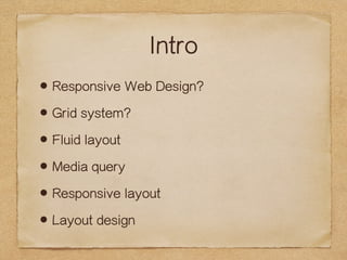
- 2. Intro ?Responsive Web Design? ?Grid system? ?Fluid layout ?Media query ?Responsive layout ?Layout design
- 3. Responsive Web Design? Responsive Web Design Ēææ¬╩ĮŠWĒōįOėŗ
- 4. Good Maintain one code For any size screen Cross platform
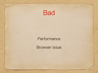
- 5. Bad Performance Browser issue
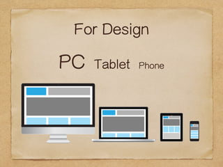
- 6. For Design PC Tablet Phone
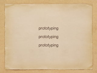
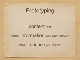
- 10. Prototyping content first What information you want show? What function you want?
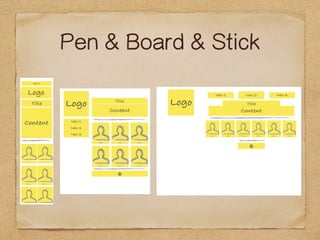
- 11. Pen & Board & Stick
- 12. For Develop media query? viewport?
- 13. For Develop media query? viewport?
- 14. It is a design pattern!
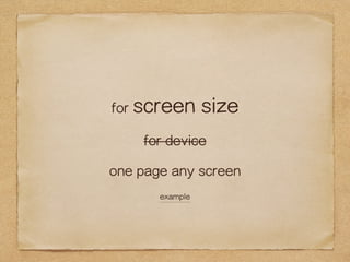
- 15. for screen size for device one page any screen example
- 16. Grid System? 960 grid system
- 17. Grid System? 960 grid system
- 18. Grid System? 1200 grid system
- 19. Grid System? 1200 grid system
- 20. Grid System? responsive grid system!
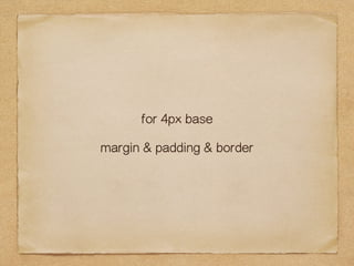
- 21. for 4px base margin & padding & border
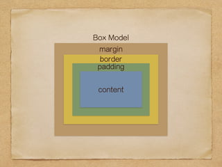
- 22. Box Model margin border padding content
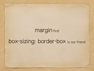
- 23. margin first box-sizing: border-box is our friend
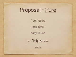
- 24. Proposal - Pure from Yahoo less 10KB easy to use for 16px base example
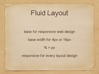
- 25. Fluid Layout base for responsive web design base width for 4px or 16px % > px responsive for every layout design
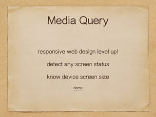
- 26. Media Query responsive web design level up! detect any screen status know device screen size demo
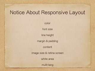
- 27. Notice About Responsive Layout color font size line height margin & padding content image size & retina screen white area multi-lang
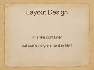
- 28. Layout Design It is like container put something element in html
- 29. Web Design != Graphic Design
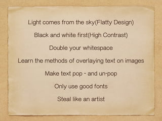
- 30. Light comes from the sky(Flatty Design) Black and white first(High Contrast) Double your whitespace Learn the methods of overlaying text on images Make text pop - and un-pop Only use good fonts Steal like an artist
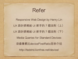
- 31. Refer Responsive Web Design by Henry Lin UX įOėŗĤīæĮo UI ą┬╩ųĄ─ 7 éĆĘ©ätŻ©╔ŽŻ® UX įOėŗĤīæĮo UI ą┬╩ųĄ─ 7 éĆĘ©ätŻ©Ž┬Ż® Media Queries for Standard Devices ╔Ķ▒ĖŽ±╦ž▒╚devicePixelRatio╝“ĄźĮķ╔▄ http://tedshd.lionfree.net/device/