SQT.ppt
Download as ppt, pdf0 likes27 views

This document discusses 7 quality control tools: check sheets, Pareto diagrams, cause and effect diagrams, stratification, scatter diagrams, histograms, and graphs and control charts. It provides details on how to collect data and use check sheets, Pareto analysis, cause and effect diagrams, stratification, scatter diagrams, and histograms for quality control purposes. Key steps and considerations for constructing and interpreting these tools are outlined.


More Related Content
Similar to SQT.ppt (20)
Recently uploaded (20)


![[HIFLUX] Lok Fitting&Valve Catalog 2025 (Eng)](https://cdn.slidesharecdn.com/ss_thumbnails/lokfittingen-250528072439-8696f1c6-thumbnail.jpg?width=560&fit=bounds)


SQT.ppt
- 1. 1 7 QC Tools
- 2. 2 SEVEN QC TOOLS ÔÄ™ Check Sheets ÔÄ™ Pareto Diagram ÔÄ™ Cause and Effect Diagram. ÔÄ™ Stratification. ÔÄ™ Scatter Diagram. ÔÄ™ Histogram. ÔÄ™ Graphs and Control Charts.
- 3. 3 How to Collect Data 1. Have Clear Defined Objectives • Controlling and monitoring the production process • Analysis of non-conformance • Inspection 2. What Is Your Purpose • Collecting as per strata • Collecting in Pairs (correlation) 3. Are Measurements Reliable 4. Find Right Ways to Record Data • Arrangement • Data sheet
- 4. 4 Check Sheet What : An easy to understand form used to answer the question “ How often are certain events happening?” Why : Starts the process of translating “opinion” into “fact When : Gathering data in order to detect patterns. Good point to start most problem solving cycles.
- 5. 5 How : •Team agrees as to exactly what event is being observed. •Decide on the time period during which data will be collected. This could range from hours to weeks. •Design a form that is clear and easy to use making sure that all columns are clearly labeled and that there is enough space to enter the data. •Collect the data making sure that observations/ samples are as representative as possible. Check Sheet
- 6. 6 Mark defect by SN Class Mean Value Tally Marks Total 1 950-955 952.5 IIII 4 2 955-960 957.5 IIII III 8 3 960-965 962.5 IIII IIII IIII 15 4 965-970 967.5 IIII IIII 10 5 970-975 972.5 IIII I 6 Diagram type check sheet Frequency check sheet Sn Parameter Spec Judgement Remark 1 2 3 4 5 Part No: Process: Machine: Sample No Inspection check sheet Check sheet contd...
- 7. 7 Pareto Analysis What: A bar chart that helps to prioritize actions by arranging elements in descending order of occurrence. Sorts out the “vital few” from the “trivial many”. Why : •To prioritize actions needed to solve complex problems. •To separate important from non-important causes contributing to a problem. When : •Many factors are impacting a problem. •Attention needs to be directed only to the few factors that account for most of the problem.
- 8. 8 How: •Define a problem and collect data on the factors that contribute to it. •Historical records generally provide sufficient information. •Classify the data by type, cost , percent, number of occurrences, or whatever is appropriate for the situation. •Arrange the data in descending order. Pareto Analysis
- 9. 9 Contd……. Pareto Analysis How contd…. •Draw bar graph showing constituent ratio on vertical axis. •Connect cumulative percentage of each bar graph to obtain Pareto curve. D efect D efect Q ty % C um C ode description R ej C ontribution % age A D rill B roken 70 46.60% 46.60% B Serration M ism atch 45 30% 76.60% C R unout m ore 25 16.60% 93.20% D D ia U/S 6 4% 97.20% E D ia O /S 4 2.80% 100% Total 150 R ejection details of P inion
- 10. 10 Contd… Pareto 75% 50% 25% n=150 100% A B C D E Defect Code Nos.
- 11. 11 Types of Pareto Diagrams 1. Pareto Diagrams by Phenomenon • Quality: defects, faults, failure, complaints, RW etc. • Cost: amount of loss, expenses • Delivery: delay in delivery, stock shortages etc • Safety: accidents, mistakes, breakdowns etc 2. Pareto Diagrams by Causes • Operator: shift, group, age, experience, skill etc • Machine: machines, equipments, tools, instruments etc. • Material: manufacturer, plant, lot, kind etc • Process: conditions, orders, arrangements,methods etc.
- 12. 12 Hints on Making Pareto Diagrams 1. Check various classifications and construct many kinds of Pareto diagrams Essence of a problem can be grasped by observing it from various angles 2. It is undesirable that “others” represents a higher percentage A different method of classification should be considered 3. It is best to draw Pareto diagrams by assigning monetary value Cost is an important scale of measurement in management. If financial implications of a problem are not properly appreciated, the research itself may end up as ineffective.
- 13. 13 Hints on Using Pareto Diagrams 1. If an item is expected to be amenable to a simple solution, it should be tackled right away even if it is of relatively small importance. It will serve as an example of efficient problem solving, and the experience, information and incentives to morale obtained through this will be of great assets for future problem solving. 2. Do not fail to make Pareto diagram by causes After identifying the problem by making a Pareto diagram by phenomenon, it is necessary to identify the causes in order to solve the problem. It is therefore vital to make a Pareto diagram by causes if any improvements are to be effected.
- 14. 14 Cause & Effect Diagram What: •A graphic tool used to represent the relationship between an effect and the cause that influence it. Why: •Identifies various causes affecting a process. •Helps groups in reaching a common understanding of a problem. •Helps reduce incidence of subjective decision making. When: •Looking for all potential causes of problem.
- 15. 15 How: •Define the problem or effect clearly. •Generate the potential cause of problem through brain storming. •Encourage wild ideas •‘Quantity’ rather than ‘Quality’ of ideas •Suspend judgement on ‘Good’ or ‘Bad’ •Ride on another’s idea •Construct the cause and effect diagram by: •Place problem statement in a box on right hand side. •Draw the major cause category boxes on the left hand side. Commonly used categories are man, machine, method, material and measurement. Cause & Effect Diagram
- 16. 16 •For each cause ask “ Why” and list responses as branches off the major causes or use ideas from brainstorming after categorizing into main causes •Identify likely root cause(s) and circle them. •Collect data to verify the most likely root causes Cause & Effect Diagram
- 17. Cause and Effect Diagram Nurses Many patients Long waiting time after completion of ultrasonic scan Methods Environment People Reception work Medical charts hard to tell apart Many charts to input Shortage of numbers Inexperience Patients Two or more booked in at same time Record findings Charts all returned together Handling Data input takes time Calculation of bill Charts from all departments come together Test Rooms Far away Busy Computer terminal slow Reception
- 18. 18 Hints on Making Cause and Effect Diagrams •Identify all the relevant factors through examination and discussion by many people •Express the characteristic as concretely as possible •Make the same number of cause and effect diagrams as that of characteristics •Choose a measurable characteristic and factors •Discover factors amenable to action
- 19. 19 Hints on Using Cause and Effect Diagrams • Assign an importance to each factor objectively on the basis of data Examination of factors on the basis of your own skill and experience is important, but it is dangerous to give importance to them through subjective perceptions or impressions alone (would have been solved by now if so). Assigning importance to factors objectively using data is both more scientific and more logical. • Try to improve the cause and effect diagram continuously while using it Actually using a cause and effect diagram will help in seeing those parts which need to be checked, deleted or modified. This will be useful in solving problems, and at the same time, will help improve your own skill and to increase your technological knowledge
- 20. 20 Pareto Diagrams and Cause and Effect diagrams-combination Case Study: 1. Selection of Problems This is an example illustrating the examination of non- conformity in a manufacturing process by the use of a Pareto diagram. When data on non-conformity collected on two months was classified by non-conforming items, it was found that dimensional defectives were largest in number, constituting 48 percent of the total non-conformance. We therefore tried to reduce the number of non-conformity with stress on dimensional defectives.
- 21. 21 Case Study… contd. 150 100 50 100 75 50 25 A B C D E Others June 1-July 31 A: Dimensional defectives B: Pinholes C: Scratches D: Cracks E: Distortion Pareto Diagram of Non-conformance Items
- 22. 22 Case Study… contd. 2. Analysis and Countermeasures All the shop members discussed the causes of the dimensional variation and constructed a cause and effect diagram. A Pareto diagram by causes was then made by investigating all the units with dimensional variation in order to examine to what extent these factors were affecting the non-conformance. With some items, it was impossible to clarify the causes of non-conformance, and these were lumped together under the heading “Unclear”. We discovered from the Pareto diagram that the occurrence of the defect was greatly affected by the fitting position. Although the fitting position had been stipulated by the traditional operational standard, the standard fitting method was not shown. This led variation in the fitting position, and resulted into dimensional defectives. The shop members therefore designed a suitable fitting method, which was further standardized and added to the operational standards.
- 23. 23 Case Study… contd. Fitting Material Quality of material Skills Health Training Spirit Dimensional Variation Methods Machine Operation Stability Inspection Working Order Setting Parts & Materials Dimension Component People Deformation Illnes s Inexperience Jigs & Tools Imbalance Abrasion Concentration Attentiveness Part Method Item Illnes s Education Position Angle Procedure Speed Degree of tightening Form Diameter Shape Storage
- 24. 24 Case Study… contd. 70 50 10 100 75 50 25 W X Y Z Unclear Others June 1-July 31 V: Fitting position W: Working speed X: Components Y: Abrasion of jigs & tools Z: Shape of parts Pareto Diagram by causes V 30 20 60 40 80
- 25. 25 Case Study… contd. 3. Effects of Improvements After the improvement was carried out, data was collected, and a Pareto diagram was made to compare the results. The following two Pareto diagrams clearly show that dimensional defectives were reduced.
- 26. 26 100 50 100 75 50 25 C B A D E Others Sept. 1-Oct. 31 150 100 50 100 75 50 25 A B C D E Others June 1-July 31 Total effect Effect Case Study… contd. Comparison of Pareto Diagrams Before and After Improvement
- 27. 27 Stratification What: Stratification is a statistical technique of breaking down values and numbers into meaningful categories or classification. Why: To focus on corrective action or identify true causes. When: To identify the cause of problem if they come from a particular source. •To analyze root cause in conjunction with other techniques like Pareto diagram histogram and graphs.
- 28. 28 How: Regroup original data as per the source of data (eg. Machine wise, shift-wise, model-wise, supplier-wise) •If required collect data afresh after making the source from which they come. • Recreate histogram, Pareto charts and graphs on classified data Stratification
- 29. 29 Stratification ……..contd... Month Model A Mode B Apr 10 50 May 8 32 Jun 15 65 Jul 10 50 Aug 8 42 Sep 7 28 0 10 20 30 40 50 60 70 80 90 Apr May Jun Jul Aug Sep Month Rej Nos Mode B Model A
- 30. 30 Stratification ……..contd... Impurity Amount V i s c o s i t y After Stratification Impurity Amount V i s c o s i t y Before Stratification
- 31. 31 Scatter Diagram What: A tool used to study the possible relationship between two variables. Why: To test for possible causes and effect relationships. Though it cannot prove that one variable causes the other, the diagram does make it clear whether a relationship exists and shows the strength of that relationship. When: There is a need to display what happens to one variable when another one changes in order to test that the two variables are related.
- 32. 32 How: •Collect 50 to 100 paired samples of data believed to be related. •Construct a data sheet. •Draw the horizontal and vertical axis of the diagram. •Label the axes. • “Cause”is usually plotted on the horizontal axis and the “effect” variable on the vertical axis. • Plot the data on the diagram. If values repeat, circle that point. Scatter Diagram
- 33. 33 Interpretation D. Possible negative correlation E. Strong Negative correlation A. Randomly scattered points - No correlation B. Possible Positive correlation C. Strong positive correlation n=15 r=0.06 n=18 r=0.54 n=14 r=0.96 n=22 r=- 0.5 n=18 r=-0.92
- 34. 34 Some Important Definitions Mean, x : Sum of the values of the observations divided by the number of observations. Variance, s2 : Mean of the squares of deviations of the observations from their mean Standard Deviation, s : Positive square root of the variance
- 35. 35 Correlation Coefficient S(xy) S(xx).S(yy) r= S(xx) = (x -x) i 2 n i=1 S(yy) = (y -y) i 2 n i=1 S(xy) = (x -x) (y –y) i n i=1 i If r=0 No correlation If r=1 Very strong correlation If r=-1 Very strong negative correlation If 0<r>1 Possible correlation
- 36. 36 Significance of ‘r’ If calculated value of r is more than the table value of r at 1% or 5% significance level at (n-2) degrees of freedom, then at 99% or 95% confidence we can say that correlation exists between two or vice-versa.
- 37. 37 Notes on Correlation Analysis 1. Coordinate Axes: Effect of choosing scale of axes 2. Stratification: Stratify the data and then see the correlation 3. Range of variables: Select range of variables carefully as it affects correlation
- 38. 38 Notes on Correlation Analysis 4. False Correlation: According to a certain survey, there was a strong positive correlation between the consumer price index and the number of incidents of fire. If so, then, if consumer price index lowers, will there be indeed fewer fire emergencies? The answer is most likely “No’. In order to reduce the incidence of fires, we would stress the importance of cleaning-up of ashtrays and not to discard any trash that would bring upon incendiary. In this way, when calculating a correlation coefficient between two variables, it is sometimes found, by chance, there is a high value of correlation coefficient between the two variables which originally have little or no cause and effect relationship to each other. This sort of correlation is called False correlation. Even if the correlation coefficient is high, it does not necessarily indicate a cause and effect relationship. It is necessary to take good note of this fact, and to think about its meaning in science and technology.
- 39. 39 Regression Analysis Estimating the exact relationship between dependent and independent variables Line of best fit joining data points on a scatter diagram is a regression line having equation y=a+bx where y is dependent variable, x is independent variable, a is a constant and b is regression coefficient y x
- 40. 40 Regression Analysis Calculations: 1. Calculate x and y 2. Calculate S(xx) and S(xy) 3. Calculate b b=S(xy)/S(xx) 4. Calculate a a=y-b x Then, equation of line is y=a+bx Note: For both Correlation and Regression Analysis, draw scatter diagram first
- 41. 41 Histogram What: A bar chart that displays the variation within the process. Also called a frequency distribution because the frequency of occurrence of any given value is represented by the height of the bars. Why: •Allows one to quickly visualize what’s going on within a large amount of data. •Provides clues to causes of problems. •Maybe be used to show the relationship between the engineering tolerance and the capabilities of the process.
- 42. 42 When: •Capability studies are being performed. •Analyzing the quality of incoming material. •Understanding population at a glance How: •Collect measurements(variable data)from a process or key characteristic. •Thirty or more measurements are preferred. •Construct check sheet to record the data. •Find the range by subtracting the smallest measurements from the largest. •Using this guide determine the proper number of class intervals. Histogram
- 43. 43 Histogram…... How…….contd.. Observations No. of classes(K) 25 to 50 5 to 8 51 to 100 6 to 11 101 to 250 9 to 13 251 and over 11 to 15 K=R/h +1 (R = Range) Select h such that K is between 5~8 or ….. •Construct a frequency table by properly making class boundaries. Tally the number of observations found in each class.
- 44. 44 •Taking the class interval on horizontal axis, draw the height of the bar corresponding to frequencies in interval on the vertical axis. Class Class limits Tally Number of observations 1 0.51 to 5.50 IIII IIII 10 2 5.51 to 10.50 IIII IIII IIII IIII 20 3 10.51 to 15.50 IIII IIII IIII IIII IIII 25 4 15.51 to 20.50 IIII IIII IIII IIII 20 5 20.51 25.50 IIII IIII IIII 15 6 25.51 to 30 .50 IIII IIII 10 Histogram…... How…….contd..
- 45. 45 0.5 5.5 10.5 15.5 20.5 25.5 30.5 5 10 15 20 5 25 Histogram…... How…….contd..
- 46. 46 Types of Histogram General Type Comb Type Positively Skew Type Left-hand Precipice Type Plateau Type Twin Peak Type Isolated Peak Type
- 47. READING HISTOGRAMS A. General Type Shape symmetrical (Bell shaped). If your vendor has less variability but centre is shifting you can help him to do right setting. B. Bimodal or Twin Peak Type Two Distributions with widely different mean values mixed. C. Comb Type Multimodel Number of units of data included in class varies from class to class. Rounding off. Incorrect least count of measurement system D. Positive Skew Occurs when lower limit is controlled either theoretically or by specification value or when values lower than certain value do not occur E. Left Hand Precipice Type 100% screening has been done because of low process capability or when positive skewness becomes more extreme. (Check your vendor if in receipt supply having such pattern) F. Plateau Type Mixture of several distributions having different mean values, or 100% screening on both sides
- 48. EXERCISE Given below are 100 observations taken in microns of the surface finish of 100 machined tubes. 24 33 19 19 21 24 24 12 20 27 28 15 23 23 21 23 27 27 27 25 24 27 31 16 20 23 27 24 27 30 27 15 16 17 22 27 24 19 31 23 29 31 24 21 22 24 32 20 27 20 19 15 19 22 29 19 27 27 19 27 31 17 21 20 20 12 23 27 24 25 29 19 23 21 31 15 23 27 24 24 23 16 27 20 21 15 32 23 27 24 34 23 19 22 30 25 24 20 16 27 Prepare Frequency table, plot histogram. Calculate mean and standard deviation
- 49. 49 Normal Distribution x f(x) •Frequency is the highest in the middle and becomes gradually lower towards the tail. •It is symmetrical It is denoted by N (s   : The centre of the distribution (the mean) s : The spread of the distribution(the standard deviation) To obtain a probability in a normal distribution, we standardize by transforming x to a variable, u= x- s , We then have a standard measure u, which is distributed as the standard normal distribution N(0, 12 ). The normal distribution table gives probabilities in the standard normal distribution. s :- 68.3% of area 2s :- 95.4% of area 3s :- 99.7% of area
- 50. 50 Process Capability Index After Histogram shows that it follows normal distribution, a study of process capability is often undertaken. This is to find out whether the process can meet specifications or not Both-sided specifications (SU and SL) CP = SU - SL/6s One-sided specification (SU or SL) CP = SU - x /3s Evaluation of process: 1) 1.33  CP Satisfiable enough 2) 1.00  CP  1.33 Adequate 3) CP  1.00 Inadequate
- 51. DIFFERENCE BETWEEN Cp & Cpk 1. Cp is a ratio of tolerance and six sigma. It does not talk about process setting. This can be appreciated that even if variability is small & setting is out we will have Cp very high. This is therefore not an effective indicator. Even though process setting may be totally out, Cp value could be well above 1.33. Therefore, Cp can be best described as process potential index. 2. Cpk takes care of setting as well as variation. Therefore Cpk describes the actual condition
- 52. 52 Graphs Graphs are among the simplest and best techniques to analyze and display data for easy communication. Various types of graphs generally used are shown below which are self explanatory. Y e a r R e j C o s t 1 9 9 6 5 0 1 9 9 7 4 5 1 9 9 8 7 0 0 2 0 4 0 6 0 8 0 1 9 9 6 1 9 9 7 1 9 9 8 Y e a r R e j . c o s t M onth Rej A pr 0.2 M ay 0.6 Jun 0.2 Jul 0.2 A ug 0.15 S ep 0.2 0 0.2 0.4 0.6 0.8 Apr May Jun Jul Aug Sep Month Rejection %age Rej Bar chart Trend chart
- 53. 53 OTHERS 5.56% RBS STRG. ASSY. 10.83% R&P ASSY. 17.62% POW ER STRG. 4.92% AXLE ASSY. 28.67% PROP.SHAFT ASSY. 6.15% COLUMN ASSY. 26.25 Pie-chart Graphs…contd
- 54. 54 Control Charts What: A control chart is a line graph used to display variation on time ordered fashion. A centerline and control limits are placed on the graph to help analyze the pattern of the data. Why: •To separate common causes from special causes of variation. •To help assign causes of variation. When : Measuring control characteristics. Where: At the earliest possible point in the manufacturing process.
- 55. 55 How : •Define process parameter to be measured. •Define wherein the process the control characteristics will be measured. •Select where control chart is to be used. •Determine sample size and frequency. •Take measurements. •Plot measurements on graph. •Connect dots. •After 20 plot points calculate center-line and control limits. •Analyze pattern for special cause of variation. Control Charts
- 56. 56 Control Charts……contd.. •Chance Cause •Assignable Cause •Upper Control Limit •Lower Control Limit •Upper Specification Limit •Lower Specification Limit
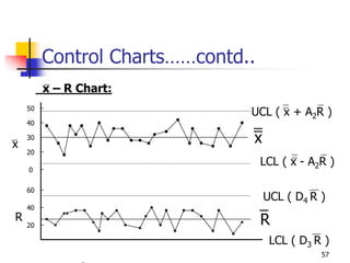
- 57. 57 Control Charts……contd.. x – R Chart: 30 50 40 20 0 60 40 20 x R UCL ( x + A2R ) LCL ( x - A2R ) x R UCL ( D4 R ) LCL ( D3 R )
- 58. 58 Coefficients for x-R Charts Size of Sub-group X-Chart R Chart R Chart R Chart n A2 D3 D4 d2 2 1.880 - 3.267 1.128 3 1.023 - 2.575 1.693 4 0.729 - 2.282 2.059 5 0.577 - 2.115 2.326 6 0.483 - 2.004 2.534
- 59. 59 Control Charts……contd.. Other Charts: pn Chart Number of Defective p Chart Fraction Defective c Chart No. of Defects on a fixed sized Product u Chart No. of Defects on a varying sized product
- 60. 60 How to Read Control Charts 1. Out of Control Limits: Points outside the limits 2. Run: Continuously on one side of center line • Seven-Point length of run is abnormal • 10 Out of 11 consecutive points on one side • 12 Out of 14 consecutive points on one side • 16 Out of 20 consecutive points on one side 3. Trend: Continuous upward or downward curve
- 61. 61 How to Read Control Charts 4. Approach to the Control Limits • Two out of three points occur outside of 2-sigma limits is abnormal 5. Approach to the Center Line • When most of the points are within central 1.5-sigma lines, this is also abnormal. It indicates mixing odd data in sub-groups 6. Periodicity • When the curve repeatedly shows an up and down trend for almost same interval, this is also abnormal