Tagged Mobile UX & Design
Download as pptx, pdf0 likes1,051 views

The document discusses mobile user experience principles, emphasizing the importance of speed, simplicity, and ease of navigation in mobile design. It advocates for a mobile-first approach to prioritize essential features, allowing for enhanced experiences on larger screens. Furthermore, it highlights progressive enhancement as a strategy to ensure functionality across various device capabilities.


Tagged Mobile UX & Design
- 1. Mobile User Experience Principles Mark Lieberwitz Mobile Product Manager at Tagged, Inc.
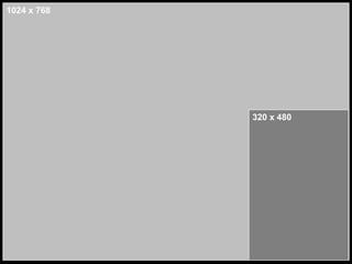
- 3. 1024 x 768 320 x 480
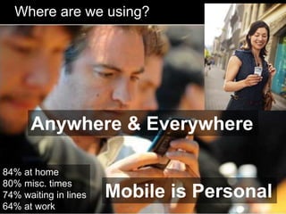
- 6. Where are we using? Anywhere & Everywhere 84% at home 80% misc. times 74% waiting in lines Mobile is Personal 64% at work
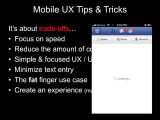
- 7. Mobile UX Tips & Tricks ItŌĆÖs about trade-offsŌĆ” ŌĆó Focus on speed ŌĆó Reduce the amount of content ŌĆó Simple & focused UX / UI ŌĆó Minimize text entry ŌĆó The fat finger use case ŌĆó Create an experience (make navigation easy)
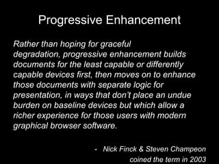
- 12. Progressive Enhancement Rather than hoping for graceful degradation, progressive enhancement builds documents for the least capable or differently capable devices first, then moves on to enhance those documents with separate logic for presentation, in ways that donŌĆÖt place an undue burden on baseline devices but which allow a richer experience for those users with modern graphical browser software. - Nick Finck & Steven Champeon coined the term in 2003
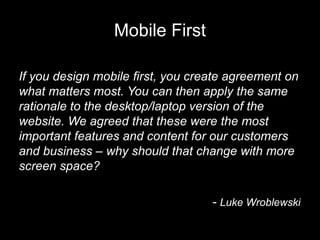
- 13. Mobile First If you design mobile first, you create agreement on what matters most. You can then apply the same rationale to the desktop/laptop version of the website. We agreed that these were the most important features and content for our customers and business ŌĆō why should that change with more screen space? - Luke Wroblewski
Editor's Notes
- #4: For years the tech industry struggled for a standard size to design for and we finally settled here. Everyone is familiar with this, we all design in 960, yes? This was fine for a while, although it ignores most other screen resolutions and doesnŌĆÖt represent the real world. Jeremy Keith calls this ŌĆśthe consensual hallucinationŌĆÖ.Design is the art of applying constraints until an elegant solution is created. 80% of the screen we designed for is GONE. This creates FOCUS.So letŌĆÖs talk about focus and User ExperienceŌĆ”.
- #5: SW is focused on what customers want.Has anyone studied visual perception? Has anyone heard of change blindness?When two things are similar and only 1 or 2 things change people canŌĆÖt tell the difference. So be aware of that concept when I make this transition, cause you might not see the difference. Let me do that againŌĆ”.
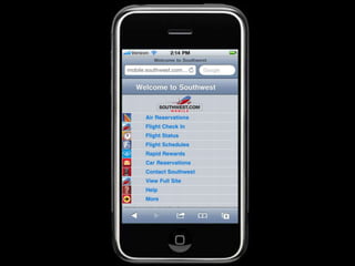
- #6: WhatŌĆÖs on here?How does the airline make money? They sell reservations.Customers want to buy that stuff, they want to check their flight and manage their rewardsŌĆ”.thatŌĆÖs it!Business goals + user needs ŌĆō nothing else. There is no room, they had to get rid of all the crap and focus on what customers want, what the business is for. This is not, every single marketing initiativeŌĆ”itŌĆÖs what is NEEDED.Know your audience: what are they doing and why? What is importantŌĆ”.make it EASY.This deisng isnŌĆÖt exactly viasually appealing, but it gets the job done and it has focus. So what else do we need to be aware of in designing for mobile?
- #7: Home ŌĆō In between cooking dinner or watching TVPeople use these devices anywhere and everywhere.-Very distinct factor of mobile. WhenŌĆÖs the last time you saw someone in line with their laptop? New Usage begets new UX.Because we can use anywhere, we have partial attention. YouŌĆÖre not sitting their for hours using these devices like a PC. ItŌĆÖs a one thumb one eyeball experienceŌĆ”focus on designing for a simple user experience. (think angry birds)This means we have to think about mobile design differently, thereŌĆÖs a short attention span for people using mobile. Think about going to see a movie you really were looking forward to on a huge IMAX screen and youŌĆÖre sitting next to a guy with a really terrible laugh.Mobile is personalŌĆ”.youŌĆÖve got all these things that are specific to mobile. Device is ALWAYS with youSmall ScreenBattery is going to dieNetwork is inconsistentIncreasingly use fingersEnvironmental SensorsLocationDirectionAmbient Light SensorCan call / text everyone you knowThese things together make the device much more personal:It changes the equation when we design for stuff based on these agronomical factors.
- #8: Mobile is about speed Things are generally slower on mobile. Give the user an indication something is happeningŌĆ”a spinning wheel, blinking ŌĆśloadingŌĆÖ iconŌĆ”this makes it feel like the app/site is faster than it actually is.Speed is one of the top concerns in mobile designTry to design for a slow-medium connection speed (strike a balance)Design for 3G, not necessarily WiFi connectivityCalls to the serverImage sizeReduce the amount of contentMobile web: Reduce number of new page loadsSimple & focused UX (KISS)Single column layouts tend to work wellMinimize text entryAuto-fill, dropdowns, pinwheels, lists, calendar picker, etc. ŌĆō If you want the user to type something bring up the keyboard right away, donŌĆÖt make them click for it.Copy Paste This is painful on mobile (describe experience), use a ŌĆśmail-toŌĆÖ instead and allow the user to use the mail client to post the linkŌĆ”this pops an overlay over the browser and is a great experience everyone is used too. This may be bad on the desktop, but itŌĆÖs great on mobile.Quotes:Design is the method of putting form to content.- Paul Rand Design is the stuff around the end result.- Mark Boulton
- #12: What we need to realize as designers is that we donŌĆÖt have control. This is hard for designersŌĆ”we LOVE control.But users can access our content in any amount of ways; RSS, Print, desktop, laptop, mobile devices, aggregate websites that use iframes, twitter, facebook, tablets, the list goes on and onŌĆ”and we donŌĆÖt always have control over how our content displays or is consumed. Once we admit this to ourselves itŌĆÖs easy to see why responsive design offers a great answer to the question of How our content is consumed on the three major platforms. When talking about mobile many people use the term mobile web. But I ask you, is there such a thing as mobile web? Stephen Hay wrote an essay titled ŌĆ£There is no Mobile WebŌĆØ in which he statedŌĆ”.Most sites on the web are not built with specific mobile use-cases in mind. However, millions of people access these sites every day through mobile devices. They access a ŌĆ£normalŌĆØ (whatever that means) website through their ŌĆ£mobileŌĆØ device.Stephen HayWhat makes a design responsive?Flexible GridsFlexible Images / MediaMedia Queries (CSS3) ŌĆ”but design isnŌĆÖt just about layout.Design is the method of putting form to content.- Paul Rand Design is the stuff around the end result.- Mark Boulton
- #13: This way of thinking has been around for some time, but we need to adapt it to todayŌĆÖs world. This means designing for the base use case and then adding to the experience as the device the user is accessing our content on becomes better enabledŌĆ”.we can then layer on more and better tools and experiences where they add value to the user. This way of thinking brings us to my last pointŌĆ”.
- #14: Luke has written a book called Mobile First and has also given numerous presentations which are available online. I highly recommend you read his book or look into these presentations as they can be eye-opening. Especially for friends of ours in the industry who still arenŌĆÖt convinced that mobile is the future or donŌĆÖt know how to react to the new paradigm weŌĆÖre in.Mobile first allows us to design for the base use case and add more value to the user experience as we design upward for devices that are more enabled by screen size or JavaScript or CSS capabilities. It also allows us to design specific use cases for mobile and tablet devices which have capabilities that desktops simply donŌĆÖt have. ItŌĆÖs a new, potentially scary, way of thinking (especially for a successful business that has been web driven from the outset). But we as an industry need to change with the times and design for how users want and need to interact with our content. That means changing the way we think and design to provide a better, broader and adaptable experience that responds to any use case users might have.So how do we tie this all together? ŌĆ”
- #15: Any questions?