狠狠撸

狠狠撸Share a Scribd company logo
Tainted Evaluation
What have we learned from audience
feedback?
Tainted Evaluation
The Poster:
Here is our first draft of our film poster, however we made many changes to it
based on our audience feedback. Our audience like the main photo, however
as the character wasn’t looking directly into the camera, it didn't exactly meet
the standard conventions of a film poster. We also made some spelling
mistakes, which our audience picked up on, this was quick and easy to fix.
The audience also felt the layout didn’t look very professional, for example
the position of the title, ‘Tainted’.
Tainted Evaluation
Here is our final film poster, as you can see it is very different to our first draft. The main
change we made was the background image, we decided to change it to this image, as it is
much more creative and reflects the narrative of the film; a school girl becoming tainted. We
also superimposed an image of houses at the bottom, to reflect the city/urban vibe of the
film. We changed the positioning of the title, as in the middle it is more eye catching and it
also reflects how titles were placed in film posters we looked at. We added in some more
conventions of posters, such as the logos of the film creators, web address, social media
links such as twitter and facebook and the blurb telling the audience who starred and
created the film.
Tainted Evaluation
The Trailer:
Our first draft of the trailer had 2 pieces of music, however our audience commented that
this was not like most trailers. This meant we had to find one song that suited the whole of
our trailer, as the narrative slightly shifts in our trailer. For this we re-watched film trailers
that were the same genre as ours to find a better suited piece of music. This greatly
improved our trailer, as it made it flow better, rather than seeming like two separate trailers.
It also came up in our research that we need a title displaying the age rating of our film, as
it contained bad language and scenes of a sexual nature. We didn’t have this in our first
draft, however added on into our final.
There was some scenes that we cut from our first draft, as we felt they didn’t suit the
trailer and our audience seemed to think they was a bit pointless. By cutting these, our
trailer felt more gritty and suited to our genre, of urban drama.
Tainted Evaluation
The Magazine:
This is our first draft of our magazine, our
audience felt that the layout wasn't quite right as
it didn’t follow conventions of magazine. For
example the left alignment didn’t follow the
conventions, as it was slightly out of place.
They also felt the text was to ‘left heavy’, so there
was too much space on the right hand side.
They liked our central image, however felt the
magazine didn’t make it clear was our unique
selling point was, as it didn’t clearly state that it
was from the creators of ‘Kidulthood’.
Tainted Evaluation
This is our final draft of the
magazine, we slightly changed the
position of the image, to meet the
rule of thirds. This makes the front
cover stand out more, especially if it
was in a stand at a shop.
We also added more conventions of
film magazines, such as a sticker
showing what was in this edition of
the magazine and interviews with
other film related subjects.
We slightly changed the colour
scheme, to move away from it just
being black and white.
We also changed the position of the
title of the film, and added the
unique selling point of our film.
The magazine follows the codes and
conventions of having a barcode,
date and price, web address and
strong masthead.

More Related Content

What's hot (20)

PPTX
Magazine and poster
Elle Chandler
?
PPTX
BlueSkyStudios Initial Audience Survey
rhsmediastudies
?
PPTX
Thinking of a Song
callie_edwards
?
PPTX
Media Evaluation Question 1
fb9342
?
PPT
n what ways does my media product use, develop or challenge forms and convent...
ianjbbeattie
?
PPTX
Music video pitch
09hurfordkat
?
PPTX
Codes and conventions
perer050308
?
PPTX
Evaluation Question 2 - How succesful is the combination of your main product...
29556
?
PPTX
Task seven presentation
13241324
?
PPTX
Initial pitch ideas
callie_edwards
?
PPTX
Audience feedback media evaluation final
lelbish0302
?
PPTX
Evaluation Question 1 - In what ways does your media product develop or chall...
29556
?
PPT
Media question 1
Sophie Lemm
?
PPTX
Evaluation
Luke Simpson
?
DOCX
Story Board Adaptations and Changes 2
Konyslover
?
PPTX
Poster analysis
Alex Madej
?
PPTX
Film magazine covers
charlottemedia13
?
PPTX
Eval task 2
bbucklandmedia
?
PPTX
Eval Q1
MaisieLegg
?
PPTX
Poster Analysis
Alex Madej
?
Magazine and poster
Elle Chandler
?
BlueSkyStudios Initial Audience Survey
rhsmediastudies
?
Thinking of a Song
callie_edwards
?
Media Evaluation Question 1
fb9342
?
n what ways does my media product use, develop or challenge forms and convent...
ianjbbeattie
?
Music video pitch
09hurfordkat
?
Codes and conventions
perer050308
?
Evaluation Question 2 - How succesful is the combination of your main product...
29556
?
Task seven presentation
13241324
?
Initial pitch ideas
callie_edwards
?
Audience feedback media evaluation final
lelbish0302
?
Evaluation Question 1 - In what ways does your media product develop or chall...
29556
?
Media question 1
Sophie Lemm
?
Evaluation
Luke Simpson
?
Story Board Adaptations and Changes 2
Konyslover
?
Poster analysis
Alex Madej
?
Film magazine covers
charlottemedia13
?
Eval task 2
bbucklandmedia
?
Eval Q1
MaisieLegg
?
Poster Analysis
Alex Madej
?

Viewers also liked (10)

PPT
Urban evaluation
eveyarde
?
PPTX
Tainted evaluation
eveyarde
?
PPTX
Photoshoot
eveyarde
?
PPTX
Music Magazine Research
eveyarde
?
PPTX
Redux+react js
國昭 張
?
PPTX
Asp.net core v1.0
國昭 張
?
PPTX
顿顿顿引导
國昭 張
?
PPTX
顿顿顿系统分析
國昭 張
?
PPTX
前端测试
國昭 張
?
PPTX
顿顿顿架构设计
國昭 張
?
Urban evaluation
eveyarde
?
Tainted evaluation
eveyarde
?
Photoshoot
eveyarde
?
Music Magazine Research
eveyarde
?
Redux+react js
國昭 張
?
Asp.net core v1.0
國昭 張
?
顿顿顿引导
國昭 張
?
顿顿顿系统分析
國昭 張
?
前端测试
國昭 張
?
顿顿顿架构设计
國昭 張
?
Ad

Similar to Tainted evaluation (20)

PPTX
A2 Media Evaluation - Question 3
NR10209
?
PPTX
Question 3 Evaluation
NR10209
?
PPTX
Evaluation Question 3
NR10209
?
PPTX
Evaluation Question 3
Monique Jackson
?
PPTX
Evaluation Question 3
Monique Jackson
?
PPTX
Evaluation Question 3
Monique Jackson
?
PPT
Evaluation
asrisatkunam
?
PPT
Evaluation
asrisatkunam
?
PPT
Evaluation
asrisatkunam
?
PPT
Evaluation
asrisatkunam
?
PPT
Evaluation
asrisatkunam
?
PPT
Evaluation
asrisatkunam
?
PPT
Evaluation
asrisatkunam
?
PPT
Evaluation
asrisatkunam
?
PPT
Evaluation
asrisatkunam
?
PPT
Evaluation - Question 1
ameliabird
?
PPTX
Obsesion Question 3
BeckyThompson8
?
PPTX
Evaluation q1
saskiadk
?
PPTX
Evaluation question 3
mediastudiesfinearts
?
PPTX
Evaluation task 3
DG160859
?
A2 Media Evaluation - Question 3
NR10209
?
Question 3 Evaluation
NR10209
?
Evaluation Question 3
NR10209
?
Evaluation Question 3
Monique Jackson
?
Evaluation Question 3
Monique Jackson
?
Evaluation Question 3
Monique Jackson
?
Evaluation
asrisatkunam
?
Evaluation
asrisatkunam
?
Evaluation
asrisatkunam
?
Evaluation
asrisatkunam
?
Evaluation
asrisatkunam
?
Evaluation
asrisatkunam
?
Evaluation
asrisatkunam
?
Evaluation
asrisatkunam
?
Evaluation
asrisatkunam
?
Evaluation - Question 1
ameliabird
?
Obsesion Question 3
BeckyThompson8
?
Evaluation q1
saskiadk
?
Evaluation question 3
mediastudiesfinearts
?
Evaluation task 3
DG160859
?
Ad

Tainted evaluation

  • 1. Tainted Evaluation What have we learned from audience feedback?
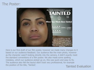
  • 2. Tainted Evaluation The Poster: Here is our first draft of our film poster, however we made many changes to it based on our audience feedback. Our audience like the main photo, however as the character wasn’t looking directly into the camera, it didn't exactly meet the standard conventions of a film poster. We also made some spelling mistakes, which our audience picked up on, this was quick and easy to fix. The audience also felt the layout didn’t look very professional, for example the position of the title, ‘Tainted’.
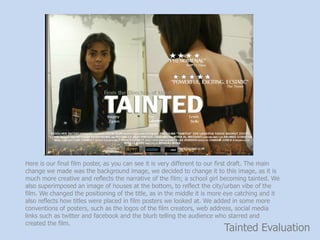
  • 3. Tainted Evaluation Here is our final film poster, as you can see it is very different to our first draft. The main change we made was the background image, we decided to change it to this image, as it is much more creative and reflects the narrative of the film; a school girl becoming tainted. We also superimposed an image of houses at the bottom, to reflect the city/urban vibe of the film. We changed the positioning of the title, as in the middle it is more eye catching and it also reflects how titles were placed in film posters we looked at. We added in some more conventions of posters, such as the logos of the film creators, web address, social media links such as twitter and facebook and the blurb telling the audience who starred and created the film.
  • 4. Tainted Evaluation The Trailer: Our first draft of the trailer had 2 pieces of music, however our audience commented that this was not like most trailers. This meant we had to find one song that suited the whole of our trailer, as the narrative slightly shifts in our trailer. For this we re-watched film trailers that were the same genre as ours to find a better suited piece of music. This greatly improved our trailer, as it made it flow better, rather than seeming like two separate trailers. It also came up in our research that we need a title displaying the age rating of our film, as it contained bad language and scenes of a sexual nature. We didn’t have this in our first draft, however added on into our final. There was some scenes that we cut from our first draft, as we felt they didn’t suit the trailer and our audience seemed to think they was a bit pointless. By cutting these, our trailer felt more gritty and suited to our genre, of urban drama.
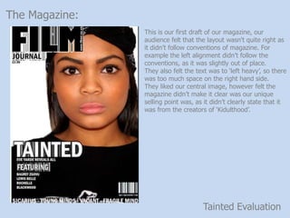
  • 5. Tainted Evaluation The Magazine: This is our first draft of our magazine, our audience felt that the layout wasn't quite right as it didn’t follow conventions of magazine. For example the left alignment didn’t follow the conventions, as it was slightly out of place. They also felt the text was to ‘left heavy’, so there was too much space on the right hand side. They liked our central image, however felt the magazine didn’t make it clear was our unique selling point was, as it didn’t clearly state that it was from the creators of ‘Kidulthood’.
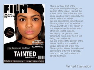
  • 6. Tainted Evaluation This is our final draft of the magazine, we slightly changed the position of the image, to meet the rule of thirds. This makes the front cover stand out more, especially if it was in a stand at a shop. We also added more conventions of film magazines, such as a sticker showing what was in this edition of the magazine and interviews with other film related subjects. We slightly changed the colour scheme, to move away from it just being black and white. We also changed the position of the title of the film, and added the unique selling point of our film. The magazine follows the codes and conventions of having a barcode, date and price, web address and strong masthead.