Tickets for Premiere, Promotion and Presentation
Download as PPTX, PDF0 likes103 views
This presentation has the tickets we made for the trailer premiere, as well as how we promoted and presented the final products.
1 of 9
Download to read offline


Recommended
Evaluation Question 2
Evaluation Question 2jassinta
╠²
The document evaluates how effective the combination of the main product and ancillary texts was. It discusses how the protagonist was featured prominently in the trailer, poster, and magazine cover to focus attention on the hero rather than villains. Similar fonts were used in the trailer and poster to create coherence. The exact same film title was used across all pieces to clearly connect them. Recurring imagery of a mobile phone and glitches, along with a consistent color scheme of green, white, and black, were applied to link the different elements together. An evaluation concludes that the combination of pieces was effective in belonging to the same narrative through the use of consistent mise-en-scene and film title.Final Poster Image and Fonts
Final Poster Image and Fontsjassinta
╠²
This document discusses final design choices for a film poster, magazine, and trailer. It summarizes that the main focus of the photo is in the center with a protagonist's hand to relate the materials. Dark areas make the title and credits stand out. The film title font uses colors from the photo and glitch text effects to relate to the technological theme. A simple, clear font was chosen for credits and quotes to be easily read against the background and resemble smartphone fonts for audience familiarity.Front Cover & Film Poster Target Audience Feedback
Front Cover & Film Poster Target Audience Feedbackjassinta
╠²
Our target audience provided feedback on the final front cover and film poster. They responded positively to the color scheme and use of a glitch on the face, feeling it reflected themes in the narrative and moral panic. They also liked the features on the front cover and its familiar aesthetic. Additionally, they enjoyed the cracked phone on the poster, finding it subverted conventions by not including characters and making it stand out.Evaluation 1. in what ways does your media product use, develop or challenge ...
Evaluation 1. in what ways does your media product use, develop or challenge ...Izzy Nobbs
╠²
The teaser trailer was 1.13 minutes long to match typical trailer lengths. Editing techniques like cut to black and gradual speeding were used to build tension. Dark tones and ominous sounds created an unsettling mood. Minimal plot details aligned with conventions to pique interest. The title was placed at the end to linger in viewers' minds. Research informed the trailer's style and color scheme.Evaluation question 2
Evaluation question 2GennaroBonito
╠²
The document discusses the marketing campaign for the film Star Wars: The Force Awakens. It summarizes how the campaign established the film's identity over 10 years through unique trailers and marketing techniques. Different elements of the marketing campaign, such as the film poster, teaser trailer, and magazine covers are then analyzed in more detail to show how they portrayed the film's brand identity and appealed to fans of the Star Wars franchise through familiar elements and characters.Evaluation 2 media
Evaluation 2 mediameganh24914
╠²
The combination of the main product (film "The Passage") and ancillary texts (poster, teaser trailer, magazine cover) was effective because key elements were consistently featured across all materials. This included similar titles/fonts, taglines, characters, settings, costumes/mise-en-scene, and color schemes. While some individual elements differed slightly between materials due to being produced by different companies, the overall marketing package clearly conveyed that all pieces were advertising the same film. Featuring these consistent elements helped link the materials and ensured the audience would recognize they were all part of the same promotional campaign for "The Passage".Poster analysis
Poster analysisNT160371
╠²
The poster analyzes features two thriller movie posters. Both posters convey mystery and conflict through their visual elements. The first poster features two male characters on either side of a female protagonist, suggesting tension. Dark colors and the characters' body language further imply mystery and potential conflict. The second poster stands out through its use of black background, drawing attention to the lead actor. Mysterious eye contact and a "glitch" in the title enhance the thriller genre. The analyzed posters inform the design of the student's own thriller poster, focusing on visual symbols of opposing characters and an atmosphere of secrecy through lighting and colors.Film poster terminology and features
Film poster terminology and featuresAdyn97
╠²
A2 media task, all about film poster terminology and the features in the poster I had analysed which is Shutter IslandPresentation2
Presentation2Megan Harding
╠²
The magazine cover features Robert Downey Jr. as Sherlock Holmes in the center surrounded by plugs advertising other articles. The capitalized title engages attention. The elements like price and barcode are unobtrusively placed. The cover uses conventions like prominent central imagery and plugs to attract readers.Film posters terminology and features
Film posters terminology and featuresMollie Green
╠²
The document discusses the key elements and conventions of film posters, including billing, title, release date, images, credits, quotes, and taglines. It analyzes posters for the films The Theory of Everything and Rush, noting their use of stars, romantic poses, and colors to portray genre. Alternative posters for Vantage Point and The Girl with the Dragon Tattoo are also examined, highlighting differences in main images and taglines.Question 2 - Evaluation
Question 2 - Evaluationjworgan
╠²
The document discusses the effectiveness of combining a main product with ancillary texts like a poster and trailer.
It summarizes how the same shot was used for the poster and trailer to highlight the iconic scene. Minor changes were made to the logo on each for readability against the backgrounds. The same font was used for both to link them while adjusting color for visibility.
The magazine on the film further advertises the trailer by featuring the main actor. Subtle links between the magazine and trailer include a title referring to sympathizing with the villainous protagonist. Another effective link discusses the actor himself separate from his character.Poster analysis
Poster analysisMegan Harding
╠²
The document analyzes posters for four horror films: Paranormal Activity, The Exorcist, Sinister, and Insidious. For each poster, the document examines elements like direct address, main images, text, lighting, color schemes, and layouts. It provides details on how each element contributes to effectively conveying the films' horror genres.Film poster conventions 
Film poster conventions CaponEmily
╠²
Film posters follow certain conventions in their visual design. The main image typically represents a key moment or character(s) to convey the genre and attract interest. Typography provides information about the film through titles, quotes, and ratings. Camera angles and lighting are chosen to set the mood and match the film's tone, such as close-ups for mystery or low lighting for horror. Additional text lists the director, producers, actors, and other production details to promote those involved and provide relevant details.3 Poster Analysis'
3 Poster Analysis'keziahmiller
╠²
This document analyzes and summarizes the visual graphics, color palettes, and text choices used in the movie posters for The Girl on the Train, Gone Girl, and South Paw. For each poster, the analysis discusses how the visuals focus on the main character, incorporate elements from the film's narrative, and use colors that match the film's mood. It also examines how the text is designed to draw attention to the visuals rather than stand out. The posters are praised for subtly connecting the advertising to the films through their visual and stylistic choices.Skyfall poster analysis
Skyfall poster analysischloebuckland
╠²
The Skyfall movie poster uses a simple color scheme of black and white to portray a sophisticated and serious tone. It features Daniel Craig prominently in the center to attract attention as the well-known James Bond actor. In the background is a black and white image of London with the British union jack flag standing out in color to indicate the film's setting. Craig holds a gun, establishing the action/thriller genre for viewers. The release date is displayed prominently in orange to encourage pre-booking tickets or seeing it on opening day. Legal text is included discreetly.Q3 Evaluation A2
Q3 Evaluation A2MediaStudCourse
╠²
The ancillary tasks of a magazine cover and poster effectively promote the film trailer. Both include an image of the main actor wearing similar clothing to the trailer to create consistency. The same text, color scheme, and fonts are used across the trailer, magazine, and poster to clearly link the materials together. The lighting and costumes of the main characters in the poster photos match those used in the trailer scenes. Key elements like dialogue excerpts and character placements help tell the story and draw connections between the ancillary tasks and the main trailer.Semiology 
Semiology khalfyard
╠²
This document discusses semiology and how signs are used in film posters to convey meaning to audiences. It provides definitions for different types of signs, including iconic, symbolic, and indexical signs. Film posters use signs like costumes, lighting, color, and imagery to hint at the genre and plot of the film. Effective posters deconstructed in the document use techniques like faded facial images and positioning characters in the sky to connote death or a spiritual presence, and establish settings and body language to imply characters searching or feeling lost. Color balancing and bold title text are also discussed as ways posters provide essential information to audiences.Eval 1
Eval 1Jodie Brown
╠²
My partner and I created a teaser trailer and poster for a psychological thriller film. We drew inspiration from films like "Split" and "Inception" that target a youthful audience. The trailer incorporates elements of both the horror and thriller genres to create a hybrid product. It includes scary and violent scenes like a horror film but also psychological suspense like a thriller. We used conventions like a dark color palette, possessed object as the central image, and ominous soundtrack. However, we also challenged some conventions by not including the main character's face or a specific release date to generate mystery. The goal was to attract audiences with a unique product that fits in the psychological thriller genre.A2 evaluation - Enforcer
A2 evaluation - EnforcerJack Bcfc Denning
╠²
The document discusses conventions used in film trailers and posters to promote media productions. It describes how the author's trailer and promotional materials for a film follow conventions like using key plot moments out of order, including release date and production company at the end of the trailer, and using titles to introduce clips. The poster features the main character and production details against a backdrop relating to the plot. Challenges to conventions include combining genres of action, thriller and sci-fi and portraying the main character as potentially a "false protagonist".Media question 2 
Media question 2 rc160161
╠²
The document discusses establishing a brand identity for the film "Soft Focus" through various media products including a teaser trailer, poster, and magazine cover. A key part of the brand identity is using the color purple throughout, featuring the protagonist Lucy, and including imagery of a camera to reference the film's narrative. A handwritten font is used consistently, and taglines like "A Story of Friendship" are meant to suggest the film's themes. While the magazine cover focuses more on promoting the actress, the teaser and poster aim to present the same narrative and genre of a teen drama to link the brand identity across media.Horror Movies Posters Analysis
Horror Movies Posters Analysisoshin34
╠²
The poster uses several horror film conventions to attract audiences. It features a close-up image showing physical possession in progress that is visually striking yet scary. The tagline "Darkness lives inside" and the image provide clues about the film's concept of possession. Standard horror color schemes like dark tones are used to create an unsettling mood. The date is placed below the main image to draw more attention to it, while credits use smaller fonts to take less attention away. Overall visual and textual elements work together to intrigue audiences and imply a frightening story centered around the theme of possession.A2 how does your media product challenge or follow forms and conventions of r...
A2 how does your media product challenge or follow forms and conventions of r...AndyBrown100
╠²
This document discusses how the media product challenges or follows conventions of real media. For the double page spread (DPS), the author followed conventions from Empire magazine in terms of layout and including a picture between columns. Color, page numbers, and lines at the bottom also follow conventions. The poster was inspired by Silence of the Lambs and includes the actors' names, masthead in largest font, and credits underneath. The film includes experimental elements like color changes but also more conservative conventions like voiceovers, flashbacks in black and white, and text overlays - all common in thrillers to make it feel professional.Q2
Q2StephStraw05
╠²
The document discusses the use of fonts, colors, and other stylistic elements across a film poster, magazine cover, and teaser trailer for a film called "Reverie." There is consistency in using a red font for the film title across all pieces, while other fonts vary stylistically depending on the needs of each ancillary task. Character expressions also differ slightly between the poster and magazine to suit the tone and audience of each medium. Overall, the combination of main product and ancillary tasks effectively promotes the film through clear visual links tied to its mystery genre themes.Evaluation 4
Evaluation 4Megan Harding
╠²
The student used various new media technologies at different stages of constructing their horror film project. In planning and research, they used ║▌║▌▀ŻShare, SoundCloud, Internet Explorer, Popplet, YouTube and Mahara to search for inspiration, take notes, and keep all work organized. They created drafts and received feedback using YouTube, Mahara and peer reviews. For production, they used GarageBand, SoundCloud, Final Cut Pro X, Photoshop and Illustrator to edit footage, sound, and design posters and magazines. Finally, they used YouTube, ║▌║▌▀ŻShare and Popplet to evaluate their work and document how they incorporated feedback.║▌║▌▀Ż share eval
║▌║▌▀Ż share evalmoynzy
╠²
The document discusses conventions for designing movie posters. Some key conventions mentioned include using a limited color palette, bold contrasting titles, a single main image of the main characters, positioning of actors' names, inclusion of production company and director, a tagline or quote, and an overall z-shaped layout. Following these conventions can help attract audience attention and communicate essential information about the film effectively.Eval q 1
Eval q 1ellibellie97
╠²
This document summarizes the influences and conventions used in creating an original film trailer, poster, magazine, and other marketing materials for a student media project. It discusses influences drawn from real film posters like Submarine and 500 Days of Summer, including use of focal images, consistent fonts, and reviews. Film trailer conventions like character introductions, relationship shots, and end credits are also analyzed. The document examines influences from real film marketing companies and magazines like Total Film to guide design of an original company logo and magazine cover. Overall, the document shows how the student media project draws upon and develops conventions of real film marketing while creating original work.Eval q 1
Eval q 1ellibellie97
╠²
This document summarizes the influences and conventions used in creating an original film trailer, poster, magazine, and other marketing materials for a student media project. It discusses influences drawn from real film posters like Submarine and 500 Days of Summer, including use of focal images, consistent fonts, and reviews. Film trailer conventions like character introductions, relationship shots, and end credits are also examined. The document outlines the ident, magazine cover design, and color palette used, citing influences from actual film companies and magazines like Total Film. Overall, the document shows how the student media project draws from established conventions while developing its own distinct visual identity and style.Question 3
Question 3Ulera
╠²
This document discusses the consistency and differentiation between three media texts - a movie trailer, magazine cover, and poster - created to advertise the movie "ANNABELLE." Key elements like the main actress, movie title, and tagline "from the makers of Insidious" were kept consistent across all texts. Color scheme and small details were altered between the texts to create variation while still maintaining continuity of theme and branding. The goal was to familiarize audiences with the film across all advertising platforms using common conventions.Evaluation 1 
Evaluation 1 euddin1
╠²
In what ways does your media product use, develop or challenge forms and conventions of real media products?Evaluation
Evaluationasrisatkunam
╠²
The document discusses an evaluation of a film trailer and its accompanying ancillary tasks (poster and magazine cover). Feedback was gathered from a target audience of teenagers through questionnaires. Positives included realistic portrayals and a well-shot silhouette scene. Improvements suggested a less clich├®d storyline, clearer plot, and inclusion of a second song. The combination of tasks effectively advertised the fictional film from different perspectives. Media technologies like Photoshop, Pinnacle Studio, and Fronter were used for production, research, and evaluation.More Related Content
What's hot (20)
Presentation2
Presentation2Megan Harding
╠²
The magazine cover features Robert Downey Jr. as Sherlock Holmes in the center surrounded by plugs advertising other articles. The capitalized title engages attention. The elements like price and barcode are unobtrusively placed. The cover uses conventions like prominent central imagery and plugs to attract readers.Film posters terminology and features
Film posters terminology and featuresMollie Green
╠²
The document discusses the key elements and conventions of film posters, including billing, title, release date, images, credits, quotes, and taglines. It analyzes posters for the films The Theory of Everything and Rush, noting their use of stars, romantic poses, and colors to portray genre. Alternative posters for Vantage Point and The Girl with the Dragon Tattoo are also examined, highlighting differences in main images and taglines.Question 2 - Evaluation
Question 2 - Evaluationjworgan
╠²
The document discusses the effectiveness of combining a main product with ancillary texts like a poster and trailer.
It summarizes how the same shot was used for the poster and trailer to highlight the iconic scene. Minor changes were made to the logo on each for readability against the backgrounds. The same font was used for both to link them while adjusting color for visibility.
The magazine on the film further advertises the trailer by featuring the main actor. Subtle links between the magazine and trailer include a title referring to sympathizing with the villainous protagonist. Another effective link discusses the actor himself separate from his character.Poster analysis
Poster analysisMegan Harding
╠²
The document analyzes posters for four horror films: Paranormal Activity, The Exorcist, Sinister, and Insidious. For each poster, the document examines elements like direct address, main images, text, lighting, color schemes, and layouts. It provides details on how each element contributes to effectively conveying the films' horror genres.Film poster conventions
Film poster conventions CaponEmily
╠²
Film posters follow certain conventions in their visual design. The main image typically represents a key moment or character(s) to convey the genre and attract interest. Typography provides information about the film through titles, quotes, and ratings. Camera angles and lighting are chosen to set the mood and match the film's tone, such as close-ups for mystery or low lighting for horror. Additional text lists the director, producers, actors, and other production details to promote those involved and provide relevant details.3 Poster Analysis'
3 Poster Analysis'keziahmiller
╠²
This document analyzes and summarizes the visual graphics, color palettes, and text choices used in the movie posters for The Girl on the Train, Gone Girl, and South Paw. For each poster, the analysis discusses how the visuals focus on the main character, incorporate elements from the film's narrative, and use colors that match the film's mood. It also examines how the text is designed to draw attention to the visuals rather than stand out. The posters are praised for subtly connecting the advertising to the films through their visual and stylistic choices.Skyfall poster analysis
Skyfall poster analysischloebuckland
╠²
The Skyfall movie poster uses a simple color scheme of black and white to portray a sophisticated and serious tone. It features Daniel Craig prominently in the center to attract attention as the well-known James Bond actor. In the background is a black and white image of London with the British union jack flag standing out in color to indicate the film's setting. Craig holds a gun, establishing the action/thriller genre for viewers. The release date is displayed prominently in orange to encourage pre-booking tickets or seeing it on opening day. Legal text is included discreetly.Q3 Evaluation A2
Q3 Evaluation A2MediaStudCourse
╠²
The ancillary tasks of a magazine cover and poster effectively promote the film trailer. Both include an image of the main actor wearing similar clothing to the trailer to create consistency. The same text, color scheme, and fonts are used across the trailer, magazine, and poster to clearly link the materials together. The lighting and costumes of the main characters in the poster photos match those used in the trailer scenes. Key elements like dialogue excerpts and character placements help tell the story and draw connections between the ancillary tasks and the main trailer.Semiology
Semiology khalfyard
╠²
This document discusses semiology and how signs are used in film posters to convey meaning to audiences. It provides definitions for different types of signs, including iconic, symbolic, and indexical signs. Film posters use signs like costumes, lighting, color, and imagery to hint at the genre and plot of the film. Effective posters deconstructed in the document use techniques like faded facial images and positioning characters in the sky to connote death or a spiritual presence, and establish settings and body language to imply characters searching or feeling lost. Color balancing and bold title text are also discussed as ways posters provide essential information to audiences.Eval 1
Eval 1Jodie Brown
╠²
My partner and I created a teaser trailer and poster for a psychological thriller film. We drew inspiration from films like "Split" and "Inception" that target a youthful audience. The trailer incorporates elements of both the horror and thriller genres to create a hybrid product. It includes scary and violent scenes like a horror film but also psychological suspense like a thriller. We used conventions like a dark color palette, possessed object as the central image, and ominous soundtrack. However, we also challenged some conventions by not including the main character's face or a specific release date to generate mystery. The goal was to attract audiences with a unique product that fits in the psychological thriller genre.A2 evaluation - Enforcer
A2 evaluation - EnforcerJack Bcfc Denning
╠²
The document discusses conventions used in film trailers and posters to promote media productions. It describes how the author's trailer and promotional materials for a film follow conventions like using key plot moments out of order, including release date and production company at the end of the trailer, and using titles to introduce clips. The poster features the main character and production details against a backdrop relating to the plot. Challenges to conventions include combining genres of action, thriller and sci-fi and portraying the main character as potentially a "false protagonist".Media question 2
Media question 2 rc160161
╠²
The document discusses establishing a brand identity for the film "Soft Focus" through various media products including a teaser trailer, poster, and magazine cover. A key part of the brand identity is using the color purple throughout, featuring the protagonist Lucy, and including imagery of a camera to reference the film's narrative. A handwritten font is used consistently, and taglines like "A Story of Friendship" are meant to suggest the film's themes. While the magazine cover focuses more on promoting the actress, the teaser and poster aim to present the same narrative and genre of a teen drama to link the brand identity across media.Horror Movies Posters Analysis
Horror Movies Posters Analysisoshin34
╠²
The poster uses several horror film conventions to attract audiences. It features a close-up image showing physical possession in progress that is visually striking yet scary. The tagline "Darkness lives inside" and the image provide clues about the film's concept of possession. Standard horror color schemes like dark tones are used to create an unsettling mood. The date is placed below the main image to draw more attention to it, while credits use smaller fonts to take less attention away. Overall visual and textual elements work together to intrigue audiences and imply a frightening story centered around the theme of possession.A2 how does your media product challenge or follow forms and conventions of r...
A2 how does your media product challenge or follow forms and conventions of r...AndyBrown100
╠²
This document discusses how the media product challenges or follows conventions of real media. For the double page spread (DPS), the author followed conventions from Empire magazine in terms of layout and including a picture between columns. Color, page numbers, and lines at the bottom also follow conventions. The poster was inspired by Silence of the Lambs and includes the actors' names, masthead in largest font, and credits underneath. The film includes experimental elements like color changes but also more conservative conventions like voiceovers, flashbacks in black and white, and text overlays - all common in thrillers to make it feel professional.Q2
Q2StephStraw05
╠²
The document discusses the use of fonts, colors, and other stylistic elements across a film poster, magazine cover, and teaser trailer for a film called "Reverie." There is consistency in using a red font for the film title across all pieces, while other fonts vary stylistically depending on the needs of each ancillary task. Character expressions also differ slightly between the poster and magazine to suit the tone and audience of each medium. Overall, the combination of main product and ancillary tasks effectively promotes the film through clear visual links tied to its mystery genre themes.Evaluation 4
Evaluation 4Megan Harding
╠²
The student used various new media technologies at different stages of constructing their horror film project. In planning and research, they used ║▌║▌▀ŻShare, SoundCloud, Internet Explorer, Popplet, YouTube and Mahara to search for inspiration, take notes, and keep all work organized. They created drafts and received feedback using YouTube, Mahara and peer reviews. For production, they used GarageBand, SoundCloud, Final Cut Pro X, Photoshop and Illustrator to edit footage, sound, and design posters and magazines. Finally, they used YouTube, ║▌║▌▀ŻShare and Popplet to evaluate their work and document how they incorporated feedback.║▌║▌▀Ż share eval
║▌║▌▀Ż share evalmoynzy
╠²
The document discusses conventions for designing movie posters. Some key conventions mentioned include using a limited color palette, bold contrasting titles, a single main image of the main characters, positioning of actors' names, inclusion of production company and director, a tagline or quote, and an overall z-shaped layout. Following these conventions can help attract audience attention and communicate essential information about the film effectively.Eval q 1
Eval q 1ellibellie97
╠²
This document summarizes the influences and conventions used in creating an original film trailer, poster, magazine, and other marketing materials for a student media project. It discusses influences drawn from real film posters like Submarine and 500 Days of Summer, including use of focal images, consistent fonts, and reviews. Film trailer conventions like character introductions, relationship shots, and end credits are also analyzed. The document examines influences from real film marketing companies and magazines like Total Film to guide design of an original company logo and magazine cover. Overall, the document shows how the student media project draws upon and develops conventions of real film marketing while creating original work.Eval q 1
Eval q 1ellibellie97
╠²
This document summarizes the influences and conventions used in creating an original film trailer, poster, magazine, and other marketing materials for a student media project. It discusses influences drawn from real film posters like Submarine and 500 Days of Summer, including use of focal images, consistent fonts, and reviews. Film trailer conventions like character introductions, relationship shots, and end credits are also examined. The document outlines the ident, magazine cover design, and color palette used, citing influences from actual film companies and magazines like Total Film. Overall, the document shows how the student media project draws from established conventions while developing its own distinct visual identity and style.Question 3
Question 3Ulera
╠²
This document discusses the consistency and differentiation between three media texts - a movie trailer, magazine cover, and poster - created to advertise the movie "ANNABELLE." Key elements like the main actress, movie title, and tagline "from the makers of Insidious" were kept consistent across all texts. Color scheme and small details were altered between the texts to create variation while still maintaining continuity of theme and branding. The goal was to familiarize audiences with the film across all advertising platforms using common conventions.Similar to Tickets for Premiere, Promotion and Presentation (20)
Evaluation 1
Evaluation 1 euddin1
╠²
In what ways does your media product use, develop or challenge forms and conventions of real media products?Evaluation
Evaluationasrisatkunam
╠²
The document discusses an evaluation of a film trailer and its accompanying ancillary tasks (poster and magazine cover). Feedback was gathered from a target audience of teenagers through questionnaires. Positives included realistic portrayals and a well-shot silhouette scene. Improvements suggested a less clich├®d storyline, clearer plot, and inclusion of a second song. The combination of tasks effectively advertised the fictional film from different perspectives. Media technologies like Photoshop, Pinnacle Studio, and Fronter were used for production, research, and evaluation.Evaluation
Evaluationasrisatkunam
╠²
The document discusses an evaluation of a film trailer and its ancillary tasks (poster and magazine cover). Feedback was gathered from a student audience through questionnaires. Positives included realistic characters, well-shot scenes, and a successful silhouette shot. Improvements included making the storyline less cliche and clearer, and including a second song for more tempo. The combination of tasks effectively advertised the fictional film from different perspectives.Evaluation
Evaluationasrisatkunam
╠²
The document discusses an evaluation of a film trailer and its ancillary tasks (poster and magazine cover). Feedback was gathered from a student audience who viewed the trailer. The feedback was positive about the cinematography, acting, and a silhouette shot. However, the storyline was seen as too cliche. Based on this, changes were made to improve storyline clarity and add a second song to vary tempo. Various media technologies were used in production, including Photoshop, Pinnacle Studio, and Fronter.Evaluation
Evaluationasrisatkunam
╠²
The document discusses an evaluation of a film trailer and its ancillary tasks (poster and magazine cover). Feedback was gathered from a student audience via questionnaires. Positives included realistic characters, well-shot scenes like the silhouette kiss. Improvements suggested a less cliche storyline, clarifying the character relationships, and adding a second song for variety. The tasks aimed to advertise the fictional film from different angles to provide a full understanding.Evaluation
Evaluationasrisatkunam
╠²
The document discusses a film trailer and poster created for a teen drama film project. It analyzes how the trailer and poster follow conventions of real media products to advertise the film. The trailer uses techniques like montages of clips and music to set the tone. It challenges conventions by including a twist to the typical romance plot involving violence. The poster features a silhouette image from the trailer to create mystery and intrigue about the forbidden relationship at the center of the film.Evaluation
Evaluationasrisatkunam
╠²
The document discusses a film trailer and poster created for a teen drama film project. It analyzes how the trailer and poster follow conventions of real media products in their genre. The trailer uses techniques like montages of clips and music to set the tone and advance the plot. It challenges conventions by incorporating elements of violence from other genres. The poster features a silhouette image from the trailer to create mystery and intrigue around the central forbidden relationship at the heart of the film.Evaluation
Evaluationasrisatkunam
╠²
The document discusses an evaluation of a film trailer and its ancillary tasks (poster and magazine cover). Feedback was gathered from a student audience via questionnaires. Positives included clear themes/genre and realistic acting. Criticisms were that the storyline was clich├®d and character relationships unclear. Improvements included reordering scenes for clarity and adding a second song. The combination of tasks effectively advertised the fictional film from different perspectives.Evaluation
Evaluationasrisatkunam
╠²
The document discusses a film trailer and poster created for a teen drama film project. It analyzes how the trailer and poster follow conventions of real media products in their genre. The trailer uses techniques like montages of clips and music to set the tone and advance the plot. It challenges conventions by incorporating elements of violence from other genres. The poster features a silhouette image from the trailer to create mystery and intrigue around the central forbidden relationship at the heart of the film.Pitch Presentation
Pitch Presentationcp11351
╠²
This is our Pitch Presentation for our film which includes details about our teaser trailer, film poster and magazine cover.Evaluation 1
Evaluation 1euddin1
╠²
In what ways does your media product use, develop or challenge forms and conventions of real media products?Media A2 Evaluation
Media A2 EvaluationKKAProductionsAmber
╠²
The document discusses how the media product uses, develops, and challenges conventions of real media forms. It summarizes how the teaser trailer incorporates various film theories, follows structural conventions of trailers such as length and credits, and references other films through intertextuality. While it adheres to many standard conventions, it also challenges some, such as having a strong female protagonist rather than a male hero. The ancillary texts like the poster and DVD cover similarly comply with typical conventions but employ a cohesive color scheme, font, and references to photos from the film.Evaluation
Evaluationguest9943fc
╠²
The document discusses how the media product uses various film theories and conventions of real media products. It summarizes how the teaser trailer uses Propp's character archetypes but challenges conventions by having a strong female hero. It also follows Todorov's narrative structure and Levi-Strauss's concept of binary opposition through lighting. The teaser trailer and ancillary texts like the poster and DVD cover also employ common structural conventions seen in real media products.A2 Horror Evaluation
A2 Horror Evaluationguest9314cf8
╠²
The document discusses a media trailer created by the author that follows horror genre conventions seen in films like "28 Days Later" with themes of a global crisis and zombie attacks. Research was conducted on real trailers, magazines, and film posters that influenced the style and elements of the author's trailer, magazine cover, and poster. Feedback was collected that showed most found the trailer interesting but some felt it lacked gore and the plot was unclear. Suggestions for improvement included making the voiceover clearer and quickening the beginning.A2 Horror Evaluation
A2 Horror Evaluationwelavmedia
╠²
The document discusses a media trailer created by the author that follows horror genre conventions seen in films like "28 Days Later" regarding themes, costumes, props, and locations. It summarizes how the trailer, magazine cover, and film poster were influenced by and developed upon conventions from real media texts within those genres regarding visual style, layout, use of motifs like blood, and ambiguous portrayals of protagonists. Audience feedback indicated that some found the beginning too slow and voiceover unclear, but most found it interesting and the story/plot good.Question 1
Question 1EllisHackett
╠²
The document discusses how the media producer's film poster, magazine cover, and trailer challenge or develop conventions of those media forms. For the poster, they included credits and logos at the bottom as is typical, but used silhouettes to maintain mystery. For the magazine, they modeled it after Empire magazine but included a close-up of the main actor. Their trailer drew inspiration from Murder by Numbers, using character introductions, clues to the killer, and editing techniques like quick cuts between shots to build mystery. Overall, the media producer aimed to fit genre conventions while also preventing viewers from knowing too much about the source of drama in their crime story.Media studies coursework evaluation
Media studies coursework evaluationchargerrard
╠²
The document discusses a student's media studies coursework evaluating a teaser trailer they created for a horror film project. It covers the typical conventions used in horror trailers and how the student incorporated these into their teaser trailer. It also discusses how they developed ancillary tasks including a magazine cover and film posters to create a consistent brand identity and reinforce the film's image. The student analyzes how effective the combination of these materials was at constructing a strong brand. Finally, it discusses how the student gathered audience feedback on the project through various methods.Media studies coursework evaluation
Media studies coursework evaluationchargerrard
╠²
The document discusses the student's media studies coursework, including a teaser trailer for a horror film and accompanying ancillary tasks like posters and a magazine cover.
The student used typical conventions for a horror genre teaser trailer, including brief glimpses of actors, blood, and an ominous setting. Feedback was gathered from peers via a survey. The trailer and ancillary tasks were designed to have consistent branding elements like the use of a main character, colors, font, and taglines related to the film's woods setting and childlike elements. Media technologies like YouTube, blogs, and editing software were used for research, production, and gathering audience feedback evaluations.Media studies coursework evaluation
Media studies coursework evaluationchargerrard
╠²
The document discusses the student's media studies coursework, including a teaser trailer for a horror film and accompanying ancillary tasks like posters and a magazine cover.
The student used typical conventions for a horror genre teaser trailer, including quick shots, blood, and an ominous setting. Feedback was positive, though some felt the trailer could have shown the killer (a little girl) more.
Accompanying tasks like posters and magazines also featured these conventions to create a consistent brand identity. Feedback noted the clear brand image across tasks but felt one poster could include more.
Media technologies helped at all stages, from research/planning using YouTube, blogs and Google to production using editing software and cameras to evaluation by gatheringRecently uploaded (20)
The Power of Exterior Models in Shaping Architectural Vision.pdf
The Power of Exterior Models in Shaping Architectural Vision.pdfMaadhu Creatives-Model Making Company
╠²
This PDF explains the importance of exterior models in architecture. It shows how these models, whether physical or digital, help architects see designs, improve ideas, and communicate clearly with clients and others. The PDF also talks about how exterior models help with client collaboration, testing how buildings fit into their environment, and marketing. It compares exterior models with other tools like CAD drawings, 3D renderings, and prototypes. In the end, it highlights how exterior models help create buildings that look good and work well.IObit Smart Defrag Pro 9.2.0.323 Crack + Key 2024 [Latest]![IObit Smart Defrag Pro 9.2.0.323 Crack + Key 2024 [Latest]](https://cdn.slidesharecdn.com/ss_thumbnails/slidsahre-file-250220164342-7ea7fa5f2-250303081403-c780870e-thumbnail.jpg?width=560&fit=bounds)
IObit Smart Defrag Pro 9.2.0.323 Crack + Key 2024 [Latest]abbaskanju3
╠²
Direct License file Link Below¤æć https://click4pc.com/after-verification-click-go-to-download-page/
IObit Smart Defrag Pro Crack is a powerful Free Disk Defragmenter that accelerates the whole system with fast and efficient disk defragment. Based on IObit latest disk defrag engine and ŌĆ£Boot Time Disk DefragŌĆØ technology, it created with the worldŌĆÖs leading defragmentation ability.
Betternet VPN Premium 8.6.0.1290 Full Crack [Latest]![Betternet VPN Premium 8.6.0.1290 Full Crack [Latest]](https://cdn.slidesharecdn.com/ss_thumbnails/slidsahre-file-250220164342-7ea7fa5f-250303081849-fb582ea0-thumbnail.jpg?width=560&fit=bounds)
Betternet VPN Premium 8.6.0.1290 Full Crack [Latest]abbaskanju3
╠²
Direct License file Link Below¤æć https://click4pc.com/after-verification-click-go-to-download-page/
Betternet VPN Crack is an impressive application that can be used to browse the Internet anonymously or use other IP addresses and have the opportunity to visit any website. This application enables you to connect to a VPN server and enjoy the protection of IP trackers on the Internet.
The history of documentary films presentation.pptx
The history of documentary films presentation.pptxSinisaMilosevic4
╠²
The history of documentary films presentation
Password Depot 17.2.1 Full Crack Free Download [Latest]![Password Depot 17.2.1 Full Crack Free Download [Latest]](https://cdn.slidesharecdn.com/ss_thumbnails/slidsahre-file-250220164342-7ea7fa5f1-250303081604-84852296-thumbnail.jpg?width=560&fit=bounds)
Password Depot 17.2.1 Full Crack Free Download [Latest]abbaskanju3
╠²
Direct License file Link Below¤æć https://click4pc.com/after-verification-click-go-to-download-page/Password Depot Crack is a powerful and easy-to-use password manager software that helps you organize all your passwords for example, credit card or software licenses. This powerful software provides security for your password ŌĆō in three ways: it securely stores your password, guarantees you access to secure data and helps you get a secure password.
Filmora Video Editor 14.2.5 Crack [Latest Version] 2025![Filmora Video Editor 14.2.5 Crack [Latest Version] 2025](https://cdn.slidesharecdn.com/ss_thumbnails/maranaoandlumad-250302050027-c24c7938-250302123426-a413432d-thumbnail.jpg?width=560&fit=bounds)
Filmora Video Editor 14.2.5 Crack [Latest Version] 2025crackstore786
╠²
COPY & PASTE LINK¤æē¤æē¤æē https://crackedstore.co/after-verification-click-go-to-download-page/
5 Crack [Latest Version] 2025 Download for Windows. Filmora is a popular video editing software developed by Wondershare. It's known for being user-friendly ...MiniTool Partition Wizard Professional Edition 10.2.1 Crack
MiniTool Partition Wizard Professional Edition 10.2.1 Crackcrackstore786
╠²
COPY & PASTE LINK¤æē¤æē¤æē https://crackedstore.co/after-verification-click-go-to-download-page/
It is a powerful tool that can help you with various tasks such as resizing, moving, copying, merging, splitting, converting, and recovering partitions.

Latest FL Studio Crack 24 Free Serial Key [2025]![Latest FL Studio Crack 24 Free Serial Key [2025]](https://cdn.slidesharecdn.com/ss_thumbnails/lect5-250227155726-618fad5f-250301095444-eebe0061-250305025648-101608b61-250305070125-22a1140c-thumbnail.jpg?width=560&fit=bounds)
Latest FL Studio Crack 24 Free Serial Key [2025]abbaskanju3
╠²
Direct License file Link Below¤æć https://click4pc.com/after-verification-click-go-to-download-page/ It totally reworks the user interface and adds exciting new features you have been asking for. FL Studio 12 is the fastest way ŌĆ”
4K Video Downloader Crack 4.28.0.5600 + License Key [2024]![4K Video Downloader Crack 4.28.0.5600 + License Key [2024]](https://cdn.slidesharecdn.com/ss_thumbnails/slidsahre-file-250220164342-7ea7fa5f-250303081712-224122af-thumbnail.jpg?width=560&fit=bounds)
4K Video Downloader Crack 4.28.0.5600 + License Key [2024]abbaskanju3
╠²
Direct License file Link Below¤æć https://click4pc.com/after-verification-click-go-to-download-page/
4K Video Downloader Crack Free Download allows you to download video, audio, and subtitles from YouTube in high-quality and as fast as your computer and connection. If you want that video on your iPad, iPhone, or other devices, weŌĆÖve got you covered. Downloading is simple and straightforward: copy the video link from your browser and click ŌĆśPaste Url.ŌĆÖ Done! Save entire YouTube playlists and channels in MP4, MKV, M4A, MP3, FLV, 3GP.
International womens day 2025 submissions (1).pdf
International womens day 2025 submissions (1).pdfHebaBakr6
╠²
International womens day 2025 submissions (1).pdf>IObit Driver Booster Pro 12.3.0.549 Crack 2025?
>IObit Driver Booster Pro 12.3.0.549 Crack 2025?crackstore786
╠²
COPY & PASTE LINK¤æē¤æē¤æē https://crackedstore.co/after-verification-click-go-to-download-page/
Ensures compatibility with various hardware components. Updates outdated, missing, or faulty drivers automatically. One-Click Update. Simplifies ...ETHNIC-GROUPS-IN-THE-PHILIPPINES-Philippines women university
ETHNIC-GROUPS-IN-THE-PHILIPPINES-Philippines women universityricardopacionwork
╠²
The Philippines is home to a diverse range of ethnic groups, each with its own distinct culture, language, and traditions. The major ethnic groups include:
Major Ethnolinguistic Groups:
1. Tagalog ŌĆō Predominantly in Luzon, especially in Metro Manila, Batangas, and Bulacan.
2. Cebuano (Bisaya/Binisaya) ŌĆō Largest group in the Visayas and parts of Mindanao.
3. Ilocano ŌĆō Mainly in Northern Luzon (Ilocos Region and parts of Cagayan Valley and Cordillera).
4. Hiligaynon (Ilonggo) ŌĆō Mostly in Western Visayas, particularly Iloilo and Negros Occidental.
5. Bikolano (Bicolano) ŌĆō Found in the Bicol Region.
6. Waray ŌĆō In Eastern Visayas, particularly Samar and Leyte.
7. Kapampangan ŌĆō Predominantly in Pampanga and parts of Tarlac.
8. Pangasinense ŌĆō In Pangasinan province.
Indigenous and Ethnic Minority Groups:
1. Igorot Tribes ŌĆō Includes Kankanaey, Ifugao, Bontoc, Ibaloi, and others in the Cordillera region.
2. Mangyan ŌĆō Indigenous people of Mindoro, composed of subgroups like Iraya, Alangan, and Hanunuo.
3. Aeta (Ati, Dumagat, Agta) ŌĆō Negrito groups in Luzon, Visayas, and Mindanao.
4. Lumad ŌĆō A collective term for non-Muslim indigenous groups in Mindanao, including Manobo, T'boli, and Bagobo.
5. Badjao (Sea Gypsies) ŌĆō Nomadic seafaring people in Mindanao, Sulu, and Sabah.
Muslim Ethnic Groups (Moro People):
1. Maranao ŌĆō Found around Lake Lanao in Mindanao.
2. Maguindanao ŌĆō Predominantly in Maguindanao province.
3. Tausug ŌĆō Primarily in Sulu and parts of Mindanao.
4. Yakan ŌĆō Native to Basilan.
5. Sama-Bajau ŌĆō Found in Tawi-Tawi, Sulu, and Zamboanga.
These ethnic groups have contributed to the rich cultural heritage of the Philippines through their languages, traditions, and customs. Would you like more details on a specific group?
Download iTop VPN Crack Latest Version 2025?
Download iTop VPN Crack Latest Version 2025?abbaskanju3
╠²
Direct License file Link Below¤æć https://click4pc.com/after-verification-click-go-to-download-page/Itop VPN Crack increases download speed with built-in download logic accelerator, resume and schedule downloads. Janhvi Kapoor Birthday: Janhvi Kapoor entered the film world without Sridevi'...
Janhvi Kapoor Birthday: Janhvi Kapoor entered the film world without Sridevi'...SEOExecutive1
╠²
Today, on 6 March, Bollywood actress Janhvi Kapoor is celebrating her 28th birthday. Janhvi Kapoor is the elder daughter of late actress Sridevi. It has been 7 years since she entered the film industry.Adobe Premiere Pro Crack 2025 + Registration Key Free Download
Adobe Premiere Pro Crack 2025 + Registration Key Free Downloadcrackstore786
╠²
COPY & PASTE LINK¤æē¤æē¤æē https://crackedstore.co/after-verification-click-go-to-download-page/
Developed by Adobe and part of the Creative Cloud suite, Premiere stands out against rivals like Final Cut Pro, Sony Vegas, or DaVinci Resolve for its intuitive ...Sirens and Mermaids, from the Middle Ages to the 20th century, paintings.ppsx
Sirens and Mermaids, from the Middle Ages to the 20th century, paintings.ppsxguimera
╠²
an animal woman, sensual, erotic, wild, indomitable, tempting, evil, dangerous,
but sometimes sympathetic and innocent ...
Driver Easy Pro Crack 2025 Latest Version
Driver Easy Pro Crack 2025 Latest Versionandrewmargaret40
╠²
COPY & PASTE LINK¤æē¤æē¤æē https://up-community.pro/dld/
Driver Easy Pro is an impressive application that you can use to find missing drivers and then download them to your computer.The Power of Exterior Models in Shaping Architectural Vision.pdf
The Power of Exterior Models in Shaping Architectural Vision.pdfMaadhu Creatives-Model Making Company
╠²
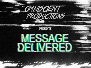
Tickets for Premiere, Promotion and Presentation
- 1. This is the final design for our tickets to the premiere of our horror trailers. We decided to use a phone screen as the ticket so that the target audience could begin to question what role it would have in the narrative for our trailer. We then used a pun in the text message, as we know that our target audience is responsive to jokes. We changed some of the details on the phone screen, such as the battery percentage and mobile network, so that it still had connotations of the horror genre.
- 2. This is the presentation that we made to introduce our trailer, magazine cover and film poster:
- 4. We were tasked to create a horror film trailer, poster and magazine cover. It had to be rated 15 and also had to contain conventions and features usually displayed in real media text.
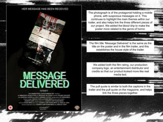
- 5. Our group decided on a synopsis regarding the genre of paranormal as this is popular in current trends of horror films. The narrative is about a female protagonist named Azyln who is haunted by a unknown entity and as she gains popularity online, she is sabotaged by ŌĆśherselfŌĆÖ through social media. With the determination to find out who it is, Azyln finds out a secret about her family which sends her life into chaos as the entity continues to isolate her. Is she able to escape??
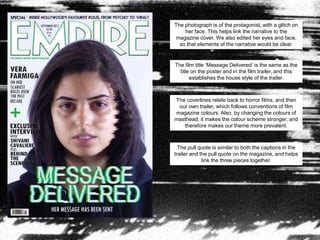
- 6. The photograph is of the protagonist, with a glitch on her face. This helps link the narrative to the magazine cover. We also edited her eyes and face, so that elements of the narrative would be clear. The film title ŌĆśMessage DeliveredŌĆÖ is the same as the title on the poster and in the film trailer, and this establishes the house style of the trailer. The coverlines relate back to horror films, and then our own trailer, which follows conventions of film magazine colours. Also, by changing the colours of masthead, it makes the colour scheme stronger, and therefore makes our theme more prevalent. The pull quote is similar to both the captions in the trailer and the pull quote on the magazine, and helps link the three pieces together.
- 7. The photograph is of the protagonist holding a mobile phone, with suspicious messages on it. This continues to highlight the main themes within our trailer, and also helps link the three different pieces of our project. We added the blood drip to make the poster more related to the genre of horror. The film title ŌĆśMessage DeliveredŌĆÖ is the same as the title on the poster and in the film trailer, and this establishes the house style of the trailer. We added both the film rating, our production company logo, an entertainment distributor and credits so that our product looked more like real media text. The pull quote is similar to both the captions in the trailer and the pull quote on the magazine, and helps link the three pieces together.
- 8. The conventions that our horror trailer follows are the use of the final girl, jump scares and scenes that include blood and gore. As well as setting the scene at night which is usually when bad things start to happen, as seen in existing trailers such as Carrie, Halloween and Unfriended. Our trailer subverts from conventions shown in existing horror trailers, as they usually speed up the length of each scene , highlight the climatic points in the narrative. We edited sound clips to increase the tension, and therefore create a suspenseful atmosphere. This is seen often in trailers.
- 9. Throughout our project, we used different outputs of media in order to display our research such as ║▌║▌▀Żshare, this was significant in displaying our ideas which would help us in making our trailer. For example, we were able to find out and use a theory called Moral Panic, linking to devices in our trailer. Alongside this, in our construction, we ended up becoming for familiar with ways of using the camera and finding out the different between shots and movement of it. We also used Adobe Photoshop & Premiere to edit our clips and auxiliary tasks.
Editor's Notes
- #3: Screenshot of our logo film name
- #4: Screenshot of our logo film name
- #5: Introduction
- #6: Basic plotline - Rubab
- #7: In what ways does your media product use, develop or challenge forms and conventions of real media products? Talk about conventions in magazine coevr and poster, and highlight main similarities + Jassinta
- #9: In what ways does your media product use, develop or challenge forms and conventions of real media products? Talk about conventions in trailer, and highlight main similarities + Angelie
- #10: How did you use new media technologies in the construction and research, planning and evaluation stages? -Trailer + Rubab