UBCTUG - Best practices for powerful dashboards
- 1. PRESENTED BY George Firican UBCTUG ŌĆō UBC Tableau User Group Best practices for powerful dashboards
- 2. UBCTUG http://meetup.com/UBCTUG Quick presenter intro http://ca.linkedin.com/in/georgefirican https://twitter.com/georgefirican Now: ŌĆó Data Quality Manager ŌĆō Development & Alumni Engagement (UBC) Past: ŌĆó 10+ years experience in education, software/web development and e- commerce industries ŌĆó 7+ years Business/Technical Analysis & Project Management
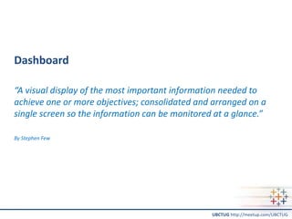
- 3. UBCTUG http://meetup.com/UBCTUG Dashboard ŌĆ£A visual display of the most important information needed to achieve one or more objectives; consolidated and arranged on a single screen so the information can be monitored at a glance.ŌĆØ By Stephen Few
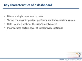
- 4. UBCTUG http://meetup.com/UBCTUG Key characteristics of a dashboard ŌĆó Fits on a single computer screen ŌĆó Shows the most important performance indicators/measures ŌĆó Data updated without the userŌĆÖs involvement ŌĆó Incorporates certain level of interactivity (optional)
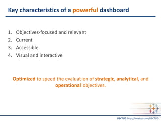
- 5. UBCTUG http://meetup.com/UBCTUG Key characteristics of a powerful dashboard 1. Objectives-focused and relevant 2. Current 3. Accessible 4. Visual and interactive Optimized to speed the evaluation of strategic, analytical, and operational objectives.
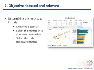
- 6. UBCTUG http://meetup.com/UBCTUG 1. Objective-focused and relevant ŌĆó Determining the metrics to include ŌĆó Know the objective ŌĆó Select the metrics that your users understand ŌĆó Select the truly necessary metrics
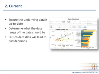
- 7. UBCTUG http://meetup.com/UBCTUG 2. Current ŌĆó Ensure the underlying data is up-to-date ŌĆó Determine what the date range of the data should be ŌĆó Out-of-date data will lead to bad decisions
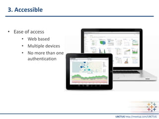
- 8. UBCTUG http://meetup.com/UBCTUG 3. Accessible ŌĆó Ease of access ŌĆó Web based ŌĆó Multiple devices ŌĆó No more than one authentication
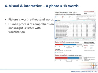
- 9. UBCTUG http://meetup.com/UBCTUG 4. Visual & interactive ŌĆō A photo = 1k words ŌĆó Picture is worth a thousand words ŌĆó Human process of comprehension and insight is faster with visualization
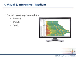
- 10. UBCTUG http://meetup.com/UBCTUG 4. Visual & interactive - Medium ŌĆó Consider consumption medium ŌĆó Desktop ŌĆó Mobile ŌĆó Static
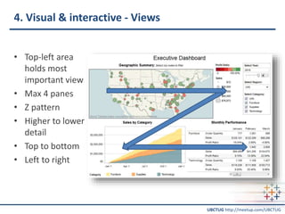
- 11. UBCTUG http://meetup.com/UBCTUG 4. Visual & interactive - Views ŌĆó Top-left area holds most important view ŌĆó Max 4 panes ŌĆó Z pattern ŌĆó Higher to lower detail ŌĆó Top to bottom ŌĆó Left to right
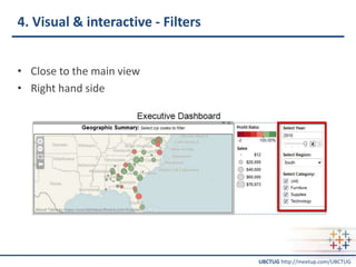
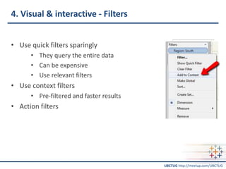
- 12. UBCTUG http://meetup.com/UBCTUG 4. Visual & interactive - Filters ŌĆó Close to the main view ŌĆó Right hand side
- 13. UBCTUG http://meetup.com/UBCTUG 4. Visual & interactive - Filters ŌĆó Use quick filters sparingly ŌĆó They query the entire data ŌĆó Can be expensive ŌĆó Use relevant filters ŌĆó Use context filters ŌĆó Pre-filtered and faster results ŌĆó Action filters
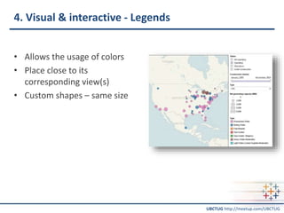
- 14. UBCTUG http://meetup.com/UBCTUG 4. Visual & interactive - Legends ŌĆó Allows the usage of colors ŌĆó Place close to its corresponding view(s) ŌĆó Custom shapes ŌĆō same size
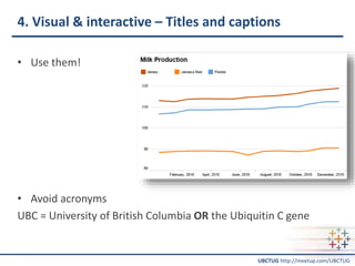
- 15. UBCTUG http://meetup.com/UBCTUG 4. Visual & interactive ŌĆō Titles and captions ŌĆó Use them! ŌĆó Avoid acronyms UBC = University of British Columbia OR the Ubiquitin C gene
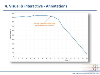
- 16. UBCTUG http://meetup.com/UBCTUG 4. Visual & interactive - Annotations
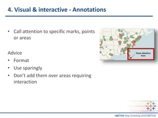
- 17. UBCTUG http://meetup.com/UBCTUG 4. Visual & interactive - Annotations ŌĆó Call attention to specific marks, points or areas Advice ŌĆó Format ŌĆó Use sparingly ŌĆó DonŌĆÖt add them over areas requiring interaction
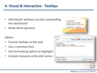
- 18. UBCTUG http://meetup.com/UBCTUG 4. Visual & interactive - Tooltips ŌĆó Add details without visually overloading the dashboard ŌĆó Make them dynamic Advice ŌĆó Format tooltips at the end ŌĆó Use a common font ŌĆó Use formatting option to highlight ŌĆó Include measure units and names
- 19. UBCTUG http://meetup.com/UBCTUG 4. Visual & interactive ŌĆō Overall format ŌĆó Make it aesthetically pleasing ŌĆó Be consistent ŌĆó Use color wisely (keep in mind black & white printing and colorblindness) ŌĆó Avoid pie charts for one to many comparisons ŌĆó 3D charts offer no increase in viewer comprehension ŌĆó DonŌĆÖt use the same chart type twice
- 20. UBCTUG http://meetup.com/UBCTUG Recap ŌĆó Choose current metrics that matter ŌĆó Make it simple to access ŌĆó Keep it visual and interactive
- 21. UBCTUG http://meetup.com/UBCTUG Recommended books ŌĆó Information Dashboard Design: The Effective Visual Communication of Data (Stephen Few) ŌĆó Effective Dashboard Design (Gail La Grouw) ŌĆó Business Dashboards: A Visual Catalog for Design and Deployment (Nils Rasmussen, Manish Bansal, Claire Chen)
- 22. UBCTUG http://meetup.com/UBCTUG Thank you! UBCTUG http://meetup.com/UBCTUG
Editor's Notes
- #4: A way of communicating important information at a glance. Dashboardinsight.com Stephen Few - Information Dashboard Design: The Effective Visual Communication of Data He has over 20 years of experience as an IT innovator, consultant, and educator. As Principal of the consultancy Perceptual Edge, Stephen focuses on data visualization for analyzing and communicating quantitative business information. He provides consulting and training services, speaks frequently at conferences, and teaches in the MBA program at the University of California in Berkeley.
- #5: All the visualizations fit on a single computer screen (scrolling to see more violates the definition of a dashboard) Shows the most important performance indicators/measures to be monitored Data automatically gets updated without any involvement from the user. The frequency of the update will vary by the organization and by purpose. The most effective dashboards have data updated at least on a daily basis Incorporates certain level of interactivity such as filtering and drill-down, but these types of actions should not be required to see which performance indicators are under performing.
- #6: Displays relevant and current data Optimized to speed the evaluation of strategic, analytical, operational needs
- #7: Choosing which metrics to include in the dashboard is important. Above all, they must be metrics that matter and that are relevant to the job at hand. But that doesnŌĆÖt mean every metric should be include. Knowing the objective is CRITICAL. Be sure you can clearly explain how every metric on your dashboard connects to organization objectives.
- #8: Make sure that the data underlying your dashboard is up-to-date so that your selected metrics reflect current business challenges. File-based distribution youŌĆÖll have synchronization issues (people reading old versions) and the security of your data may be a bit more cumbersome.
- #10: Dan Murray ŌĆō urges not to build grids or pivot table looking dashboards and use visuals instead
- #12: Place your most important view in the top left as this is where the human eye is naturally drawn and where your user will look first. Chained interactivity or when one view filters the next make sure you structure them top to bottom and left to right.
- #13: Interactive, highly visual dashboards enable your audiences to perform basic analytical tasks, such as filtering the views, drilling down and examining underlying data ŌĆō all with little training. Viewers need to be able to literally get the big picture from the dashboard that everyone sees and then be able to drill down into a view that tells them what they need to know to get their jobs done. Place your filters close to that view, preferably on the right hand side (you can do this by using the layout containers).
- #14: Using them promotes interaction Keep in mind that when using a quick filter, a query is created and the entire data is probed so it can be expensive. So only use relevant filters and take out the ones that are not frequently used as it will improve load time Dan Murray ŌĆō avoid quick filters Use context filters instead. ŌĆō the results are pre-filtered and they are proportionally faster
- #15: A legend will allow you to use colors to your advantage, while making sure your audience knows what theyŌĆÖre looking at. Place your legend close to that view. Avoid eye movements away from data view.
- #16: Depending on whoŌĆÖll be looking at your reports, be sure theyŌĆÖll know what each graph means. Consider, Jersey, Jamaica Red, Florida.╠²These words all come from the same category, but if you didnŌĆÖt know I was listing breeds of cattle you might think I was having a problem with Geography.
- #21: Dashboards have become popular in recent years as uniquely powerful tools for communicating important information at a glance. Although dashboards are potentially powerful, this potential is rarely realized. The greatest display technology in the world won't solve this if you fail to use effective visual design. Tableau offers the technology to make powerful dashboards. And if a dashboard fails to tell you precisely what you need to know in an instant, you'll never use it, even if it's filled with cute gauges, meters, and traffic lights. Choose metrics that matter. Keep it current or donŌĆÖt bother Make it simple to access and use Keep it visual. Make it interactive