Web design-workflow
Download as ppt, pdf0 likes1,598 views

This document discusses web design workflow and front-end development. It covers the layers of front-end development including HTML, CSS, JavaScript, grids, and frameworks. It also discusses designing static comps versus in the browser, the mobile revolution and responsive design. The document then discusses information architecture, wireframes, and the languages of web design including HTML, CSS, JavaScript. It also discusses grids, frameworks, SASS/LESS, and responsive design.


Web design-workflow
- 1. Web Design Workflow A web standards approach in 2013
- 2. Web - HTML, CSS & Javascript What we will cover • The layers of front end development • Grids • Frameworks • Web workflow 1.0 vs. today’s • Designing with static design comps vs. in the browser with code • The mobile revolution & responsive design
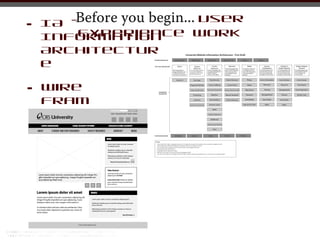
- 3. Before you begin... User • IA- Experience work Information Architectur e • Wire fram es
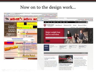
- 4. Now on to the design work...
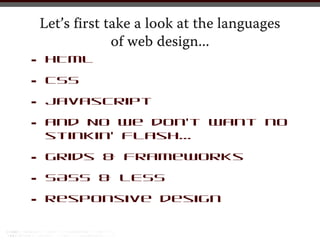
- 5. Let’s first take a look at the languages of web design... • HTML • CSS • Javascript • and NO we don’t want no stinkin’ Flash... • Grids & Frameworks • SASS & LESS • Responsive design
- 6. HTML r text markup lang
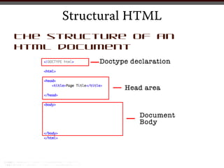
- 7. Structural HTML The structure of an html document
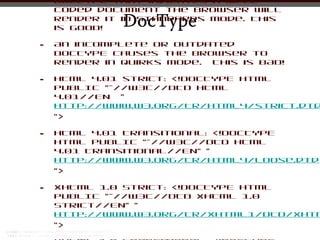
- 8. DOCTYPE that indicates a well coded document the browser will DocType render it in Standards Mode. This is GOOD! • An incomplete or outdated DOCTYPE causes the browser to render in Quirks mode. This is BAD! • HTML 4.01 strict: <!DOCTYPE html PUBLIC "-//W3C//DTD HTML 4.01//EN " http://www.w3.org/TR/html4/strict.dtd "> • HTML 4.01 Transitional: <!DOCTYPE html PUBLIC "-//W3C//DTD HTML 4.01 Transitional//EN" " http://www.w3.org/TR/html4/loose.dtd "> • XHTML 1.0 Strict: <!DOCTYPE html PUBLIC "-//W3C//DTD XHTML 1.0 Strict//EN" " http://www.w3.org/TR/xhtml1/DTD/xhtm ">
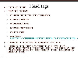
- 9. • Title tag Head tags • meta tags • character encoding • language • keywords • description • author • more: http://www.w3schools.com/html/ • links to stylesheet files • links to any script files (ie: javascript) These now should be placed right before the closing body tag
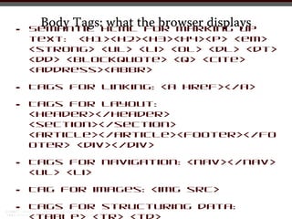
- 10. Body Tags:HTMLthe browser displays what for marking up • Semantic text: <h1><h2><h3><h4><p> <em> <strong> <ul> <li> <ol> <dl> <dt> <dd> <blockquote> <q> <cite> <address><abbr> • Tags for linking: <a href></a> • Tags for layout: <header></header> <section></section> <article></article><footer></fo oter> <div></div> • Tags for navigation: <nav></nav> <ul> <li> • Tag for images: <img src> • Tags for structuring data:
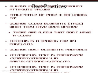
- 11. • Best Practices Always include quotes around attribute values • titile=”Title of Page I am linking to” • Always close elements (tags) when they have been opened • there are a few that don’t have a close • <h1>This is a Heading for my Page</h1> • Always nest elements properly • <p><em>This text is emphasized <strong>strongly in parts</strong></em></p> • <p><em>This text is emphasized <strong>strongly in
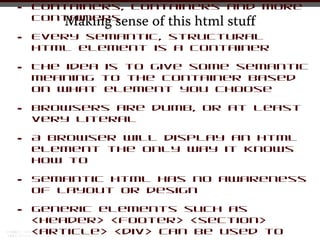
- 12. • Containers, containers and more containers Making sense of this html stuff • Every semantic, structural html element is a container • The idea is to give some semantic meaning to the container based on what element you choose • Browsers are dumb, or at least very literal • A browser will display an html element the only way it knows how to • Semantic html has no awareness of layout or design • Generic elements such as <header> <footer> <section> <article> <div> can be used to
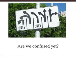
- 13. Are we confused yet?
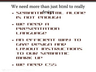
- 15. We need more than just html to really • is design semantic html alone not enough • we need a presentation language • an efficient way to give design and layout instructions to our semantic mark up • we need CSS
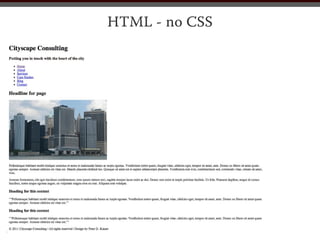
- 16. HTML - no CSS
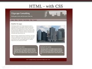
- 17. HTML - with CSS
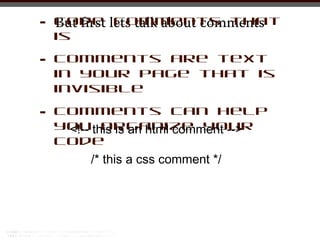
- 18. • Code lets talk about comments But first comments that is • Comments are text in your page that is invisible • Comments can help youthis is an html comment --> <!-- organize your code /* this a css comment */
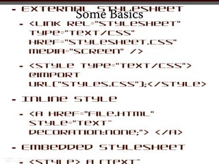
- 19. • External Stylesheet Some Basics • <link rel=”stylesheet” type=”text/css” href=”stylesheet.css” media=”screen” /> • <style type="text/css"> @import url(/slideshow/web-designworkflow/18106574/"styles.css");</style> • Inline Style • <a href=”file.html” style=”text- decoration:none;”> </a> • Embedded Stylesheet
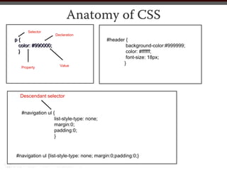
- 20. Anatomy of CSS Selector Declaration p{ #header { color: #990000; background-color:#999999; } color: #ffffff; font-size: 18px; Value } Property Descendant selector #navigation ul { list-style-type: none; margin:0; padding:0; } #navigation ul {list-style-type: none; margin:0;padding:0;}
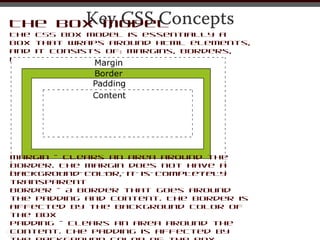
- 21. Key CSS Concepts The Box Model The CSS box model is essentially a box that wraps around HTML elements, and it consists of: margins, borders, padding, and the actual content. Margin - Clears an area around the border. The margin does not have a background color, it is completely transparent Border - A border that goes around the padding and content. The border is affected by the background color of the box Padding - Clears an area around the content. The padding is affected by
- 22. More Key CSS Concepts Inheritance Some styles, like font family, text-alignment etc., are automatically inherited by child elements from their parent element (i.e. by an element contained inside another one). Others are not automatically inherited. Specificity A measure of how specific a rule’s selector is. Source Order If you define a style property, and later define an alternative style property for the same thing, the later definition over- rules the earlier one.
- 23. • Some Basic CSS Strategies Think about the CSS for your site holistically • Keep as much of your CSS in the external stylesheet or style sheets • Group your styles in your stylesheet by what they control • Well comment your stylesheet (and your html files)
- 24. Now are we confused...
- 25. Grids sic part of all we
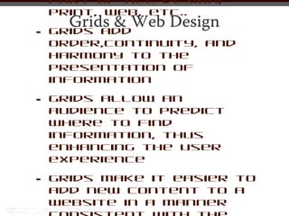
- 26. part of all design; print, web, etc.. Grids & Web Design • Grids add order,continuity, and harmony to the presentation of information • Grids allow an audience to predict where to find information, thus enhancing the user experience • Grids make it easier to add new content to a website in a manner
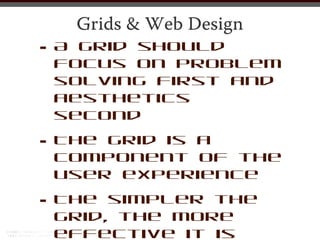
- 27. Grids & Web Design • A grid should focus on problem solving first and aesthetics second • The grid is a component of the user experience • The simpler the grid, the more effective it is
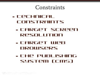
- 28. Constraints • Technical constraints • Target screen resolution • Target Web browsers • The publishing system (CMS)
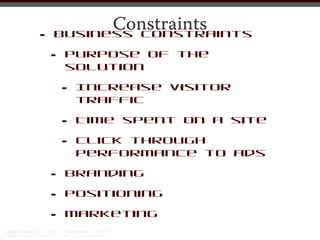
- 29. Constraints • Business constraints • Purpose of the solution • Increase visitor traffic • Time spent on a site • Click through performance to ads • Branding • Positioning • Marketing
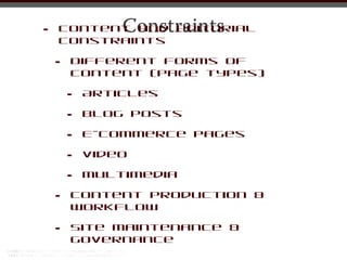
- 30. • Constraints Content and editorial constraints • Different forms of content (page types) • Articles • Blog posts • E-commerce pages • Video • Multimedia • Content production & workflow • Site maintenance & governance
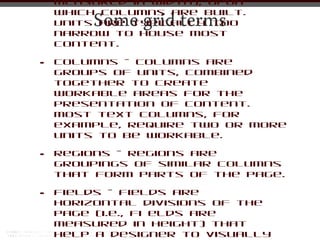
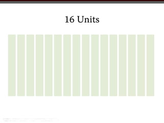
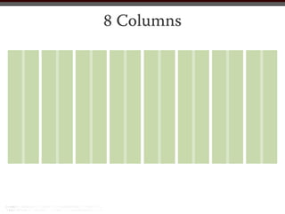
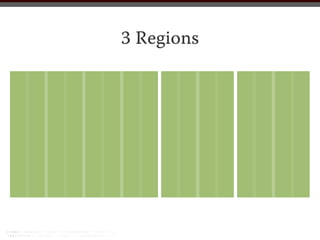
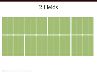
- 31. measured in width), upon which columns are built. Some grid terms Units are typically too narrow to house most content. • Columns - Columns are groups of units, combined together to create workable areas for the presentation of content. Most text columns, for example, require two or more units to be workable. • Regions - Regions are groupings of similar columns that form parts of the page. • Fields - Fields are horizontal divisions of the page (i.e., fi elds are measured in height) that help a designer to visually
- 32. 16 Units
- 33. 8 Columns
- 34. 3 Regions
- 35. 2 Fields
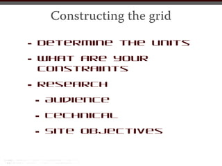
- 36. Constructing the grid • Determine the units • constraints What are your • Research •Audience • Technical • Site objectives
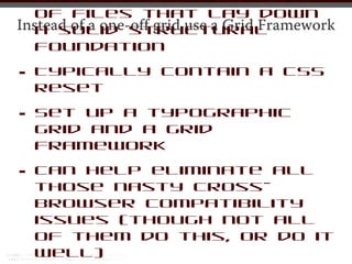
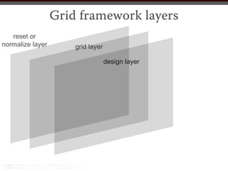
- 37. • A preset CSS file or set of files that lay down Instead of a one-off grid use a Grid Framework a solid structural foundation • Typically contain a CSS reset • Set up a typographic grid and a grid framework • Can help eliminate all those nasty cross- browser compatibility issues (though not all of them do this, or do it well)
- 38. Grid framework layers reset or normalize layer grid layer design layer
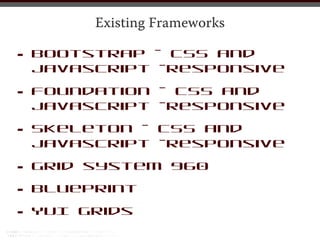
- 39. Existing Frameworks • Bootstrap - CSS and javascript -responsive • Foundation - CSS and javascript -responsive • Skeleton - CSS and javascript -responsive • Grid system 960 • Blueprint • YUI Grids
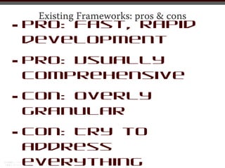
- 40. • Existing Frameworks: pros & cons Pro: Fast, rapid development • Pro: Usually comprehensive • Con: Overly granular • Con: Try to address everything
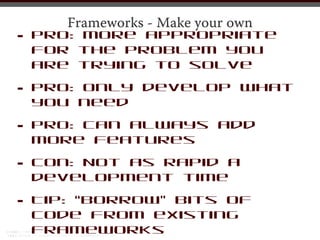
- 41. Frameworks - Make your own • Pro: More appropriate for the problem you are trying to solve • Pro: only develop what you need • Pro: can always add more features • Con: Not as rapid a development time • Tip: “Borrow” bits of code from existing frameworks
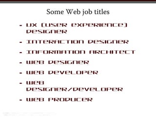
- 42. Some Web job titles • UX (user experience) designer • Interaction designer • Information architect • Web designer • Web developer • Web designer/developer • Web producer
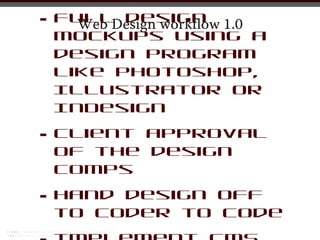
- 43. • Full design 1.0 Web Design workflow mockups using a design program like Photoshop, Illustrator or InDesign • Client approval of the design comps • Hand design off to coder to code
- 44. Why this does not work
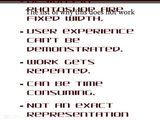
- 45. • Designs in Photoshop are The list of why this does not work fixed width. • User experience can’t be demonstrated. • Work gets repeated. • Can be time consuming. • Not an exact representation
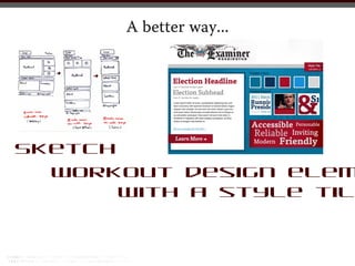
- 46. A better way... Sketch Workout design elem with a style til
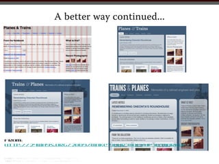
- 47. A better way continued... From: http://24ways.org/2009/make-your-mockup-in-markup/
- 48. • Mobile internet users will The mobile revolution... reach 113.9 million in 2012, up 17.1% from 97.3 million in 2011. • Smartphone users will reach 106.7 million in 2012, up 18.4% from 2011. • In 2012, 94% of smartphones users will be mobile internet users. • All mobile phone users will reach 242.6 million in 2012, up 2.3% from 2011. • Mobile shoppers will reach 72.8 million in 2012. • Tablet users will reach 54.8 million in 2012, up
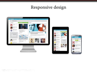
- 50. experience across a wide range of screen resolutions Responsive design... what it is.. and devices. • Accomplished using the same codebase and content, instead of separate sites for different devices. • Responsive design is made possible with the use of: • Adaptive layout - Uses media queries to modify the design in ways that suit different screen sizes. • Fluid grid - Uses relative units like percentages instead of fixed-width units like pixels. • Flexible media/images - Images and other media
- 51. Some resources • http://alistapart.com/ • http://styletil.es/ • http://css-tricks.com/ • http://www.smashingmagazine.co / • http://webdesign.tutsplus. com/ • http://sixrevisions.com/