Everlane iOS App Design Critique
7 likes4,438 views

This document summarizes the author's experience using the Everlane app as a new user. The author critiques various aspects of the app design and user experience. Key points noted include that the app store images did not clearly communicate what the app was for, there were many negative reviews indicating bugs, the app focused more on community than quick purchases, and opportunities were missed to further engage the user after checkout. Overall, the author provides helpful design suggestions while also praising some elements, like the wardrobe recommendation feature.


Everlane iOS App Design Critique
- 1. How Everlane Sells More Than Clothes DESIGNFIELDGUIDE.COM PRESENTS... ...AN AWESOME APP DESIGN CRITIQUE
- 2. Hi! IŌĆÖm going to walk through EverlaneŌĆÖs app ŌĆ£as a userŌĆØ and reveal my insights so you can learn how to think like a designer and design better.
- 3. Oh, who am I? Four years as a visual and interaction designer at Google. Before that, I started a mobile app company with some friends that was acquired by Google. Now I teach design at DesignFieldGuide.com PS props to useronboard.com for coming up with this awesome format for teaching and sharing.
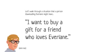
- 4. LetŌĆÖs walk through a situation that a person downloading Everlane might have... ŌĆ£I want to buy a gift for a friend who loves Everlane.ŌĆØ (mini-me)
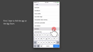
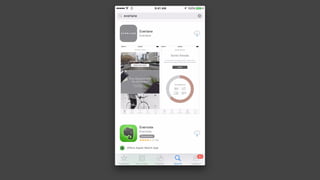
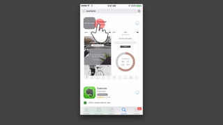
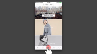
- 6. First I have to find the app on the App Store.
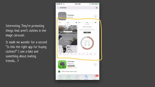
- 8. Interesting. TheyŌĆÖre promoting things that arenŌĆÖt clothes in the image carousel. It made me wonder for a second ŌĆ£Is this the right app for buying clothes?ŌĆØ I see a bike and something about inviting friendsŌĆ” ?
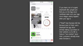
- 9. If you have a lot of organic downloads (like, people just find you on the App store randomly) make sure your app store images clearly explains what your app is. I *think* that Everlane did this because most of their users download the app after already making a purchase on their website, so its OK to feature ŌĆ£non-clothesŌĆØ since their customers already know what Everlane is.
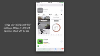
- 10. The App Store listing is like their home page because itŌĆÖs the first experience I have with the app.
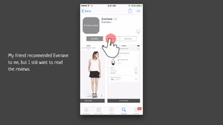
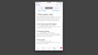
- 14. My friend recommended Everlane to me, but I still want to read the reviews.
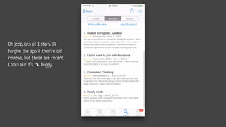
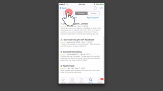
- 16. Oh jeez, lots of 1 stars. IŌĆÖll forgive the app if theyŌĆÖre old reviews, but these are recent. Looks like itŌĆÖs buggy.
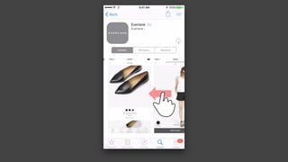
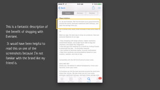
- 18. This is a fantastic description of the benefit of shopping with Everlane. It would have been helpful to read this on one of the screenshots because IŌĆÖm not familiar with the brand like my friend is.
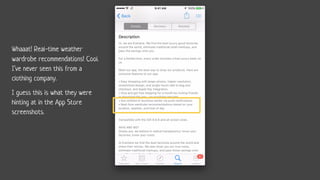
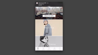
- 19. Whaaat! Real-time weather wardrobe recommendations! Cool. IŌĆÖve never seen this from a clothing company. I guess this is what they were hinting at in the App Store screenshots.
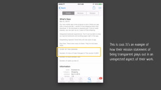
- 21. This is cool. ItŌĆÖs an example of how their mission statement of being transparent plays out in an unexpected aspect of their work.
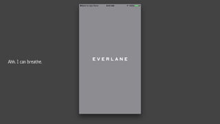
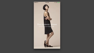
- 25. Ahh. I can breathe.
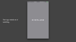
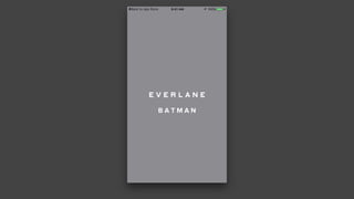
- 26. Their logo reminds me of something...
- 27. B A T M A N
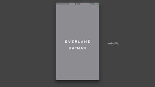
- 28. B A T M A N ...nailed it.
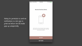
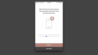
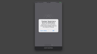
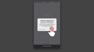
- 29. Asking for permission to send me notifications is a nice way to prime me before the iOS modal pops up unexpectedly.
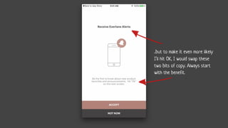
- 30. ..but to make it even more likely IŌĆÖll hit OK, I would swap these two bits of copy. Always start with the benefit.
- 31. Be the first to know about new product launches and announcements. How? Receive Everlane Notifications by hitting OK on the next screen.
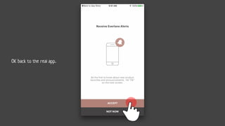
- 32. OK back to the real app..
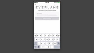
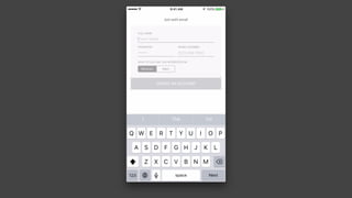
- 36. Signing up with email
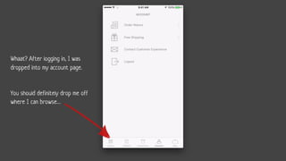
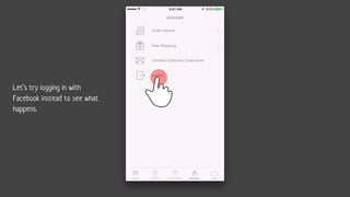
- 41. Whaat? After logging in, I was dropped into my account page. You should definitely drop me off where I can browseŌĆ”
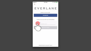
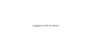
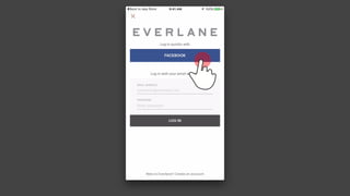
- 42. LetŌĆÖs try logging in with Facebook instead to see what happens.
- 43. Logging in with Facebook
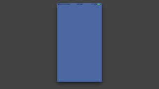
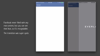
- 47. Facebook never filled with any real content, but you can see that blue, so itŌĆÖs recognizable. The transition was super quick.
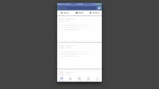
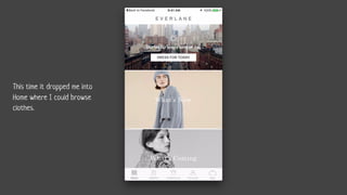
- 49. This time it dropped me into Home where I could browse clothes.
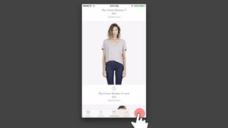
- 50. OK, now IŌĆÖm actually buying a sweatshirt.
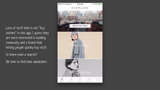
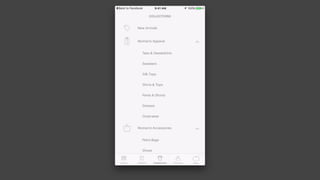
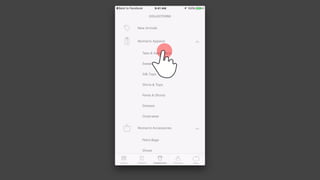
- 51. Lots of stuff that is not ŌĆ£buy clothesŌĆØ in this app. I guess they are more interested in building community and a brand than letting people quickly buy stuff. Is there even a search? OK time to find that sweatshirt.
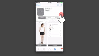
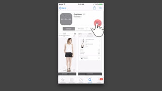
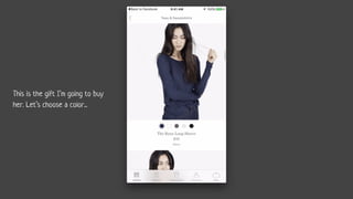
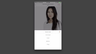
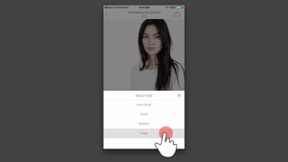
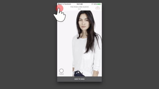
- 55. This is the gift IŌĆÖm going to buy her. LetŌĆÖs choose a color...
- 57. Visually this page is beautiful and functional The photos are square (like Instagram) so they feel well-balanced. ThereŌĆÖs a light, airy feeling to everything on this page. The combination of serif and san-serif feels refined. Serif for the products, and sans-serif for the navigation. ItŌĆÖs subtle, but makes a difference for a company like this.
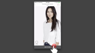
- 63. Nice, big call-to-action here makes it easy and obvious what to do.
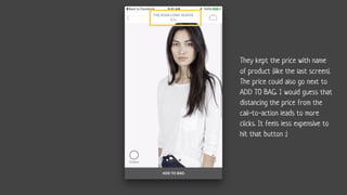
- 64. They kept the price with name of product (like the last screen). The price could also go next to ADD TO BAG. I would guess that distancing the price from the call-to-action leads to more clicks. It feels less expensive to hit that button :)
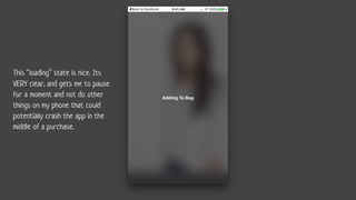
- 69. This ŌĆ£loadingŌĆØ state is nice. Its VERY clear, and gets me to pause for a moment and not do other things on my phone that could potentially crash the app in the middle of a purchase.
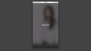
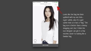
- 71. Looks like the bag has been updated with my one itemŌĆ” super subtle.. also itŌĆÖs super subtle that is in fact a ŌĆ£bag.ŌĆØ The bag icon is better than a cheesy shopping cart, but I think the icon designer can get it a few notches closer to looking like a familiar bag.
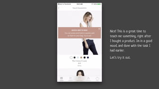
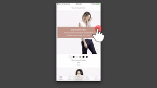
- 73. Nice! This is a great time to teach me something, right after I bought a product. Im in a good mood, and done with the task I had earlier. LetŌĆÖs try it out.
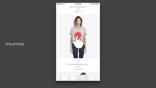
- 76. (long-pressing)
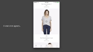
- 77. A small circle appears...
- 79. OK, this is familiar. Cool.
- 80. OK, this is familiar. CoolŌĆ”
- 81. ŌĆ” but no thanks.
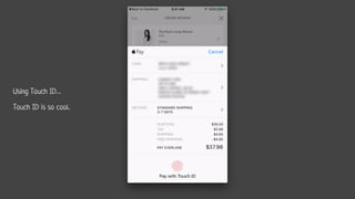
- 83. LetŌĆÖs checkout
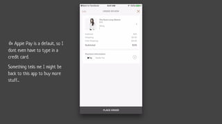
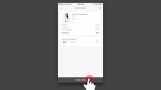
- 85. Apple Pay is a default, so I dont even have to type in a credit card. Something tells me I might be back to this app to buy more stuff...
- 87. Using Touch IDŌĆ” Touch ID is so cool..
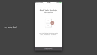
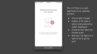
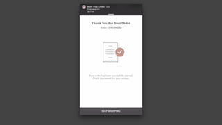
- 91. This is it? There is so much opportunity to do something cool here. ŌŚÅ A list of what I bought ŌŚÅ A photo of the team or factory that produced my clothes thanking me ŌŚÅ A little bit more about the Everlane brand ŌŚÅ How long I can expect it to take for me to get my stuff
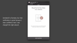
- 93. Unrelated to Everlane, but that notification is great because I have confidence that I was charged the right amount.
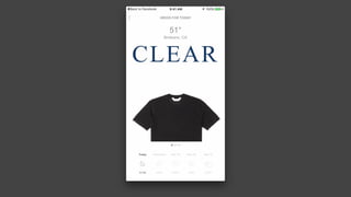
- 96. After purchasing, exploring the real-time wardrobe recommendation feature.
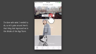
- 97. IŌĆÖm done with what I needed to do, so letŌĆÖs poke around. HereŌĆÖs that thing that impressed me in the details of the App Store.
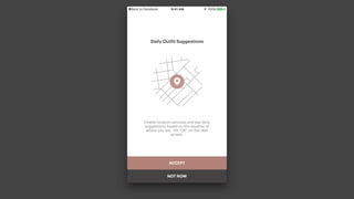
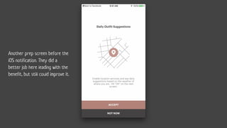
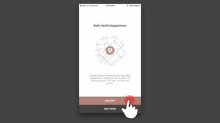
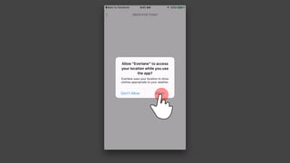
- 99. Another prep screen before the iOS notification. They did a better job here leading with the benefit, but still could improve it.
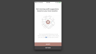
- 100. Get morning outfit suggestions based on your local weather Turn on Location Services so we know what the weather is like where you are. Hit OK on the next screen.
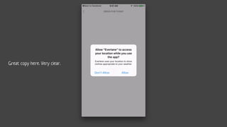
- 102. Great copy here. Very clear.
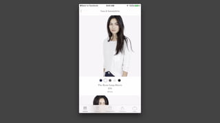
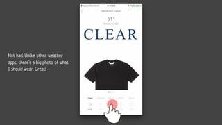
- 105. Not bad. Unlike other weather apps, thereŌĆÖs a big photo of what I should wear. Great!
- 108. So thatŌĆÖs Everlane! Sign-up for more app design critiques at DesignFieldGuide.com
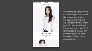
Editor's Notes
- #16: Then I always check reviews. These arenŌĆÖt great reviews.
- #17: Then I always check reviews. These arenŌĆÖt great reviews.
- #18: Then I always check reviews. These arenŌĆÖt great reviews.
- #43: Ok. IŌĆÖve signed up and I am taken to the account page instead of landing on home where I can explore. interesting.
- #75: A small popup