Poster step by-step
Download as PPT, PDF0 likes192 views
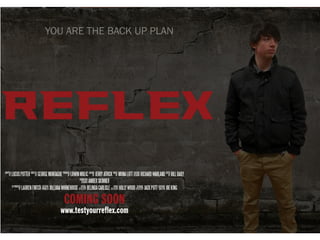
The document describes the process of designing a movie poster. Key elements were added including a monochrome background, the title in red text to be the focal point, credits in a neat block, the phrase "Coming Soon" in red, the film's web address in white, a catch phrase to identify it with the target audience, the main actor's picture on the side darkened slightly for aesthetic purposes, and adjusting the background positioning until it was finalized. The goal was to create a poster that represented the film and effectively advertised it.
1 of 10
Download to read offline

Recommended
Edius 7


Edius 7CaponEmily
Ěý
The document discusses editing techniques used in the production of a short film called PROMISE. It was edited in Edius 7 software, which allowed color and audio correction as well as effects like dissolves between shots. Specific techniques used included adjusting the YUV color curve for a cinematic look, matching colors between shots, using Quick Titler for titles and text, adjusting audio levels between dialogue and music, and varying clip speed to alter pacing. Dissolves were mainly used for smooth scene transitions. Three-way color correction in Edius 7 also allowed saturation and contrast adjustments for different color tones.Creating the Film Review


Creating the Film Reviewkhalfyard
Ěý
The document discusses the creation of a film review magazine layout in InDesign. It describes setting margins and choosing a black background to represent the dark themes of the film. Images were added first to help structure the layout, and were color graded to match the evening setting. The font "Bebas Neue" in bold was used for the title for its legibility. The film review text was written in Word and checked by others before being added to the InDesign file to catch spelling errors. Page numbers were also added following magazine conventions.Creating the film review


Creating the film reviewHanifHamza2088
Ěý
The document describes the process of creating a film review magazine template. They first created margins and found an appealing background. Images were added and color graded to fit an evening setting. The font Bebas Neue Bold was used as it looked like a magazine font. The film review was written in Word and sent to English students for proofreading. The magazine was page numbered as is common for film reviews, especially of short films. Visual elements were added to improve the look of the film review.Producing a film review


Producing a film reviewKayyah_Robun
Ěý
The document summarizes the process of creating a film review layout in InDesign. Key steps included deciding on a conventional two-column layout, writing the review with an intro, plot summary, analysis and release date, and testing the layout in A5 format. Images were added from the film and edited in Photoshop to represent themes before being placed. Additional design elements such as a pull quote, information boxes and consistent color scheme were utilized to create a polished, magazine-style review.Step for desgining


Step for desginingberfinhe
Ěý
1) The document describes the steps taken to design a campaign poster, including taking photos, editing photos in Photoshop to adjust lighting and saturation, designing wording and logos in Illustrator, and assembling the final poster in Photoshop.
2) Key aspects of the design process included using a white backdrop for photos, adjusting brightness, contrast, saturation and lightness of photos, designing wording in sections for quality, and changing the font and color scheme to fit the campaign's message.
3) The main programs used were Photoshop for assembling the final poster and Illustrator for designing wording and logos, though exporting between the programs required multiple steps.Construction1


Construction1Charl234
Ěý
This promotional poster for an artist uses Photoshop to edit a photograph and incorporate different effects. The photograph is opened in Photoshop and a motion blur filter is applied to the background to make it seem like the photo was taken while moving. Different black and white filters are tested before settling on a reticulation filter that makes the poster stand out. The edited photo and design elements are then placed in InDesign, which allows for precise font manipulation. The artist's name is placed at the top in a futuristic Futura font to represent their genre-blending music and widen their audience. Additional text is added on another layer to provide more information to engage viewers.Evaluation Q2 - Branding


Evaluation Q2 - BrandingJeppe Laursen
Ěý
The document discusses how branding was achieved throughout the production's various products. Key elements used for consistency included color scheme (purple and red), fonts (Jeepers for titles, Georgia for body text), layout (similar images and minimal text), and logo placement (logo featured prominently on all pages and materials). These elements worked together to create a recognizable visual identity and sense of branding across the website, postcard, and film logo.Film magazine experiments and process


Film magazine experiments and processECardMedia
Ěý
The document describes several experiments conducted to create a cover image for a film magazine in the style of Little White Lies magazine. The first experiment blacked out the eyes to look like a mask but needed more editing. The second version was paler and bluer to resemble a mask but looked too over-edited. The third blacked out one eye and subtly added the title in the hair but looked too graphically edited. Further experiments tried to make the image look edited but realistic, but did not fit the film's branding. The most recent experiment followed a tutorial for photorealistic drawing in Photoshop but is unfinished.Film magazine experiments


Film magazine experimentschapellecooper
Ěý
The document describes experiments conducted to design a magazine cover that fits the style of Little White Lies magazine. Several approaches were tried, including blacking out a model's eyes, applying filters to create different effects, and editing the image to look like an illustration. None of these were fully successful. A later experiment involved giving the image a blue tint and partially blacking out one eye to represent two characters from the featured film. While closer, this design still needed more elements reflecting the magazine's brand identity. Further experiments are planned to develop a cover that successfully captures Little White Lies' subtle, stylized aesthetic.The stages of our film trailer poster


The stages of our film trailer posteralexformediawork
Ěý
The document outlines the stages of creating a film poster, including choosing a title design using bold red text and key words, adding captions and text in white block capitals to make information stand out, and including logos and ratings information to promote the film to the intended target audience. The poster is meant to attract attention and create interest in the horror film being advertised.Construction1


Construction1Charl234
Ěý
The document summarizes the process of creating a promotional poster for an artist. Key steps included:
1) Selecting a photograph from photoshoots that best represented the artist's genre.
2) Editing the photograph in Photoshop, including applying a motion blur filter to draw attention to the artist.
3) Saving the edited photo as a JPEG and placing it in InDesign, which offers more font and layout options.
4) Adding the artist's name in a futuristic font to represent how she symbolizes the future of her genre.Making the film poster (1)


Making the film poster (1)ShahEman
Ěý
The document discusses the making of a film poster. It will be created in Adobe Photoshop due to the group's experience with the software and its tools for editing images. The film's messages of forgiveness, love, and loss/death will be conveyed through the portrayal of the protagonist as a ghostly or spiritual character using techniques like costume, makeup, and transparency. Conventions for film posters like following the rule of thirds for image placement and including the title will be followed. The protagonist will be depicted in a pale, windswept manner to suggest her ghostly nature without revealing too much of the plot.Magazine cover layout photoshop


Magazine cover layout photoshopkendra20003
Ěý
The group created a magazine cover in Photoshop using the flat plan as a starting point. Lauren imported the masthead from Total Film magazine and had to remove the white background and add effects to match the original. She positioned the masthead above the cover image as is typical. Lauren also included cover lines separated by dots as seen in real magazines. The movie title font was centered on the cover image to draw reader attention, as is common. Additional details like features, date, issue number, and barcode were added to make the magazine look authentic.Question 1


Question 1harrya2media
Ěý
In what ways does your media product use, develop or challenge forms and conventions of real media products?front cover2


front cover2kateabradford
Ěý
Kate Bradford edited her film magazine front cover by following 29 steps. She cut out and used the protagonist's face from her film poster to create continuity. She added a grainy cloud background and erased corners of the photo to create a ripped effect suggesting the protagonist is a suspect. She added the magazine title "TOPFILM" in bold red letters and the cover line "HERE COME THE BRITS!" in alternating red and black letters. After making adjustments based on feedback, she produced the final cover with the protagonist's face in the center and cover text attracting audience attention.Magazine advert production


Magazine advert productionSnowfairy007
Ěý
The document summarizes the steps taken to create a magazine advertisement for a band. It involved removing the background of an image using selection tools, filling the background with black, converting the image to black and white to relate to the rock genre, and adding text elements like the band name using a similar font since the desired font could not be downloaded. Multiple layers and adjustments were made to clean up the image and text elements and produce a final advertisement that stood out visually while relating to conventions of the genre and other magazine ads.Photoshop construction process


Photoshop construction processMEkanem
Ěý
Michael created a magazine mockup in Photoshop titled "Official Magazine". He added pictures from a shared Dropbox folder, increasing the brightness of one photo to use as the main image. He set the background to black and added a masthead inspired by Total Film magazine. Michael included the date, website info, and slogans around the masthead. He added drop shadows to the film title and words like "Exclusive" to make them stand out against the white clothing in the photo. Michael included issue numbers, prices, barcodes and other conventional magazine elements in the kickers section. He cut out additional photos to use as buttons and previewed an imitation movie poster inside the magazine.Photoshop Construction Process


Photoshop Construction ProcessMEkanem
Ěý
Michael Ekanem created a poster for a film called "Official Poster" using Photoshop. He selected a main image featuring a ghost to be the dominant element. Through adjusting brightness, contrast, and levels, he darkened the image and added more red and yellow tones. The burn tool was used to add shadows and give the poster a polished, Hollywood style. Yellow and burgundy text was added for the title using the eyedropper tool to match the ghost's color. Production credits and social media information were included at the bottom along with a film rating of R to follow conventions.Final digi pak photos 


Final digi pak photos yvette95
Ěý
This document provides a slideshow and explanations of the editing process used to create final photos for a DigiPak album cover. It includes before and after photos with annotations describing the edits made, such as adding a grain effect to make photos appear more vintage, applying color filters, adjusting lighting and focus, and adding text using a consistent font with outline. The goal was to establish a consistent vintage aesthetic and visual identity for a fictional indie band across the album packaging.9.5 Group 4 Apps for Good Entry 2015


9.5 Group 4 Apps for Good Entry 2015scorkery
Ěý
The document describes a proposed app called MyCinema that would allow users to plan cinema outings. The app would let users watch movie trailers, select films by genre and showtime, and view which cinemas are playing a selected film and ticket prices. The target audience is described as young teenagers and adults who enjoy going to the cinema. Wireframes showcase app designs with search functions for films and cinemas. The document discusses addressing problems people have planning cinema trips and combining multiple cinema chains within the app.Mag ad-feedback redone


Mag ad-feedback redonemiaferntaylor
Ěý
The feedback provided on the magazine advert discusses positive aspects of the design such as the effective use of color, strong image that conveys the genre, and inclusion of relevant institutional information. Suggestions are made to make the release date stand out more, mention that it is a special edition digipak, and adjust the size of some text for readability. The overall consensus is that the advert looks professional while maintaining conventions of the format.Manipulating images


Manipulating imagesckelly97
Ěý
To create a movie poster showing the main character Imogen fading away, the document author manipulated the image in Photoshop. They first adjusted the color balance to make the colors more vivid since the original photo was dull. Then they adjusted the curves to brighten the image and add a glow around Imogen. Finally, they changed the exposure offset to fade out Imogen, reflecting the ending of the film. The background was changed to black and white to link to flashbacks in the film and make Imogen stand out.Magazine 5th draft & reflection


Magazine 5th draft & reflectionSadu19776
Ěý
This presentation shows specific changes I made to my magazine cover, explaining why I did them, and how it aids my final magazine.Mise en scene


Mise en sceneShahEman
Ěý
The document discusses several filmmaking techniques including high key and low key lighting, costume, setting and props, facial expressions and body language, color, and expressive skills and realism. High key lighting uses fill light to minimize shadows while low key lighting creates strong shadows. Costumes establish time period and social context. Settings and props provide visual context and can take on symbolic meaning. Facial expressions and body language convey emotions. Color carries symbolic meaning and influences mood. Acting styles like realism aim for believability while allowing audiences to understand.Evaluation 2


Evaluation 2BaileyMcMeekin
Ěý
The document analyzes the effectiveness of a music video advertisement in a magazine. It discusses how the advertisement incorporates similar elements to the music video, such as a celebration theme, font, and images of the main artist, to clearly link the two. It also ensures the advertisement promotes the music video's production company and social media accounts. The location, photo selection, editing techniques, and design elements were all chosen to attract the target teenage audience and make the advertisement aesthetically pleasing, prominent, and professionally executed.Magazine advert analysis


Magazine advert analysisBaileyMcMeekin
Ěý
The magazine advert underwent extensive analysis and editing to create the most effective design. Two final images were considered, with one chosen for its more professional appearance. Lighting effects were added to make the main character stand out against a darker background. Research showed reviews, release dates, song names, logos and social media details should be included. A red color scheme was selected to match the company logo and stand out from the grey background. Phrases about the video were placed down the side in a simple font for readability.Graphic Design app icon

Graphic Design app iconMelchiorre Ruvolo
Ěý
The document describes the process of designing an app logo. It discusses experimenting with different colors and outlines for the character image. A dark blue background was selected along with shades of grey for the character features and a drop shadow. Feedback noted the white outline was too bold and clashed with the shadow effect. The final design used a patterned background effect and removed the bold outline.Magazine advertisement production screenshots


Magazine advertisement production screenshotsemzywmzy087
Ěý
The document describes the steps taken to create an advertisement in Photoshop, including:
1) Setting the page size to A4 and inserting the image to be used.
2) Removing the unwanted background of the image using selection tools and filling in the empty areas.
3) Changing the background color to black and filling it in around the image.
4) Adding the band name "Paramore" in a similar font since the actual font could not be downloaded.Fracking, Elsipogtog First Nation, and the police: Examining the social media...


Fracking, Elsipogtog First Nation, and the police: Examining the social media...Jill Hopke
Ěý
A research presentation on the role of visual social media in amplifying protest against shale gas development in Canada. Presented at the Association for Politics and the Life Sciences (APLS) annual conference. Madison, Wisconsin, October 2015.Marke resume 2.0


Marke resume 2.0Eric Mark
Ěý
The document appears to be a presentation about an individual named Eric Mark Opportunity Equalizer. It is divided into sections on his past, present, and future. In the past section, it describes Eric as a lifelong learner and leader who attended various schools and held leadership roles. It also lists his personal assets and work experience. The present section states Eric's purpose is to serve those less fortunate and discusses his proudest achievement of creating a peer review process for project managers. Finally, the future section indicates Eric's ultimate goal is to equalize opportunities for all children through education. It provides his contact information to learn more.More Related Content
What's hot (20)
Film magazine experiments


Film magazine experimentschapellecooper
Ěý
The document describes experiments conducted to design a magazine cover that fits the style of Little White Lies magazine. Several approaches were tried, including blacking out a model's eyes, applying filters to create different effects, and editing the image to look like an illustration. None of these were fully successful. A later experiment involved giving the image a blue tint and partially blacking out one eye to represent two characters from the featured film. While closer, this design still needed more elements reflecting the magazine's brand identity. Further experiments are planned to develop a cover that successfully captures Little White Lies' subtle, stylized aesthetic.The stages of our film trailer poster


The stages of our film trailer posteralexformediawork
Ěý
The document outlines the stages of creating a film poster, including choosing a title design using bold red text and key words, adding captions and text in white block capitals to make information stand out, and including logos and ratings information to promote the film to the intended target audience. The poster is meant to attract attention and create interest in the horror film being advertised.Construction1


Construction1Charl234
Ěý
The document summarizes the process of creating a promotional poster for an artist. Key steps included:
1) Selecting a photograph from photoshoots that best represented the artist's genre.
2) Editing the photograph in Photoshop, including applying a motion blur filter to draw attention to the artist.
3) Saving the edited photo as a JPEG and placing it in InDesign, which offers more font and layout options.
4) Adding the artist's name in a futuristic font to represent how she symbolizes the future of her genre.Making the film poster (1)


Making the film poster (1)ShahEman
Ěý
The document discusses the making of a film poster. It will be created in Adobe Photoshop due to the group's experience with the software and its tools for editing images. The film's messages of forgiveness, love, and loss/death will be conveyed through the portrayal of the protagonist as a ghostly or spiritual character using techniques like costume, makeup, and transparency. Conventions for film posters like following the rule of thirds for image placement and including the title will be followed. The protagonist will be depicted in a pale, windswept manner to suggest her ghostly nature without revealing too much of the plot.Magazine cover layout photoshop


Magazine cover layout photoshopkendra20003
Ěý
The group created a magazine cover in Photoshop using the flat plan as a starting point. Lauren imported the masthead from Total Film magazine and had to remove the white background and add effects to match the original. She positioned the masthead above the cover image as is typical. Lauren also included cover lines separated by dots as seen in real magazines. The movie title font was centered on the cover image to draw reader attention, as is common. Additional details like features, date, issue number, and barcode were added to make the magazine look authentic.Question 1


Question 1harrya2media
Ěý
In what ways does your media product use, develop or challenge forms and conventions of real media products?front cover2


front cover2kateabradford
Ěý
Kate Bradford edited her film magazine front cover by following 29 steps. She cut out and used the protagonist's face from her film poster to create continuity. She added a grainy cloud background and erased corners of the photo to create a ripped effect suggesting the protagonist is a suspect. She added the magazine title "TOPFILM" in bold red letters and the cover line "HERE COME THE BRITS!" in alternating red and black letters. After making adjustments based on feedback, she produced the final cover with the protagonist's face in the center and cover text attracting audience attention.Magazine advert production


Magazine advert productionSnowfairy007
Ěý
The document summarizes the steps taken to create a magazine advertisement for a band. It involved removing the background of an image using selection tools, filling the background with black, converting the image to black and white to relate to the rock genre, and adding text elements like the band name using a similar font since the desired font could not be downloaded. Multiple layers and adjustments were made to clean up the image and text elements and produce a final advertisement that stood out visually while relating to conventions of the genre and other magazine ads.Photoshop construction process


Photoshop construction processMEkanem
Ěý
Michael created a magazine mockup in Photoshop titled "Official Magazine". He added pictures from a shared Dropbox folder, increasing the brightness of one photo to use as the main image. He set the background to black and added a masthead inspired by Total Film magazine. Michael included the date, website info, and slogans around the masthead. He added drop shadows to the film title and words like "Exclusive" to make them stand out against the white clothing in the photo. Michael included issue numbers, prices, barcodes and other conventional magazine elements in the kickers section. He cut out additional photos to use as buttons and previewed an imitation movie poster inside the magazine.Photoshop Construction Process


Photoshop Construction ProcessMEkanem
Ěý
Michael Ekanem created a poster for a film called "Official Poster" using Photoshop. He selected a main image featuring a ghost to be the dominant element. Through adjusting brightness, contrast, and levels, he darkened the image and added more red and yellow tones. The burn tool was used to add shadows and give the poster a polished, Hollywood style. Yellow and burgundy text was added for the title using the eyedropper tool to match the ghost's color. Production credits and social media information were included at the bottom along with a film rating of R to follow conventions.Final digi pak photos 


Final digi pak photos yvette95
Ěý
This document provides a slideshow and explanations of the editing process used to create final photos for a DigiPak album cover. It includes before and after photos with annotations describing the edits made, such as adding a grain effect to make photos appear more vintage, applying color filters, adjusting lighting and focus, and adding text using a consistent font with outline. The goal was to establish a consistent vintage aesthetic and visual identity for a fictional indie band across the album packaging.9.5 Group 4 Apps for Good Entry 2015


9.5 Group 4 Apps for Good Entry 2015scorkery
Ěý
The document describes a proposed app called MyCinema that would allow users to plan cinema outings. The app would let users watch movie trailers, select films by genre and showtime, and view which cinemas are playing a selected film and ticket prices. The target audience is described as young teenagers and adults who enjoy going to the cinema. Wireframes showcase app designs with search functions for films and cinemas. The document discusses addressing problems people have planning cinema trips and combining multiple cinema chains within the app.Mag ad-feedback redone


Mag ad-feedback redonemiaferntaylor
Ěý
The feedback provided on the magazine advert discusses positive aspects of the design such as the effective use of color, strong image that conveys the genre, and inclusion of relevant institutional information. Suggestions are made to make the release date stand out more, mention that it is a special edition digipak, and adjust the size of some text for readability. The overall consensus is that the advert looks professional while maintaining conventions of the format.Manipulating images


Manipulating imagesckelly97
Ěý
To create a movie poster showing the main character Imogen fading away, the document author manipulated the image in Photoshop. They first adjusted the color balance to make the colors more vivid since the original photo was dull. Then they adjusted the curves to brighten the image and add a glow around Imogen. Finally, they changed the exposure offset to fade out Imogen, reflecting the ending of the film. The background was changed to black and white to link to flashbacks in the film and make Imogen stand out.Magazine 5th draft & reflection


Magazine 5th draft & reflectionSadu19776
Ěý
This presentation shows specific changes I made to my magazine cover, explaining why I did them, and how it aids my final magazine.Mise en scene


Mise en sceneShahEman
Ěý
The document discusses several filmmaking techniques including high key and low key lighting, costume, setting and props, facial expressions and body language, color, and expressive skills and realism. High key lighting uses fill light to minimize shadows while low key lighting creates strong shadows. Costumes establish time period and social context. Settings and props provide visual context and can take on symbolic meaning. Facial expressions and body language convey emotions. Color carries symbolic meaning and influences mood. Acting styles like realism aim for believability while allowing audiences to understand.Evaluation 2


Evaluation 2BaileyMcMeekin
Ěý
The document analyzes the effectiveness of a music video advertisement in a magazine. It discusses how the advertisement incorporates similar elements to the music video, such as a celebration theme, font, and images of the main artist, to clearly link the two. It also ensures the advertisement promotes the music video's production company and social media accounts. The location, photo selection, editing techniques, and design elements were all chosen to attract the target teenage audience and make the advertisement aesthetically pleasing, prominent, and professionally executed.Magazine advert analysis


Magazine advert analysisBaileyMcMeekin
Ěý
The magazine advert underwent extensive analysis and editing to create the most effective design. Two final images were considered, with one chosen for its more professional appearance. Lighting effects were added to make the main character stand out against a darker background. Research showed reviews, release dates, song names, logos and social media details should be included. A red color scheme was selected to match the company logo and stand out from the grey background. Phrases about the video were placed down the side in a simple font for readability.Graphic Design app icon

Graphic Design app iconMelchiorre Ruvolo
Ěý
The document describes the process of designing an app logo. It discusses experimenting with different colors and outlines for the character image. A dark blue background was selected along with shades of grey for the character features and a drop shadow. Feedback noted the white outline was too bold and clashed with the shadow effect. The final design used a patterned background effect and removed the bold outline.Magazine advertisement production screenshots


Magazine advertisement production screenshotsemzywmzy087
Ěý
The document describes the steps taken to create an advertisement in Photoshop, including:
1) Setting the page size to A4 and inserting the image to be used.
2) Removing the unwanted background of the image using selection tools and filling in the empty areas.
3) Changing the background color to black and filling it in around the image.
4) Adding the band name "Paramore" in a similar font since the actual font could not be downloaded.Viewers also liked (18)
Fracking, Elsipogtog First Nation, and the police: Examining the social media...


Fracking, Elsipogtog First Nation, and the police: Examining the social media...Jill Hopke
Ěý
A research presentation on the role of visual social media in amplifying protest against shale gas development in Canada. Presented at the Association for Politics and the Life Sciences (APLS) annual conference. Madison, Wisconsin, October 2015.Marke resume 2.0


Marke resume 2.0Eric Mark
Ěý
The document appears to be a presentation about an individual named Eric Mark Opportunity Equalizer. It is divided into sections on his past, present, and future. In the past section, it describes Eric as a lifelong learner and leader who attended various schools and held leadership roles. It also lists his personal assets and work experience. The present section states Eric's purpose is to serve those less fortunate and discusses his proudest achievement of creating a peer review process for project managers. Finally, the future section indicates Eric's ultimate goal is to equalize opportunities for all children through education. It provides his contact information to learn more.Film openings


Film openingsJames Lesingham
Ěý
The purpose of a film opening is to engage the audience and set the genre. Film openings often introduce main characters and the setting through techniques like title sequences, flashbacks, establishing shots of locations, action scenes, or narration. These openings aim to attract the target audience and provide context about the characters and plot.Step by step ian


Step by step ianRagingSeas
Ěý
Ian enjoys a variety of foods like pizza, pasta, shrimp, and chocolate quesadillas. His interests include video games, food, and Magic: The Gathering. He considers himself lazy and will only put effort into things that interest him, as he has no particular goals so that he is not obligated to work.Charting a path to the cloud final


Charting a path to the cloud finalScott Clinton
Ěý
This document discusses how cloud strategies can provide instant business value through an enterprise content management (ECM) approach. It notes that while information security is a top concern, ECM in the cloud is plausible when properly implemented. Hybrid cloud models that leverage both on-premise private clouds and public clouds can help balance speed, cost savings, and information security based on content value and classification. The document provides an example scenario of how a manufacturing company established new operations internationally using a hybrid private hosted cloud approach to align with their business needs and information governance policies.Question 2 evaluation


Question 2 evaluationJames Lesingham
Ěý
The document provides an evaluation of the house style, images, typography, and messages conveyed across a trailer, magazine, and poster for a film. The trailer, magazine, and poster all utilize the Falcon font for titles and feature images of the main character engaging in action and displaying sophistication through costume. Bold fonts are used for key text to make it easy to read. Common elements like release dates and credit blocks on the poster additionally link the marketing materials together while portraying messages of action, danger, and the main character's skills through props like a gun and strategic placement against urban backdrops.Step by-step magazine


Step by-step magazineJames Lesingham
Ěý
The document describes the process of designing a magazine cover to resemble Empire magazine and promote a fictional film. Key steps included:
1. Adding a gradient background and main character image.
2. Incorporating Empire magazine conventions like placing the title behind the character and using matching fonts/colors.
3. Adding additional articles and adjusting text colors so they were visible.
4. Including standard magazine cover elements like the film title and taglines to complete the design.Jason C Poole Cv Linked In


Jason C Poole Cv Linked Inrastare1a
Ěý
Jason C. Poole has 17 years of experience as a molecular biologist developing novel molecular and genetic assays. He has a PhD in molecular genetics and most recently worked at EMD Millipore developing qPCR and next generation sequencing assays that were commercialized. He is seeking a senior scientist or project leader position and has strong skills in areas like qPCR, sequencing, cloning, and assay development.Ancillary task: Poster Research


Ancillary task: Poster ResearchJames Lesingham
Ěý
1. Film posters usually show the main characters and stars to attract audiences and give insight into the narrative.
2. Key locations, genre-reflecting fonts and images, and taglines are also included to further set the scene and tone.
3. Credit blocks at the bottom typically list stars using distinctive fonts to draw in fans and influence viewership.Evaluation question 1


Evaluation question 1James Lesingham
Ěý
This media product uses and develops conventions of real media products in the following ways:
1. It uses conventional shots like establishing shots to set the scene and location. It introduces the main character to give insight into their lifestyle and the film's genre.
2. It uses conventional costumes and props to identify characters and locations and show stereotypes. For example, suits signify businessmen.
3. It includes conventional titles at the beginning listing the director, producer, writers and main actors.
4. It uses a conventional font for the film title that carries connotations of the action crime genre. Transitions between shots also follow genre conventions.Ancillary task: Magezine Research


Ancillary task: Magezine ResearchJames Lesingham
Ěý
The document provides details on conventions for magazine front covers. It discusses how images are typically used to depict main characters and establish the narrative. Captions in various fonts and sizes are employed to highlight different sections. Placement of mastheads, bar codes, and other elements follow standard layouts. House styles reflect the magazine brand or genre through visual elements like fonts, colors, and proportions.NUGSS Events 


NUGSS Events ksmith8870
Ěý
The document announces several social events being held by the student government at UNBC including a backyard BBQ in November, a talent show in December, a New Year's party in January, a Winterfest ski event also in January, a Toga party in February, a pub crawl in March, and a St. Patrick's Day party in March. It encourages students to attend these fun events with food, friends, and entertainment.Metric system blackboard


Metric system blackboardbriansitz
Ěý
The document discusses ancient measurement units and how to convert them to the modern metric system. It provides details on the cubit unit of measurement, Noah's Ark dimensions of 300 cubits long, 50 cubits wide and 30 cubits high. It also includes information on the metric system units of length, mass, volume and temperature and prefixes used with metric units like milli, centi, and deci.Matter and change


Matter and changebriansitz
Ěý
The document discusses the key properties and characteristics of matter. It defines matter as anything that has mass and takes up space. It describes the three main states of matter - solids, liquids, and gases - and their properties. It also discusses physical and chemical properties, mixtures and compounds, and how chemical and physical changes can alter matter.Maintaining Journalism Principles and Ethics in a Digital Age


Maintaining Journalism Principles and Ethics in a Digital AgeJill Hopke
Ěý
A presentation on some of the challenges to maintaining journalistic ethics in a digital age, with a focus on social media.Foursquare brandbook


Foursquare brandbookchamberlinksp
Ěý
This document provides branding guidelines for Foursquare, including summaries of their logo, icon, colors, copy tone of voice, typography, and trademark usage. The guidelines emphasize maintaining a consistent fun and playful brand identity across all uses of the Foursquare assets and ensuring proper usage of their logo, icon, colors and other trademarks.Health seminar-final


Health seminar-finalohadcohen10
Ěý
The document summarizes a health seminar that discusses body composition analysis, obesity risks, ideal nutrition, and Herbalife products. It promotes Herbalife meal replacements for breakfast that provide protein, vitamins, and minerals to replace 1-2 meals per day at 200 calories. Clinical studies show their products help reduce weight, body fat percentage, and improve blood parameters. Testimonials from customers report weight loss success stories losing 10-60 pounds using Herbalife products and nutrition plans.Routine report assignment


Routine report assignmentchamberlinksp
Ěý
The CEO has assigned the task of analyzing employee transportation habits and attitudes to identify solutions to reduce the workforce's impact on local traffic. Data from an employee survey shows that 23% carpool daily, 54% use public transportation daily, and potential improvements like reduced commute times and lower fares could encourage more to use public transportation. The nature of work makes telecommuting an option for 8% daily and 20% several days a week. The report will recommend subsidized bus passes and expanding telecommuting options based on the data.Similar to Poster step by-step (20)
Editing the film poster


Editing the film posteremmalouise01
Ěý
The document summarizes the steps taken to edit a film poster, including using Photoplus and Drawplus software to edit photographs and design layout. Key aspects edited included changing photo colors to purple, adding a galaxy overlay, and positioning and styling text elements like the title, tagline, and credits. Feedback was gathered on a draft, which informed minor final changes to improve readability of the tagline and prominence of the title and release date.Construction propmotional poster ..


Construction propmotional poster ..salaffina
Ěý
The document summarizes the process of creating a promotional poster for a construction company. Key steps included:
1) Selecting a photograph from photoshoots that best represented their genre.
2) Using Photoshop to add motion blur effects to draw attention to the artist.
3) Experimenting with filters like black and white and "reticulation" to make the poster stand out.
4) Adding text in InDesign like the artist name, album title, and release date to clearly advertise the purpose.The Process of Creating the TV Listings


The Process of Creating the TV Listingsa2media14f
Ěý
This document outlines 24 steps taken to create a TV listings magazine article. It describes cropping and inserting images, adding filler text, titles and captions. Fonts, colors and positioning of elements are adjusted. The article is written, including questions, answers and a quote. A background, pull quote and review are added. The final product follows conventions of TV listings magazines to advertise a documentary.Anaylsis Of Final Products


Anaylsis Of Final ProductsGreenshaw
Ěý
The document provides details about the design choices for a film magazine, poster, and trailer that a group created for their final project. For the magazine, they chose a color scheme of white, black, and red to match the film and used fonts for consistency. Their poster included an edited lead actress photo, slogans, and cast/crew information. Their trailer utilized costume, lighting, camera angles and editing techniques to build tension and showcase the thriller genre. The group overcame challenges to design professional-looking elements and achieve continuity across their three pieces.Anaylsis final!


Anaylsis final!Tayla233
Ěý
The document provides details about the design choices for a film magazine, poster, and trailer that a group created for their final project. For the magazine, they chose a color scheme of red, black, and white to match the film, and fonts that promoted consistency. Images and layout were selected to effectively portray information. The poster included an edited lead actress photo, custom logo, and slogan to intrigue audiences. Sound and editing techniques built tension in the trailer. Overall, the group felt their work successfully followed film marketing conventions through continuity in style across formats.Anaylsis final!


Anaylsis final!Tayla233
Ěý
The document provides details about the design choices for a film magazine, poster, and trailer that a group created for their final project. For the magazine, they chose a color scheme of red, black, and white to match the film, and fonts that were consistent with materials from the film. The poster included an edited lead actress photo, slogans, and cast/crew information. Their trailer used costume, lighting, camera angles and editing to build tension, as well as soundtrack choices to set the tone. The group felt they overcame challenges to create professional-looking materials that followed film industry conventions.Evaluation 1


Evaluation 1amytrickett06
Ěý
The document discusses the design process for a film poster and magazine review created to promote a student film. Research was conducted on real film marketing materials to identify conventions. The poster features the protagonist in color against a black and white background to convey mood. Continuity was maintained between the poster and review through matching font, color scheme, and feel. Feedback suggests the photos could be of higher quality and the review text could be more advanced.Magazine Changes


Magazine Changeslucyrose01
Ěý
This is a slide share discussing all of the alterations my partner and I have made to our magazine front cover; once having feedback from our target audience and teacher.Dvd1


Dvd1Charl234
Ěý
The document summarizes the process of constructing a DVD cover in Adobe Photoshop and InDesign. Key steps included:
1. Editing a photograph in Photoshop by cutting off the top and experimenting with filters to make it stand out as the front cover image.
2. Editing a template in Photoshop by cutting out the inside to create a usable PNG template for the DVD cover and back.
3. Placing the edited image and adding text in InDesign to construct the DVD cover, changing font size and color to make the text visible.
4. Further editing a heart graphic and brick wall photo in Photoshop, changing colors to link the front and backDvd


DvdAdella1
Ěý
The document describes the process of designing a DVD cover in Adobe Photoshop and InDesign. Key steps included editing photographs in Photoshop using filters and cutting tools to prepare images for the front and back covers. Text and elements were then arranged in InDesign to construct the final DVD cover design, with consideration given to font size, color, and positioning of elements. Further editing in Photoshop and arrangement in InDesign was done to refine the design until it met expectations for professional quality and cohesiveness between the front and back covers.Poster editing


Poster editingSarah Nurse
Ěý
The document describes the process of creating a film poster. They began by uploading a photo of the main character, Rebecca, and cropping it to be portrait. They added a background image of a science lab with bottles and blood. Editing tools were used to add makeup and highlight hair to make her look more dramatic. A purple tint was added to give an airbrushed effect and connote power. Additional blood splatter was layered on to reinforce the blood element. Text was added in Bighugelabs including the title, names, and caption split over two lines to build suspense. Logos were subtly added in the corners to complete the poster.Magazine Advertisement Development Diary


Magazine Advertisement Development Diarysamjewiss
Ěý
The document summarizes the process of designing a magazine advertisement using Adobe Photoshop. First, the photographer selected an image and duplicated the background layer to edit without altering the original. Curves and levels were adjusted to enhance brightness and contrast. The image size was changed to fit a double page spread for the magazine. A sepia tone action was applied to give a vintage look. Text, shapes, and shadows were added. Noise and blur filters were applied to edges for a worn vintage effect. The final advertisement design is shown.Poster pictures 


Poster pictures BesaAlili
Ěý
This document summarizes the steps taken to create a movie poster. It describes choosing an image of the antagonist holding a knife and mask [1], editing the image by adding effects like rain drops and faded text [2], and inserting additional text elements commonly found on movie posters such as the movie title, tagline, ratings, age rating, and production company names [3]. The final poster image aims to convey a horror genre film in a gloomy, unsettling way through the edited visuals and formatted text.Editing the photo


Editing the photoBradley Gale
Ěý
The document summarizes the editing process for a film poster in Adobe Photoshop. It describes cropping the image to center the model, lightening the model's coat for visibility, and darkening the background. The final edited image features the model standing out against a dark background, making her seem important for the intended horror film audience.Poster Design


Poster DesignBeckyASMedia
Ěý
This document describes the process of designing three posters for a found footage horror film called "Occult". For each poster design, the artist chose an image from the film shoot, adjusted colors and lighting in Photoshop to give a horror film feel, and added elements like static, motion blur, and cuts/smeared makeup on the character to match horror film poster conventions. The titles were placed in the camera screen area to look like the "REC" symbol was replaced. Minor adjustments were made to finalize each poster design.Development diary digi pak


Development diary digi pakl-heathorn
Ěý
1) The document describes the process of designing a digi-pak album cover. Photographs were taken and edited using tools like the clone stamp and paintbrush tools to straighten images and reduce glare.
2) Text was added and formatted using different fonts and the warp text tool. Actions were used to add sepia and vintage color effects.
3) The back cover and interior pages were similarly designed using photographs edited to add frames, landscapes in doors, and candles. Actions were used to match the color scheme throughout.
4) The final product matched the original mock up except for excluding models, making the design more ambiguous and personal for the target audience.Construction dvd cover...


Construction dvd cover...salaffina
Ěý
The document describes the process of designing a DVD cover in Adobe Photoshop and InDesign. Key steps included editing photographs in Photoshop by cutting out sections, applying filters, and adjusting colors and brightness. Templates were also edited in Photoshop by removing unneeded areas. The edited images and templates were then placed in InDesign along with text. Multiple revisions were made to text size, color, positioning and effects to improve readability and cohesiveness with the overall design. Layers in InDesign were used to organize and position elements on the front and back covers.Promotional Magazine Poster


Promotional Magazine Postermediafan
Ěý
This document discusses editing a promotional magazine poster image to appeal to the target audience. Several edits were made to the image including:
1. Making the eyes green to stand out, which required adjusting opacity, erasing surroundings, and sharpening pupils.
2. Darkening the lips to a plum color and blurring them to look rough while keeping the eyes as the main focal point.
3. Removing a necklace from the image and making the skin look paler by adding a pasty cream color at 27% opacity.
4. Erasing the white background and tidying hair with the clone tool then blurring to look natural.
5. Experimenting with a black and whiteROUTINE Media Technologies evaluation


ROUTINE Media Technologies evaluationguest8d5d682
Ěý
This document discusses the group's use of online resources and software in their pre-production, production, and post-production processes for creating a media project about dance films. In pre-production, they researched dance film campaigns using websites like YouTube, IMDB, and Wikipedia to analyze trailers and marketing strategies. They used Mac applications like Photo Booth and Garage Band to create blogs and record voiceovers. In production, they took photos with a digital camera and filmed scenes with a video camera for their teaser trailer. In post-production, they experimented with creating mock posters and backgrounds in Photoshop but received feedback that their initial designs were weak.Poster construction for media studies A2


Poster construction for media studies A2benjhaines85
Ěý
Benjamin Haines created a movie poster for a horror film in 10 steps:
1. They edited the main character's eyes to be red to convey danger and evil.
2. They changed the skin tone to gray to give a horror look and signify she was possessed.
3. They blurred the tree in the background to make the character the focus.
4. They added claw marks to the tree to represent the evil character and hint at action scenes.
5. In InDesign, they added the title, release date, and credits using horror-inspired fonts and colors.
6. The final poster conveyed the horror genre through its unsettling character and visual elements.Poster step by-step
- 1. First off as we did with our magazine cover we started with a monochrome background to place everything on.
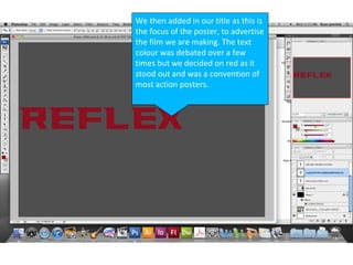
- 2. We then added in our title as this is the focus of the poster, to advertise the film we are making. The text colour was debated over a few times but we decided on red as it stood out and was a convention of most action posters.
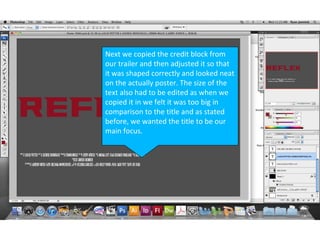
- 3. Next we copied the credit block from our trailer and then adjusted it so that it was shaped correctly and looked neat on the actually poster. The size of the text also had to be edited as when we copied it in we felt it was too big in comparison to the title and as stated before, we wanted the title to be our main focus.
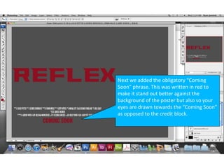
- 4. Next we added the obligatory “Coming Soon” phrase. This was written in red to make it stand out better against the background of the poster but also so your eyes are drawn towards the “Coming Soon” as opposed to the credit block.
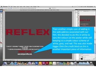
- 5. Then another simple case of adding in the web address associated with our film. We decided to do this in white to vary the colours on the poster while still keeping to a simple colour scheme of white, grey, and red. This was also made bigger then the credit block as this is another important piece of information.
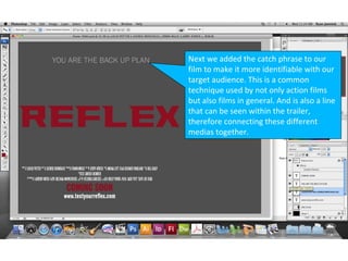
- 6. Next we added the catch phrase to our film to make it more identifiable with our target audience. This is a common technique used by not only action films but also films in general. And is also a line that can be seen within the trailer, therefore connecting these different medias together.
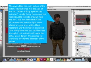
- 7. Then we added the main picture of the actor and positioned it to the side of the text. When making a poster the actor isn't usually facing the camera but looking just to the side or down from the lens. We also noticed that the picture we took was too light so we placed an extra layer with a black rectangle. We then made it at around 25% transparency so you could still see through it but so that it still made the other layers darker. This seemed to work very well for the aesthetic of the poster.
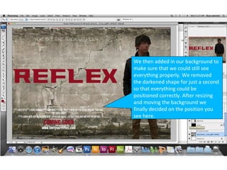
- 8. We then added in our background to make sure that we could still see everything properly. We removed the darkened shape for just a second so that everything could be positioned correctly. After resizing and moving the background we finally decided on the position you see here.
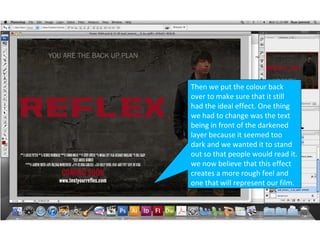
- 9. Then we put the colour back over to make sure that it still had the ideal effect. One thing we had to change was the text being in front of the darkened layer because it seemed too dark and we wanted it to stand out so that people would read it. we now believe that this effect creates a more rough feel and one that will represent our film.
