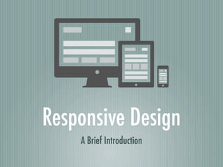
Responsive Design 101
2 likes1,017 views

The document provides an overview of responsive design, highlighting the importance of a mobile-first strategy and the need for flexible grid designs. It discusses technical ingredients like fluid grids, flexible images, and media queries, alongside a user experience (UX) perspective on content strategy. The document emphasizes accessibility and the necessity of adapting navigation design for different screen sizes and interaction methods.

Responsive Design 101
- 1. Responsive Design A Brief Introduction
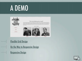
- 2. A DEMO Flexible Grid Design On the Way to Responsive Design Responsive Design
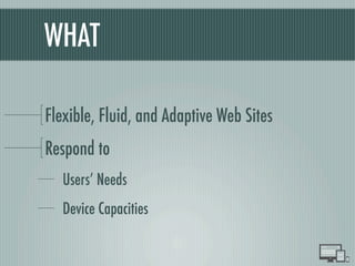
- 3. WHAT Flexible, Fluid, and Adaptive Web Sites Respond to UsersÔÇÖ Needs Device Capacities
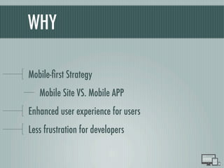
- 4. WHY Mobile-´¼ürst Strategy Mobile Site VS. Mobile APP Enhanced user experience for users Less frustration for developers
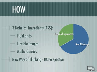
- 5. HOW 3 Technical Ingredients (CSS): Fluid grids Flexible images Media Queries New Way of Thinking - UX Perspective Technical Ingredients New Thinkings
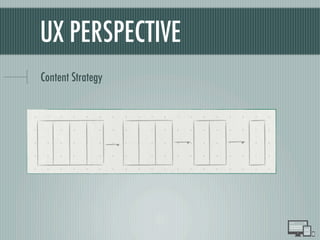
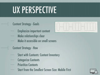
- 8. UX PERSPECTIVE Content Strategy - Goals Emphasize important content Make relationships clear Make it accessible on small screens Content Strategy - How Start with Contents: Content Inventory Categorize Contents Prioritize Contents Start from the Smallest Screen Size: Mobile First
- 9. UX PERSPECTIVE Content Strategy - Goals Emphasize important content Make relationships clear Make it accessible on small screens Content Strategy - How Start with Contents: Content Inventory Categorize Contents Prioritize Contents Start from the Smallest Screen Size: Mobile First
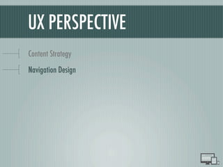
- 10. UX PERSPECTIVE Content Strategy Navigation Design
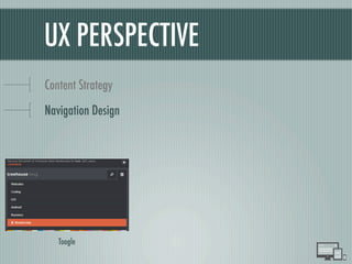
- 11. UX PERSPECTIVE Content Strategy Navigation Design Toogle
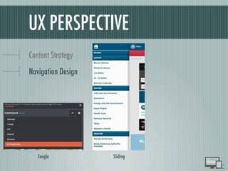
- 12. UX PERSPECTIVE Content Strategy Navigation Design Toogle Sliding
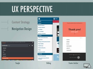
- 13. UX PERSPECTIVE Content Strategy Navigation Design Toogle Sliding Footer Anchor
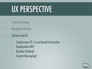
- 14. UX PERSPECTIVE Content Strategy Navigation Design Context-speci´¼üc Touchscreen VS. Cursor-based Interaction Geolocation API? Number Dialing? Instant Messaging?
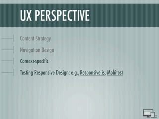
- 15. UX PERSPECTIVE Content Strategy Navigation Design Context-speci´¼üc Testing Responsive Design: e.g., Responsive.is, Mobitest
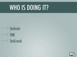
- 16. WHO IS DOING IT? Starbucks TIME TechCrunch
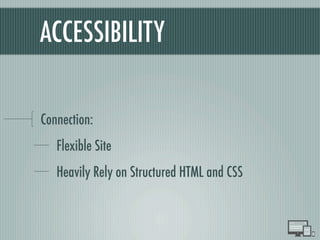
- 17. ACCESSIBILITY
- 18. ACCESSIBILITY Connection: Flexible Site Heavily Rely on Structured HTML and CSS